
A Mound, stars and sunset.
I have had the photo of the beautiful clouds and the old rock formation on the mound lying around for a couple of years. Once in a while, I have tried to process it, but I always found that the photo lacked something.
A couple of days ago I got the idea to mix in some stars above the clouds and then darken the clouds some. That did the trick and finally, I had a finished photo.
In a way, it is a bit like my “Time compressed” photos, as I am portraying photos from two different times of the day, but the difference is, that these two are not shot on the same location. The stars are from Norway and the clouds and ground from Røsnæs in Denmark.
If you have a photo that is lacking something, don’t give up. If you have some quality, but just a missing piece, try to solve that piece. I find such task immensely fun and that is where the creativity sparkles.
To get inspired, look at other photographers photos and suddenly you might find the muse that you need.
–Jacob
]]>
Kastrup Søbad which is located in Greater Copenhagen.
This location in Greater Copenhagen I have had on my to do list for quite a while. This particular day, I wanted to test my Lee filters on my Sony A7R using the Sony Zeiss 24-70 f/4 lens. Normally I use my filters on my Nikon camera, because they have the 77mm size that fits my adapter ring. But I have bought a 67mm adapter ring and had a 67mm -> 62mm step down ring, which made it possible to use my filter kit on the 24-70 f/4.
I had an upcoming UK trip and I seriously considered leaving the D800 at home, and stick to my Sony’s, due to the much smaller size and a little more flexibility on the lenses, by carrying only one system.
As it turned out this evening, the Sony A7R did very well with the filters and long exposures. This photo is a 79 seconds exposure and I have no complaints about the quality of the image.
For the shoot I used a 6-stop Lee filter, also called The Little Stopper, and then a 2-stop soft ND-grad.
The Sea Pool is lit until 2300 hours, which I didn’t know. I arrived with the lights on, and I thought it was fantastic with lights on. A bit difficult to shoot, due to the extreme dynamic range, but a challenge. Then suddenly they turned out the light and I thought, that that was that. I shot two shots more, mostly because I just found a composition that I liked. And I shot them without the lights. This being one of them.
As it turned out the ones without the light are by far the best. Learnings to take with me: Even when the moment seems gone, don’t despair, you might get something else, maybe even better.
–Jacob
]]>

Waking up in Copenhagen.
On my way to the dentist one early morning, I suddenly noticed this reflection. I have crossed Kultorvet in Copenhagen hundreds of times. But I have never seen the reflection. I had 15 minutes for shooting photos. I learned the reason why I had never seen the reflection before. just as I was finishing up. It is a fountain, and I had to jump off not to get wet.
]]>
Roskilde Cathedral Square. A 169 megapixel image stitched from 28 downscaled images.
There is something about panorama photos or stitched photos that fascinate me. It’s a bit like a fisheye lens, that shows the world in a way you can’t see with the naked eye.
A panorama photo serves multiple purposes seen from my perspective. The obvious reason is to include more of a scene in one photo, in a panoramic way.
Another reason is to compensate, for a missing lens. If you haven’t got that really wide angle lens in the bag, shoot two less wide angled images, and stitch them when you get home.
An even more fascinating reason is to use it as an effect. An effect that can distort the world, just like the Fisheye lens does, only in a different way, but often with some resemblance.

Same scene more or less, just shot with a Fisheye lens.
And what I like even more about panorama photos, is that I find it hard to predict the result. There is always a surprise. Sometimes I use my iPhone and shoot a panorama, it can help visualizing the scene as a panorama image, but the iPhone doesn’t work when it gets dark.
I have a deep passion for showing the World in a surreal, yet recognizable and realistic way. I have one foot in the surreal world and one foot in reality. Sometimes I have more weight on one foot, than the other.
Panoramic photos give me another way to add surrealism to my photos, and I like that.
The story behind why I shot this 28 image photo, is that I have grown fascinated by Medium Format cameras, and the fact, that a 60mm Medium Format lens is approximately the same as a 24 mm full frame lens.
Apparently a Medium Format lens distorts the scene less, but instead of spending a huge fortune on a Medium Format camera, I thought, shooting at 50mm and stitching the afterwards, would give a similar effect. As it turned out 50mm was too many shots, and I went to 39mm instead.
I must say, that the perspective is much less distorted, than in this 14mm shot. It is shot at approximately the same distance as the panorama.

14mm on a full frame. Shot at the same distanse as the 28 image stitch.
Stitching the Panorama photos
Panorama photos, or stitched photos, are several photos that are stitched together. Lightroom and Photoshop both have features to support this.
From my experience, Lightroom does a great job on simple panoramas but gives up on more complex stitching tasks. Photoshop is better and has got a few additional options.
But neither Photoshop nor Lightroom could give me, a decent result for this photo. The problem was the projections mapping the images distorted the image in an unpleasant way.
A projection is like when you want to map the round Earth to a flat piece of paper. In a way you record a sphere, from the inside, when you move your camera around shooting photos. When you project something round to a flat surface, you have to make some compromises. Just try to flatten the peel from an orange.
There are different algorithms, or projections for doing this, and they give different results. You just need to find one you like.
This photo is made of 28 photos shot with my Sony A7R, which means 36 megapixels per image, that is a lot of pixels.
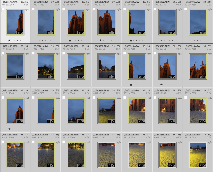
Shooting that many 3 shot HDR photos during the blue hour is a problem. The light changes so rapidly that you get different light in the photos, and I had to reshoot some of the photos because the light had changed too much. Luckily I discovered that before I moved the camera.
Lightroom only offered one projection, which looked terrible. For some reason, it would do not the two other projections. This is something I encounter from time to time.
I then exported to Photoshop, picked automatic projection and in a few moments, the fan went to high speed, and the computer got sluggish. Half and hour or maybe an hour later Photoshop was still stitching, and suddenly I got a warning “Out of disk space”. What?!? I have 700 Gigs of free space!? I opened my Finder, but “nooo” disk space certainly was critically low.
I emptied the trash can, but suddenly the fan stopped. After another hour of waiting and nothing had happened, I realized that Photoshop had died on me.
Instead, I exported the photos as TIFF 16-bit in 3000×2000 pixels. This Photoshop could handle nicely. I chose TIFF 16-bit, to be able to do some proper image processing later. When you export you only want to have fixed lens distortion, and synchronized the White Balance across all photos.
TIP: If your files are too big, export them as TIFF 16-bit, and make them smaller. You will still get a big file.
I have ended up with a 17.000 x 9.930 pixel image (169 Megapixel), using the smaller files. This is plenty for an insanely large print (7 yards wide, and you would still not be able to count the pixels close up).
Photoshop could now process the images, but I didn’t like the result. It got warped too much, in ways I didn’t like. Here’s an example:
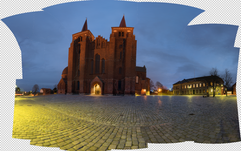
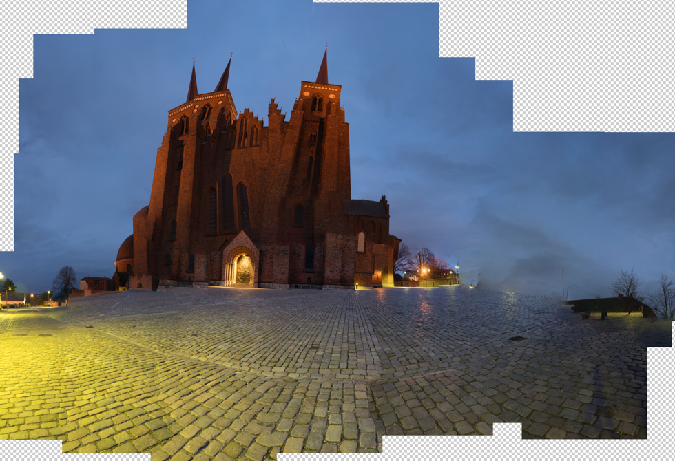
The default project from Photoshop looked terrible, and one of the others is a bit funny. I tried the others, butdidn’t get a result I liked.
Instead, I turned to Auto Pano Giga v4. This is the most advanced Panorama software that I know of. It’s not cheap, but if you can afford it, it’s worth every penny, and it get’s the job done. I only had the old version had to upgrade, and now I bought the bigger version. It integrates into Lightroom and Bridge, and there are some other advantages, I thought I would like to have.
Auto Pano Giga offers a huge range of projections, and some have parameters you can adjust. I picked the ‘Pannini’ projection and adjusted until I got something nice, and then I exported the final result to a Photoshop file. I still only used the 3.000 x 2.000 files.
And from this point, I processed only in Photoshop and later in Lightroom.
I have tried to run the full resolution files into Auto Pano Giga, and I does allow me to do it, however, it does take some time to process. But, it does not suck up all my free disk space. It works in a different way than Photoshop does.
The full resolution is 40.000 pixels wide, and in a slightly different crop, it is just north of 1 Gigapixel. Photoshop struggled with my 169 megapixels image, I think I will only process the full resolution, if anyone needs a twenty yards wide print, with crazy people stepping up in front to see if they can count the pixels (which they wouldn’t be able to, once scaled properly).
–Jacob Surland
]]>
Rubjergknude Light house stands in the middle of a moving sand dune. The surrounding houses lies as debris around the light house. It is predicted, that it will fall into the sea in 10-15 years.
This Weekend Post is about, how I prepared this image for a huge print.
When you have to prepare a large print, you must be more careful, than with a smaller print. Even small irregularities and dust spots will be easy to see and can potentially ruin the whole print. And a larger print is more expensive.
So time spent preparing your photo, is time well spent.
Recently I had to prepare a 130cm / 52 inches wide print for an exhibition at Photographers Lab in Copenhagen, and some problems showed themselves.
Some of you might remember this image from a fairly recent post (a post about why this composition is so strong). I showed how the initially processed photo was a bit too flat, and how a textured version had too strong texture, but the right mix was just perfect.
When an image has to be printed in large, you need to have a good look at a 100% or even more to be sure that the quality is good. This is what I found at 200%:
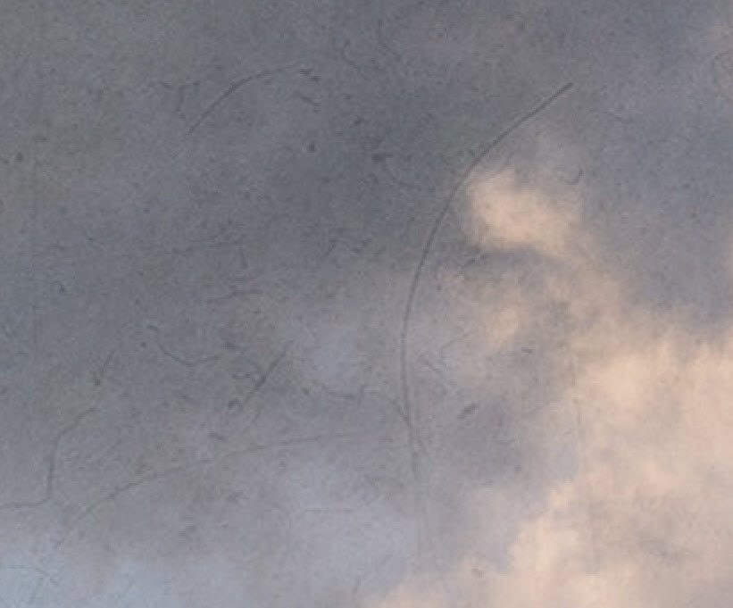
200% crop of the processed photo. This texture will not look good in a huge print.
While this kind of texture and grittiness does look fine in the small version of the image, I am pretty sure, it will not work in a huge print. And I will certainly not do an experiment because that is expensive.
The hairs and scratches come from one of the textures I used, and it is only 6 megapixels. Six megapixel is ok when you mix a lot, and the textures don’t stand out individually. In this case, the texture with hairs and scratches stands out, and that is not good.
Restoring the mood of the image
I removed the textures. Then I switched them on and off for a bit until I suddenly realized what it is the textures do for this photo. They add colors and toning, the texture as a texture is secondary.
Sometimes I want the grittiness the textures can give, but at other times, it is the colors and toning I want. In this case, it is the colors and the toning, and not the textures.
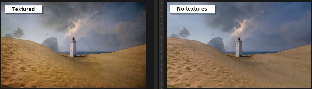
At this zoom level, you hardly notice the textures, but the colors and the light are different, and that is what is important.
I now had a problem I had to solve: How to add light and colors similar to what the textures add?
I started by adding a Hue and Saturation adjustment layer and, switched on the colorize check mark. Now the whole image turns into one hue, just in different tones, like a mono chrome.

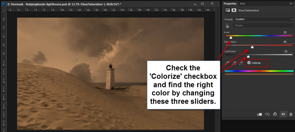
You can use Colorize to change the color of an image, and if you mask in or out, you can target specific areas.
I found an orange brown’ish color similar to that color the textures had added to the sand. What I had to do now, was to mix this colored layer in using the mask.
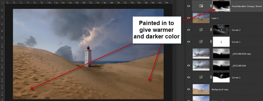
I painted in, in various degrees over the sand. The stronger I painted in, the warmer and the darker it became. I could use this layer to dodge and burn, as well as changing the colors. It quickly began to look like the textured image.
However, I couldn’t achieve everything I wanted, from the orange layer. I couldn’t use it, in the clouds for instance. Instead, I created a number of adjustment layers to enhance light, contrast, colors etc.
Preparing for the print
Step 1 – Clean up your scene
There are a number of basic steps you have to go through when you print. One of the most important things is to clean up your scene.
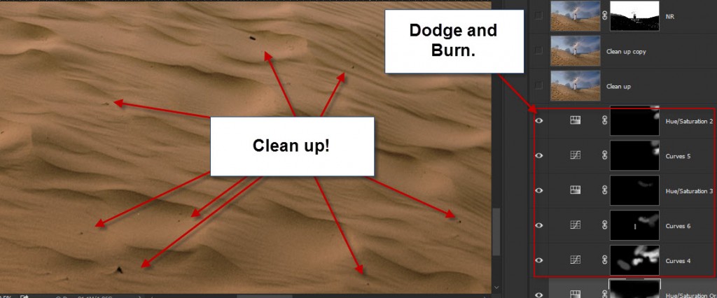
This photo has a peaceful mood, and I want to keep it that way, as much as possible. When this gets blown up big, small rubble and stones in the sand stick out. I cloned out that all over the big soft dune.
The Light House is standing in the middle of a moving sand dune, and the surrounding houses have been crushed by the dune and torn down.
There’s a lot of debris from that in the sand, and that is a part of the scene, even if a lot less peaceful. I removed a few that caught my eye, from the principle, if it catches my eye, it will probably also catch the eye of somebody else.
I also went through the sky, found a couple of dust spots and a bird. Those I removed too. And I removed a cord going on the outside of the light house.
Be thorough!
Step 2 – Noise reduction
The sky has some noise. I use Topaz Denoise to remove it. I am careful not to lose details in the sand and the light house.
Step 3 – Sharpen the primary objects
When you print, you want to sharpen the image more, just be careful not to get sharpening halos, they will be easy to spot on a large print.
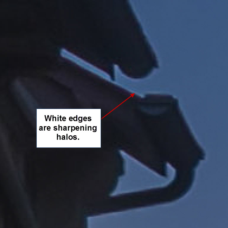
Removing sharpening halos can be done, but is a big hastle. It’s better to avoid them.
I sharpened the Light house and the vegetation on the right hand side dune.
Step 4 – Brighten
Sometimes I also brighten my photos slightly. A monitor has light, and you can see it in the dark. A print doesn’t light up, it has to have the brightness built into the image.
If you are unsure, see if you can get a small print proof before you print for real. This can save some frustration. When you have done it a few times, you get to know your printing company, and what happens.
In the case of this photo, I did not brighten additionally. But I would say I do it in 50% of the cases.
Before and after
Below here, you can see the difference between the textured and the print ready image. Not exactly the same, but in many ways, the same feeling is present.
[twentytwenty]

[/twentytwenty]
The Weekend Post by Jacob Surland
If you find my articles interesting and consider getting AuroraHDR, please use the link on my webpage and support me that way. I only recommend software and tools that I use.
I am not ‘bought’ to say nice things with sugar on top. I say what I think and feel about products. I get nothing for writing these articles, but I do get a kickback if you use my link to buy AuroraHDR, as well as if you use my 15% discount coupon code “caughtinpixels” for buying Buy Photomatix Pro. Thanks.
If you like my work, why not follow me on Twitter, Facebook, and Google+. I post photos daily.
–Jacob Surland
]]>
The ‘Skerpi’ is a house made of sticks, and put on wheels. The gourmet restaurant ‘Koks’ from the Faroe Islands has this as a pop-restaurant in Copenhagen these days.
For the past week, I have been playing around with AuroraHDR by Trey Ratcliff and Macphun. It’s one of the latest products for creating HDR photos, and I have been pretty excited about getting to know it.
This article covers my first initial impression of AuroraHDR. My overall impression is positive. There are lot’s of good stuff, but there are also a couple of bad bits.
Let’s start with one of the bad bits. It’s Mac… Only… However, Macphun is working on a Windows version, but there is no official date for this yet. Maybe they will brand it under ‘Winphun’? Probably not!
Anyway, I am or was a Windows user, but I do have a MacBook Air 13″ from mid-2011, equipped with an i7 1.8 GHz and 4Gb ram. It was the most powerful MacBook air back then. And this Mac has been my test drive computer.
I think that has been a good exercise and I can give a couple of additional input because I used this older computer.
First run of AuroraHDR
I picked a series of bracketed photos from my latest photoshoot. I exported seven exposures from Lightroom as DNG (Adobe’s device independent RAW format) files, as I always do, and dragged them into AuroraHDR.
And I waited for the preview screen getting ready to show the images.
It was 7 36.3 megapixel photos from my Nikon D800, and it took a while, so I waited a bit more. Fair enough, it is big image files.
And then I waited a longer bit more.
After 30 minutes of waiting and nothing had happened, I shut off the computer. I was VERY disappointed.
I tried once more, and picked only 3 of the 7 exposures, and after a couple of minutes the previews did show up, and I could start up AuroraHDR.
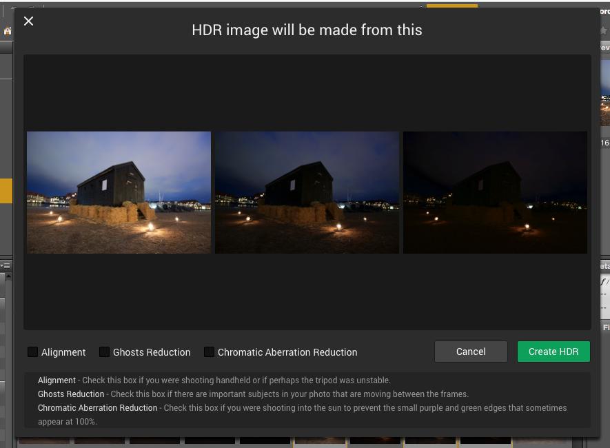
I wondered because I had heard that AuroraHDR should be fast. I looked up the minimum requirements, but my oldish Mac was above the minimum requirements. What could be the problem? Had Macphun really made a piece of software that couldn’t run on an older Mac?
No, of course, they had not. It took a little experimenting to figure out, what the problem was. It was the file format DNG. For some reason, the DNG files are insanely slow loading in AuroraHDR.
As soon as I used JPEG or native RAW files, it’s pretty snappy. 36 megapixel files are slower to work with, than 12 megapixel, which is no big surprise. But it works.
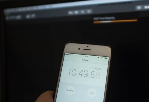
I did a test using three 3 images of 36 megapixels. The native Nikon RAW files took 1 minute and 55 seconds until it was ready to process. The DNG files took 11 minutes and 11 seconds. The first is comparable to other tools, but DNG is just too slow.
AuroraHDR tip #1: Do not use DNG files. Use native RAW files or JPEG files.
Now that I had found a solution to my initial major disappointment, I began exploring the tool itself. After looking for a little while, I realized, that AuroraHDR is a stand-alone image processing tool.
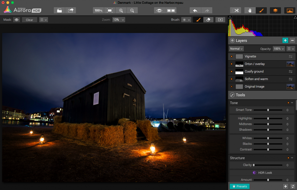
You can (almost) use ONLY AuroraHDR; it’s like a studio.
AuroraHDR high-level feature overview
The software loads and merges the images into the 32-bit HDR image, as is expected from HDR software. And then what? What is available?
As I said before, AuroraHDR is a Studio, and what do I mean by that? You don’t need much else. You can do almost everything inside AuroraHDR.
It offers layers with masks, as you know it from Photoshop and GIMP. It has a ton of tools to adjust including: White Balance, Clarity, Contrast, Color balance, toning, Gradient adjustment, split toning, and these are just some of the tools available.
The initial HDR image will be the first layer. On top of that, you can add other layers, and each layer has the same set of adjustment tools available.
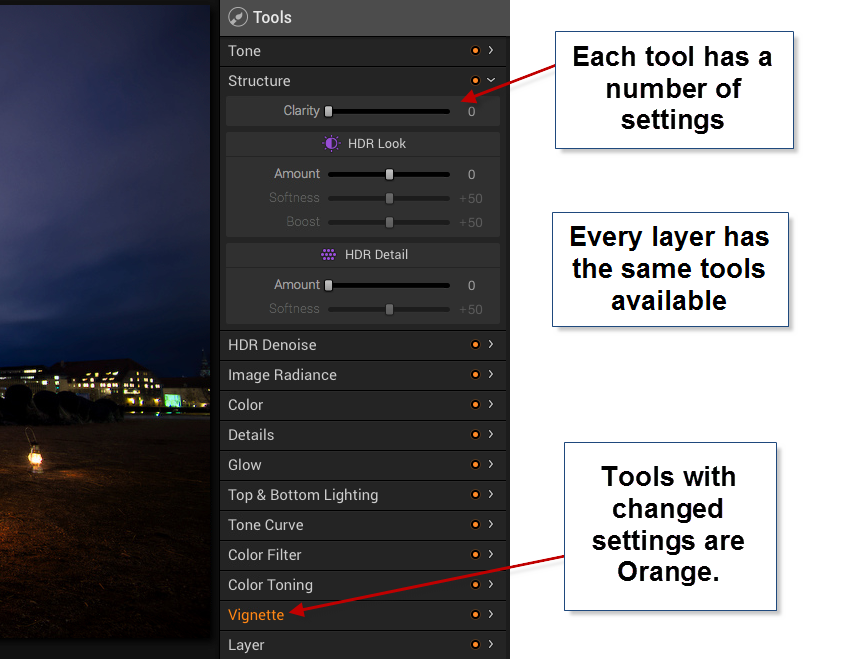
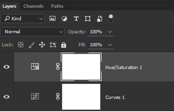
In Photoshop, you can add a curves adjustment layer and a Hue and Saturation layer etc., and they appear as individual layers. In AuroraHDR if you add a layer, that layer has everything, all adjustment tools are available.
The first mistake I made, was to forget about the layers and try to do everything in one layer – the Original HDR image layer. And of course, I can’t do that. I can try, but the result is not very good.
After having played around with a couple of images, I decided to do this little cottage standing in the harbor in Copenhagen. I ended up with 5 layers.
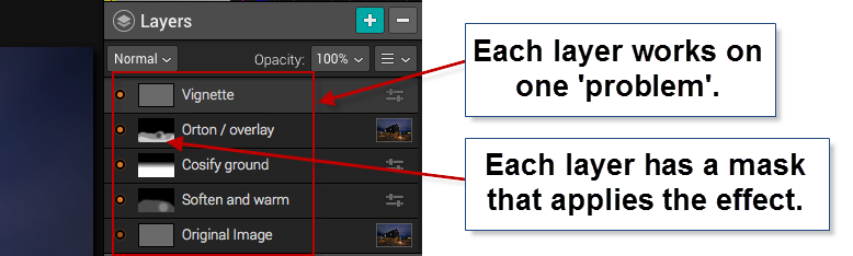
In a way, this is similar to what I would do in Photoshop. I start out with an original image, and I begin to apply effects, to solve ‘problems’.
Those of you who follow my blog will know, that I the way I post-process my images, is by identifying problems and solving them.
The problems I worked with on this image, were like this ‘The ground is too gritty’, ‘It’s not cozy enough’, ‘It’s not warm enough’. All problems leading to the creation of an inviting warm image.
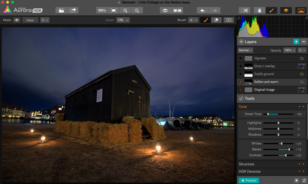
The second layer enhances the warm light coming from the small lamps.
As it turned out, I adjusted no more than 3 tools in one layer, and I think that was the right strategy. If you try to do too many things in one layer, you end up with unwanted effects in some areas.
AuroraHDR Tip #2: Limit the number of tools you use in each layer. This way you can make changes locally, rather than globally.
I am pretty happy with the final result of this image. I could have reached a similar result, using Photomatix and Photoshop, as I usually do, but in this case, I was able to create everything inside AuroraHDR.
What’s missing in AuroraHDR?
AuroraHDR is almost a complete Studio; only a few pieces are missing. In my workflow, it’s the ‘finalizing’ that I can’t do in AuroraHDR.
The Crop and Rotate tool work nicely, but it does not have perspective correcting options. If you need to do perspective corrections, you will need another program. It’s not a big issue, AuroraHDR comes with export to Photoshop, but the feature is not inside AuroraHDR.
There is no healing brush or clone stamp, which again force you out of AuroraHDR, again not a big issue, but if… That would have been nice.
There might be a couple of other things I discover when I get around in AuroraHDR. But I haven’t found them yet.
What’s not so good in AuroraHDR?
One of the big issues with creating HDR photos is the noise. Digital cameras produce noise in images, especially at higher ISO levels, and HDR increases that noise.
Photomatix Pro, which I am very fond of, has a bad reputation for creating a lot of noise. But Photomatix can create noiseless HDR photos if you set the settings right. The question is if you like that output.
AuroraHDR comes with a built-in adjustable noise reduction. A very nice touch I must say. However, if your photos have areas, that are underexposed, AuroraHDR handles those areas badly, at least if you try to lift the shadows.
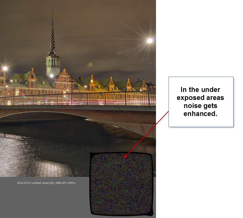
In my first test drive of AuroraHDR, I didn’t find a good solution for handling underexposed areas. Not the built-in HDR Denoise tool. By the time the noise is gone, so is the details. So the solution I found best, was to leave the dark, in the dark.
You could argue, that this wouldn’t have been a problem, had I shot some brighter exposures. In reality I had shot too few shots, to cover all of the dynamic range, so, in a way, it’s a self-inflicted problem.
AuroraHDR tip #3: If you have noise levels beyond control in AuroraHDR, you can make a version of the image in Lightroom, treating these dark areas as you would like them treated. Then export that version and blend it in, in Photoshop or GIMP.
Conclusion after the test drive of AuroraHDR
Will I use this tool again? Definitely. Will it be the only tool I use? I think not, but it will play a major role I think.
It will not replace my beloved Photomatix, but it will be a strong alternative. And thinking about it, I will be able to use AuroraHDR in the same way, as I use Photomatix, just as well as I can use the ‘Studio’ to make a final photo.
The initial HDR image created by AuroraHDR, you can process using the various tools included. But even before you do anything, you get a pretty good start:
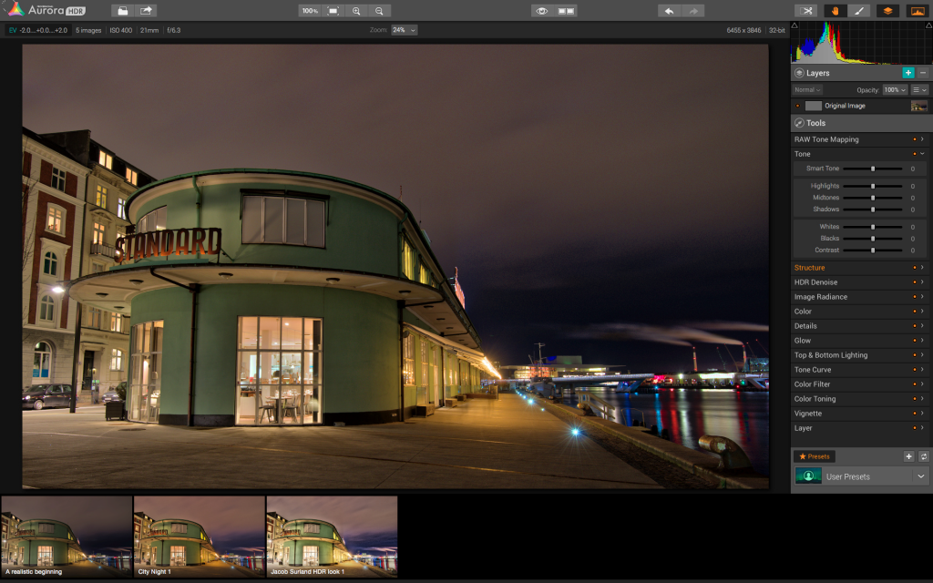
The Standard is an old ferry terminal in Copenhagen. This is the initial HDR, and it is really good looking already.
AuroraHDR does a lot of things in a cool way. I think the biggest danger of using AuroraHDR, is that you get lazy and get stuck on presets.
For some people AuroraHDR might just be the tool they need to create better quality HDR photos, with less effort. I am not on that road. I am not searching for less effort, but for new interesting paths to walk. AuroraHDR offers that.
Because there are so many tools built into AuroraHDR, you can get tempted to stop right there, on ‘just one layer’. And if you get real lazy, that layer is just a preset.
The problem of getting stuck using just one layer is that you don’t reach the full potential of your image. You apply all changes globally with a few exceptions like the gradient tool.
What pushes a photo from 80% to a 100% is the local optimizations. AuroraHDR raises the bar, from the ‘out-of-the-box’ HDR photo, but it is still not a 100%, and what fun would that be, if it was? I love post-processing.
What is new, is that you can move from 80% to a 100% without leaving the software. AuroraHDR offers new ways of working, and it will be refreshing to try it out.
I have been planning a switch to Mac for a longer period. As it happens, my old Windows computer has numbered days and is waiting for retirement or burial.
AuroraHDR is what tipped the decision, and I have now ordered a MacBook Pro. When I get that, I can dive further into AuroraHDR. And that I am looking very much forward to!
The Weekend Post by Jacob Surland
If you find my articles interesting and consider getting AuroraHDR, please use the link on my webpage and support me that way. I only recommend software and tools that I use.
I am not ‘bought’ to say nice things with sugar on top. I say what I think and feel about products. I get nothing for writing these articles, but I do get a kickback if you use my link to buy AuroraHDR, as well as if you use my 15% discount coupon code “caughtinpixels” for buying Buy Photomatix Pro. Thanks.
If you like my work, why not follow me on Twitter, Facebook, and Google+. I post photos daily.
–Jacob Surland
]]>
I shot “Soft light in Nyhavn” in Copenhagen in Denmark.
Timing and location can be a game changer for a photo and sometimes you have to option to plan for something special. At other times, you just have to accept what it is, good or bad. But you can help yourself, if you have the right tools. More about that later, first a story about how I learned a lesson or two.
When I shot this photo on a very early morning, I didn’t realize that I had a gem in my hand.
This location is a place in Copenhagen called Nyhavn and it is a very famous location. And as any other famous location, it has been shot to death.
However, this morning, I captured something special, and I only have shot two shots of it. This is the second. When I published the first one, some local photographers called it ‘the best shot of Nyhavn ever seen’. Wow! The bad part is, that I didn’t see what I shot when I shot it.
This is shot very close to midsummer, and my clock radio had been on at 3 AM, and this photo is shot at 4 AM. But, what was on my mind, was something completely different. I was afraid that I was going to miss the moment when the Sun rose behind The Opera House all the way down in the other end.
I had misjudged the timing and been delayed by a couple of drunk Polish guys looking for a ferry to Poland. I was so focused on my target, that I didn’t see this one. I just made two quick shots and moved on.
Had I seen what I had, I would have made a whole series from this location. The colors and the light were just fantastic, but I didn’t see that. The lines formed by the clouds are fantastic, but I didn’t see that.
The only thing, that was on my mind, was getting the sunrise behind the Opera House.
The photo is a 5 shot HDR, but I had put a 3 stop ND filter on the lens. I rarely do that, but I wanted the water to be more smooth. The water did have small ripples this morning, and by putting on a Neutral Density filter, I could make longer exposure times to smooth out the water.
The longest exposure is 20 seconds.
A Neutral Density (ND) filter is like a pair of sunglasses put on the lens. It darkens the lens. Getting a 100% color neutral ND filter is almost impossible, however a 3-stop filter like this one, has less colorcast than a 10-stop filter.
Thinking about it right now as I am writing this blogpost, it might just be the ND-filter that has added that tiny bit of fantastic bluish colors, that makes this light very special.
After having shot my two shots I hasted down to the main harbor, at the far end of this canal.
The Sun always rises in the East… NOT!
I know this area so well, I didn’t think much about it. The canal of Nyhavn is going from East to West and because the main harbor at the end is perpendicular it goes from North to South. And the Sun rises in the East, no big deal!
I hadn’t done my homework.
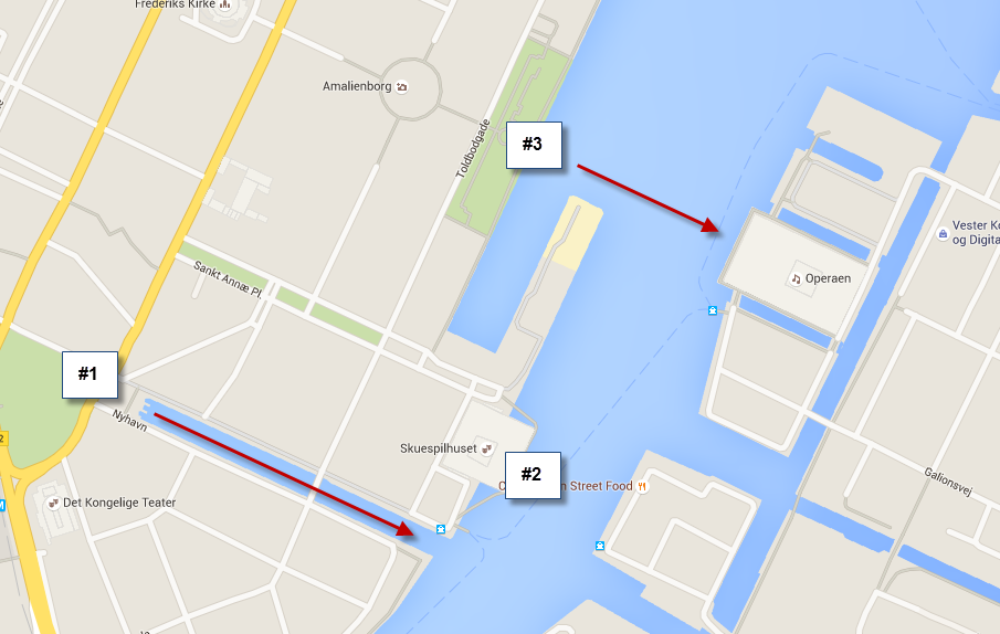
The Canal of Nyhavn does not go from East to West. It goes from South East to North West, more east than South, but absolutely NOT East to West.
The Canal of Nyhavn does not go from East to West. It goes from South East to North West, more East than South, but absolutely not East to West. This fact combined with another fact flunked my intended shot completely.
“The Sun rises in the East”, and in the summer slightly to the North, and in the winter, slightly to the South. Only, it’s not ‘slightly’. But, in Copenhagen it is not just a little to the North, it is a quite a lot!
The Sun rose so far north, that even if I had used an extreme wide angle lens, I still wouldn’t have had it within the frame.
Had I done my homework, I would not only have looked at a map. I would have used an app, to let me know exactly when and where the Sun would get up.
I now use a Sundial app on my iPhone to plan when and where to shoot. It uses the GPS and calculates when the sun rises and sets. You can even set the date, and a location, so you can plan where to shoot the sunset or sunrise.
Had I used the app ‘Photo Sundial‘ (it costs $1.99), I would have seen, that the project that I had in mind, was not at all possible, at this time of the year.
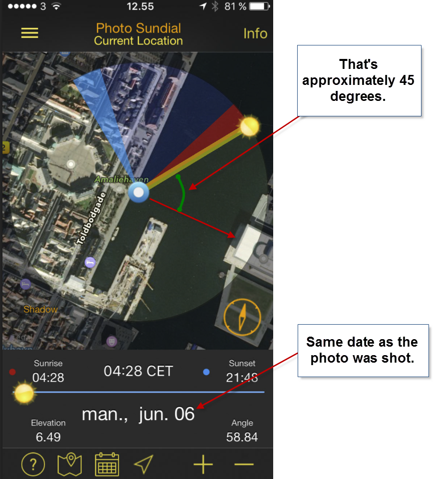
Even an extreme wideangle lens, would hardly have included the Sun.
I use the ‘Photo Sundial’ quite a lot, but I also use the ‘Sun Seeker‘ (it’s more expensive it costs $9.99) quite a lot. I found the expensive one first, and I got comfortable with that before I found the cheaper one.
The ‘Sun Seeker’ is way more advanced, and has augmented reality, which I don’t use, but you could use it.
If I went to The Opera House, I could use the augmented reality viewer, to find the exact date and time to get the Sun rising EXACTLY in the middle of The Opera House. Maybe one day I will do that.
A Sundial app like either of these two is ‘a must haves’ for any photographer. I couldn’t live without them today, and they are an integrated part of my photo planning. Sometimes it means, that I don’t go to a particular location, at rather to another.

The Opera House in Copenhagen. A few minutes later the Sun rises far to the left, way out of the frame. The water is not as smooth as I had hoped. I only used the 3-stop ND filter
The best thing I could have done on this morning was to stay in Nyhavn, and kept shooting as the light changed. The clouds were fantastic seen from there, and I would have gotten a lot of great photos.
I did go back to The Opera House later when I had consulted one of my Sundial apps. And at the end of September, it looked about right.
I went on the 27th of September, coordinated with the weather forecast, and the Sundial looked like this on that day:
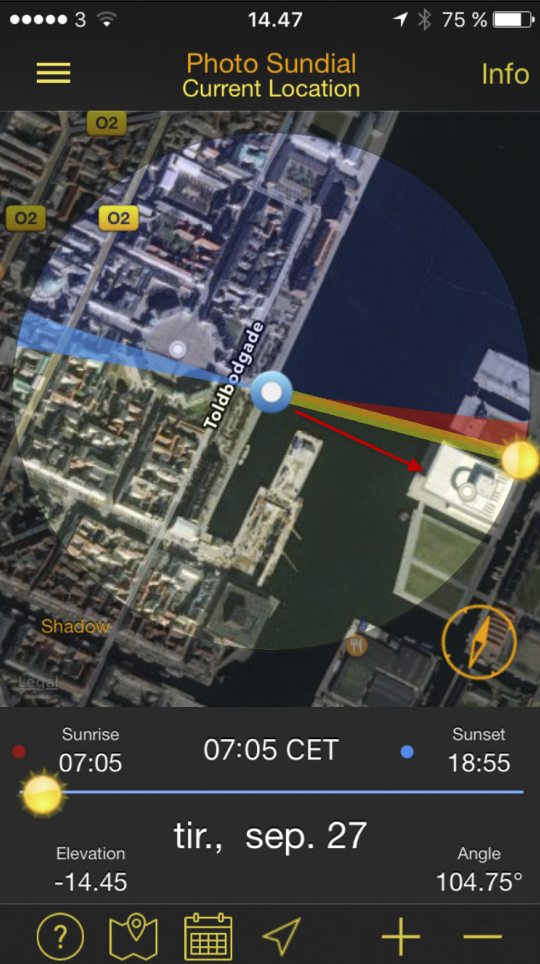
The Sun rises slightly to the left of The Opera House, seen from the other side.
It was not very important that it was precisely behind The Opera House, but just within the frame.

A few minutes before the Sun rises behind The Opera House.
Lessons learned
I learned quite a bit on this summer morning, and I have not covered everything. It is from making mistakes you learn. You have to be critical of your work to be able to see your mistakes and learn from them.
Nobody is perfect, but if you learn to see your mistakes, you grow closer to being perfect step by step.
So what did I learn this morning?
- I have to plan when to shoot a sunset and a sunrise if I have a certain location and scene in mind.
- I can’t smooth water at sunrise using a 3 stop ND filter. I need to bring a 6 stop or a 10 stop ND filter.
- Look at my photos as I shoot. If I have something magic, I must reconsider and adapt my plan. A sunrise is dynamic; I should be too.
- My Nikon D600 had a severe dust problem. Don’t bother shooting when there are so many dust spots. At least not on f/32. The sky had hundreds of dust spots. I ended up using the “Dust and Scratches” filter in Photoshop. It also took all texture from the clouds.
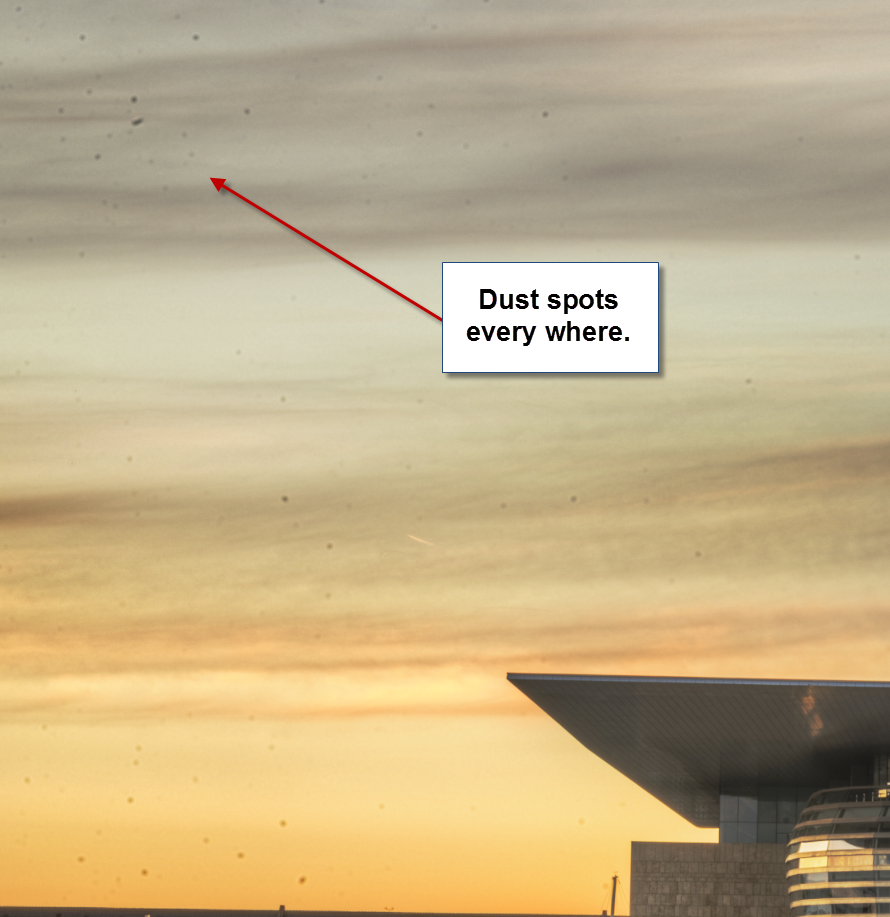
The dust issue from the Nikon D600 was a total nightmare the first year. But it seems to be solved pretty well now, and I have got life time free sensor cleaning.
So I learned a lot this morning, the hard way.
You can also follow me on Twitter, Facebook, and Google+. I post photos daily.
–Jacob Surland
]]>

Boat House at Bastrup Lake.
I went chasing the sunset one day a couple of years ago. I went to this place, called Bastrup Castle Ruin. It’s right next to Bastrup lake and it’s not that far away, and yet I have never seen it. It’s not always you get around, to go to see what’s close to home.
Bastrup Castle Ruin used to be one of the strongest fortifications in northern Europe around 1100. It had an impressive 6m thick walls. However, there s not much left of it, and I went searching for something else along Bastrup Lake, and I came across this little boat house, with an old boat inside.
I wasn’t too lucky with the light, though. The sunset didn’t really work my way, and I never did finish processing any of them. I tried a few times doing this boat house, which I liked. Not until I tried this ‘Orange’ look, things started working my way.
This is the before photo:
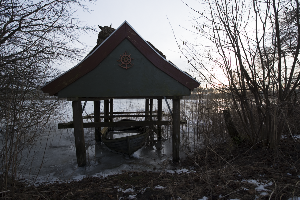
As you can see something quite different. Because I am shooting right into a pretty strong Sun, I have shot from -5 to +3, that is 9 shot’s, and merged them in Lightroom, using the new’ish HDR merge. I only normally only use this one, if I do not want to make any tone mapping. I often want to do tone mapping, because it opens up for a lot of creative processing. In this case, however, the orange look is created within Lightroom.
The Orange Look presets will be available in my upcoming Lightroom presets.
–Jacob Surland
]]>
Fiskettorvet is one of the Shopping Malls in Copenhagen.
Fisketorvet is one of the shopping malls in Copenhagen. In the beginning it was quite lonely, on the old harbor, but other houses, both residental, and offices has been built around the shopping mall. And now, it is a pretty cool area, especially for photographers!
This one is shot literally with the camera standing on the ground. It’s a amazing how clear a reflection in the water can be. I only had to fix a few issues in the reflection.
One day, at a conference I sat and played around with my camera. I had my 50mm lens on, and I shot photos of various slides from the presentation. Suddenly I noticed, that if I pointed the camera, at my iPhone, the iPhone would be completely blurred, but what it reflected was 100% sharp. Later I took this photo, which once again is a reflection in my iPhone shot real close with a 50mm lens.
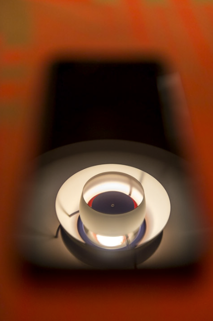
Closeup photo of an iPhone. Notice how out of focus the iPhone is, and how sharp the object reflected is.
I really wondered what happened and later on the same day I learned why. The glass works as a lens, and for that reason you have to focus from the distance of the ‘lens’ (the glass of the iPhone) to the subject. The iPhone and the camera being very close to each other makes this distance almost the same. And this also explains, why you can put your camera literally on a poodle of water, and reflect completely sharp.
]]>

Nyhavn (New Harbor) is a beautiful place in Copenhagen.
On this particular morning, I saw the craziest wild colored sunrise, but I never saw the Sun itself. I saw it shine on the city behind me, but before it got clear of the horizon, it disappeared behind clouds. Really weird. This photo is from Nyhavn in Copenhagen. While Nyhavn means New Harbor, it is an old harbor today, only there used to be an even older harbor.
Today Nyhavn is the place to go, for a cold nice beer and a nice meal on a summers day. Not only tourists go there. If the weather is great, the locals will go there too, for a beer after work, or just to hang out.
]]>