Warning: Undefined array key "multiauthor" in /var/www/caughtinpixels.com/public_html/wp-content/plugins/post-layout/plugin.php on line 114
Warning: Undefined array key "mobile" in /var/www/caughtinpixels.com/public_html/wp-content/plugins/post-layout/plugin.php on line 352

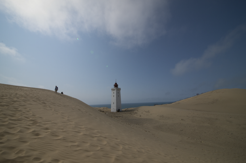
Rubjerg Knude Fyr in Denmark.
I have approximately 20 different compositions from this day. It was a bright summer day just after midday. The light was pretty hard, but just a little bit of summer haze defused the light a tiny bit. But not enough to make great light. Of the 20 compositions, this one, is the one that works best, and it works really well, even if I broke the rule “do not center your primary object”. I did that, and it yet it still works, but why is that?
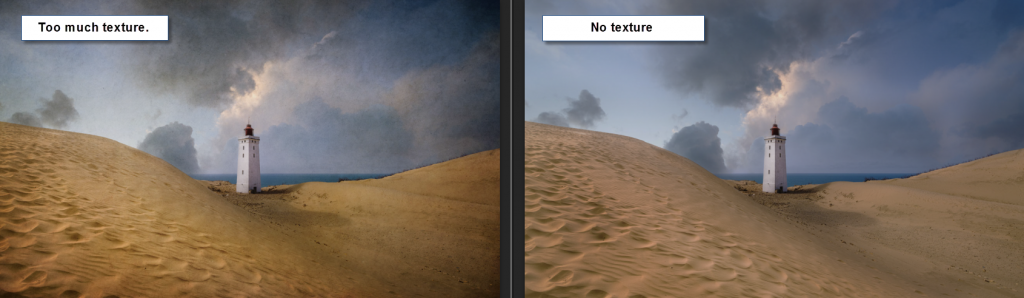
I have been thinking about the ‘why’. Let me start by showing you the original unprocessed shot:
Unprocessed shot of Rubjerg Knude Fyr.
The unprocessed photo is flat, and the light is pretty hard. The sky is uninteresting, and yet you can see the potential. There some leading lines and a couple of other important details.
The tower is shot at close to an exact 45-degree angle. Dead on angles usually work well. as for the dead center. This is no different than shooting a building straight from the front, like this shot:

The Pantheon in Rome shot dead on from the front. A strong composition.
Symmetry is pleasing to the eye, a square building, like the lighthouse, gives symmetry when shot at a 45-degree angle. This is the first important factor. When you work with symmetry, it often works well, to have the object the center, in particular if you can support it with leading lines.
The leading lines in the shot from Pantheon are easy to spot. Man made lines, and they all (if extended) point to the door. This draws the eyes of the viewer to the center of the image, to the door, and the door itself is also a focus point because it is so bright.
But how about the leading lines in the lighthouse photo? There are plenty! Let’s have a look:

Leading lines. Some are more subtle than others.
As you can see, there are many leading lines. Some are more subtle than others. The one going from the left-hand lower corner is very subtle, but there are lines going through the sand dune. And the curved orange line going through the sand is very powerful, and probably the most important one. And then you have the sand dune horizon that also work as leading lines from left and right.
During the post-processing, I also enhanced some lines, and I created some new ones. The sky I had, in the original photo, didn’t work well. I replaced that, with another sky, shot just before sunset. A sky that had the soft light, that we like so much. I made a mask, and dumped the new sky. The sky was shot at higher resolution, and it allowed me to move the sky around until I found the strongest position for it.
The new sky also adds some leading lines. There is the brighter cloud wiggling like an s-curve from the right to the center of the image, and you also have it coming down from the top. And from the left, you have clear blue sky moving in. Everything pointing to the lighthouse.
There is one more thing the new sky added, and that is a repeated shape. The cloud where it says #1 repeats the shape (more or less) of the lighthouse, this is also a well working a compositional trick.
The dark and bright lines coming in, from the right-hand corner I enhanced by using some simple dodge and burn (making things brighter and darker in local areas). This enhanced existing lines.
A centered composition can be a strong composition
So, what at a first glance looks like a simple composition, turns out to be quite complex. All of these lines makes it a very powerful composition, and if you compare it to the photo of Pantheon, it is a very similar composition. All lines point to the center of the image, where you find the brightest part (the bright door and the bright lighthouse).
The straight on composition used on the Pantheon photo, is a strong composition, even if it seems simple. The interesting composition, are the ones, that order things in a pleasing way, no matter how complex that may be. And usually in a way, that you don’t normally see with your human eye.
The head-on shot of some building or whatever, is unusual for the human eye. How often to you stand at the exact center and watch a building or similar? Hardly ever! And that is why it is unusual to the human eye and is a strong composition, and it is pleasing because it is symmetric.
The hard part is to know when to use the centered composition, and especially when NOT to use it. One of the important factors is, can you get a perfect symmetry? Then it’s probably ok. If it is supported by leading lines, then go ahead for sure!
The processing details
As for the rest of the processing. The photo still had a bit of hard light to it, and I began to add some textures. I find that textures can be used to add that missing element, that softness in the colors, take off the edge of the hard light.
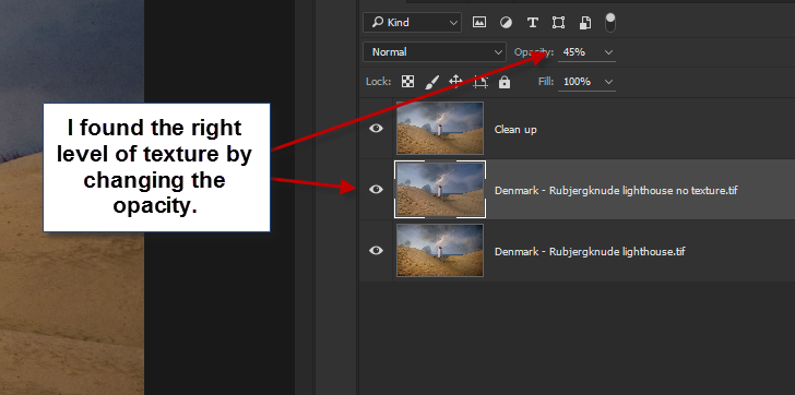
When I was done, I could see, that the texture was too much, and I had second thoughts on the textures. I made a new copy of the image, without the texture part. That’s one of the great things about working with layers in Photoshop. You can just hide some. Now I had these two images:
Now I had these two images:
Too strong textures and no texture version.
I found that neither worked to my satisfaction. One had too strong textures, but the other one missed something.
In the end, I decided to do a compromise. I loaded both images as layers into Photoshop and changed the global opacity for the top layer, which happened to be the one without textures. And moved the slider back and forth, until I had the right amount of textures, to my taste, and that was at 45% opacity.
And my final step, was to do a clean up in the photo. Removing irregularities, stones, rubble etc. that did no good thing to the image.
–Jacob Surland