
In 2018 I only made one blog post for Caught in Pixels. I did write a handful for DigitalPhotographySchool.com though. But 2018 was in many ways a strange year. Far too many things happened in my life and very little time was available for writing blog posts.
It is an ambition of mine, is that 2019 will be different. My goal is to write more blog posts for www.caughtinpixels.com.
The first topic I thought I would cover is Color Harmony. It is something, that I have spent some time investigating and understanding over the past couple of years and have become increasingly fascinated by it. It is something that you can use intentionally and it can make quite dramatic changes to the perception of a photo.
Color theory and color harmony were formalized by painters way back long before the invention of any camera let alone cameras that could take colored photos. Nevertheless, it is still highly relevant and also to photographers.
When you have begun to understand color harmonies, you will see them anywhere you look. You will find them in commercial photos, old and new paintings, movies – literally everywhere.
When you photograph cityscapes and landscapes like I mostly do, you can sometimes find natural color harmonies and photograph them, but more often than not you can’t control the colors of the environment.
You can make some choices on what to include and what not include, but the general mix of colors you can’t change at the time of photographing. Sometimes, you can change the time which you photograph, like nighttime, daytime, blue hour, golden hour, autumn, summer, spring, and winter, but even that is not always possible and you get what you get.
Very often you end up with photos that are not in perfect color harmony and you will have to create that in the post-process. That is what this blog post is about.
Colors and moods
Colors can change the mood of an image. Colors like yellow, orange and red are considered warm because they give a warm feeling. Blue and cyan, on the other hand, are cold colors. You can intentionally use warm or cold colors to make your image convey the mood you want it to.
A good and simple way to change the mood is to simply to shift the white balance either towards the warmer or colder temperatures. This can often also push the image towards a color harmony, as you will see later.
What is a color harmony?
Color Harmonies are colors that look good together. There are many different systems to create
The Adobe color wheel shows how the Red, Green and Blue (RGB) colors can be mixed to any color. On the opposite side of the wheel you can see the complementary color. The complementary colors to the primary colors are:
Blue has Orange as complementary color.
Red has Green as complementary color.
Yellow has Purple as complementary color.
The purpose of this article is not to explain Color Theory in details, but rather to show how change the colors of a photo to have a color harmony. If you want to get a deeper explanation of Color Theory and Color Harmonies, I find Blender Guru’s video very explanatory.
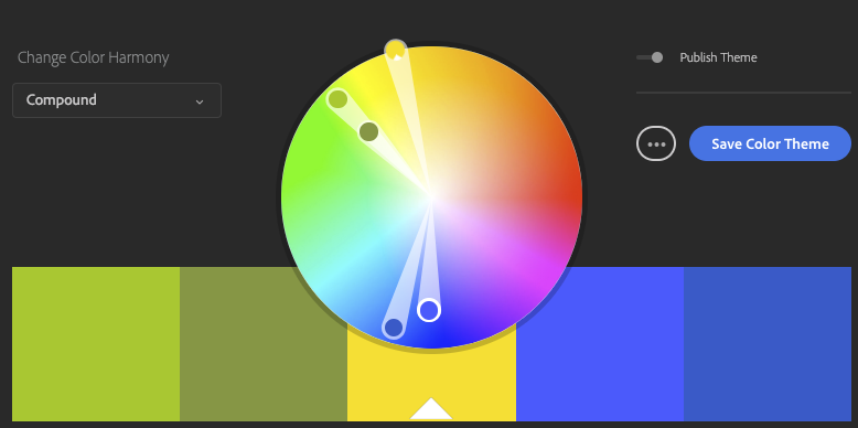
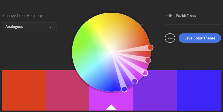
In Adobe’s color tool you can put together 5 colors based on a Color Harmony Model and those colors will be a good match. If you pick Triad as shown below you get three hues with an

By fiddling around you can find various color harmonies that you like and try to use them in your photos. It also holds a huge library of Color Harmonies, which you can if you like. Personally I don’t use them.
Color harmony is a bit like a chord in music. You can make some that are more harmonious than others, but somehow, they always fit together.
What you find out after having used color harmonies consciously for a little while, is that as soon as you get a color harmony, something incredibly amazing happens to your photo. It’s like it reaches another level and gets pleasing and calm. It is not without a reason it is called Color Harmony.
In some cases, it can be the difference between ‘just a photo’ and a pretty cool photo. Another er weird thing is that the colors do not even have to match reality … not at all!
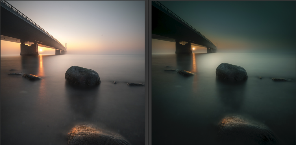
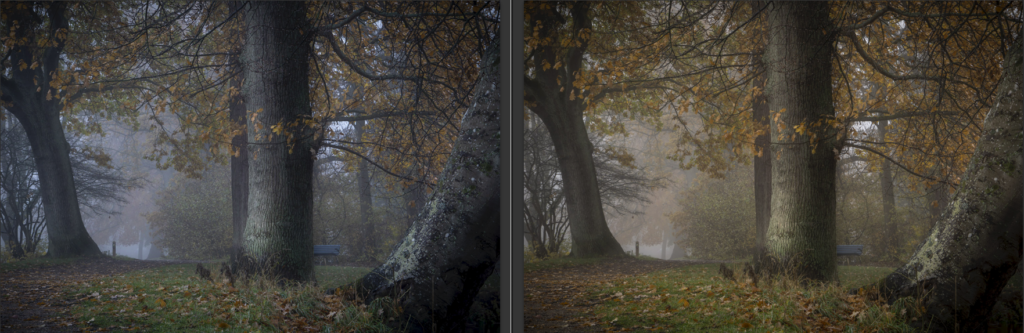
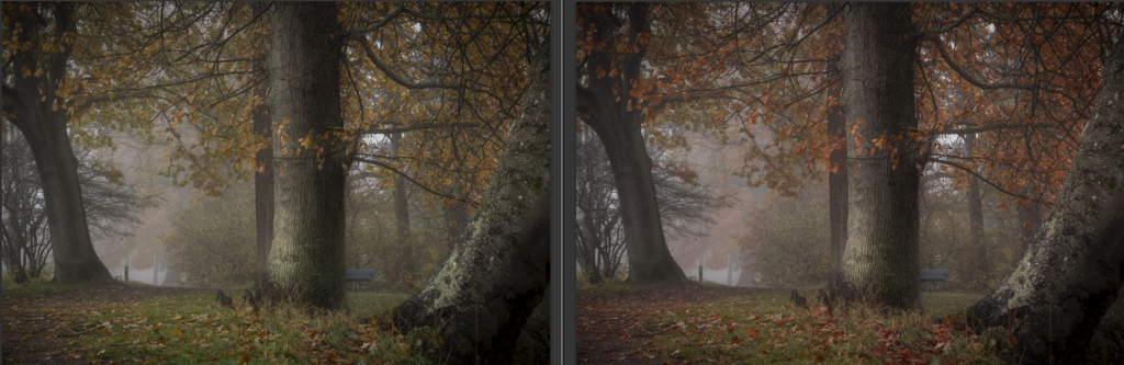
Have a look at this photo from in a forest in Denmark. This mist will never look that color, yet, because the color of the mist is in harmony with the leaves and it works out just great.

How to Create a Color Harmony?
The trick is to twist the colors into a color harmony. This can be done in many different ways and it is called color grading.
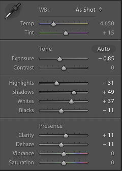
I will show you a couple of easy ways available in Lightroom to color grade your images. This is the before and the after:
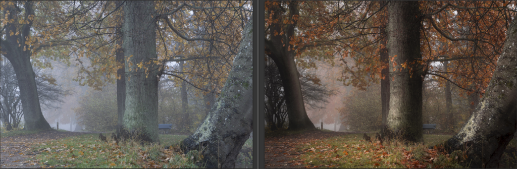
My goal with this image was to get a dark and warm ‘feel-good’ forest image. I did some simple basic image editing before I began working with the colors.
White Balance
Normally you would probably not see White Balance as a color grading technique, but it does change the colors of a photo
The colors straight of the camera are on the cold side, but by shifting the White Balance towards the warmer segment it gets closer to what I want.
I suggest that you begin by adjusting the White
The White Balance has been warmed slightly, to push the colors more into the Yellow and Orange color range, in which I want the image to end up in.
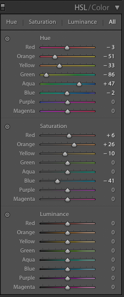
Color Adjustments using HSL
There are so many different ways to tune your color harmony, one of the best and simplest yet also most effective ways is use the Hue, Saturation, and Luminosity (HSL) panel in Lightroom.
The HSL panel, not surprisingly from the name, allows you to change the hue and saturation (and luminosity) of individual colors and this way you can nudge them into a color harmony.
In the example below I have used exactly the same basic image editing on both images (highlights, shadows and contrast), except for White Balance and HSL settings.
After having adjusted the White Balance you go to the HSL / Color panel in Lightroom and begin to push the Hue sliders to the left and right accordingly to what you want to achieve. Below I have pushed the colors towards Orange and Yellow.
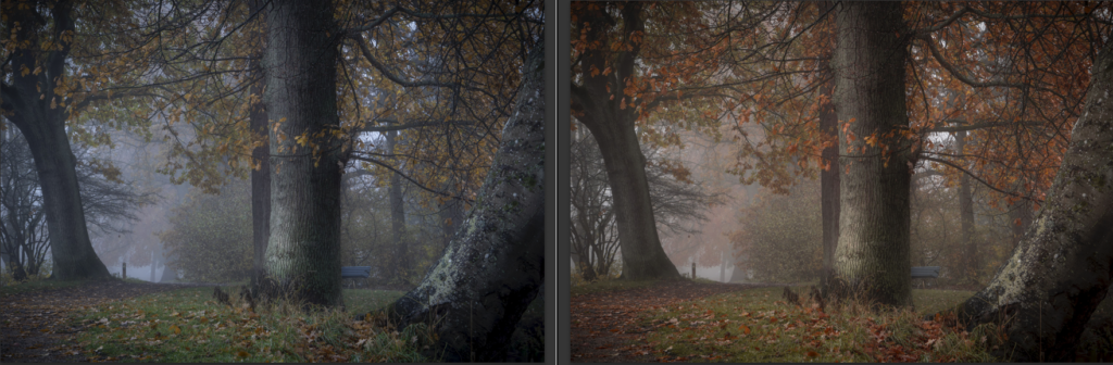
Then you adjust the saturation to balance the saturation or take out a color of the equation. I remove some of the Blue because I found it too dominant.
The image on the left is not bad, but the one on the right has a better balance – a better harmony. It not only because it is warmer it also has a subtle, yet important, color balance.
These are the HSL settings I used:
The White Balance is a part of the equation above, but I can take it out of the equation by making the same warmer White Balance settings on both images. Now you see the difference the HSL settings do.
Essentially there is no right and wrong, but if you want to achieve a perfect color harmony, you can get a lot out of the HSL panel, by tuning the individual colors.
Some images will need more bending than what the HSL will allow, and then you will have to turn to other methods, like local changes using brushes and gradients or even taking the image into Photoshop.
Split toning to add color harmony
You may have heard of split toning. It is a more creative way to work with your colors and it can be very dramatic, but it is a tool you should use with care.
Split Toning is a process where you add one color to the highlights and add another color to the shadows. If you do it in a subtle way, it will hardly be noticeable, but it can make a difference. If you do it more aggressively it will make a strong impact on your image, for better or worse.
You can create Split Toning in many different was. In Lightroom, it is very easy from the Split Toning panel.
In the first example, I have first turned it into black and white photo and then I have colored it using the Split Toning. I have added

And these are the settings.
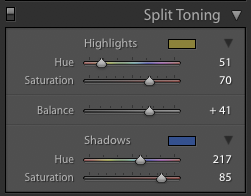
The colors you add, might not be natural even if they are very pleasing to the eye. This is a creative decision for you to make.
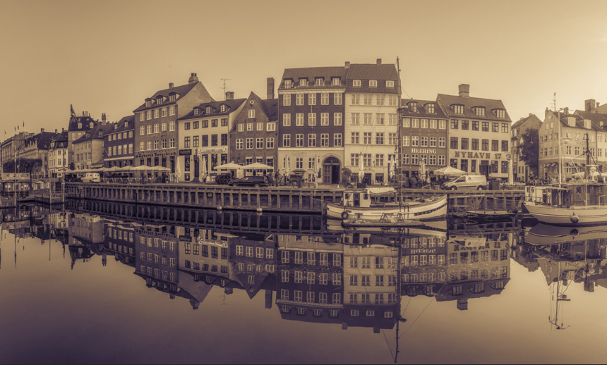
Here is another example. Same principle – first black and white, and then split toning it.
While split toning is an incredibly powerful tool and can be used to create fantastic creative colored photos it is not always enough to create color harmony.
My personal preference is to use Split Toning later in the process to see if it can add just that spice, that makes the difference.
I have a strong belief about image editing: you cannot do everything in one big step. The is no silver bullet, no one-button image processing. It is the many small steps, that may be tiny, that adds up to the big change.
In the example below, the same split toning is added to the colored version of the photo. It changes the photo into a warmer photo.
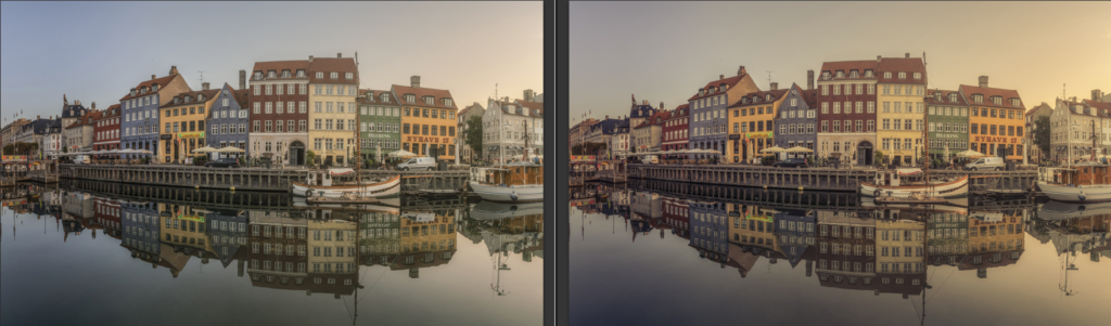
And if you look at Color Harmony, it is the one showed earlier.

–Jacob
]]>
Eltz Castle in Germany.
How do you shoot a unique photo of something that one million others have shot before you? It’s tricky and it requires preparation and patience, and in the end, the result may “just” be your version of a classic shot.
For a long time I have wanted to take a photo of Eltz Castle in Germany and finally, I got the chance when I came back by car from my exhibition in Paris.
I really wanted to have one that I had not seen before, but it has been shot to death and therefore no easy task. There is quite a steep walk down from the parking lot and the first time you see the castle is from a viewpoint you pass as you walk down.
As preparation, I had watched other photographer’s photos of the castle and studied the paths around the castle at www.openstreetmap.org. OpenStreetMap has a lot more details than Google Maps when it comes to paths and hiking routes. In short, I had some kind of idea how to area was arranged and the viewpoint was high on my list of potential shooting locations for my hopefully unique shot.
All shots I looked at when I Googled Eltz Castle without exception was shot at daytime, at various times of the year. I realized I could shoot a night time shot and that alone would make it a special photo and that was my plan.
I arrived well in advance of when I planned to shoot my “photo”. That is always a good thing to arrive in good enough time, to allow you to search the area for compositions as well as be prepared for the light.
I examined the different places to shoot the castle and shot various compositions. After having taken the classic pictures in … classic light (ie daylight), I decided to use the viewpoint. There are probably 10,000 photographers who have got a nice picture home from there, but I prepared myself to wait for the light.
When I had waited for 30 minutes I realized that I had forgotten my jacket in the car. Mental note for later: Always bring warm enough clothes. As the light dimmed the cold came too and the wind felt really cold and I still had a couple of hours ahead of me.
As I waited the clouds began to clear somewhat, from a total clouded sky to something with holes. That was good. A very nice little moon appeared, but of course outside the frame and the composition would suffer too much if I tried including it, so I ignored it.
After hours, the staff began cleaning up and driving back up using the shuttle bus.
Finally, they lit the light on the castle and just as I thought that I had shot the last shot, a car came up from behind the castle and while it picked up the last group of people, I set the camera to a 20 second exposure and I got my picture of Eltz Castle, which I have not seen before.
Sony A7RII, 24-70 f/4
EXIF: ISO 50, f / 8, 24mm and 20 seconds.
–Jacob
]]>
The entrance to the area where The Cavern is located.
Liverpool has a strong history in many ways. It has football, shipyard industry and the music to mention a few. The Beatles came out of Liverpool and in particular, one club is known for having the Beatles playing there, and that is the Cavern.
In particular, The Beatles have put a lot of footprints in the Button Street and Mathew Street area, where The Cavern is located. The Cavern as it was back when The Beatles played there, does not exist anymore, due to construction work. But a new Cavern has been built in some of the original areas. Whether that is kind of fake or good enough I think is a subjective matter.
To me, The Cavern was a bit over the top touristic wise, but the rooms were pretty cool and gave an impression of how it might have looked back then.
We went on a Beatles tour too, with our own cab with a knowledgeable guy from Fab4Tours. There is a huge amount of mythology and The Beatles stories. Some are just good stories but have got nothing to do with the real world. Sorting out what is real and what is not, is hard work or impossible work. Fab4Tours have tried to find into the core what supposedly is the truth.
But seeing Penny Lane and Strawberry Fields and how they relate to the songs is quite fantastic.
This photo I shot at the entrance to the party area. It is a 3 shot HDR I shot on my new FujiFilm X100F. Did I mention, that I love that camera?
–Jacob
]]>
Åre early in the morning seen from my hotel room.
It was a Fuji X100 that in 2012 was one-half of the cause to start my photo disease. That is the sickness in which one is driven to take the next bold photo.
A lot has happened since 2017. I have moved to first DSLRs and later I included mirrorless cameras. But even the mirrorless cameras are not pocketable, the X100 was. , but I was very pleased when there was finally a
The X100 had two major limitations, which meant that I didn’t use it terribly much. First of all, the sensor was 12 megapixels, which was only just enough. And not enough for cropping. Second, it only did -1, 0 and +1 in bracketing, which is rarely enough to shoot the HDR scenes that I shoot.
But when the X100F got out, I was happy. Finally – 24 megapixel and -2, 0 and +2 autoexposure bracketing, and still the amazing image quality. I bought it instantly and I love it very much. The smallest camera I have, fast and amazing image quality. I have used that diligently since then.
I shot the image on top, with my X100F from my hotel room in Åre, Sweden. It is a panoramic picture consisting of 3 pictures. I actually had much bigger ambitions with this image than I managed. I would have made a ‘compressed time’ picture, in which I merged pictures together, to show time from when it was completely dark until it was bright.
But, the fantastic little X100F came in short. Funny, because it can easily take time lapse pictures for hours. Even bracketed. The camera also has Manual focus, which works great by the way. First I tried using autofocus, but fair enough, it was nearly pitch dark. The camera could not focus. Instead, I switched to manual focus. But it made a funny mechanical sound after each photo. After having lied in my bed, I eventually got up and checked. All of the images where slightly out of focus.
Then I looked out of the window and thought ‘this is pretty damn nice – I will just shoot a panorama’ – and the result is at the top.
Time compressed photo
A night I picked up my Nikon D800 and put that up for time lapse photography. The good old real DSLR does not play any of the funky electronic games. This image below is 5 hours compressed into one image.

Åre in Sweden in a time compressed photo.
–Jacob
]]>I am a late bloomer as a photographer, and I think about everything that I do. I have put in a lot of hard work to get to where I am today, but it is not longer ago than I can still remember what frustrated me in the beginning. Just like my first book ‘10 Essential Tips for Fine Art Photographers‘ (the 50% discount code “Welcome50” is still active), my new book on composition will be the book that I wanted 4 years ago. It will not only cover some theory on composition but also suggest ready-to-cook compositions, making it possible to go out and shoot a great photo using the recipe.
I believe in that you have to build a foundation before going for more advanced stuff. An important part of that is to learn from what others do, not only from a theoretic point of view but also from a practical ready-to-cook point of view. At least that is my belief.
Anyway, I am working on the book, and will try post a bit on my blog too, but time is not unlimited.
About the photo
I shot this photo a couple of years back at Mont Saint Michel in France. It is one of the most fantastic places I have been to, and it is the photographers wet dream. Recently I learned Tour de France would begin from here this year. What an awesome scenery for a start for the world’s biggest cycling race on the planet.
It is an HDR from -3 to +3. I shot it very late in the evening when people were leaving, and this couple just stood there to get a last look at this magnificent building. The Dynamic range in the scene is incredibly high and difficult to control. The spotlights are so bright, and the shadows so dark, that it got quite difficult to blend them together to and get a good balance in lights and shadows.
–Jacob
]]>
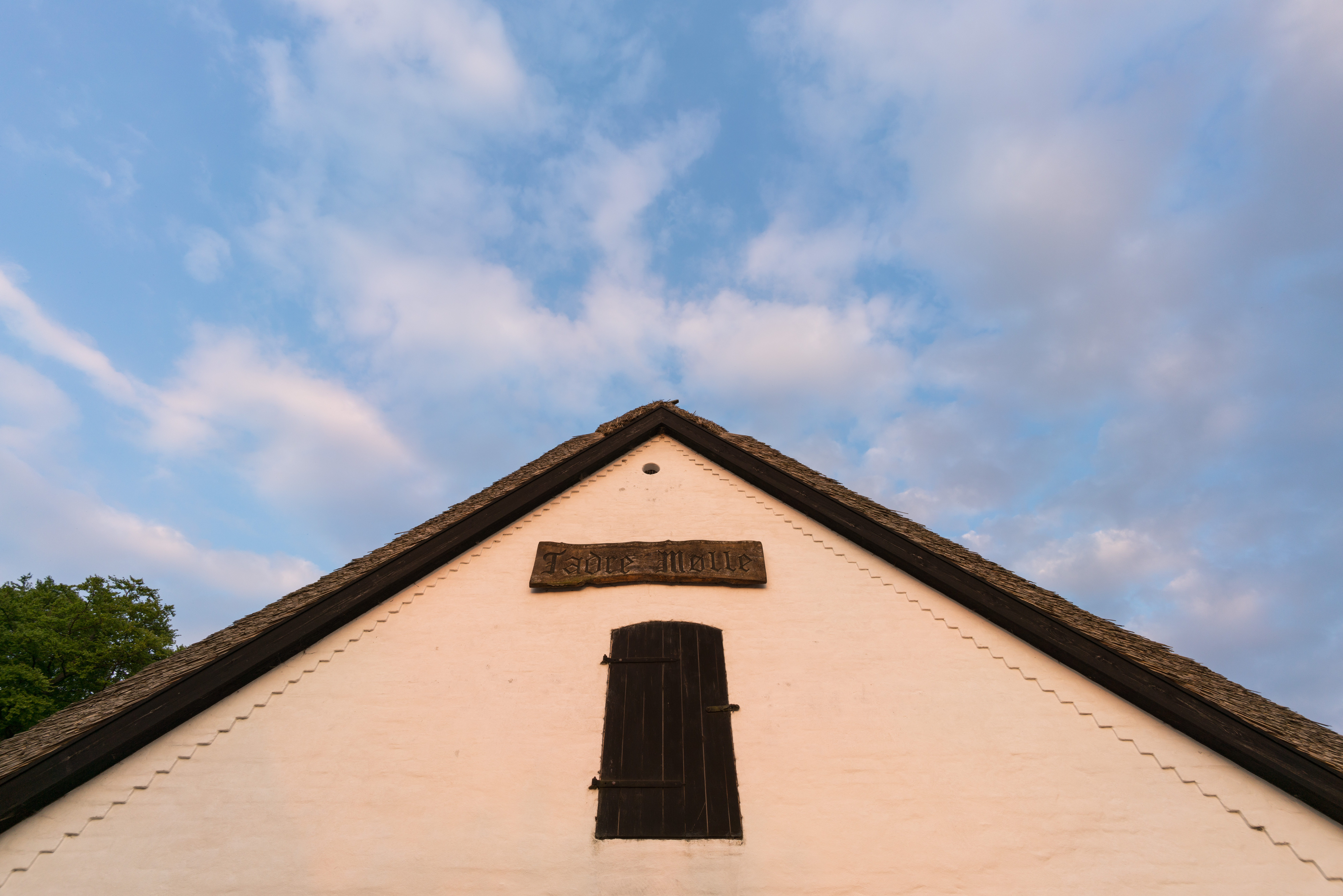
Sunset at Tadre Mill in Denmark. One of the very first images I shot using my brand new Voigtländer SUPER WIDE-HELIAR 15mm III for Sony FE mount.
I have been waiting for this lens for what seems like AGES. Since I got my Sony A7R two years ago I have been looking for a good wide angle lens solution. I bought the Sony 10-18mm, and though some say you can use it for full frame, I do not agree. It is by far too soft in the corners, and the distortion is a mustache like distortion. And then I can use my Nikon lenses on my Sony cameras, using my Metabones adapter. But neither solution has been satisfactory.
The Metabones adapter has no electronic connection to the Sony camera, and does not transfer the EXIF information, and it does not trigger the focus peaking. Smaller things, and yet still annoying things. The reviews of the first automatic adaptor for Nikon to Sony FE mount, haven’t impressed me.
So Voigtländer SUPER WIDE-HELIAR 15mm III for Sony FE mount is the lens I have been waiting for, along with a native f/2.8 16-35mm.
At the time of writing, the lens is in pre-order most places. But if you like the review, and consider buying the lens, you can support me by using this link and buying it at BHphoto.
Overall remarks
The Voigtländer SUPER WIDE-HELIAR 15mm III for Sony FE mount is a prime full frame format lens. It also fits on APS-C cameras, like Sony A6000 and A6300, only it will be like a 22.5mm lens. Being prime means that it only has one focal length, in this case 15mm.
The aperture goes from f/4.5 to f/22, which means that it is not a super fast lens, on the contrary, a fairly slow lens. It will not be the obvious choice for low light photography.
The aperture ring has a nice feature, allowing you to switch between clicks and smooth turning. When using clicks, it’s 1/3 of a stop per click. The smooth and silent aperture ring turning is practical for filming.
There is no autofocus, but when you start using the focus ring, the lens triggers the focus peaking – God I love that! And even better all EXIF information is transferred. In Lightroom, it registers as:
![]()
It uses 58mm filters and the nearest focusing distance is 30cm / 11.8″.
Built quality
When unboxing the lens, it feels heavy when picked up, but this is only a relative deception because the lens is small. The weight is between a third and a quarter of my workhorse, the Nikon 14-24mm, which is around 1000 grams. The Voigtländer is only 294 grams.
The built quality is excellent. It feels solid, though it has no weather sealing. The aperture ring is firm when set to clicks but not too hard. When ‘de-clicked’ it is smooth and easy to turn.
The focus ring is smooth and easy to turn.
Size matters
The Voigtländer HELIAR 15mm III is surprisingly small. I knew it would be small, and yet I became surprised. That you can construct such a small full frame lens is just amazing. This is compared to the lens I have been using so far:
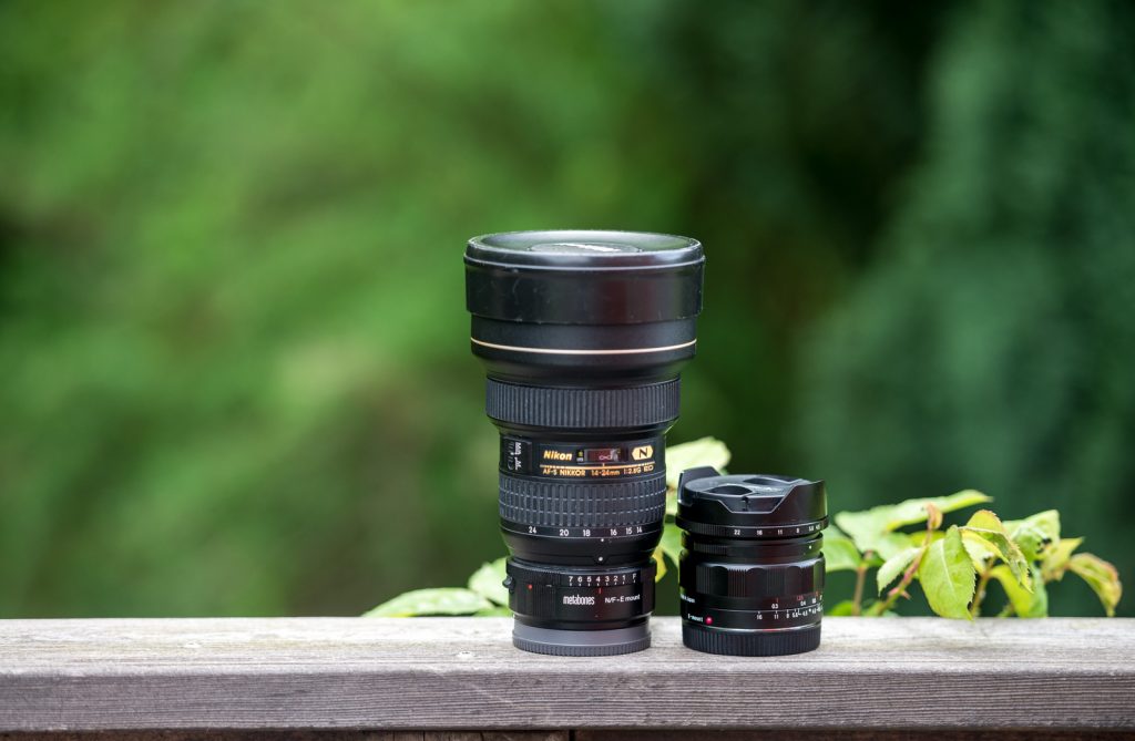
Nikon 14-24mm attached to the metabones adapter side by side with the Voigtländer SUPER WIDE-HELIAR 15mm III for Sony FE mount.
Image quality
I had some expectations to this lens, but I also expected some shortcomings. I have read reviews of the non-native versions of the lens, and of the Mark II version of the lens, so I was pretty excited to test this one.
Sharpness and barreling
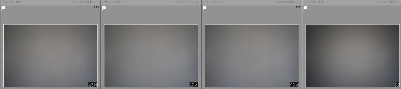
The Voigtländer 15mm has a great sharpness in the center, at all apertures, though you can detect som diffraction at f/22.
If you stay around the mid apertures (f/8 to f/13) it also has also a great corner sharpness. I have been used to great sharpness, from my Nikon 14-24mm, and at f/8-f/13 I have absolutely no complaints about the sharpness from the Voigtländer lens.
Wide open at f/4.5 it does have some softness in the corners, but I have seen far worse.
Here are some examples. Click to download the full-resolution jpeg file (unprocessed 80% compression).
Shot with a Sony A7RII at f/4.5. Click to download full resolution file.
100% crop of the corner af f/4.5. A bit on the soft side, but I have seen worse.
Shot with a Sony A7RII at f/4.5. Click to download full resolution file.
100% crop of the corner at f/8. I can not ask for much more. This is great corner sharpness, and for landscape and city scape photography, this is more than good enough.

Shot with a Sony A7RII at f/13. Click to download full resolution file.
100% crop of the corner at f/13. Again a great corner sharpness, maybe even slightly sharper than at f/8.
Shot with a Sony A7RII at f/22. Click to download full resolution file.
100% crop of the corner at f/22. Now we again have soft corners, but again I have seen worse. Diffraction is also noticable, if you look at the center sharpness.
The lens is sharp, very sharp, even in the corners if you stay in the middle of f-stop range. This is normal behaviour to lenses. As a Landscape and Cityscape photographer I have no problem working in the middle around f/8-f/13.
What you can also see from the shots, is that barrelling is no big problem at all, and when Lightroom gets updated, it will fix this in lens correction with no problem at all.
Lens vignetting
The lens does have some vignetting, and it is worst at the extreme ends of the aperture, that is f/4.5 and f/22.
f/4.5, f/8, f/13 and f/22.
Again when Lightroom gets the lens correction profile, this is easily fixed. But I think does have pretty strong vignetting, and definitely more than I am used to.
Flares and Chromatic Aberrations
I tried doing some flare tests. It is not a big issue, in fact I would perhaps go as far to say, that this is probably wide angle with the least flares I have tried.

Flares is always a problem on wide angle lenses. This might be one of the best I have seen. Click to downlod full resolution file.
Chromatic aberrations are very low. I have not been able to detect any.
Bokeh
Using a slow extreme wide angle lens, like the Voigtländer 15mm will not give a lot of bokeh, even at f/4.5. But here a 100% crop just to show it.
Sample images in full resolution
Here are a few sample images, and again you can click to see the full resolution files.
Voigtländer 15mm shot at f/8. Click to download full resolution.

Voigtländer 15mm shot at f/8. Click to download full resolution.
Voigtländer 15mm shot at f/16. Click to download full resolution.
Verdict
Overall I must say that I am very happy with this lens, and I expect it to be my wide angle work horse. And because the lens is so small, it fits nice on the A7RII, and will be perfect for travelling.

Pros
- Native super wide angle lens for Sony FE
- Small
- Very sharp also in the corners at middle f-stops.
- The built quality is excellent
- Triggers focus peaking
- Minimum flares for a wide angle lens
- Very low on chromatic aberrations
Cons
- Slow lens, only f/4.5
- No weather sealing
- No autofocus
- A bit strong vignetting
In short, this lens has definitely been worth waiting for, it is just fantastic.
If you like this review, and consider buying the lens (or other equipment) you can support me, by using this link and buying it at BHphoto.
–Jacob
]]>
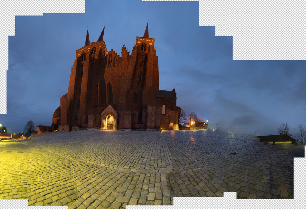
Roskilde Cathedral Square. A 169 megapixel image stitched from 28 downscaled images.
There is something about panorama photos or stitched photos that fascinate me. It’s a bit like a fisheye lens, that shows the world in a way you can’t see with the naked eye.
A panorama photo serves multiple purposes seen from my perspective. The obvious reason is to include more of a scene in one photo, in a panoramic way.
Another reason is to compensate, for a missing lens. If you haven’t got that really wide angle lens in the bag, shoot two less wide angled images, and stitch them when you get home.
An even more fascinating reason is to use it as an effect. An effect that can distort the world, just like the Fisheye lens does, only in a different way, but often with some resemblance.

Same scene more or less, just shot with a Fisheye lens.
And what I like even more about panorama photos, is that I find it hard to predict the result. There is always a surprise. Sometimes I use my iPhone and shoot a panorama, it can help visualizing the scene as a panorama image, but the iPhone doesn’t work when it gets dark.
I have a deep passion for showing the World in a surreal, yet recognizable and realistic way. I have one foot in the surreal world and one foot in reality. Sometimes I have more weight on one foot, than the other.
Panoramic photos give me another way to add surrealism to my photos, and I like that.
The story behind why I shot this 28 image photo, is that I have grown fascinated by Medium Format cameras, and the fact, that a 60mm Medium Format lens is approximately the same as a 24 mm full frame lens.
Apparently a Medium Format lens distorts the scene less, but instead of spending a huge fortune on a Medium Format camera, I thought, shooting at 50mm and stitching the afterwards, would give a similar effect. As it turned out 50mm was too many shots, and I went to 39mm instead.
I must say, that the perspective is much less distorted, than in this 14mm shot. It is shot at approximately the same distance as the panorama.

14mm on a full frame. Shot at the same distanse as the 28 image stitch.
Stitching the Panorama photos
Panorama photos, or stitched photos, are several photos that are stitched together. Lightroom and Photoshop both have features to support this.
From my experience, Lightroom does a great job on simple panoramas but gives up on more complex stitching tasks. Photoshop is better and has got a few additional options.
But neither Photoshop nor Lightroom could give me, a decent result for this photo. The problem was the projections mapping the images distorted the image in an unpleasant way.
A projection is like when you want to map the round Earth to a flat piece of paper. In a way you record a sphere, from the inside, when you move your camera around shooting photos. When you project something round to a flat surface, you have to make some compromises. Just try to flatten the peel from an orange.
There are different algorithms, or projections for doing this, and they give different results. You just need to find one you like.
This photo is made of 28 photos shot with my Sony A7R, which means 36 megapixels per image, that is a lot of pixels.
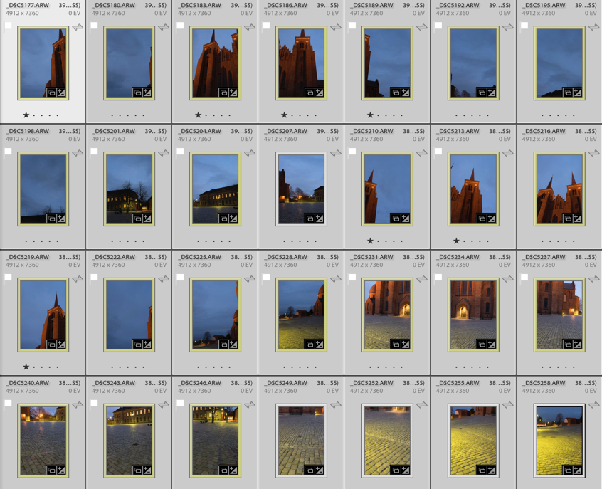
Shooting that many 3 shot HDR photos during the blue hour is a problem. The light changes so rapidly that you get different light in the photos, and I had to reshoot some of the photos because the light had changed too much. Luckily I discovered that before I moved the camera.
Lightroom only offered one projection, which looked terrible. For some reason, it would do not the two other projections. This is something I encounter from time to time.
I then exported to Photoshop, picked automatic projection and in a few moments, the fan went to high speed, and the computer got sluggish. Half and hour or maybe an hour later Photoshop was still stitching, and suddenly I got a warning “Out of disk space”. What?!? I have 700 Gigs of free space!? I opened my Finder, but “nooo” disk space certainly was critically low.
I emptied the trash can, but suddenly the fan stopped. After another hour of waiting and nothing had happened, I realized that Photoshop had died on me.
Instead, I exported the photos as TIFF 16-bit in 3000×2000 pixels. This Photoshop could handle nicely. I chose TIFF 16-bit, to be able to do some proper image processing later. When you export you only want to have fixed lens distortion, and synchronized the White Balance across all photos.
TIP: If your files are too big, export them as TIFF 16-bit, and make them smaller. You will still get a big file.
I have ended up with a 17.000 x 9.930 pixel image (169 Megapixel), using the smaller files. This is plenty for an insanely large print (7 yards wide, and you would still not be able to count the pixels close up).
Photoshop could now process the images, but I didn’t like the result. It got warped too much, in ways I didn’t like. Here’s an example:
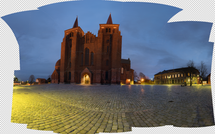
The default project from Photoshop looked terrible, and one of the others is a bit funny. I tried the others, butdidn’t get a result I liked.
Instead, I turned to Auto Pano Giga v4. This is the most advanced Panorama software that I know of. It’s not cheap, but if you can afford it, it’s worth every penny, and it get’s the job done. I only had the old version had to upgrade, and now I bought the bigger version. It integrates into Lightroom and Bridge, and there are some other advantages, I thought I would like to have.
Auto Pano Giga offers a huge range of projections, and some have parameters you can adjust. I picked the ‘Pannini’ projection and adjusted until I got something nice, and then I exported the final result to a Photoshop file. I still only used the 3.000 x 2.000 files.
And from this point, I processed only in Photoshop and later in Lightroom.
I have tried to run the full resolution files into Auto Pano Giga, and I does allow me to do it, however, it does take some time to process. But, it does not suck up all my free disk space. It works in a different way than Photoshop does.
The full resolution is 40.000 pixels wide, and in a slightly different crop, it is just north of 1 Gigapixel. Photoshop struggled with my 169 megapixels image, I think I will only process the full resolution, if anyone needs a twenty yards wide print, with crazy people stepping up in front to see if they can count the pixels (which they wouldn’t be able to, once scaled properly).
–Jacob Surland
]]>
I found this Colorful Shop in Rome.
While we were in Rome we passed this little mini restaurant, street kitchen, kiosk, souvenir shop many times, and at night, it was full of lights.
Just behind this little street shop, there are stairs leading down the Tiber, which is the river winding its way slowly through Rome.
We went down there during the day, to shoot the Castel Sant’Angelo from below. We had the feeling, that it was probably not the safest place in Rome after dark. And yet, we had seen many night shots from down there.
We decided to take the Blue Hour up around the Vatican, and then work our way down here to Castel Sant’Angelo, and take the late blue hour or the first of the night. And then we would make a judgment of the situation. Would it be safe to go down to the Tiber or not.
By the time we got down to this kitchen on wheels, at was a bit darker than we had planned. A few people hung around in the area, and I started the descent of the stairs, looking carefully around.
I didn’t get more than 10 steps down, and the stairs were splashed in what looked exactly like fresh blood, and I turned around. Even if I wanted a photo from down there, I didn’t want it that bad.
Instead, I have been playing around with one of the daytime photos I shot. I don’t like daytime photos that much, and I don’t a lot of them. But what I have come to like, is to put textures on them.

Castel Sant’Angelo in Rome is fascinating. I wouldn’t go as far as claiming that the building is beautiful, but spectacular it is.
The textures take the daylight away, in particular in this one, where I have gone berserk. I have begun to use AuroraHDR. Another neat feature in AuroraHDR is, that it support Textures too. However, my poor old MacBook Air from 2011, didn’t like 5 layers of textures on top of a 36 megapixel HDR.
Fair enough, it adds up in the memory, and my Mac only has 4 Gb, which is far too little to be doing heavy image processing. 8 Gb would have been much better.
When you make textured images, it is important to use several layers of different textures. A single layer will be too dominant and too easy to see ‘what is’.
Textures are typically images of a wall, ground, iron, paper, anything flat, and by using several textures, you get a complex mix, not only of structure but also of colors. And if you can find something, that works nicely together
The trick is to find some textures, that work nicely together, both in colors, and structure. And depending on the image you use, the blending changes, and you find that you have to apply textures that work well with your photo.And if you can find something, that works nicely together
I never apply a texture evenly on an image. I always add a mask and paint in and out the bits I like and don’t like. My primary objects, like the Castel Sant’Angelo in this image, I give a less texture, to enhance it.
If you find my articles interesting and consider getting AuroraHDR, please use the link on my web page and support me that way. I only recommend software and tools that I use.
I am not ‘bought’ to say nice things with sugar on top. I say what I think and feel about products. I get nothing for writing these articles, but I do get a kickback if you use my link to buy AuroraHDR, as well as if you use my 15% discount coupon code “caughtinpixels” for buying Buy Photomatix Pro. Thanks.
If you like my work, why not follow me on Twitter, Facebook, and Google+. I post photos daily.
–Jacob Surland
]]>
The ‘Skerpi’ is a house made of sticks, and put on wheels. The gourmet restaurant ‘Koks’ from the Faroe Islands has this as a pop-restaurant in Copenhagen these days.
For the past week, I have been playing around with AuroraHDR by Trey Ratcliff and Macphun. It’s one of the latest products for creating HDR photos, and I have been pretty excited about getting to know it.
This article covers my first initial impression of AuroraHDR. My overall impression is positive. There are lot’s of good stuff, but there are also a couple of bad bits.
Let’s start with one of the bad bits. It’s Mac… Only… However, Macphun is working on a Windows version, but there is no official date for this yet. Maybe they will brand it under ‘Winphun’? Probably not!
Anyway, I am or was a Windows user, but I do have a MacBook Air 13″ from mid-2011, equipped with an i7 1.8 GHz and 4Gb ram. It was the most powerful MacBook air back then. And this Mac has been my test drive computer.
I think that has been a good exercise and I can give a couple of additional input because I used this older computer.
First run of AuroraHDR
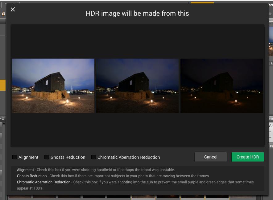
I picked a series of bracketed photos from my latest photoshoot. I exported seven exposures from Lightroom as DNG (Adobe’s device independent RAW format) files, as I always do, and dragged them into AuroraHDR.
And I waited for the preview screen getting ready to show the images.
It was 7 36.3 megapixel photos from my Nikon D800, and it took a while, so I waited a bit more. Fair enough, it is big image files.
And then I waited a longer bit more.
After 30 minutes of waiting and nothing had happened, I shut off the computer. I was VERY disappointed.
I tried once more, and picked only 3 of the 7 exposures, and after a couple of minutes the previews did show up, and I could start up AuroraHDR.
I wondered because I had heard that AuroraHDR should be fast. I looked up the minimum requirements, but my oldish Mac was above the minimum requirements. What could be the problem? Had Macphun really made a piece of software that couldn’t run on an older Mac?
No, of course, they had not. It took a little experimenting to figure out, what the problem was. It was the file format DNG. For some reason, the DNG files are insanely slow loading in AuroraHDR.
As soon as I used JPEG or native RAW files, it’s pretty snappy. 36 megapixel files are slower to work with, than 12 megapixel, which is no big surprise. But it works.
I did a test using three 3 images of 36 megapixels. The native Nikon RAW files took 1 minute and 55 seconds until it was ready to process. The DNG files took 11 minutes and 11 seconds. The first is comparable to other tools, but DNG is just too slow.
AuroraHDR tip #1: Do not use DNG files. Use native RAW files or JPEG files.
Now that I had found a solution to my initial major disappointment, I began exploring the tool itself. After looking for a little while, I realized, that AuroraHDR is a stand-alone image processing tool.
You can (almost) use ONLY AuroraHDR; it’s like a studio.
AuroraHDR high-level feature overview
The software loads and merges the images into the 32-bit HDR image, as is expected from HDR software. And then what? What is available?
As I said before, AuroraHDR is a Studio, and what do I mean by that? You don’t need much else. You can do almost everything inside AuroraHDR.
It offers layers with masks, as you know it from Photoshop and GIMP. It has a ton of tools to adjust including: White Balance, Clarity, Contrast, Color balance, toning, Gradient adjustment, split toning, and these are just some of the tools available.
The initial HDR image will be the first layer. On top of that, you can add other layers, and each layer has the same set of adjustment tools available.
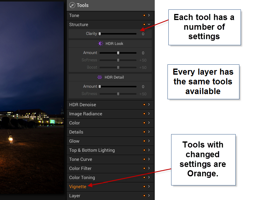
In Photoshop, you can add a curves adjustment layer and a Hue and Saturation layer etc., and they appear as individual layers. In AuroraHDR if you add a layer, that layer has everything, all adjustment tools are available.
The first mistake I made, was to forget about the layers and try to do everything in one layer – the Original HDR image layer. And of course, I can’t do that. I can try, but the result is not very good.
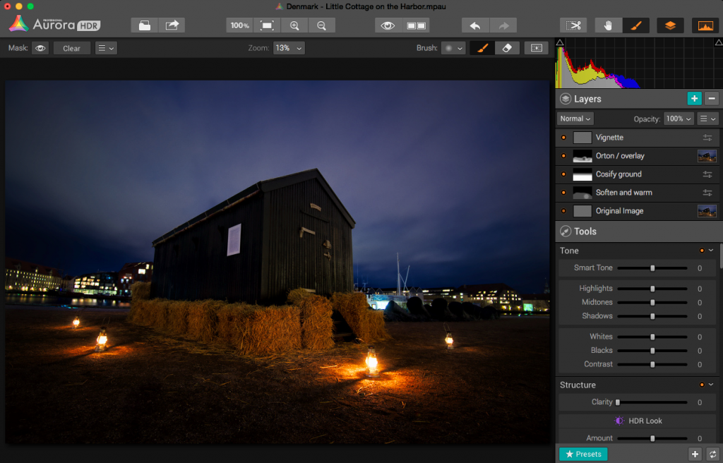
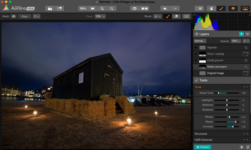
After having played around with a couple of images, I decided to do this little cottage standing in the harbor in Copenhagen. I ended up with 5 layers.
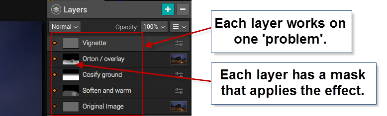
In a way, this is similar to what I would do in Photoshop. I start out with an original image, and I begin to apply effects, to solve ‘problems’.
Those of you who follow my blog will know, that I the way I post-process my images, is by identifying problems and solving them.
The problems I worked with on this image, were like this ‘The ground is too gritty’, ‘It’s not cozy enough’, ‘It’s not warm enough’. All problems leading to the creation of an inviting warm image.
The second layer enhances the warm light coming from the small lamps.
As it turned out, I adjusted no more than 3 tools in one layer, and I think that was the right strategy. If you try to do too many things in one layer, you end up with unwanted effects in some areas.
AuroraHDR Tip #2: Limit the number of tools you use in each layer. This way you can make changes locally, rather than globally.
I am pretty happy with the final result of this image. I could have reached a similar result, using Photomatix and Photoshop, as I usually do, but in this case, I was able to create everything inside AuroraHDR.
What’s missing in AuroraHDR?
AuroraHDR is almost a complete Studio; only a few pieces are missing. In my workflow, it’s the ‘finalizing’ that I can’t do in AuroraHDR.
The Crop and Rotate tool work nicely, but it does not have perspective correcting options. If you need to do perspective corrections, you will need another program. It’s not a big issue, AuroraHDR comes with export to Photoshop, but the feature is not inside AuroraHDR.
There is no healing brush or clone stamp, which again force you out of AuroraHDR, again not a big issue, but if… That would have been nice.
There might be a couple of other things I discover when I get around in AuroraHDR. But I haven’t found them yet.
What’s not so good in AuroraHDR?
One of the big issues with creating HDR photos is the noise. Digital cameras produce noise in images, especially at higher ISO levels, and HDR increases that noise.
Photomatix Pro, which I am very fond of, has a bad reputation for creating a lot of noise. But Photomatix can create noiseless HDR photos if you set the settings right. The question is if you like that output.
AuroraHDR comes with a built-in adjustable noise reduction. A very nice touch I must say. However, if your photos have areas, that are underexposed, AuroraHDR handles those areas badly, at least if you try to lift the shadows.
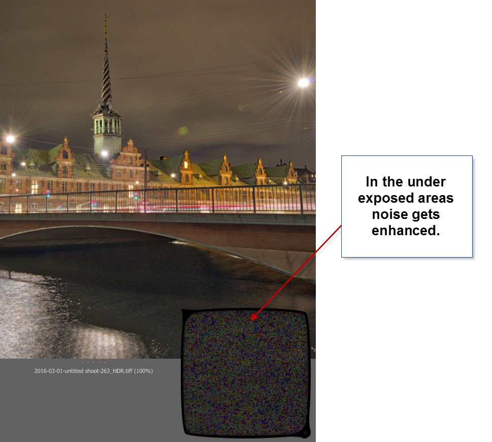
In my first test drive of AuroraHDR, I didn’t find a good solution for handling underexposed areas. Not the built-in HDR Denoise tool. By the time the noise is gone, so is the details. So the solution I found best, was to leave the dark, in the dark.
You could argue, that this wouldn’t have been a problem, had I shot some brighter exposures. In reality I had shot too few shots, to cover all of the dynamic range, so, in a way, it’s a self-inflicted problem.
AuroraHDR tip #3: If you have noise levels beyond control in AuroraHDR, you can make a version of the image in Lightroom, treating these dark areas as you would like them treated. Then export that version and blend it in, in Photoshop or GIMP.
Conclusion after the test drive of AuroraHDR
Will I use this tool again? Definitely. Will it be the only tool I use? I think not, but it will play a major role I think.
It will not replace my beloved Photomatix, but it will be a strong alternative. And thinking about it, I will be able to use AuroraHDR in the same way, as I use Photomatix, just as well as I can use the ‘Studio’ to make a final photo.
The initial HDR image created by AuroraHDR, you can process using the various tools included. But even before you do anything, you get a pretty good start:
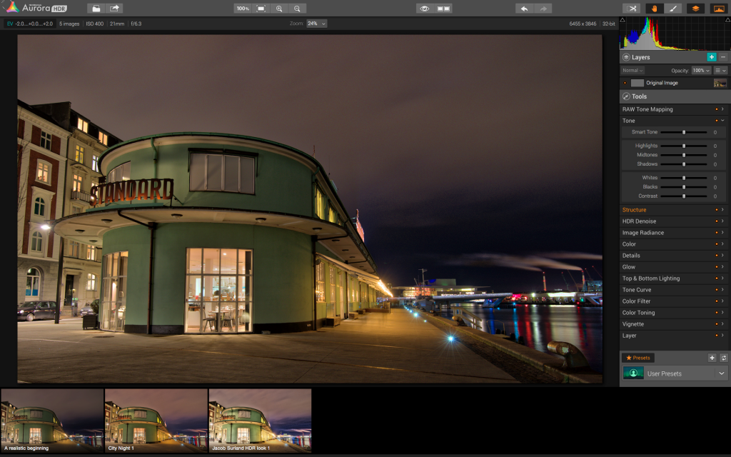
The Standard is an old ferry terminal in Copenhagen. This is the initial HDR, and it is really good looking already.
AuroraHDR does a lot of things in a cool way. I think the biggest danger of using AuroraHDR, is that you get lazy and get stuck on presets.
For some people AuroraHDR might just be the tool they need to create better quality HDR photos, with less effort. I am not on that road. I am not searching for less effort, but for new interesting paths to walk. AuroraHDR offers that.
Because there are so many tools built into AuroraHDR, you can get tempted to stop right there, on ‘just one layer’. And if you get real lazy, that layer is just a preset.
The problem of getting stuck using just one layer is that you don’t reach the full potential of your image. You apply all changes globally with a few exceptions like the gradient tool.
What pushes a photo from 80% to a 100% is the local optimizations. AuroraHDR raises the bar, from the ‘out-of-the-box’ HDR photo, but it is still not a 100%, and what fun would that be, if it was? I love post-processing.
What is new, is that you can move from 80% to a 100% without leaving the software. AuroraHDR offers new ways of working, and it will be refreshing to try it out.
I have been planning a switch to Mac for a longer period. As it happens, my old Windows computer has numbered days and is waiting for retirement or burial.
AuroraHDR is what tipped the decision, and I have now ordered a MacBook Pro. When I get that, I can dive further into AuroraHDR. And that I am looking very much forward to!
The Weekend Post by Jacob Surland
If you find my articles interesting and consider getting AuroraHDR, please use the link on my webpage and support me that way. I only recommend software and tools that I use.
I am not ‘bought’ to say nice things with sugar on top. I say what I think and feel about products. I get nothing for writing these articles, but I do get a kickback if you use my link to buy AuroraHDR, as well as if you use my 15% discount coupon code “caughtinpixels” for buying Buy Photomatix Pro. Thanks.
If you like my work, why not follow me on Twitter, Facebook, and Google+. I post photos daily.
–Jacob Surland
]]>
The Kings Library in Koldinghus.
Sometimes history just is amazing, and one ‘old’ is turned into another ‘old’. Hans Christian Andersen (the author ‘The ugly Duckling” etc) was one of the first, to suggest to preserve the old Koldinghus Castle . In my perception preservation is something you do ‘now’, but of course ‘now’ is ever changing. Hans Christian Andersen suggested this around 1830.
In my World, Hans Christian Andersen is from ancient times, before cars, tv, iPhones and skyscrapers. He suggested preservation around the time when Sydney in Australia was founded. I saw excavations in Sydney uncovering the beginning of the 20th century!
The old castle had it’s time of pride, and one of the most famous kings in Denmark Christian IV spend a large part of his childhood here, that was in the 16th century. However, a terrible fire in 1808 burned half the castle almost to the ground. The castle wasn’t restored until the 1970s.
This magnificient library survived the terrible fire.
–Jacob Surland
]]>