
This photo really came to life, when I used the color space Lab Color as a tool.
Teaser: Last in this post, you can see the before version of this image of the Eiffel Tower.
Recently I have been working a lot on understanding colors and color spaces. It has been coming to me, from two different angles. It’s funny how things sometimes converge from different places and situations into the same realization, at the same time.
I have been working on understanding why some of my prints went haywire color wise, even at a professional printing house. It turned out, it had to do with color spaces or more correctly the gamut of a color space. A gamut is the range of colors a color space can produce. Gamut is a strange word, but I will try to exemplify in a simple way. I will discuss this in more detail in a later post.
At the same time, as I was working on getting my prints looking right, on another track in my life, in my eternal search for new cool processing ways, I came across the Lab color space as a processing technique. It was introduced to me, by Robin Griggs Woods, and I was completely blown by it.
What is a color space anyway?
Before getting deeper into the Lab Color color space, let’s talk a bit about the color spaces in general. Color spaces are quite complicated, and I will try to make an easier-to-digest description.
The most common color space is sRGB, it’s sort of the industry standard, and it is, as the name indicate, based on Red, Green and Blue colors. And by combining Red, Green and Blue you can generate ‘any’ color, well not exactly ‘any’, but a lot of colors. sRGB has a certain color range, a certain gamut, meaning that it has a specific amount of colors, it can produce, and each color in sRGB is defined as a mix of Red, Green, and Blue. However, sRGB does not have the biggest gamut of them all.
AdobeRGB 1998 has a larger gamut, and even if it is also based on Red, Green, and Blue. A super simple explanation of gamut could be done with simple geometric figures like these:
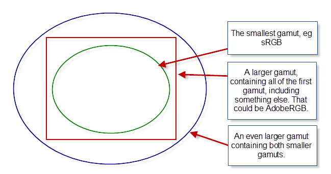
Examples of different sizes of gamuts, shown in simple geometry.
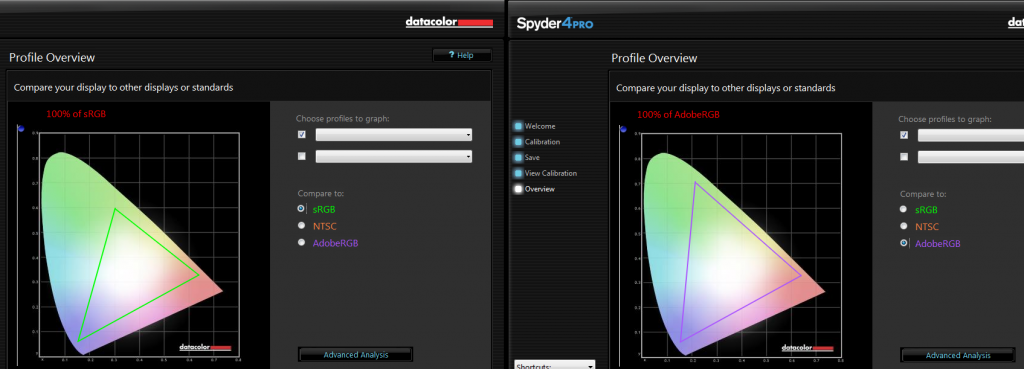
Below is shown the gamut, from the Spyder4Pro software, I use to calibrate my screen. The odd colored shape is the gamut of my monitor.
The triangles represent the gamut of sRGB on the left and the gamut of AdobeRGB on the right. As you can see my monitor can show both gamuts completely, but that might not be the case of any monitor. I have a high-end monitor a low-end monitor will probably come short on AdobeRGB.
The implications of different sizes of gamuts quickly get complex. How do you map from one color space to another? It easy to map from a small gamut to a larger, as long as the smaller is completely within the larger, but what should be done the other way, if you have colors outside the gamut? What should happen to these colors?
All of this is very complicated, and I will wait to a later post, to explain it in more detail. For now, let’s just accept that, there are different color spaces, that have different gamuts, and some are larger than others.
One color space is to rule them all
Lab Color is a color space too, and it works quite differently than RGB based color spaces, and you get some advantages from that.
The Lab colors are defined in another way than the classic RGB based color spaces. The L stands for Lightness, and a and b are the color channels; a covering green to magenta, and b covering blue to yellow.
The lightness channel only changes the lightness, and the color channels only change the colors. This is different from the RGB color spaces. It allows you to work on the colors, without changing any contrast in the photo, and you can work with the contrast, without changing any colors.
Let’s have a look at this photo, and do something wild to it first, and afterward, do something nice. This is straight out of the camera, except for a crop.
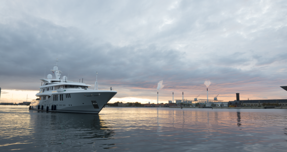
This photo is shot in RAW and when I export it to Photoshop I export in AdobeRGB, and I have set up my Photoshop to also work in AdobeRGB.
NB! A RAW file has its own native color space.
First I add a Curves Adjustment Layer to my image.
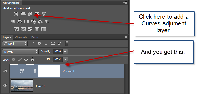
And then I do something crazy with the curve like shown below.
What happens to the image, is that the contrast change. Notice the lower part of the ship goes brighter, and the upper part goes darker. But what also happens, is that the colors go completely wonky. The from part of the sky goes orange, and greenish colors appear too. The top of the ship goes orange.
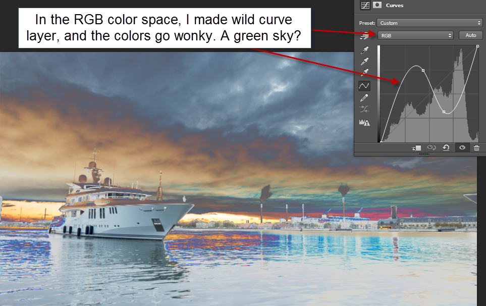
A wild curves layer added to the image in RGB Color space. The colors change.
Now I add the same Curves Adjustment layer to the image while having it in the color space Lab Color. Notice how the Curves layer now offers Lightness instead of RGB.
I change the curve to a wild one too, and now the colors actual remain the same, but the contrast change. The ship still go bright in the lower part, and the upper part still goes darker, but the upper part now remains in the gray tones it should be. The same goes for the sky and water. It remains in gray, bluish, orange/brown and purple in the right places.
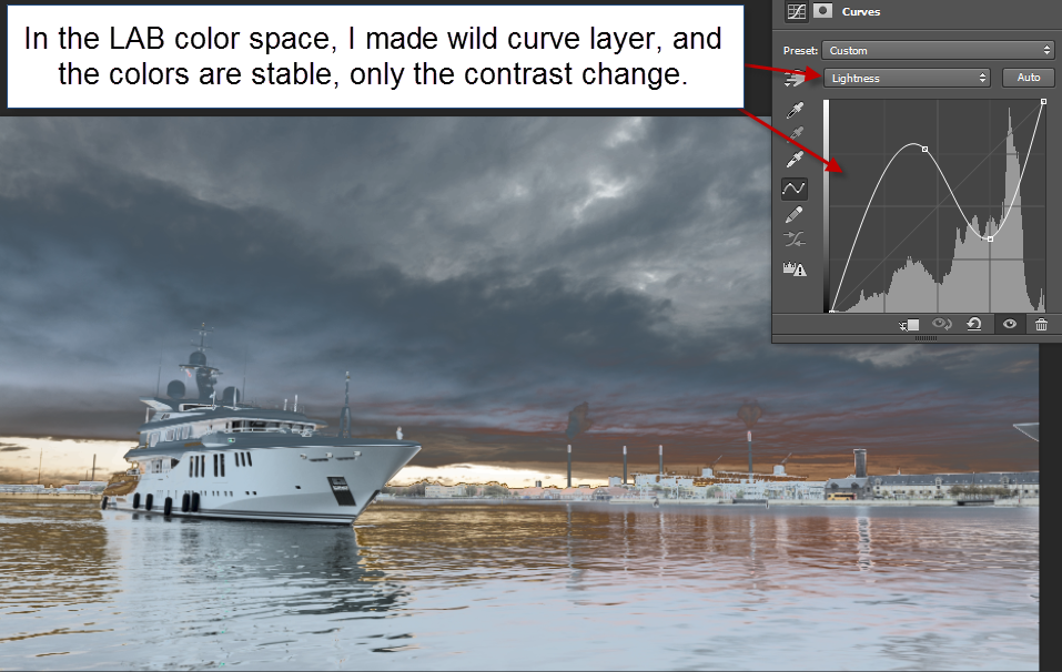
A wild curves layer added to the image in LAB Color color space. The colors stay the same, only the contrast change.
While using a wild curves adjustment layer did not change the color, only the contrast, the result is not really any prettier. But let’s do something pretty out of this photo, using Lab Color.
How to create magic photos using Lab Color
Step 1 – open the image file in Photoshop
My workflow always starts in Lightroom. Often I will do something to the image, before exporting it to Photoshop. But in this case, I will just go straight to Photoshop with the RAW file, using the standard export to Photoshop from Lightroom.
In Photoshop, I can confirm, that I am working in the RGB color space, by going to the submenu Image->Mode.

If you look closely, you can see ‘Lab Color’ in this submenu too. But I don’t want to switch to Lab Color yet.
I want to make adjustment layers to my image, but I also want to end up having my image back in the AdobeRGB color space. So what I really want, is to work in two Photoshop files, one in RGB color space and one in Lab Color.
Step 2 – make two Photoshop files
Photoshop has a feature to do this.

This gives a dialog:

I press OK and get a new copy of my image.
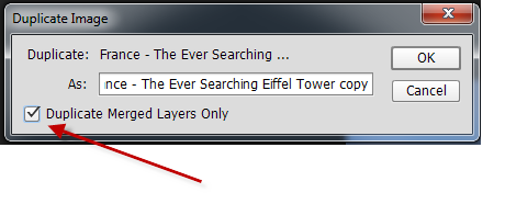
Advanced tip: If I already had made some preliminary adjustment layers in my RGB file, I would need to click the tick ‘Duplicate Merged Layers Only’ checkbox.
Step 3 – switch new copy to Lab Color
In the new copy, I go to the submenu Image->Mode and switch this image to Lab Color. I am now ready to process this image in Lab Color, and I will start by adding a Curves Adjustment Layer.
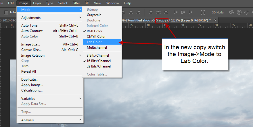
Step 4 – make adjustment layer
I add the Curves Adjustment layer:
And I adjust the curves. I start by adjusting the contrast a bit, using the Lightness channel.
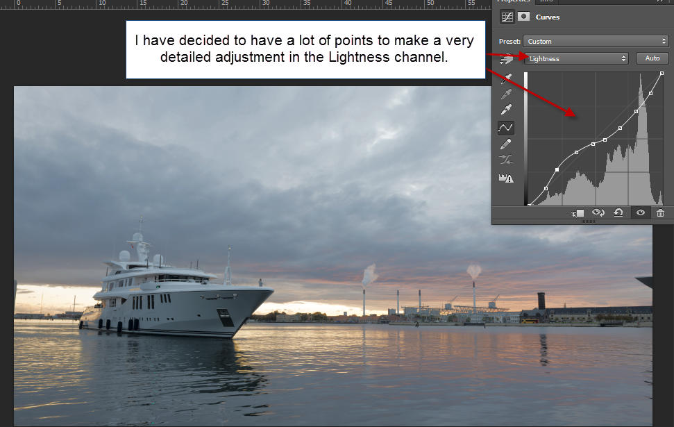
This gives a little change, not a lot, but it’s a beginning. Now the fun begins!
Step 5 – adjust color channels
Let’s take the blue and yellow channel first, that’s channel b. It’s mostly a blue and yellow photo, so I think that’s a good place to begin.
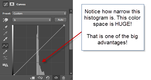
Notice I have switched to channel b. And what the heck is going on? The histogram is so narrow! This tells us, that the Lab Color’s gamut is ridiculously large, much bigger than e.g. the AdobeRGB gamut. This gives a lot of elbow room to work with the colors, without getting a lot of nasty artifacts, and this is one of the advantages.
Remember, that when I work with the color channels a and b I do not change the contrast, only the colors. Let’s pop some colors!
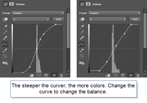
I played around with channels a and b for a little while and ended up with the curves above. The image I got out of it looks like this:
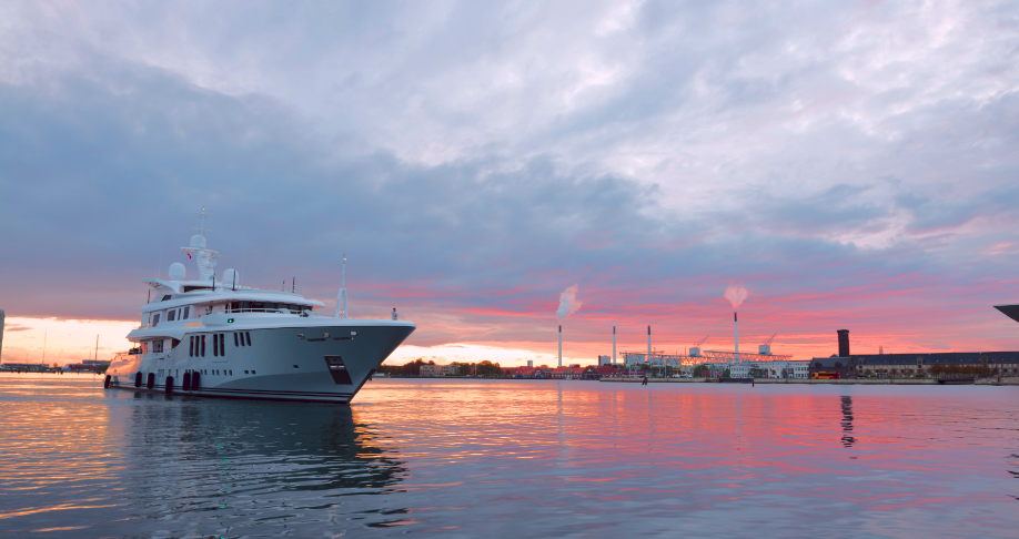
This is a much more punchy photo. Notice how the colors really has been brought to life. I haven’t added any colors, just boosted what is already there. And this is what I find so fantastic when I use the Lab Color. Not all photos really benefit from them, but some do.
Let’s bring it back to the RGB image.
Step 6 – merge the images
To bring the processed Lab Color image back to the original RGB image, I need to flatten the image. There are many ways for doing that, but I use ‘Flatten Image’.

And then copy and paste the layer back to the original psd file like this:

Now I have the image back, as a layer in my original psd file, containing the RAW file. From here I can do more processing if I want to. I have already brought this photo much more to life, but I want to do more to it. To me, the Lab Color is just a step on the way.
Real life use of Lab Color in an RGB World
How do I use this Lab Color technique, in the real life, when I process my photos? I use it as an effect. In the clinical example above I started out from scratch, slamming the RAW file straight into the Lab Color mode, but in the case below it was something I did midway because I kept not getting the colorful punch that I wanted.
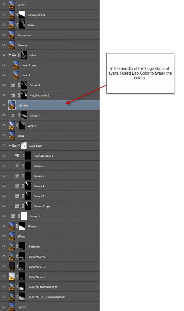
It is rare that I have this many layers for creating an image.
My problem when I worked on the image was that I could not really get the colors to work my way. Something kept missing, and I couldn’t really put my finger on it. So what I did was to take it into Lab Color, and I found exactly the effect that I wanted.
Because it was something I did at a late stage, I had to use the ‘Advanced tip’ from Step 2. Check the box in the Duplicate dialog
In Lab Color mode I managed to put some life into the distant yellow clouds. They had been a bit too gray. The warmer color goes great with the blue sky. But I also discovered some very subtle skies in the otherwise dead space in the upper right corner.
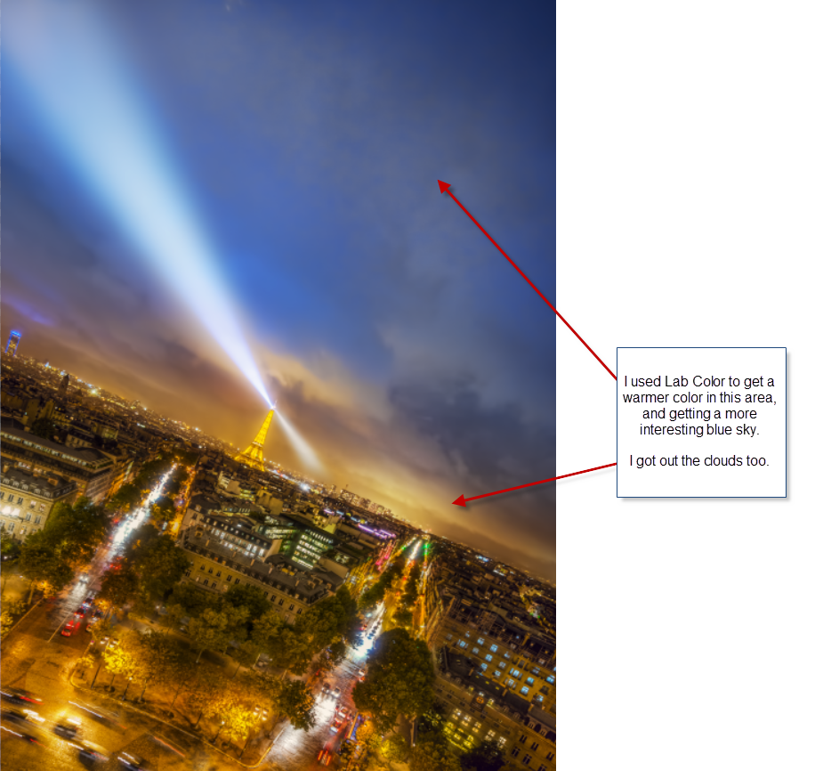
Lab Color did not make this photo, but it added just that magic I had been searching for, without knowing exactly what it was.
As promised in the beginning of this post, you get to see the before version of the primary image in this post.
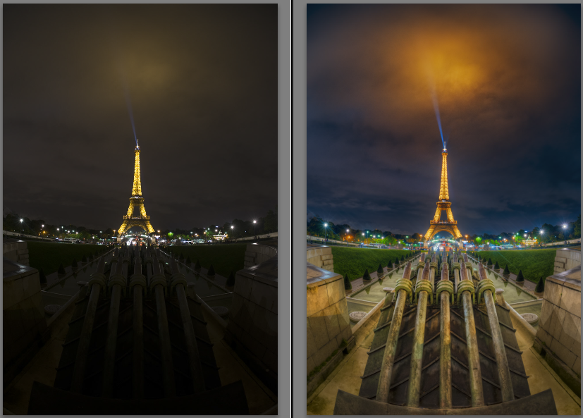
Left side unprocessed RAW file and right side final photo.
In this case, it was the balance of blue and orange that Lab Color helped me to get. Everything was too orange, but the Lab Color helped me to intensify the orange in the clouds, and getting a bluish shade in the sky.
This is the stack of layers for this image:
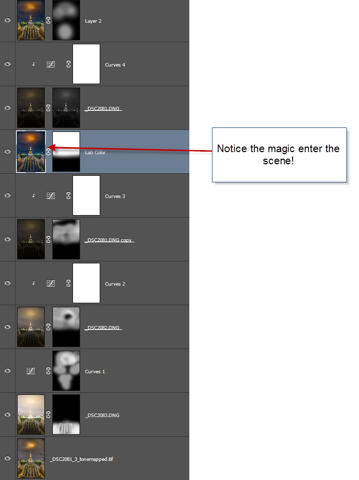
And to show the exact impact. The photo on the left is the one I put into Lab Color, and the one on the right is the one I got out. That’s magic!

Thank you, if you have read so far. This became one of the bigger tutorials.
–Jacob Surland
]]>

The Ever Searching Eiffel Tower.
It’s been a while since my last post. I have been doing a lot exciting other stuff, that I will tell you about in some posts. I have been exhibiting in France, USA and UK, and I am preparing a solo exhibition too. It does take some time. I have learned quite a lot recently, on printing photos and getting a good result, and I will tell you all about it soon.
I have also learned some new fancy techniques, one I have used in this photo. I will tell you about this too.
I already had left the roof of the Arc of the Triumph in Paris, when I decided to go back up. I am glad I did because I got this shot. I did one with a similar angle with my iPhone, earlier, and when I saw it on the phone, I went straight back to the roof, to do a version with a proper camera.
–Jacob Surland
]]>
The colors of the roof and walls keep changing colors, to simulate day, night and the weather.
I knew that the ‘Muséum national d’Histoire Naturelle’ would be something special, but I was still blown completely away with the beauty of this enormous old room.
I arrived in the midst of a tropical thunderstorm. The roof changes colors, along with the one wall, to simulate the weather. It can show lightning, day and night, and a rainbow … at least that was what I saw, during my 1,5 hours I had there until it closed. I didn’t even get much time to look at the exhibition, but that looked really awesome too. This place I would require a day, to do it full justice I think.
I could just squeeze in visiting the Museum between I hung up my artwork at Carousel du Louvre, and the VIP grand opening later in the evening.
About the processing of this photo
This photo is shot with a Sony A7R using my metabones Nikon adapter attached with my 16mm Nikon Fisheye lens. The fisheye is obvious. I used a fisheye in this location, to got something out of the ordinary classic shot from this museum, and I think I managed to get that. At least, I have never seen anything like this before.
It is an HDR shot bracketed -2, 0 and +2. The Sony A7R is somewhat limited regarding shooting bracketed HDR photos. I need at least 1 stop between each shot, and prefer 2 stops. When choosing this option, the A7R can only shoot 3 bracketed photos. If I shoot less than 1 stop between each stop, it can shoot 5 shot, a ridiculous limitation.
I shot it at an f/stop somewhere in the middle. One of the drawbacks from using the Metabones adapter for Nikon is, that no EXIF information is transferred from the lens. But I know I had the f-stop somewhere in the middle, my guess is f/8-f/11. And then I had the camera at ISO 100 and the longest shutter speed was 5 seconds. This allows me to blur most of the people fairly much away.
I used my standard processing workflow for this image. I processed it in Photomatix (you might want to see my tutorial here), and afterwards i took the three originals along with the output from Photomatix into Photoshop and blended it to this final result. These are my three original unprocessed photos:

One of the important things, when you shoot a photo symmetric like this one, is that symmetry is as exact as possible. I could spend a long time while shooting, to get it exactly right in the camera, by shooting, checking and re-shooting. I work in a different way. I need to be ‘close enough’ to the final framing, but I do not mind, doing a final more exact crop at home on the computer. This way I get more time, to do more shots, instead of working one composition into death. This might be a different way, than others work, but I like it that way. Of course I sometimes get stuck, if I can’t get a “good enough” result quickly. I hate getting home with something, that I cannot use.
I am far from puritan about ‘getting it right in the camera house’. I see no point in doing that, it would only require more time, at each location, giving me less to time, to do more compositions.
In Photoshop I first got an “overall” good blend of the tonemapped output from Photomatix, and the three original images. Then I added some effect, by using Topaz Adjust. Afterwards i used two of the original shots ones more to fix or improve very specific areas.

How do I determine what ‘needs to be fixed’ in an image? What I get out of Photomatix is next to NEVER a final image. This I know, and I just have to look for the ‘problems’ with the image from Photomatix. There is always something, that doesn’t look too good. Something that is too extreme, a nasty halo or a to hard contrast. How do I spot that? I look closely at the image, both in a smaller thumbnail seized image, and in a closer to 1:1 version. But in the end it comes down to a mix of taste and experience/practice. The more images you have processed, the better you get at doing this. In the beginning, this was pretty much a lot of guessing work and less qualified work. Most of this early work, I have withdrawn from my public stream. The more images you process, the better you get at it, and some of the ‘problems’ gets so obvious to fix, that you hardly think about it.
In this particular image, I first got the ‘basic’ image, by blending the Photomatix version, with the three originals. Then I made some effect using, Topaz Adjust, and afterwards I fine tuned the image, by picking some very specific areas from the original images, to fix some problems.
–Jacob Surland
]]>
Paris seen from the top of the Arch of Triumph in bad weather.
I was in Paris last week to exhibit at Art Shopping at Carrousel du Louvre 2015. A pretty exciting thing. As a photographer, I, of course, could not go to Paris, and not shoot photos, and I carefully planned what to photograph, and when, while not exhibiting.
I did a very careful planning of what I want to shoot mornings and evenings, and what to shoot while driving down there, and back again. It’s the first time I have been the so prepared – and yet you can still meet obstacles.
I will only have one blue hour evening, and where did I want to go? In the end, I decided for the rooftop of the Arch of Triumph. There is a magnificent view of Paris from up there. I got there in good time and waited in the line. After waiting 30 minutes in the line, I got so close to the ticket office and saw a sign which said ‘no bags larger than 40cm’ mine is 53cm and my hope sank. What a stupid mistake to make. I knew that I could not use tripods up there, but no big bags? I took a deep breath, and went took a shot at it, anyway, and I slipped through. The security guard just received a large group to pay his attention to and did not pay attention to the size of my bag. Lucky me.
I thought I was home free from there, but noo… There was a more specific security check, before going up to the top of the roof. The security lady started saying something about the size of the bag, but I just opened it and showed her my camera equipment. She said ‘no tripods’, but I knew that and had prepared for that, and she let me through.
I got to the roof, after climing a small narrow winding staircase. It really was taller than I expected, and when I got up there, the view was magnificent. I had taken no chances and was there almost two hours ahead of the sunset. So I had to wait.
Instead of a tripod, I had brought my Manfrotto Super Clamp

The Super Clamp is really made for filming equipment, but it works with cameras too.
Because I knew tripods wasn’t allowed, I had researched the nature of the roof and had seen from photos, that there was a spiked fence, which the Super Clamp would be super easy to attach to. And that was my plan. But I had not considered that the fence might be wobbly, and it certainly was. It turned out, that people leaned against it, while taking selfies, and children yanked in it. My camera would fly back and forth on long exposures.
While I waited, I searched for my compositions. This one I liked particularly well because it is different from the classic shot from up here. I also got the classic one, but this one I liked rather much. And guess what? It’s shot with a fisheye lens. You can hardly even tell!
While I waited, bad weather came. La Defense in the distance disappeared completely, and it got closer. At this time I did not feel very lucky at all, but in the end we only got a small portion of the bad weather; enough to have minor problems with rain, but not enough to ruin the photos.
Back to the wobbly fence. When it was time, and the exposures got longer, I waited until the fence was still, or if didn’t stay still, I held my breath and I put my full weight against the fence (hoping it would hold). I shot a lot of photos of the same composition and hoped that enough would be sharp enough to work with. As it turned out, it was not so bad at all. I got a lot useable photos.
So this photo I am quite happy with, not only because I like it, but also because I went through a lot of trouble to get it.
]]>