Warning: Undefined array key "multiauthor" in /var/www/caughtinpixels.com/public_html/wp-content/plugins/post-layout/plugin.php on line 114
Warning: Undefined array key "mobile" in /var/www/caughtinpixels.com/public_html/wp-content/plugins/post-layout/plugin.php on line 352

This photo really came to life, when I used the color space Lab Color as a tool.
Teaser: Last in this post, you can see the before version of this image of the Eiffel Tower.
Recently I have been working a lot on understanding colors and color spaces. It has been coming to me, from two different angles. It’s funny how things sometimes converge from different places and situations into the same realization, at the same time.
I have been working on understanding why some of my prints went haywire color wise, even at a professional printing house. It turned out, it had to do with color spaces or more correctly the gamut of a color space. A gamut is the range of colors a color space can produce. Gamut is a strange word, but I will try to exemplify in a simple way. I will discuss this in more detail in a later post.
At the same time, as I was working on getting my prints looking right, on another track in my life, in my eternal search for new cool processing ways, I came across the Lab color space as a processing technique. It was introduced to me, by Robin Griggs Woods, and I was completely blown by it.
What is a color space anyway?
Before getting deeper into the Lab Color color space, let’s talk a bit about the color spaces in general. Color spaces are quite complicated, and I will try to make an easier-to-digest description.
The most common color space is sRGB, it’s sort of the industry standard, and it is, as the name indicate, based on Red, Green and Blue colors. And by combining Red, Green and Blue you can generate ‘any’ color, well not exactly ‘any’, but a lot of colors. sRGB has a certain color range, a certain gamut, meaning that it has a specific amount of colors, it can produce, and each color in sRGB is defined as a mix of Red, Green, and Blue. However, sRGB does not have the biggest gamut of them all.
AdobeRGB 1998 has a larger gamut, and even if it is also based on Red, Green, and Blue. A super simple explanation of gamut could be done with simple geometric figures like these:
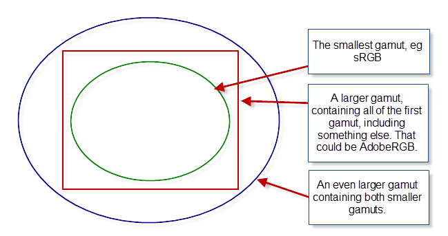
Examples of different sizes of gamuts, shown in simple geometry.
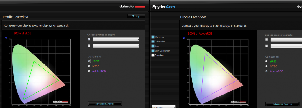
Below is shown the gamut, from the Spyder4Pro software, I use to calibrate my screen. The odd colored shape is the gamut of my monitor.
The triangles represent the gamut of sRGB on the left and the gamut of AdobeRGB on the right. As you can see my monitor can show both gamuts completely, but that might not be the case of any monitor. I have a high-end monitor a low-end monitor will probably come short on AdobeRGB.
The implications of different sizes of gamuts quickly get complex. How do you map from one color space to another? It easy to map from a small gamut to a larger, as long as the smaller is completely within the larger, but what should be done the other way, if you have colors outside the gamut? What should happen to these colors?
All of this is very complicated, and I will wait to a later post, to explain it in more detail. For now, let’s just accept that, there are different color spaces, that have different gamuts, and some are larger than others.
One color space is to rule them all
Lab Color is a color space too, and it works quite differently than RGB based color spaces, and you get some advantages from that.
The Lab colors are defined in another way than the classic RGB based color spaces. The L stands for Lightness, and a and b are the color channels; a covering green to magenta, and b covering blue to yellow.
The lightness channel only changes the lightness, and the color channels only change the colors. This is different from the RGB color spaces. It allows you to work on the colors, without changing any contrast in the photo, and you can work with the contrast, without changing any colors.
Let’s have a look at this photo, and do something wild to it first, and afterward, do something nice. This is straight out of the camera, except for a crop.
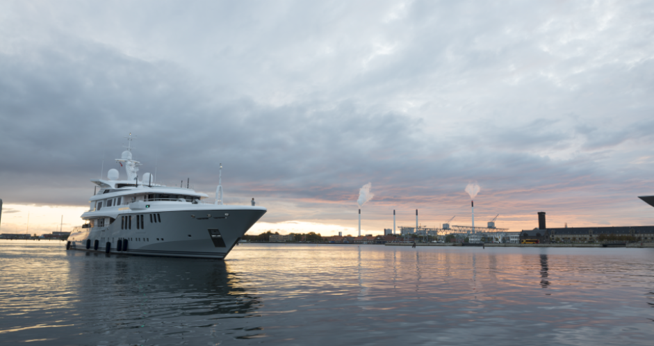
This photo is shot in RAW and when I export it to Photoshop I export in AdobeRGB, and I have set up my Photoshop to also work in AdobeRGB.
NB! A RAW file has its own native color space.
First I add a Curves Adjustment Layer to my image.
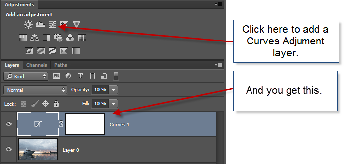
And then I do something crazy with the curve like shown below.
What happens to the image, is that the contrast change. Notice the lower part of the ship goes brighter, and the upper part goes darker. But what also happens, is that the colors go completely wonky. The from part of the sky goes orange, and greenish colors appear too. The top of the ship goes orange.
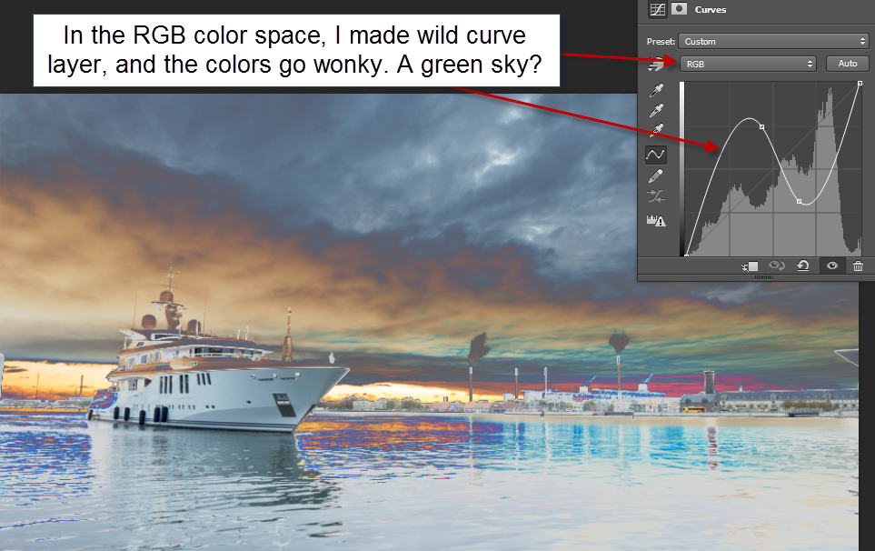
A wild curves layer added to the image in RGB Color space. The colors change.
Now I add the same Curves Adjustment layer to the image while having it in the color space Lab Color. Notice how the Curves layer now offers Lightness instead of RGB.
I change the curve to a wild one too, and now the colors actual remain the same, but the contrast change. The ship still go bright in the lower part, and the upper part still goes darker, but the upper part now remains in the gray tones it should be. The same goes for the sky and water. It remains in gray, bluish, orange/brown and purple in the right places.
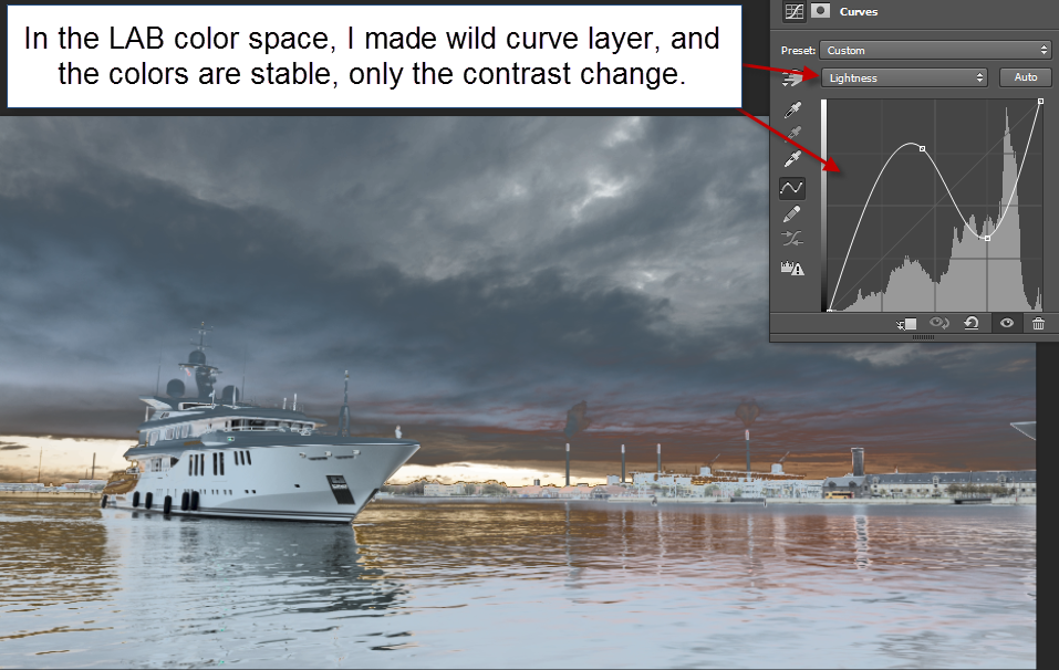
A wild curves layer added to the image in LAB Color color space. The colors stay the same, only the contrast change.
While using a wild curves adjustment layer did not change the color, only the contrast, the result is not really any prettier. But let’s do something pretty out of this photo, using Lab Color.
How to create magic photos using Lab Color
Step 1 – open the image file in Photoshop
My workflow always starts in Lightroom. Often I will do something to the image, before exporting it to Photoshop. But in this case, I will just go straight to Photoshop with the RAW file, using the standard export to Photoshop from Lightroom.
In Photoshop, I can confirm, that I am working in the RGB color space, by going to the submenu Image->Mode.

If you look closely, you can see ‘Lab Color’ in this submenu too. But I don’t want to switch to Lab Color yet.
I want to make adjustment layers to my image, but I also want to end up having my image back in the AdobeRGB color space. So what I really want, is to work in two Photoshop files, one in RGB color space and one in Lab Color.
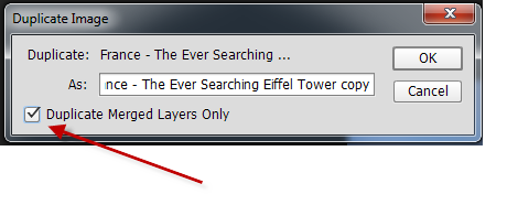
Step 2 – make two Photoshop files
Photoshop has a feature to do this.

This gives a dialog:

I press OK and get a new copy of my image.
Advanced tip: If I already had made some preliminary adjustment layers in my RGB file, I would need to click the tick ‘Duplicate Merged Layers Only’ checkbox.
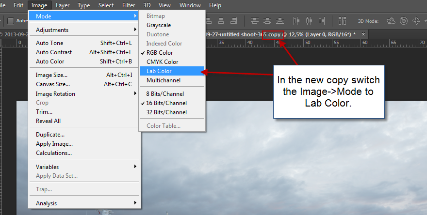
Step 3 – switch new copy to Lab Color
In the new copy, I go to the submenu Image->Mode and switch this image to Lab Color. I am now ready to process this image in Lab Color, and I will start by adding a Curves Adjustment Layer.
Step 4 – make adjustment layer
I add the Curves Adjustment layer:
And I adjust the curves. I start by adjusting the contrast a bit, using the Lightness channel.
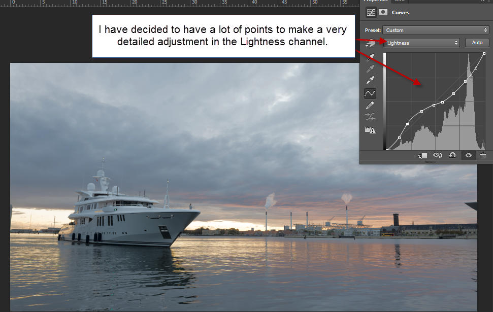
This gives a little change, not a lot, but it’s a beginning. Now the fun begins!
Step 5 – adjust color channels
Let’s take the blue and yellow channel first, that’s channel b. It’s mostly a blue and yellow photo, so I think that’s a good place to begin.
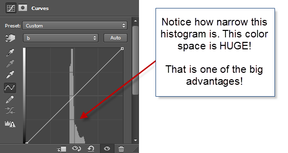
Notice I have switched to channel b. And what the heck is going on? The histogram is so narrow! This tells us, that the Lab Color’s gamut is ridiculously large, much bigger than e.g. the AdobeRGB gamut. This gives a lot of elbow room to work with the colors, without getting a lot of nasty artifacts, and this is one of the advantages.
Remember, that when I work with the color channels a and b I do not change the contrast, only the colors. Let’s pop some colors!
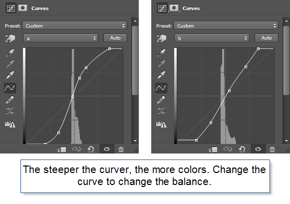
I played around with channels a and b for a little while and ended up with the curves above. The image I got out of it looks like this:
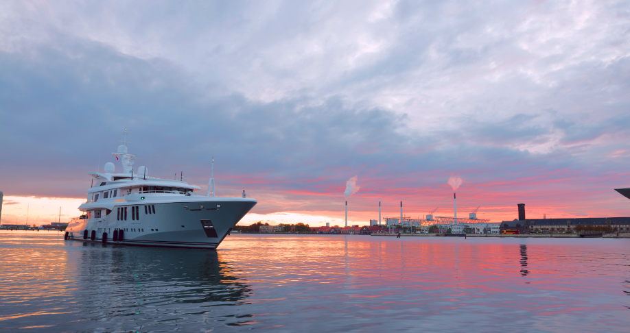
This is a much more punchy photo. Notice how the colors really has been brought to life. I haven’t added any colors, just boosted what is already there. And this is what I find so fantastic when I use the Lab Color. Not all photos really benefit from them, but some do.
Let’s bring it back to the RGB image.
Step 6 – merge the images
To bring the processed Lab Color image back to the original RGB image, I need to flatten the image. There are many ways for doing that, but I use ‘Flatten Image’.

And then copy and paste the layer back to the original psd file like this:

Now I have the image back, as a layer in my original psd file, containing the RAW file. From here I can do more processing if I want to. I have already brought this photo much more to life, but I want to do more to it. To me, the Lab Color is just a step on the way.
Real life use of Lab Color in an RGB World
How do I use this Lab Color technique, in the real life, when I process my photos? I use it as an effect. In the clinical example above I started out from scratch, slamming the RAW file straight into the Lab Color mode, but in the case below it was something I did midway because I kept not getting the colorful punch that I wanted.
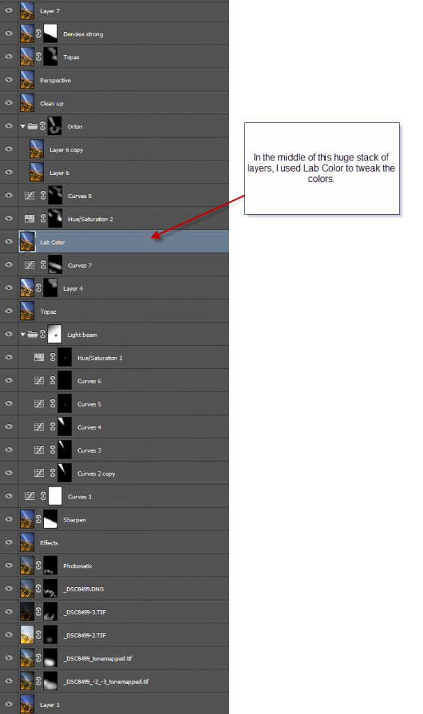
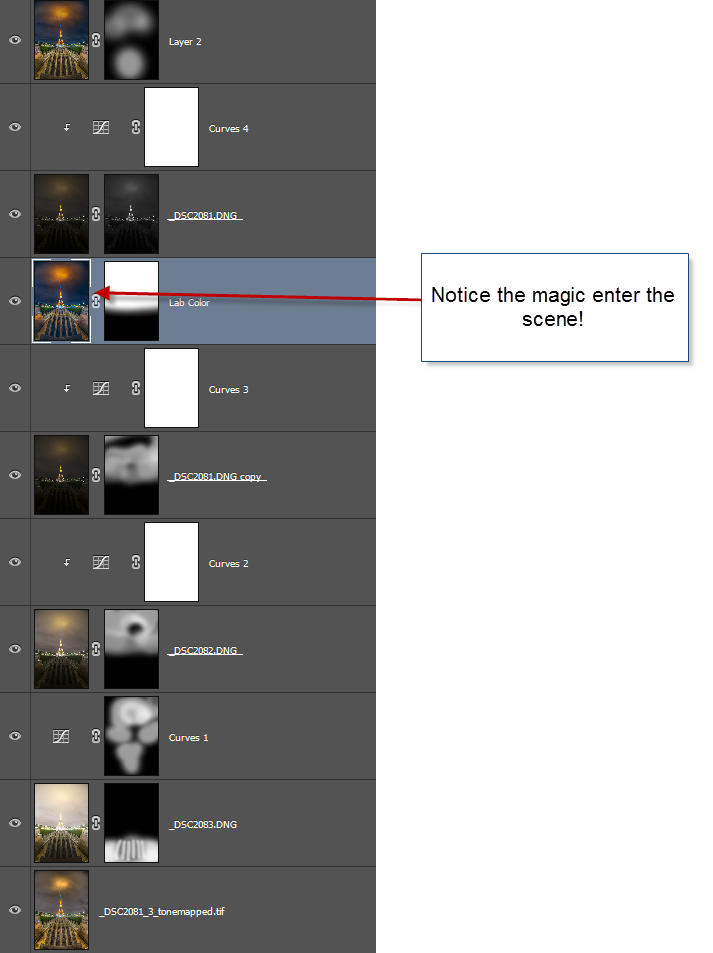
It is rare that I have this many layers for creating an image.
My problem when I worked on the image was that I could not really get the colors to work my way. Something kept missing, and I couldn’t really put my finger on it. So what I did was to take it into Lab Color, and I found exactly the effect that I wanted.
Because it was something I did at a late stage, I had to use the ‘Advanced tip’ from Step 2. Check the box in the Duplicate dialog
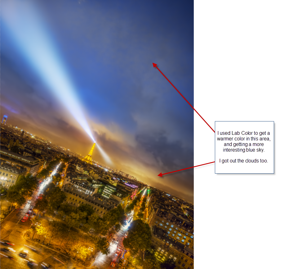
In Lab Color mode I managed to put some life into the distant yellow clouds. They had been a bit too gray. The warmer color goes great with the blue sky. But I also discovered some very subtle skies in the otherwise dead space in the upper right corner.
Lab Color did not make this photo, but it added just that magic I had been searching for, without knowing exactly what it was.
As promised in the beginning of this post, you get to see the before version of the primary image in this post.
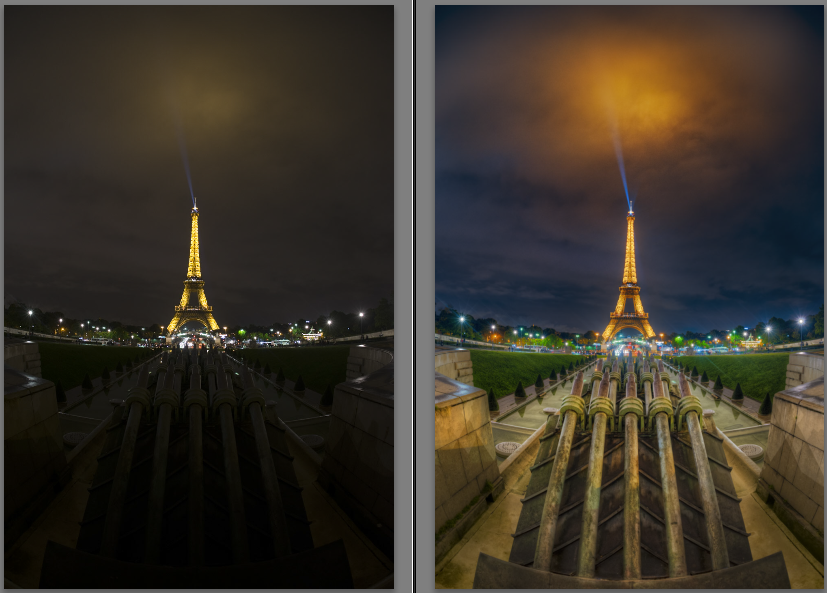
Left side unprocessed RAW file and right side final photo.
In this case, it was the balance of blue and orange that Lab Color helped me to get. Everything was too orange, but the Lab Color helped me to intensify the orange in the clouds, and getting a bluish shade in the sky.
This is the stack of layers for this image:
And to show the exact impact. The photo on the left is the one I put into Lab Color, and the one on the right is the one I got out. That’s magic!

Thank you, if you have read so far. This became one of the bigger tutorials.
–Jacob Surland
Warning: Undefined variable $pstl_comments_number in /var/www/caughtinpixels.com/public_html/wp-content/plugins/post-layout/plugin.php on line 43
Warning: Undefined array key "cid" in /var/www/caughtinpixels.com/public_html/wp-content/plugins/post-layout/plugin.php on line 46
Just a small correction to your comment “This photo is shot in AdobeRGB and when I export it to Photoshop, I have set up my Photoshop to also work in AdobeRGB.” You said later that you shot this in RAW so therefore you did not shoot in in RGB, you shot it in Camera Embedded color space. The RGB and sRGB in your camera is only for JPEGs.
Warning: Undefined variable $pstl_comments_number in /var/www/caughtinpixels.com/public_html/wp-content/plugins/post-layout/plugin.php on line 43
Warning: Undefined array key "cid" in /var/www/caughtinpixels.com/public_html/wp-content/plugins/post-layout/plugin.php on line 46
Hi Paul,
I got me! Thanks a lot, and thinking about it, it’s a stupid mistake to make. Of course, the RAW file has its own native color space.
I will update the article accordingly. Thanks!
–Jacob
Warning: Undefined variable $pstl_comments_number in /var/www/caughtinpixels.com/public_html/wp-content/plugins/post-layout/plugin.php on line 43
Warning: Undefined array key "cid" in /var/www/caughtinpixels.com/public_html/wp-content/plugins/post-layout/plugin.php on line 46
Your detailed explanation is a GENERAL case. I know a variation that is called the VELVIA effect which does not touch the lightness (it can be touched before or after).
In this variation, channels “a” and “b” are selected one at a time this way:
1) In Channels, select one of them;
2) Choose Image/Adjustments/Levels;
3) Move the Input Levels on the left cursor to the right by a certain amount until you get closer to the peak of the color;
4) Move the right cursor to the left by the SAME amount you moved the left one (this is very important);
5) Proceed to the other channel in the same fashion;
6) Convert the image back to RGB, if you want.
And this is it! It simulates the velvia colors from the old Fuji films to give an extra punch to the pictures.
Warning: Undefined variable $pstl_comments_number in /var/www/caughtinpixels.com/public_html/wp-content/plugins/post-layout/plugin.php on line 43
Warning: Undefined array key "cid" in /var/www/caughtinpixels.com/public_html/wp-content/plugins/post-layout/plugin.php on line 46
Hey Celso,
That’s very interesting – I must definitely try that out! Thanks for posting it here 🙂
–Jacob