
X-Wing Squadron in Sweden.
I had a lot of fun making this photo of three X-Wings from Starwars patrolling a Swedish night. I got the idea to make this image because I am working on a book on composition and I use a spaceship as a metaphor. I thought it would be cool to have a photo of a spaceship on those pages, but how do you get a photo of a spaceship? They don’t sit on every second corner.
My first thought was to use one my sons Lego spaceships (he has a ton of them). But before I acted I remembered this kind of cool shot of the ‘Space Mountain’ in Disneyland Paris and decided that would have to make do.

But I then shuffled a bit around in the photos from that area, and I noticed a photo of the X-Wing and an idea came to me. An X-Wing is a proper spaceship, just what I needed. I would put that on a shot of the Milky Way that has no foreground object or main subject, other than a bit of wood and the Milky Way itself.
I had two shots of the X-Wings from the same angle, just shot on two different days, using two different cameras. Had I known what I would need photos of the X-Wing at a later time, I would have shot a series from different angles, but I didn’t.

The original photo of the Milky Way looked like this:

This is the first shot I shot of the Milky Way. It requires an area low on light polution. This is place in Sweden is not too bad. You can see a bit of light polution just above the trees. However, the photo is not interesting in itself. There is a lack of interesting foreground.
The process of creating a believable composite
I wanted to make the illusion of three X-Wing fighters patrolling Sweden and to make that work and I could see some problems that I needed to be solved.
Problem #1: One photo is shot in the daylight, the second at night
I had to make the X-Wing fighters fall in, and I had two ideas, either a painterly cartoon-like approach or I could take a path on a more realistic look. I decided to try the painterly cartoon style first.
The photo is only a jpg, but I created two virtual copies in Lightroom and made an artificial -2 and +2 for an HDR processing workflow.
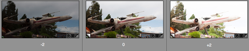
These three I put into my HDR software and got out a tone mapped HDR version. If the image, like this one, is shot in a low dynamic range situation like here, you can get fine results, when you tone map an image like this. It is only a pseudo HDR, but you still get the look from a real HDR.
At this time, I did not notice; but have a look at the darker image. That fits just perfectly into a night image. I figured that out later, but I only noticed this, because I had made this darker -2 version of the image. And that is the one in the final image.
Problem #2: Masking out the background from the X-Wing
The X-Wing is a pretty regular shape, and it is not too hard to cut out using the Pen tool. The Pen tool can create a Path, which can be converted to a very sharp mask, but it takes a little practice to use.
But for an object like this X-Wing, it was the only real option. I tried some of the magic tools in Photoshop at first, but it just didn’t work well enough in this situation.

The Pen tool you will find here:
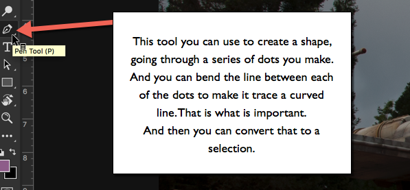
The Pen Tool allows you to set a series of dots. Photoshop will play “connect the dots”, and if you end up closing the line, you will have a shape. That shape you can convert to a Selection.
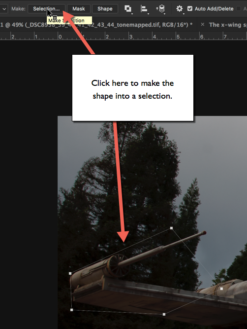
You get some options before you get your selection.
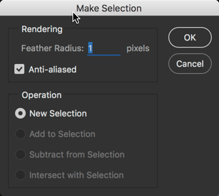
Starting from the bottom, you want to create a ‘New Selection’, and you also want to have it on ‘Anti-aliased’, because it makes a smoother transition between the neighboring pixels on the edge.
And the first option is ‘Feather Radius’. If you set this to zero, you will get a very hard edge, and it will not blend very well with a background. Typically I use values between 0.5 and 2, depending a bit on the size of the object, the resolution and what it is. For the X-Wing I used 1-pixel feather radius, and that looks great.
How to use the Pen Tool in Photoshop?
This takes a little practice before you get the hang of it. Start by setting the first dot at a location good for closing the path to a shape. A corner is always a good place.
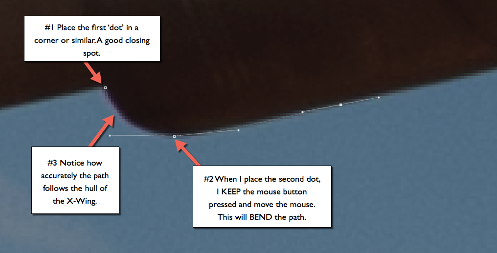
When you place the second dot DO NOT let go of the mouse button. Keep it pressed and move the mouse, notice how the path begins to bend, depending on how you move your mouse. Use this to make the path follow the shape, you want to have a mask for.

You also get two additional lines (handles). The handles tell Photoshop how to bend the path. Each dot has two handles, one for bending the path before the dot, and one for bending the path after the dot.
The path between two dots is controlled by two handles, one from each dot.
Moving handles: A handle can be moved if you carefully position the mouse exactly over the handle and press ALT. Then you can drag it around and change the path. It is necessary to use this in corners and whenever there is a need for a sudden change in the direction of the path.
And when you miss the handle, just press Undo. You will miss it 100 times because it is small.
Moving a dot: You can move a dot if you press CMD on a Mac or CTRL on PC. Again, be careful to place the mouse exactly on top of the dot, and as with the handles use Undo, whenever you miss. And you will miss.
It takes a little practice, but as soon as you get going, you can make a perfect mask for the X-Wing in less than 30 minutes.
Problem #3 making a seamless composite
As mentioned in Problem #1 I ended up using the darker exposure, and when I added the mask (just press the ‘add mask’ when your selection from the path is active), the X-Wing appeared on top of my Milky Way. As you can see in this 270% crop, the transition between the X-Wing and the background is seamless. This is because of the ‘Feather Radius’ of 1 pixel, as mentioned in Problem #2.

I made three duplicates of the X-Wing layer, and resized and rotated them a bit, to make them look like three individual X-Wings. I also distored the shape slightly, but not too much. Too much would be obvious, because the perspective would be distorted.
The second part is to make the light match both in intensity and colors. The original X-Wing is shot in daytime, and the colors match a daytime.
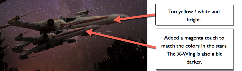
To make it fit better I change the colors, using a curves layer. I have organized my three X-Wings in a Layout Group. I can target any adjustment layer to only the the layer just below, and if that is a Group of layers, they will all be targettet. But my background will not be targetted.
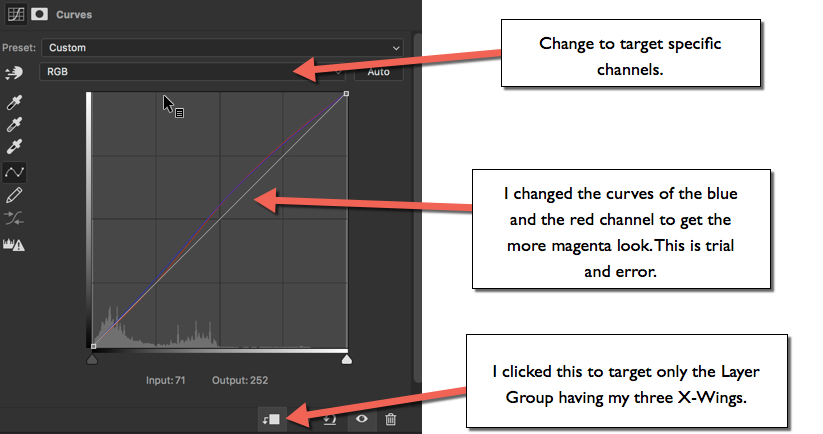
I also have a curves adjustment layer to make the ships slightly darker.
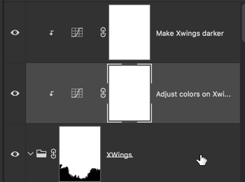
The X-Wings now have a good and transparent blend with the background.
Problem #4 placement of the X-Wings
I decided to go with the idea of three visible X-Wings on a patrol. It should look like they are flying at a low altitude, and just flying over the woods as I shot the photo.
The third X-Wing would have to be half hidden by the trees to make this work. To make this work I needed a mask for the trees only, to hide the part of the X-Wing that should look covered by trees.
In the latest version of Photoshop CC 15.5 there is a new Masking tool, and using that, I pretty quickly got a usable mask for the trees.
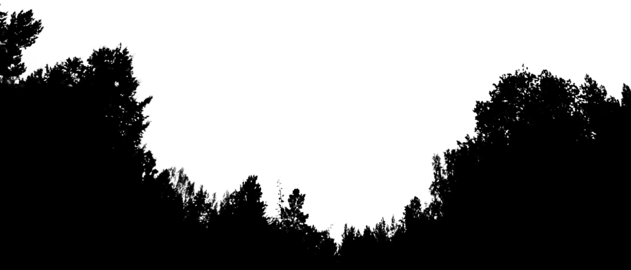
The new masking tool is accessed by using:

And putting this mask on top of the X-Wing Group allows me to half hide the third X-Wing behind the trees and the illusion is complete.
Thanks for reading
If you enjoyed reading this article, you might also enjoy my latest book “10 Essential Tips for Fine Art Photographers“. What you get from the book, that you don’t get from the blog is the mindset and organized rock solid tips on how to become a Fine Art Photographer producing professional images.
–Jacob
]]>

Roskilde Cathedral Square. A 169 megapixel image stitched from 28 downscaled images.
There is something about panorama photos or stitched photos that fascinate me. It’s a bit like a fisheye lens, that shows the world in a way you can’t see with the naked eye.
A panorama photo serves multiple purposes seen from my perspective. The obvious reason is to include more of a scene in one photo, in a panoramic way.
Another reason is to compensate, for a missing lens. If you haven’t got that really wide angle lens in the bag, shoot two less wide angled images, and stitch them when you get home.
An even more fascinating reason is to use it as an effect. An effect that can distort the world, just like the Fisheye lens does, only in a different way, but often with some resemblance.

Same scene more or less, just shot with a Fisheye lens.
And what I like even more about panorama photos, is that I find it hard to predict the result. There is always a surprise. Sometimes I use my iPhone and shoot a panorama, it can help visualizing the scene as a panorama image, but the iPhone doesn’t work when it gets dark.
I have a deep passion for showing the World in a surreal, yet recognizable and realistic way. I have one foot in the surreal world and one foot in reality. Sometimes I have more weight on one foot, than the other.
Panoramic photos give me another way to add surrealism to my photos, and I like that.
The story behind why I shot this 28 image photo, is that I have grown fascinated by Medium Format cameras, and the fact, that a 60mm Medium Format lens is approximately the same as a 24 mm full frame lens.
Apparently a Medium Format lens distorts the scene less, but instead of spending a huge fortune on a Medium Format camera, I thought, shooting at 50mm and stitching the afterwards, would give a similar effect. As it turned out 50mm was too many shots, and I went to 39mm instead.
I must say, that the perspective is much less distorted, than in this 14mm shot. It is shot at approximately the same distance as the panorama.

14mm on a full frame. Shot at the same distanse as the 28 image stitch.
Stitching the Panorama photos
Panorama photos, or stitched photos, are several photos that are stitched together. Lightroom and Photoshop both have features to support this.
From my experience, Lightroom does a great job on simple panoramas but gives up on more complex stitching tasks. Photoshop is better and has got a few additional options.
But neither Photoshop nor Lightroom could give me, a decent result for this photo. The problem was the projections mapping the images distorted the image in an unpleasant way.
A projection is like when you want to map the round Earth to a flat piece of paper. In a way you record a sphere, from the inside, when you move your camera around shooting photos. When you project something round to a flat surface, you have to make some compromises. Just try to flatten the peel from an orange.
There are different algorithms, or projections for doing this, and they give different results. You just need to find one you like.
This photo is made of 28 photos shot with my Sony A7R, which means 36 megapixels per image, that is a lot of pixels.
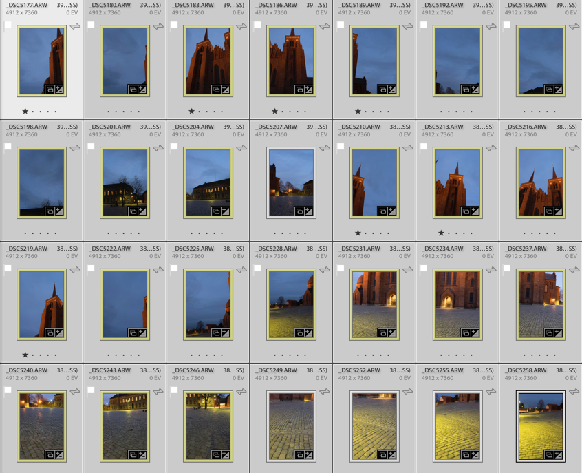
Shooting that many 3 shot HDR photos during the blue hour is a problem. The light changes so rapidly that you get different light in the photos, and I had to reshoot some of the photos because the light had changed too much. Luckily I discovered that before I moved the camera.
Lightroom only offered one projection, which looked terrible. For some reason, it would do not the two other projections. This is something I encounter from time to time.
I then exported to Photoshop, picked automatic projection and in a few moments, the fan went to high speed, and the computer got sluggish. Half and hour or maybe an hour later Photoshop was still stitching, and suddenly I got a warning “Out of disk space”. What?!? I have 700 Gigs of free space!? I opened my Finder, but “nooo” disk space certainly was critically low.
I emptied the trash can, but suddenly the fan stopped. After another hour of waiting and nothing had happened, I realized that Photoshop had died on me.
Instead, I exported the photos as TIFF 16-bit in 3000×2000 pixels. This Photoshop could handle nicely. I chose TIFF 16-bit, to be able to do some proper image processing later. When you export you only want to have fixed lens distortion, and synchronized the White Balance across all photos.
TIP: If your files are too big, export them as TIFF 16-bit, and make them smaller. You will still get a big file.
I have ended up with a 17.000 x 9.930 pixel image (169 Megapixel), using the smaller files. This is plenty for an insanely large print (7 yards wide, and you would still not be able to count the pixels close up).
Photoshop could now process the images, but I didn’t like the result. It got warped too much, in ways I didn’t like. Here’s an example:
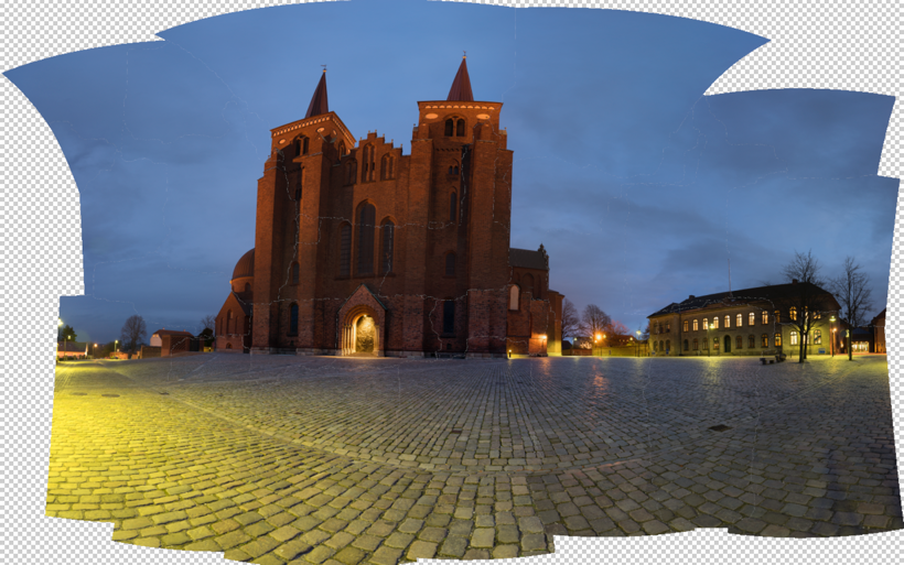
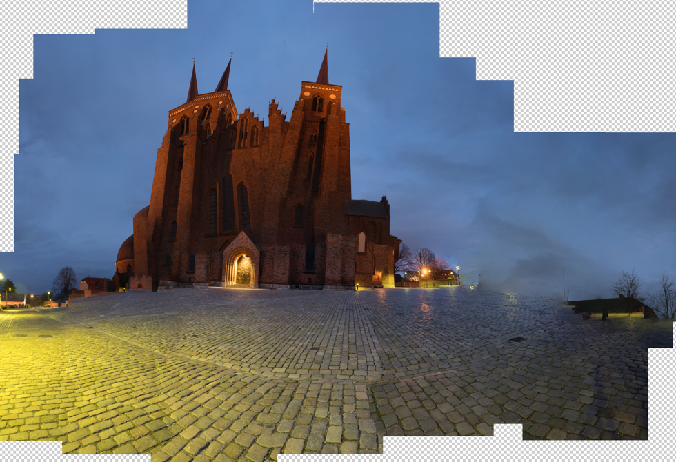
The default project from Photoshop looked terrible, and one of the others is a bit funny. I tried the others, butdidn’t get a result I liked.
Instead, I turned to Auto Pano Giga v4. This is the most advanced Panorama software that I know of. It’s not cheap, but if you can afford it, it’s worth every penny, and it get’s the job done. I only had the old version had to upgrade, and now I bought the bigger version. It integrates into Lightroom and Bridge, and there are some other advantages, I thought I would like to have.
Auto Pano Giga offers a huge range of projections, and some have parameters you can adjust. I picked the ‘Pannini’ projection and adjusted until I got something nice, and then I exported the final result to a Photoshop file. I still only used the 3.000 x 2.000 files.
And from this point, I processed only in Photoshop and later in Lightroom.
I have tried to run the full resolution files into Auto Pano Giga, and I does allow me to do it, however, it does take some time to process. But, it does not suck up all my free disk space. It works in a different way than Photoshop does.
The full resolution is 40.000 pixels wide, and in a slightly different crop, it is just north of 1 Gigapixel. Photoshop struggled with my 169 megapixels image, I think I will only process the full resolution, if anyone needs a twenty yards wide print, with crazy people stepping up in front to see if they can count the pixels (which they wouldn’t be able to, once scaled properly).
–Jacob Surland
]]>
“The Dungeon” created from the cloister at Chester Cathedral.
This post is the first in my new series of posts, which is called ‘The Weekend Post’. It is a post, that contains something good about post-processing or photography in general. It is more, than just “Hey, this is my latest photo”. If you don’t want to miss this series of posts, sign up on the website, and get it directly to your mailbox. If you have any particular topic, you want to cover, do not hesitate to ask me.
I am no good at painting and drawing, but I always liked to do it. For years, I haven’t painted or drawn anything, but my photography, or rather my post-processing, stimulates the same part of my brain (and heart for that matter). I always strive to get something out of my images, something that wasn’t there, when I shot it. Something that I create during the post-process. I see my RAW files as my oil and canvas, and I work from there.
Some photos have a lot of potentials, others don’t. The photos I get a kick out of processing, are the ones, that come out quite different, than what they looked like, and still look good. You can knock yourself over on the wrong side of the road if you just go crazy. I try not go crazy, but I do experiment a lot. My aim is to add some etherealness, something otherworldly, something surreal and perhaps even painterly to my photos in my photos. That is what gives me a kick.
Not two photos are alike, and they deserve individual post-processing. I am not in the ‘click on a button’ processing business because it is the post-processing that I love most. It is the post-processing that sparkles my creativity, it is the post-processing that resembles painting the most. And I did love to paint.
I have a chest full of tricks, tools, ideas and methods that I apply to my photos. I use the problem-solving part of my brain for creating images. I see all photos as problems, that needs to be solved, because, I am pretty good at solving problems.
Let’s walk through the photo from this post. What I started out with, was this photo:
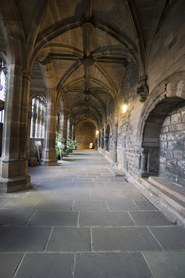
The unprocessed 0-exposure. Not a very interesting light, and yet it had potential.
The shot is a 3-shot HDR photo shot with my Sony A6000 in Chester Cathedral. The Cathedral is HUGE and in connection to the Cathedral itself, there is built a cloister like you find in monasteries, around a garth. However, that cloister had Christmas trees, and other objects, that I didn’t want in my photo. However, there wasn’t any way I could exclude them from my photo. I shot it anyway, even if I felt lacked something for the scene. But, better safe than sorry.
A few months later, I came past the photo in Lightroom and thought I would give it try in the post-processing. I often to do that, with photos that I am not sure if they will work out. Sometimes, I get an idea and get something great out of it, and when if I succeed, these are often the photos I love the most.
Some photos are bound to be successful, because the light is gorgeous or the composition so striking, and and light good enough. But a photo like this one from Chester Cathedral, was not a given success.
What I did, was that I started out on my HDR processing workflow. I mostly use Photomatix Pro for creating my more artistic HDR photos. The new HDR feature in Lightroom I also use, but only for less artistic HDR photos.
I liked the mood that Photomatix generated, even if for some of the disturbing objects:
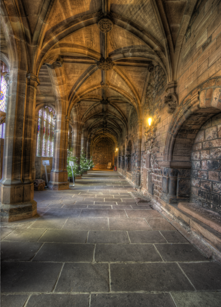
This is what I like about Photomatix. It manages to extract a lot of mood and warmth. You can’t use it straight out of Photomatix Pro, but there is a good start.
At this time, the problem-solving part of my brain kicks in, solving the problem ‘How to create harmony?’ And it didn’t take long, before it came up with the idea to mirror the image. It was the straight line in the roof, that brought the idea into play, combined with one other fact. The Chester Cathedral is only almost symmetrical in every way. NOTHING in Chester Cathedral is symmetric, even when you expect it would be. So my mind had been thinking about symmetry, in connection to the photos I shot there.
My initial intuition, was to remove the window part and the Christmas trees, and that gave me The Dungeon. I instantly fell in love with that, and wanted to finish that. But I got the idea to, try out the opposite and to my surprise that worked out as well. And in the end, I ended up having two different photos, made from one photo.

The mirrored cloister in Chester Cathedral.
This post is a first post in the series “The Weekly Post”. It will be published every Friday. If you want to be sure not to miss it, follow my website, and you will get the post on a mail every time it is posted.
Have a nice weekend.
–Jacob Surland
]]>
Wide version of photo of Pantheon.
We didn’t have any breakfast when we left the hotel early to photograph the Spanish Stairs. We figured that was ok; the hotel was quite nearby the Spanish Stairs. When we got the Spanish Stairs, they were sealed off for restoration. There was no way; we could not get any photos worth the while.
We decided to go for the Pantheon instead, but we were under pressure now. To reach the Pantheon long enough before sunrise required a forced walk. Empty stomachs and a forced walk was not the best cocktail. Half way to Pantheon we were saved by an open coffee and pastry shop. Among police officers we bought a croissant, and we were fueled, and made it to the Pantheon just in time.
About the processing of this photo
You can always process photos in different ways. Some even make a colored and a black and white of every single photo they make. I rarely do more than one version, of each photo. Sometimes I go back to fix something, that I find too displeasing in a photo.
But this one of Pantheon I have done two versions of. They share the same image processing, more or less. It is not the same file anymore, but they originate from the same HDR photo, and their path separated very late in the process.
A part of my workflow is to rumble through photos in Lightroom mobile whenever I have a few minutes. I do some preliminary processing, to find candidates for processing. Often I get an idea of what the final result could be. One of the limitations in Lightroom mobile, is that you can’t fix perspective. So I played around with cropping instead on this image, and I ended up having this very wide version of the image, that I got to like very much.

Tall version of the photo of Panteon, showing the stars more clearly.
Later when I was finalizing the processing I tried to do a perspective correction, and I liked that too. At first I stuck to the one with the perspective correction, but later I decided both qualify for final images. So here the are.
–Jacob Surland
]]>
Ancient Chicago… with dreamy lamps.
The shot is one from the shelves, and I don’t remember the exact goals from, when I shot it, I guess I thought this ancient looking construction, with skyscrapers in the background, looked cool.
But processing wise, I had an idea I wanted to try out, a special processing technique on the lamps. It was an idea I got when I saw another photo. I often do that. See something and think, that looks cool, wonder how that is made. Sometimes it takes a while to figure out, at other times, it comes easy. This is one had been lying around in the back of my head, and then one day, an idea struck me as lightning.
Before this gets too abstract, let’s get down to what it’s all about. I had seen this photo having street lamps in the dark. And I really loved these lamps, they looked just awesome. And one day, I came by this photo from Chicago in Lightroom, the word ‘dreamy lamps’ popped into my head. I was convinced I knew how those lamps in the other photo were made.
The idea works on night shots including lamps, like this one from Chicago does. As soon as I realized, that I thought of the lamps, as dreamy, I instantly knew I had to try to apply Orton effect on the lamps, maybe even a lot of it.
Afterwards, I went back to the photo, that originally inspired me, and I saw that, what I had remembered about the lamps, really was wrong. It was something, my mind remembered, and I had just done my own “invention” (probably not the first in the World to do it, but at least independently).
The principle I thought I would use, was to do a double Orton effect on the lamps, locally, to make them dreamy.
Creating dreamy lamps
As it turned out, an idea always needs to be twisted a bit. As it turned out I had to apply quite a lot more on the lamp at the left side.
What is the Orton effect? I have a longer post on it here, but let’s just repeat quickly.
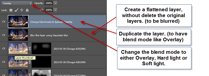
Create a flattened layer, without delete the layers below. You can do this by pressing CTRL + SHIFT + ALT + E (or on a Mac CMD + SHIFT + ALT + E). This feature I haven’t found anywhere in the menus, but I use it all the time.
Now duplicate the new ‘flattened layer’. You now have two identical layers on top. Change the blend mode on the top layer, to either Overlay, Hard Light or Soft Light. Sometimes ‘Screen’ can also be used, but I mostly use Overlay.
Go to the lower layer, and blur that using Gaussian blur. You can see the effect change as you change the blur level. Find a level you like. This effect is called Orton effect.
I then place these two new layers in a Group, and a black mask to this group (or a white, and invert it (CTRL + I or on a Mac CMD + I). I can now paint in what amount of Orton effect I like, in particular around my lamps.
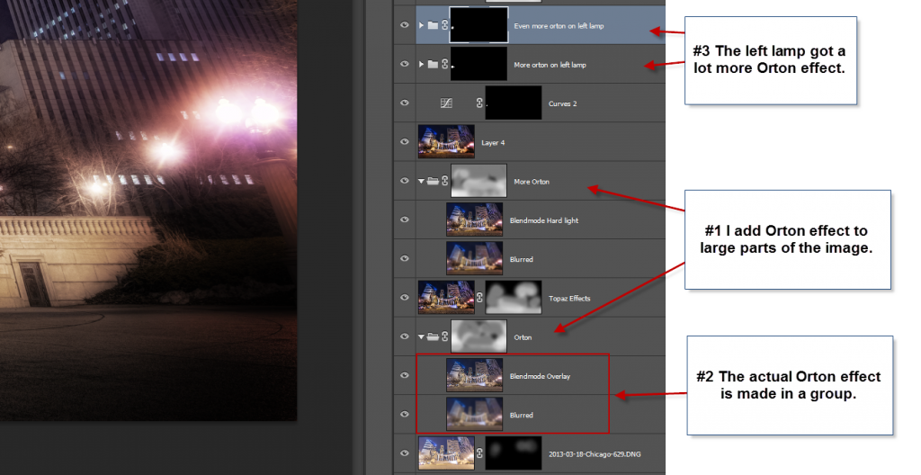
As you can see I applied Orton effect on the rest of the photo too, but just to a lesser degree. It turned out, that strong Orton in a local place, did not work out too well. It had to be used a bit more general to look good. But I did get the lamps that I wanted, even if it was different from what I had got inspired from.
–Jacob Surland
]]>
This photo is a ‘pseudo HDR’ photo, which means that I have processed it like an HDR, but only from a single exposure. To get the best result, I prefer to make 2 virtual copies in Lightroom, so that I have a -2, 0 and +2. The lightest one will be very noise, especially because I shot this at ISO 800. I crank up the noise reduction all the way to the top on the light one, and the other ones moderately high.
We visited Milan quite by accident. Milan has some pretty awesome things to photograph. I really love these vintage trams. I saw this one on the way back to the hotel.
But how do you get to Milan by accident? Well, we had planned a train trip to Venice, but there was a train strike in Germany, and we had to find other means of transport to get to Venice. As it turned out, plane tickets were insanely expensive to Venice, on the dates that matched our hotel booking. While plane tickets for Milan, on the other hand, were quite cheap. If we stayed for the night on our way to Venice and back again, we got everything included for the same price, as the refunded train tickets.
Milan turned out to have some pretty awesome places to photograph, like the ‘Galleria Vittorio Emanuele II’ shopping mall. It’s one the oldest shopping malls in the world, and definitely worth a visit! The same goes for the Milan Cathedral.
]]>
Chateau Queyras in the French Alps looks fantastic lit up in the night. This is a long exposure of no less than 370 seconds.
Long Exposure Photography is fascinating. By changing the exposure time, you achieve dramatic changes in the final result. The two photos featured in this post, are shot within a 25 minutes of each other. The first one is a long exposure og 370 seconds, and the second is a normal exposure of 0,5 seconds. Even if the images are processed different, you can easily tell the difference, if you look at the clouds.

This is a normal exposure shot 25 minutes earlier than the first one. It is only 0,5 seconds, and is processed as an HDR image.
The first photo I shot 25 minutes later having attached a 2 stop ND filter on the camera. A neutral density filter, or ND filter, stops the light down, without changing the colors. A 2 stop ND filter will double the exposure time twice. This photo was the last photo I shot from that location, and it was getting pretty dark, and I wanted to be sure that the clouds were completely smooth.
The clouds were moving a lot, and sometimes I could see the top of the mountain just behind Chateau Queyras, and at other times it was hidden in the clouds. The exposure is 370 seconds or 6 minutes and 10 seconds. In long exposures like that, you can not predict what happens. I was lucky that clouds left the top of the mountain clear in most of those 6 minutes, giving me a hat on top of Chateau Queyras.
I shot it, at f/16 and ISO 100, using my 2 stop ND filter. Had I not used the ND filter, I would have had an exposure of 370 seconds diveded by 2 twice or just by 4, that is 370/4 = 107.5 seconds. A 107.5 seconds is still a long time, and might have yielded a similar result.
I find that to smooth everything out 100% and leaving no textures what so ever, does require more time, than a minute. I wanted to be on the safe side in this case and put on a 2 stop ND filter.
You can also use ND filters during more bright times of day. Had I used the 2 stop ND filter on the first image, I would have increased the exposure time from 0,5 seconds to 2 seconds, which wouldn’t have changed a whole lot. But if I had put on a 10 stop filter, I would have had a 512-second exposure, which would have yielded a similar smooth result.
To fine tune the necessary time, you can change ISO and f-stop values. To lower the exposure time from 512 seconds, to about 370 seconds, I could have lowered the f-stop to f/14 or f/13.
To be able to work flexible using ND filters you need a set of ND filters, to be able to match the desired exposure time. I have a 2, 3, 6 and 10 stop filters. Choosing the right filter, combined with the right ISO, Shutter speed and aperture (f-stop) is what makes your exposure, when working with ND-filters and long exposures.
How to calculate the exposure time
But how to calculate the exposure time? It does require some brain activity to calculate your ways around to get the right exposure time.
Depending on, what ND filter you have on, and how long you approximately plan on making you exposure, you can do a few things. If you plan on exposing for 60 seconds, you can increase ISO to the double value (like ISO 100 to 200). Then then you can adjust filters and f-stop to until, the camera measures a 30-second exposure. Adjust the ISO back to the original value.
Another approach is to do test shots without the filter and when you have the right exposure time, attach the filter and recalculate exposure time.
You can also use an App to help you calculate and time your exposure. While this might seem perfectly easy, I always end up finding it too cumbersome and end up doing the math myself and use the timer in my iPhone.
One thing you have to be aware of the light is changing fast, is that your will have to compensate for that. If it grows brighter, you have to take that into account, shortening the exposure time. And the opposite if the light is fading, you will have to increase the exposure time with a stop or two, depending on how fast the light fades.
The shooting
The obvious thing is; you need a tripod. You can’t do long exposures handheld.
You have to be in manual mode, and switch of auto ISO to do long exposures. You need to be in control of all three parameters, ISO, Aperture and shutter time. Most DSLR or DSLR-like cameras (including the mirrorless cameras) has a maximum of a 30-second exposure. Bulb mode is required to make exposures longer than 30 seconds. Usually, this is something, which you dial to, using the same dial as you use for changing the exposure time.
You also need a remote release. You really want to be avoiding to touch the camera, while shooting. I have a simple cable release. I bought an advanced electrical one, but it died on me, in fact right before shooting this image, and I had to borrow another cable release.
You also want to switch on long exposure noise reduction. If you don’t you get strange hot pixel noise. The sensor heats up while exposing for such a long time, and the long exposure noise reduction, will help reducing the result from that. The downside is that it takes just as long to do, as your exposure took. A 6-minute exposure will also give a 6-minute noise reduction. That is a hard one to swallow.
And that is the basics of long exposure photography.
]]>
I shot this the other day, while waiting for my son while he is at music training. I have 40 minutes, and this time of year, it fits with the Sunset.
Brorfelde is an old observatory, that I have wanted to see for a while. When I got there, all of the trees had just been cut down, and the ground was all tractor wheels and ruble. Not exactly a great ground for photography. But I tried to clone out the worst of the tracks, and then I darkened the ground quite a bit.
My goal with this one, was to make a fairly classic sunset photo, with the two observatory buildings leading to the sun. I captured a couple of people riding the horizon. These I left in the image, though they would be easy to clone out, because they add value to the image.
Interesting trick used
The wall on the nearest observatory building is full of grafitty. To get rid of it, I duplicated the layer, blurred the top one, just enough to make the writings disappear. Then I took a texture of a wall, used overlay blend mode and painted that gently on top of the wall, and then the wall still has it’s color from rust and the light, but also new texture.
This is the grafitty – to particularly pretty. Notice the rust on the wall.

First thing I did was to duplicate the layer, and then blur using Gaussian Blur in Photoshop. I blurred just enough to make the grafitty unreadable. I then added a black layer mask to the blurred layer and painted the blurred layer on in, wherever the grafitty was.
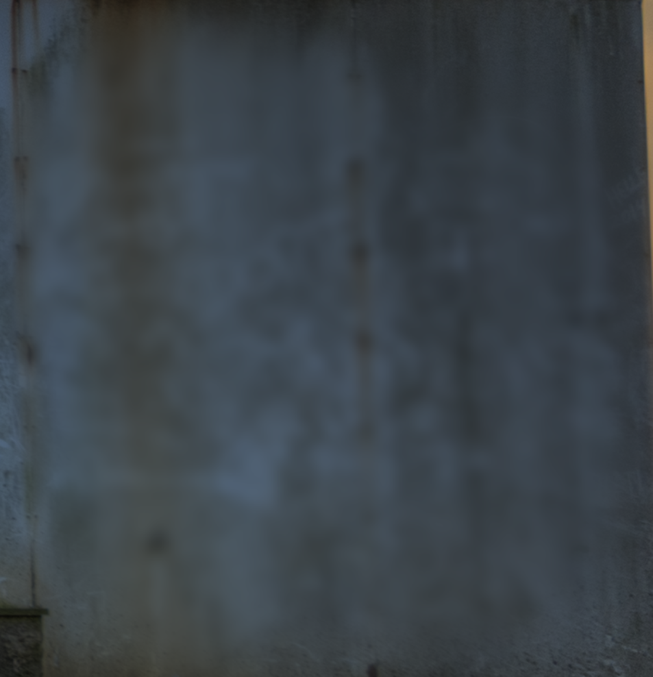
I then found a texture of a wall and by using the feature ‘Blend mode’ in Photoshop. I can add back some texture to the wall while I still keep the colors of the original wall. Notice the rust is still there.

I did it by changing the blend mode on the layer with the texture. I added a layer mask to that layer too and painted in the texture where ever I had painted in the blurred layer. The blurred wall, now receives texture but keeping its colors. There are a number of different Blend modes, i just tried all of them, and picked the one, I found best for the purpose. In this case, it was Pin Light.


This photo was the last photo after about an hour of photography in Milford Sound in New Zealand. This boat is the first boat early in the morning, one of many that will sail tourists around in the magnificent Milford Sound.
Unfortunately, one of the major drawbacks of cameras with interchangeable lenses, is that they collect dust, when you change from one lens to another. You can take a lot of precautions, like holding the camera downwards, when unscrewing the lens and make a quick switch. No doubt precaution works, but there is still no way around it, you end up with dust inside your camera, and some of that dust places itself on the sensor.
I have my Rocket Air Blaster
Spots also get more visible the smaller the aperture (larger number!) is. If you are on f/2.8, only large spots will be visible, while if on f/22 you will see every little dust spot.
On top of that, I own the Nikon D600, which is known for it’s sensor spots. The problem is more or less gone now. And my D800 was pretty bad too. Both seems to do better now. Nikon have had both in for cleaning more than once, and apparently they have done something to improve the problem.
Anyway, I get dust spots on my images, and how do I remove them?
How to remove Dust Spots in Lightroom
Lightroom has a healing brush. What it does, is to do clone some other part into the image into the area you want to heal. It’s not an exact clone, it tries to match the tones. An exact clone is possible too.
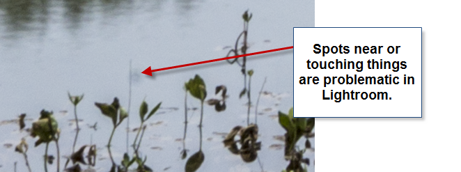
Lightroom’s Healing Brush works perfectly in skies and other fairly even areas. But if the spot sits near or in some texture, etc. I find that the Lightroom Healing Brush is not good enough, and then I prefer to use Photoshop. Photoshop has got much stronger healing tools, the downside is, that Photoshop does not have the Visualize Spots tool. If I need to clone something out, Photoshop is also the only tool good enough of the two.
The Healing Brush is located in the Development Module of Lightroom.
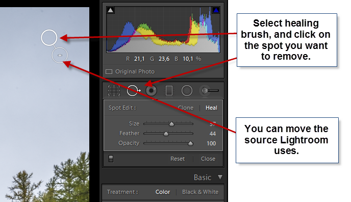
The Healing Brush samples from somewhere in the image. Sometimes it picks something ridiculous, and you need to move the sample point to somewhere else.
Some spots are very easy to see, but others are more difficult see. In Lightroom, there is a cool tool, to visualize spots. When the Healing Brush is active, there is a Toolbar (try hitting T if it’s not there, sometimes I accidently hits T, which instantly hides the toolbar). Click on the checkbox and move the slider all the way to the right.
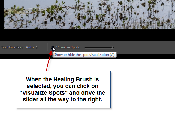
Now the spots get really easy to see. And if I didn’t know better, I would have thought this photo below, was a starry sky. Unfortunately, it’s dust spots on my sensor (oh dear a dirty sensor). It is a sort of an inverted image, that enhances the dust spots.

The spots in the sky Lightroom can fairly easy handle. The only problem is that there is a ton of dust spots in this photo. Lightroom will most likely use samples including other dust spots, and spots close to each other are difficult to remove, because you can make two healings very close to each other.
It’s more problematic in the lake. Here I can see dust spots in the plants. And this Lightroom really handles bad. This I would fix in Photoshop everytime.
How to detect dust spots in Photoshop
In Photoshop, there is a couple of tools I use a lot for spot removal. For many things, in non-problematic areas I just use the Spot Healing Brush (#1).
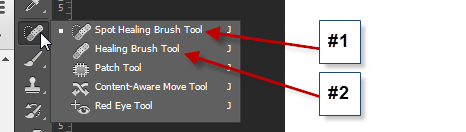
But if things get difficult, and I have to be precise, I start using the Healing Brush Tool (#2) or Clone Stamp (#3).
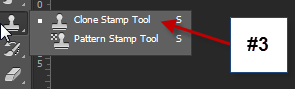
These tools are not too difficult to use and I will not cover their differences in this tutorial.
How to heal images in Photoshop non-destructively
Recently I learned how to do healing and cloning in Photoshop in a non-destructive way, and I like to work non-destructive. That makes it possible to go back and fix stuff, which I missed earlier.
First I add an empty layer:
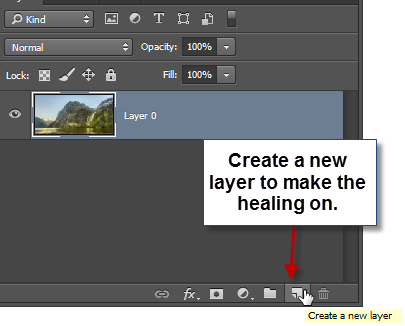
It will be on this new layer I will be doing the healing. The next thing I do, is to add a temporary Curves Adjustment Layer. I will only use it for detecting the spots. When my spots are gone, I will delete it again.
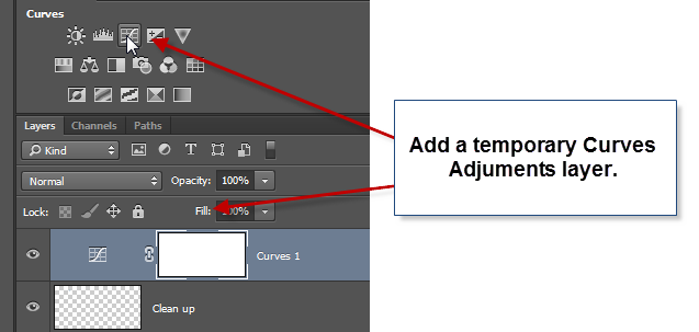
Then I make a really wild curve. The curve will be slightly different for each image. I work the curve until I can see the spots. The colors go wild, but that doesn’t matter, because I will remove the curves, when I am done cleaning up.

The spots in this image were difficult to spot, and I missed them at first.
To heal the spots, I select the Healing Brush and make sure Sample All Layers is checked. This way I can do the healing on the empty layer, and not on the image itself.
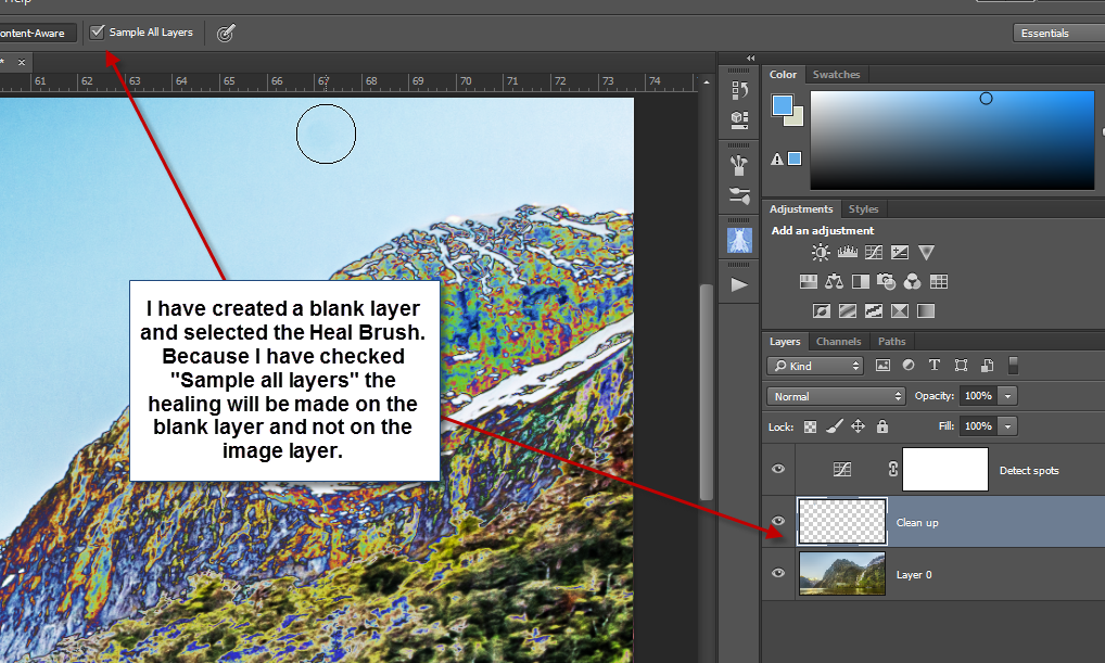
The curves layer is very effective in detecting irregularities, and the healed spots may still be slightly visible. But do rest at peace, Photoshop cleaned it away. If you are in doubt, click on the Eyeball of the curves layer, to hide it. This way you can verify your work.
When I am done cleaning the spots away, I just delete the curves adjustments layer, and my image is clean.
]]>

Ryd Junk Yard in Sweden.
The Orton Effect is named after photographer Michael Orton, who invented the method back in the 1980’s – that’s in the film era, but you can apply it to digital photos too. It’s like digital magic. And digitally you can even control it much better and easier than you could in the old film days.
The Orton effect applies a magical soft and dreamy look to your photos, you could call it Glow. It has a softness to it, and yet it remains a sharp photo, if zoomed in.
The junk yard photo above, has Orton Effect applied in the trees and the leaves, and the tree below also has Orton Effect (click to see larger version). And as you can see, it is both sharpness and unsharpness at the same time. That is what gives the magic dreamy look.

It really can be that piece of digital magic, you add to a photo, that makes it really unique and special, but you must use it with care. I fairly often use it (or one of it’s sisters – which I describe later). I use it in perhaps 20% of my photos, but I only use it selectively and sometimes even only in very subtle ways. If you compared to a version without, you would be able to see the difference, but otherwise you wouldn’t notice it, because I use it with care.
This is the final version of the tree from Wanaka in New Zealand, and it has one of the strongest uses of the Orton Effect I have ever used:

How to make the Orton Effect step by step
There are some requirements for making the Orton Effect, and these are:
- You need to have Photoshop (any version) or Gimp.
- You also need an over exposed photo. But don’t worry you can make one artificially.
The Orton effect works best on overexposed photos. If you do not have an over exposed photo, you can increase exposure artificially both in Photoshop and in Lightroom. I shoot HDR photos most of the time, which gives me over exposed photos that I can use for the Orton Effect. Later in this tutorial I will show how to make artificial overexposed photos, but also a couple of alternatives to the Orton Effect.
Let’s make some Orton Effect.
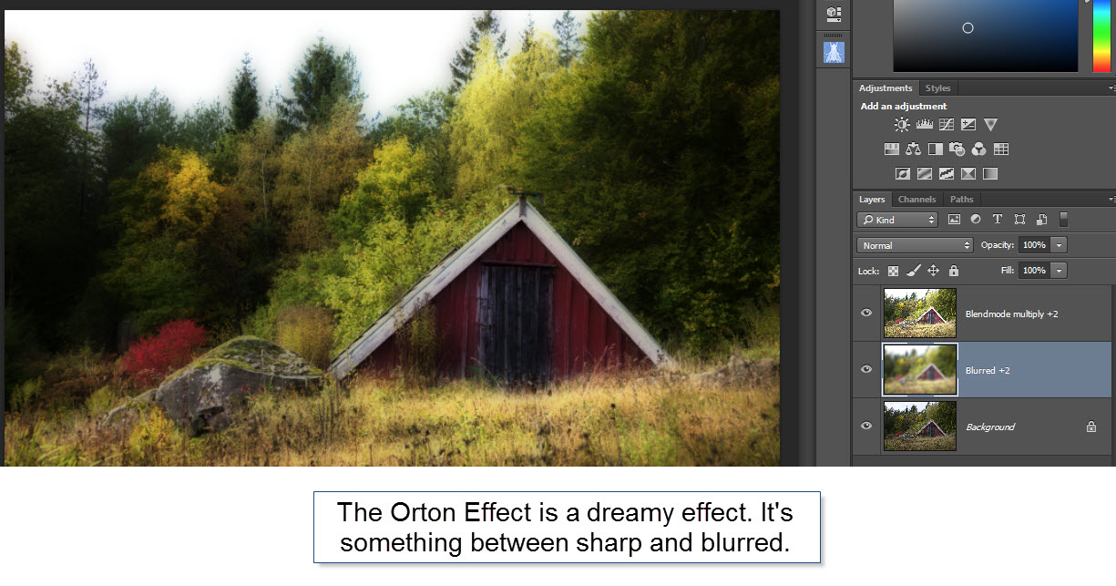
Step 1: First open your overexposed photo in Photoshop or Gimp. Duplicate the layer twice, so that you have three layers with the same image.
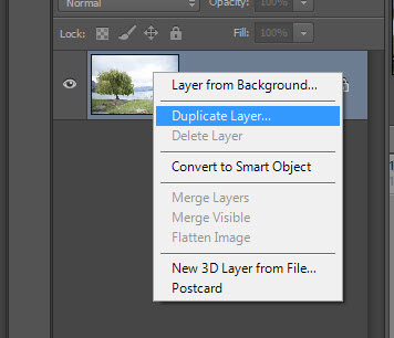
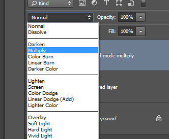
Step 2: On the top layer you have to change the Blend Mode to “Multiply”.
Step 3: The second layer must be out of focus, that is you have to blur it. You use Gaussian Blur to do that.
 Step 5: Try moving the slider between different pixel levels. As you can see in the preview, the Orton Effect changes, as you change the blur levels. It changes quite a lot.
There really are no rights or wrongs, just different effects, and you pick one that you like.
 Step 7: Don’t always use the same blur level, experiment for different effects, before picking one.
 Step 8: Merge the two layers forming the Orton Effect into one layer, that makes it easier to work with.
You can merge the two layers by selecting them and pressing CTRL + E or selecting it from the context menu.
 Step 9: Using the effect globally is generally not a good thing and by merging the two layers, you can add a layer mask, and the mask in what you like.
Create a black layer mask to hide the layer. This allows you to paint in what level of “Orton Effect” you want to apply in your photo, and more important, where to apply it.
You can add a Layer Mask by pressing the button, and then invert the layer mask by pressing CTRL+I, while having the mask in focus. Or you press ALT (or CMD on a Mac) and press the button, and you will get a black mask.
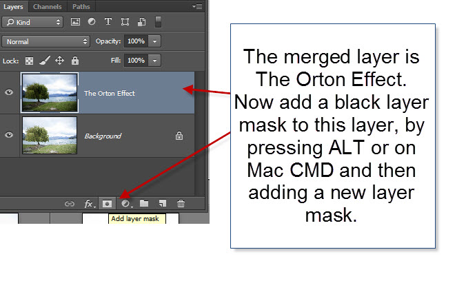
Step 10: Using the brush tool (read about layer blending here, if it’s new to you) you can paint in what level of Orton Effect you want in your photo. As you can see I only use it selectively.

The Sisters of the Orton Effect
You might already be thinking ‘What happens if I use some of the other blend modes?’ Well, most gives something that is quite unusable and psychedelic, but ‘Soft light’ and ‘Overlay’ gives something that you can use. The method is otherwise exactly the same, and the effect is somewhat similar, in particular for the ‘Soft light’.
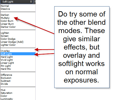
The advantage of using the Soft light and Overlay is that you can easier stick to your ordinary exposures.
As you can see, you still end up with a a nice and glowing images, that has a dreamy touch. This is Soft Light:
 And this is Overlay:

As it happens I often end up using either blend mode ‘Soft light’ or ‘Overlay’, rather than ‘Multiply’ because it works better with normal exposures, and therefore is easier to incorporate in my existing processing workflow. Or maybe I am just lazy.
Changing the Exposure to Overexposed
It’s really no big deal to make an over-exposed photo artificially. In Lightroom there is a slider for it, and you can make a virtual copy of the normal exposure, increase the exposure of it and export it along with the normal exposure.

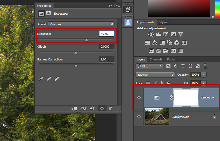
And in Photoshop you can add an Adjustment Layer for exposure, and do the exact same thing. And if you duplicate your layer, and merge the Adjustment layer to the duplicate, you will have both the normal exposure and the overexposed as two layers.
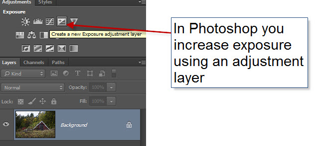 Adjust the exposure to overexposed by 2 stops.
And then you can do the Orton Effect easily:
 Enjoy using the Orton Effect or one of it’s sisters, but remember, to use it with care. Too much of everything is not great.