
Mountain Range and the Lake, New Zealand, 2012.
I don’t have as many landscapes as I would like in my portfolio. In some ways this is frustrating but in other ways, this gives me a lot of fun and artistic opportunities.
Recently I searched my New Zealand photos. I was there in 2012 on a family trip and for that reason true landscape photo opportunities were limited. By true landscape photography opportunities, I mean when you get up early at the right location and have all the time in the world, to wait for the weather to behave. I had a couple of those situations and I am very happy with the results.
New Zealand is packed with beautiful landscape and when I was not driving I often shot photos through the window of our mobile home. It requires a bit of practice to predict an upcoming scene and capturing it. But I managed to get a few. I noticed this photo and thought it had a bit of potential. There is a streak of
Recently, I noticed this photo and thought it had a bit of potential. There is a streak of sunlight on the mountain, which makes the whole difference. We drove past Lake Wanaka and Lake Hawea on this day and the light didn’t really play ball with me. But this one is slightly different, because of the sunlight on the mountain. However, the sky was not too good and the wind kind of ruined the water.

The original unedited (except for the crop) shows how much I have changed it. I replaced the sky with a more interesting sky I shot back home. Some time ago I began to shoot interesting clouds when I see some, just in case. This allowed me to try out several different clouds for this image.
What I searched for, was sky and clouds that could add something to the photo in terms of color and light and as well as play a part in the composition. I ended up using this one with pinkish clouds on the left. This is another one of the candidates I considered. I love the cloud formation, it looks almost like a dragon I think, however it is not a perfect match with the rest of the composition.

The replacement itself required a bit of tedious work along the snow-clad in the mountains. It is difficult for selection tools to tell the difference between white snow and white clouds. The eye can see the difference and I had to mask it manually.
When I had decided for the pinkish clouds I noticed a big difference in the colors of the image. The colors of the mountains looked too much like the late afternoon it was and not as a closer to sunset image. I needed to tweak the colors of the mountains and perhaps the water. There are many different ways to do it, I settled for using the gradient adjustment layer in Photoshop.

- I added the Gradient Adjustment layer.
- Then I changed the blend mode to Color. This affects the colors of the image, but not the tonality.
- Then I chose to colors from the clouds for the color gradient. I fiddled a bit with them, to get the right colors. And as you can see it added a nice purple hue to the area where the sun shines. Just what I had hoped for.
From here I worked with the contrasts and the water. I did a semi-motion blur on the water, to smooth out the contrasts a bit and make it look a bit like a long exposure.
These tricks place the image in the landscape category, but it is also more than that. My tricks add something unnatural to the image, which I like and it matches the game I play as an artist. Balancing on the ridge between the valley of the reality and the valley of surrealism.
This photo was great fun to make and it made me happy 
—Jacob
]]>
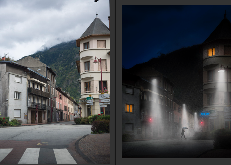
On the way home
I always have various projects that I am working. Some can go on for years at a low intensity but then suddenly bloom. Like this Day to Night concept.
I have been working on adding computer-rendered effects to my images to a greater extent and I am having a lot of fun doing it.
Today I have been working on this Day to Night image, which is a boring daytime photo from a small village in the french alps. We were on the way to shoot photos in Queyras and had to drive across the Galibier pass. As it turned out it was closed due to snow, and we had to go all the way to Italy to get there. It cost us 3 hours.
This is a before and after of the photo.

X-Wing Squadron in Sweden.
I had a lot of fun making this photo of three X-Wings from Starwars patrolling a Swedish night. I got the idea to make this image because I am working on a book on composition and I use a spaceship as a metaphor. I thought it would be cool to have a photo of a spaceship on those pages, but how do you get a photo of a spaceship? They don’t sit on every second corner.
My first thought was to use one my sons Lego spaceships (he has a ton of them). But before I acted I remembered this kind of cool shot of the ‘Space Mountain’ in Disneyland Paris and decided that would have to make do.

But I then shuffled a bit around in the photos from that area, and I noticed a photo of the X-Wing and an idea came to me. An X-Wing is a proper spaceship, just what I needed. I would put that on a shot of the Milky Way that has no foreground object or main subject, other than a bit of wood and the Milky Way itself.
I had two shots of the X-Wings from the same angle, just shot on two different days, using two different cameras. Had I known what I would need photos of the X-Wing at a later time, I would have shot a series from different angles, but I didn’t.

The original photo of the Milky Way looked like this:

This is the first shot I shot of the Milky Way. It requires an area low on light polution. This is place in Sweden is not too bad. You can see a bit of light polution just above the trees. However, the photo is not interesting in itself. There is a lack of interesting foreground.
The process of creating a believable composite
I wanted to make the illusion of three X-Wing fighters patrolling Sweden and to make that work and I could see some problems that I needed to be solved.
Problem #1: One photo is shot in the daylight, the second at night
I had to make the X-Wing fighters fall in, and I had two ideas, either a painterly cartoon-like approach or I could take a path on a more realistic look. I decided to try the painterly cartoon style first.
The photo is only a jpg, but I created two virtual copies in Lightroom and made an artificial -2 and +2 for an HDR processing workflow.
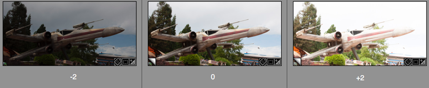
These three I put into my HDR software and got out a tone mapped HDR version. If the image, like this one, is shot in a low dynamic range situation like here, you can get fine results, when you tone map an image like this. It is only a pseudo HDR, but you still get the look from a real HDR.
At this time, I did not notice; but have a look at the darker image. That fits just perfectly into a night image. I figured that out later, but I only noticed this, because I had made this darker -2 version of the image. And that is the one in the final image.
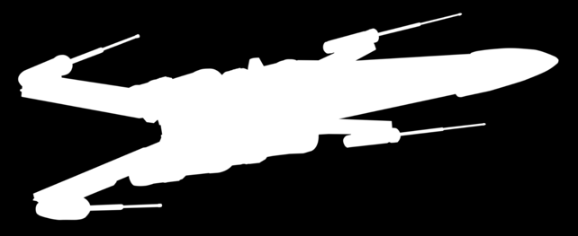
Problem #2: Masking out the background from the X-Wing
The X-Wing is a pretty regular shape, and it is not too hard to cut out using the Pen tool. The Pen tool can create a Path, which can be converted to a very sharp mask, but it takes a little practice to use.
But for an object like this X-Wing, it was the only real option. I tried some of the magic tools in Photoshop at first, but it just didn’t work well enough in this situation.
The Pen tool you will find here:
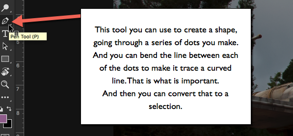
The Pen Tool allows you to set a series of dots. Photoshop will play “connect the dots”, and if you end up closing the line, you will have a shape. That shape you can convert to a Selection.
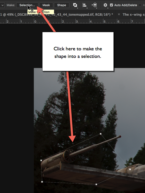
You get some options before you get your selection.
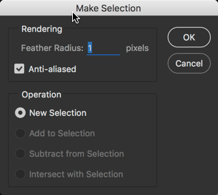
Starting from the bottom, you want to create a ‘New Selection’, and you also want to have it on ‘Anti-aliased’, because it makes a smoother transition between the neighboring pixels on the edge.
And the first option is ‘Feather Radius’. If you set this to zero, you will get a very hard edge, and it will not blend very well with a background. Typically I use values between 0.5 and 2, depending a bit on the size of the object, the resolution and what it is. For the X-Wing I used 1-pixel feather radius, and that looks great.
How to use the Pen Tool in Photoshop?
This takes a little practice before you get the hang of it. Start by setting the first dot at a location good for closing the path to a shape. A corner is always a good place.
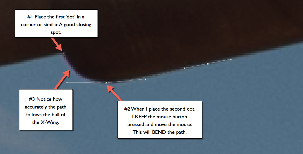
When you place the second dot DO NOT let go of the mouse button. Keep it pressed and move the mouse, notice how the path begins to bend, depending on how you move your mouse. Use this to make the path follow the shape, you want to have a mask for.
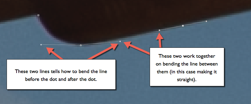
You also get two additional lines (handles). The handles tell Photoshop how to bend the path. Each dot has two handles, one for bending the path before the dot, and one for bending the path after the dot.
The path between two dots is controlled by two handles, one from each dot.
Moving handles: A handle can be moved if you carefully position the mouse exactly over the handle and press ALT. Then you can drag it around and change the path. It is necessary to use this in corners and whenever there is a need for a sudden change in the direction of the path.
And when you miss the handle, just press Undo. You will miss it 100 times because it is small.
Moving a dot: You can move a dot if you press CMD on a Mac or CTRL on PC. Again, be careful to place the mouse exactly on top of the dot, and as with the handles use Undo, whenever you miss. And you will miss.
It takes a little practice, but as soon as you get going, you can make a perfect mask for the X-Wing in less than 30 minutes.
Problem #3 making a seamless composite
As mentioned in Problem #1 I ended up using the darker exposure, and when I added the mask (just press the ‘add mask’ when your selection from the path is active), the X-Wing appeared on top of my Milky Way. As you can see in this 270% crop, the transition between the X-Wing and the background is seamless. This is because of the ‘Feather Radius’ of 1 pixel, as mentioned in Problem #2.

I made three duplicates of the X-Wing layer, and resized and rotated them a bit, to make them look like three individual X-Wings. I also distored the shape slightly, but not too much. Too much would be obvious, because the perspective would be distorted.
The second part is to make the light match both in intensity and colors. The original X-Wing is shot in daytime, and the colors match a daytime.
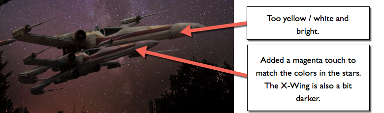
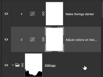
To make it fit better I change the colors, using a curves layer. I have organized my three X-Wings in a Layout Group. I can target any adjustment layer to only the the layer just below, and if that is a Group of layers, they will all be targettet. But my background will not be targetted.
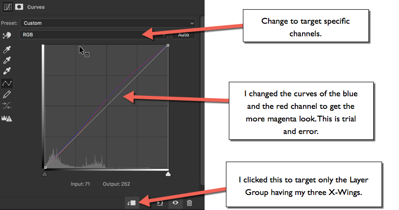
I also have a curves adjustment layer to make the ships slightly darker.
The X-Wings now have a good and transparent blend with the background.
Problem #4 placement of the X-Wings
I decided to go with the idea of three visible X-Wings on a patrol. It should look like they are flying at a low altitude, and just flying over the woods as I shot the photo.
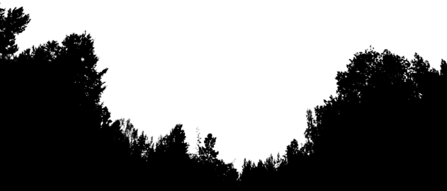
The third X-Wing would have to be half hidden by the trees to make this work. To make this work I needed a mask for the trees only, to hide the part of the X-Wing that should look covered by trees.
In the latest version of Photoshop CC 15.5 there is a new Masking tool, and using that, I pretty quickly got a usable mask for the trees.
The new masking tool is accessed by using:

And putting this mask on top of the X-Wing Group allows me to half hide the third X-Wing behind the trees and the illusion is complete.
Thanks for reading
If you enjoyed reading this article, you might also enjoy my latest book “10 Essential Tips for Fine Art Photographers“. What you get from the book, that you don’t get from the blog is the mindset and organized rock solid tips on how to become a Fine Art Photographer producing professional images.
–Jacob
]]>

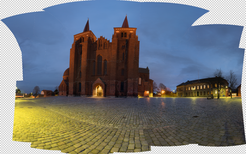
Roskilde Cathedral Square. A 169 megapixel image stitched from 28 downscaled images.
There is something about panorama photos or stitched photos that fascinate me. It’s a bit like a fisheye lens, that shows the world in a way you can’t see with the naked eye.
A panorama photo serves multiple purposes seen from my perspective. The obvious reason is to include more of a scene in one photo, in a panoramic way.
Another reason is to compensate, for a missing lens. If you haven’t got that really wide angle lens in the bag, shoot two less wide angled images, and stitch them when you get home.
An even more fascinating reason is to use it as an effect. An effect that can distort the world, just like the Fisheye lens does, only in a different way, but often with some resemblance.

Same scene more or less, just shot with a Fisheye lens.
And what I like even more about panorama photos, is that I find it hard to predict the result. There is always a surprise. Sometimes I use my iPhone and shoot a panorama, it can help visualizing the scene as a panorama image, but the iPhone doesn’t work when it gets dark.
I have a deep passion for showing the World in a surreal, yet recognizable and realistic way. I have one foot in the surreal world and one foot in reality. Sometimes I have more weight on one foot, than the other.
Panoramic photos give me another way to add surrealism to my photos, and I like that.
The story behind why I shot this 28 image photo, is that I have grown fascinated by Medium Format cameras, and the fact, that a 60mm Medium Format lens is approximately the same as a 24 mm full frame lens.
Apparently a Medium Format lens distorts the scene less, but instead of spending a huge fortune on a Medium Format camera, I thought, shooting at 50mm and stitching the afterwards, would give a similar effect. As it turned out 50mm was too many shots, and I went to 39mm instead.
I must say, that the perspective is much less distorted, than in this 14mm shot. It is shot at approximately the same distance as the panorama.

14mm on a full frame. Shot at the same distanse as the 28 image stitch.
Stitching the Panorama photos
Panorama photos, or stitched photos, are several photos that are stitched together. Lightroom and Photoshop both have features to support this.
From my experience, Lightroom does a great job on simple panoramas but gives up on more complex stitching tasks. Photoshop is better and has got a few additional options.
But neither Photoshop nor Lightroom could give me, a decent result for this photo. The problem was the projections mapping the images distorted the image in an unpleasant way.
A projection is like when you want to map the round Earth to a flat piece of paper. In a way you record a sphere, from the inside, when you move your camera around shooting photos. When you project something round to a flat surface, you have to make some compromises. Just try to flatten the peel from an orange.
There are different algorithms, or projections for doing this, and they give different results. You just need to find one you like.
This photo is made of 28 photos shot with my Sony A7R, which means 36 megapixels per image, that is a lot of pixels.
Shooting that many 3 shot HDR photos during the blue hour is a problem. The light changes so rapidly that you get different light in the photos, and I had to reshoot some of the photos because the light had changed too much. Luckily I discovered that before I moved the camera.
Lightroom only offered one projection, which looked terrible. For some reason, it would do not the two other projections. This is something I encounter from time to time.
I then exported to Photoshop, picked automatic projection and in a few moments, the fan went to high speed, and the computer got sluggish. Half and hour or maybe an hour later Photoshop was still stitching, and suddenly I got a warning “Out of disk space”. What?!? I have 700 Gigs of free space!? I opened my Finder, but “nooo” disk space certainly was critically low.
I emptied the trash can, but suddenly the fan stopped. After another hour of waiting and nothing had happened, I realized that Photoshop had died on me.
Instead, I exported the photos as TIFF 16-bit in 3000×2000 pixels. This Photoshop could handle nicely. I chose TIFF 16-bit, to be able to do some proper image processing later. When you export you only want to have fixed lens distortion, and synchronized the White Balance across all photos.
TIP: If your files are too big, export them as TIFF 16-bit, and make them smaller. You will still get a big file.
I have ended up with a 17.000 x 9.930 pixel image (169 Megapixel), using the smaller files. This is plenty for an insanely large print (7 yards wide, and you would still not be able to count the pixels close up).
Photoshop could now process the images, but I didn’t like the result. It got warped too much, in ways I didn’t like. Here’s an example:
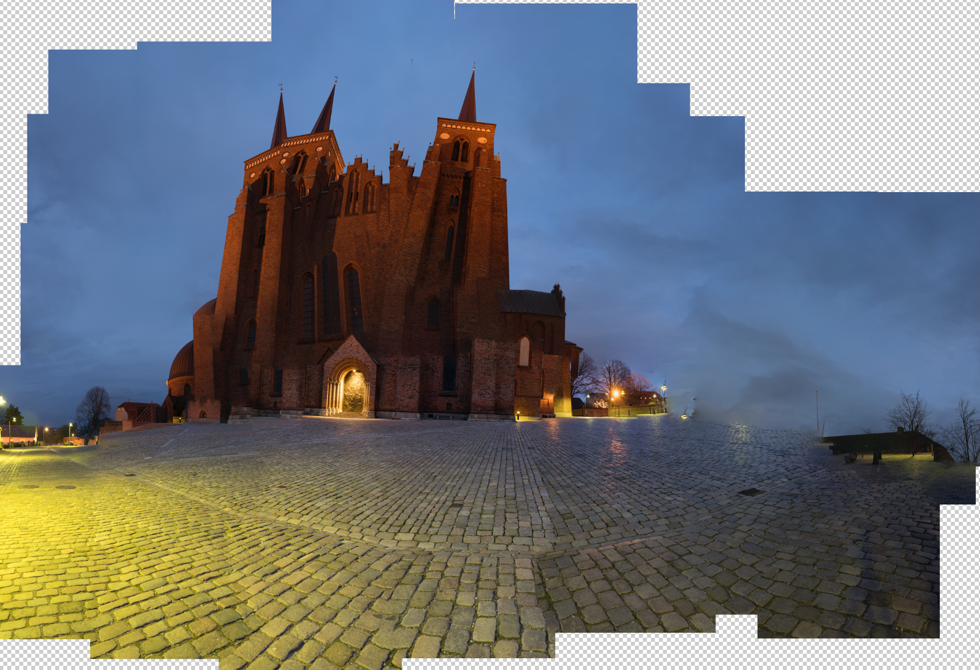
The default project from Photoshop looked terrible, and one of the others is a bit funny. I tried the others, butdidn’t get a result I liked.
Instead, I turned to Auto Pano Giga v4. This is the most advanced Panorama software that I know of. It’s not cheap, but if you can afford it, it’s worth every penny, and it get’s the job done. I only had the old version had to upgrade, and now I bought the bigger version. It integrates into Lightroom and Bridge, and there are some other advantages, I thought I would like to have.
Auto Pano Giga offers a huge range of projections, and some have parameters you can adjust. I picked the ‘Pannini’ projection and adjusted until I got something nice, and then I exported the final result to a Photoshop file. I still only used the 3.000 x 2.000 files.
And from this point, I processed only in Photoshop and later in Lightroom.
I have tried to run the full resolution files into Auto Pano Giga, and I does allow me to do it, however, it does take some time to process. But, it does not suck up all my free disk space. It works in a different way than Photoshop does.
The full resolution is 40.000 pixels wide, and in a slightly different crop, it is just north of 1 Gigapixel. Photoshop struggled with my 169 megapixels image, I think I will only process the full resolution, if anyone needs a twenty yards wide print, with crazy people stepping up in front to see if they can count the pixels (which they wouldn’t be able to, once scaled properly).
–Jacob Surland
]]>
Night view from Accademia Bridge in Venice.
I just loved that three armed street lamp in that corner. I have a very soft spot for old-fashioned street lamps, and if you have a look at my portfolio, you will find many. If I see one, I have to shoot it.
It has been a while since the last post. I have been very busy on the art side of my activity. Me and my wife exhibited at Art Nordic 2016 last weekend, and the response was overwhelming. Our booth was full all the time. Thank you to everybody who attended and visited us.
The game I play with reality fascinated people. The way I control the light, and create my own reality, they clearly considered to be art.
Many people asked ‘is it photographs?’, and such a question I consider a big compliment to my work.
A photo like this of Venice is in many ways pretty far from what it looked in real life.
[twentytwenty]


[/twentytwenty]
It still has the details of a photograph, but the light is something else. Something different. And that is what I work with.
–Jacob Surland
Easy to read and understand tutorials on
www.caughtinpixels.com
Art sale as limited prints. Photo by Jacob Surland, Licensed Creative Commons non-commercial v4.0. No Derivative Work. Protected by Pixsy.com.
]]>
Karlskrona in Sweden processed using AuroraHDR.
A few weeks ago I posted my test drive of AuroraHDR. In the meantime, I have got my new MacBook Pro and have been using AuroraHDR a lot more.
One of the risks of taking a new tool into use is that you change your style because you adapt your style to that of the tool.
The photo above is an old one from Sweden and it has been one of my ‘test-cases’. I already had processed it using Photomatix and my standard processing flow. I had got a different, yet similar result. I did not try to get a 1:1 version.What I particularly like to have in this image, is a strong texture on the building and the reflection in the water, so this was what I chased in AuroraHDR.
What I particularly like to have in this image, is a strong texture on the building and the reflection in the water, so this was what I chased in AuroraHDR.
What I have done, is to research what is possible to get out of AuroraHDR, and when I have found something that I like, I have created a preset. I have been trying to create presets that support my style, rather than adapt AuroraHDR presets into my style. You might feel different about that, which is perfectly ok, I just like to be myself with my own style.
This has been a very interesting exploration, and I have found that it can be done; I can create my style in AuroraHDR. It is a matter, of finding the sliders that do what I like to do.
Some of the sliders are extremely potent and you have to be very careful with them.
AuroraHDR gets fast to work with
After processing maybe 10 photos and having created maybe six or seven presets, something happened and things began to speed up.
I find that I learn by just keep trying and using a tool – exploring. I use different images to see how the tool works in different scenarios. I move more or less all sliders, and slowly I begin to get an understanding of the tool.
I don’t analyze each slider in depth, but I register what happens when I move it around and get a feeling. The majority of the sliders in any tool can be divided into two buckets: The contrast bucket or the color bucket. Often they work in pairs. In the contrast
In the contrast bucket, we have Highlights/Shadows and White point/Black point and some are standalone sliders like clarity and contrast.
In the color bucket, we have Temparature/Tint, Saturation, Vibrance and Hue.
There are more in most tools, but you get the picture. It is a matter of getting a feeling of how you adjust contrast and colors to your liking.
My presets represents flavors of my style and what happened, was after having created six or seven presets, I quickly get on track by using one.
AuroraHDR let me add a few more layers to optimize local areas very easily. Finally I can add a layer having a vignette if needed.
In a few minutes, I have 90% of a great image, in my style. The last 10% I have to do in partly Lightroom and partly Photoshop. The last 10% include perspective corrections and spot and lampposts removal.
These are some examples of images I have created primarily in AuroraHDR. Primarily because I cleaned up and maybe did a thing or two more in Photoshop.

Amsterdam Maritime Historic Museum. Created using AuroraHDR and a few minor adjustments in Lightroom.

The Standard in Copenhangen. Created using AuroraHDR and only a few adjustmens afterwards in Lightroom and Photoshop to clean up and adsjut perspective.
AuroraHDR does make HDR processing a much very faster process, even if you are like me and want to finish up those last couple of bits.
Workarounds for slow DNG processing
In my last post, I rounded the fact that AuroraHDR doesn’t handle DNG files very well. Even on my MacBook Pro, this is still the case. But, I have found a workaround for that problem.
A part of my normal workflow is to export my photos to a folder from Lightroom. Instead of exporting DNG files I export tiff files.
The tiff files AuroraHDR handles very well and I can work fast on those.
A different approach would be to export directly from Lightroom to AuroraHDR, and for many of you guys, this might be the right way to work. There is a very nice integration into Lightroom, with a reimport back into Lightroom.
I just prefer not to have work-in-progress files in Lightroom, they clutter up, my Lightroom catalog.
So if you like to work without too much effort on each HDR photo, you will find AuroraHDR easy and fast to work with, just be careful. Like any other HDR tool, you can ruin your photo in potent sliders.
And, if you are like me, and want to put a little more effort into it, AuroraHDR doesn’t hinder you in doing just that.
The Weekend Post by Jacob Surland
A humble request from me to you, if you find my articles interesting and consider getting AuroraHDR, please use the links on my blog and support me that way. I only recommend software and tools that I use.
I am not ‘bought’ to say nice things with sugar on top. I say what I think and feel about products. I get nothing for writing these articles, but I do get a kickback if you use my link to buy AuroraHDR, as well as if you use my 15% discount coupon code “caughtinpixels” for buying Buy Photomatix Pro. I humbly thank you.
You can also follow me on Twitter, Facebook, and Google+. I post photos daily.
–Jacob Surland
]]>
Rubjergknude Light house stands in the middle of a moving sand dune. The surrounding houses lies as debris around the light house. It is predicted, that it will fall into the sea in 10-15 years.
This Weekend Post is about, how I prepared this image for a huge print.
When you have to prepare a large print, you must be more careful, than with a smaller print. Even small irregularities and dust spots will be easy to see and can potentially ruin the whole print. And a larger print is more expensive.
So time spent preparing your photo, is time well spent.
Recently I had to prepare a 130cm / 52 inches wide print for an exhibition at Photographers Lab in Copenhagen, and some problems showed themselves.
Some of you might remember this image from a fairly recent post (a post about why this composition is so strong). I showed how the initially processed photo was a bit too flat, and how a textured version had too strong texture, but the right mix was just perfect.
When an image has to be printed in large, you need to have a good look at a 100% or even more to be sure that the quality is good. This is what I found at 200%:
200% crop of the processed photo. This texture will not look good in a huge print.
While this kind of texture and grittiness does look fine in the small version of the image, I am pretty sure, it will not work in a huge print. And I will certainly not do an experiment because that is expensive.
The hairs and scratches come from one of the textures I used, and it is only 6 megapixels. Six megapixel is ok when you mix a lot, and the textures don’t stand out individually. In this case, the texture with hairs and scratches stands out, and that is not good.
Restoring the mood of the image
I removed the textures. Then I switched them on and off for a bit until I suddenly realized what it is the textures do for this photo. They add colors and toning, the texture as a texture is secondary.
Sometimes I want the grittiness the textures can give, but at other times, it is the colors and toning I want. In this case, it is the colors and the toning, and not the textures.
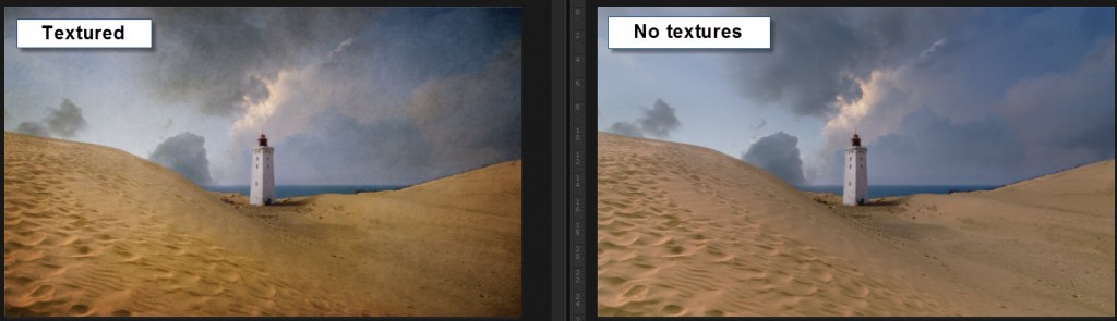
At this zoom level, you hardly notice the textures, but the colors and the light are different, and that is what is important.
I now had a problem I had to solve: How to add light and colors similar to what the textures add?
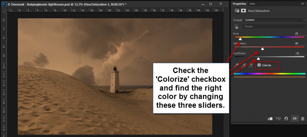
I started by adding a Hue and Saturation adjustment layer and, switched on the colorize check mark. Now the whole image turns into one hue, just in different tones, like a mono chrome.
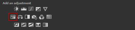
You can use Colorize to change the color of an image, and if you mask in or out, you can target specific areas.
I found an orange brown’ish color similar to that color the textures had added to the sand. What I had to do now, was to mix this colored layer in using the mask.
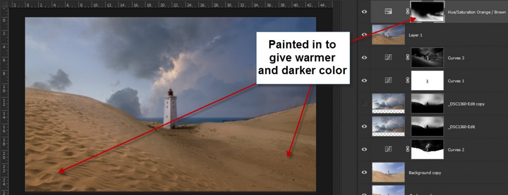
I painted in, in various degrees over the sand. The stronger I painted in, the warmer and the darker it became. I could use this layer to dodge and burn, as well as changing the colors. It quickly began to look like the textured image.
However, I couldn’t achieve everything I wanted, from the orange layer. I couldn’t use it, in the clouds for instance. Instead, I created a number of adjustment layers to enhance light, contrast, colors etc.
Preparing for the print
Step 1 – Clean up your scene
There are a number of basic steps you have to go through when you print. One of the most important things is to clean up your scene.
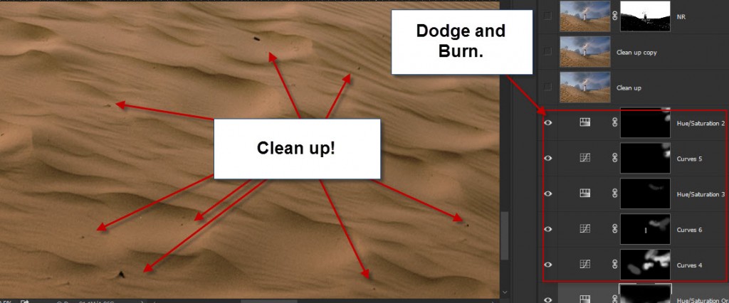
This photo has a peaceful mood, and I want to keep it that way, as much as possible. When this gets blown up big, small rubble and stones in the sand stick out. I cloned out that all over the big soft dune.
The Light House is standing in the middle of a moving sand dune, and the surrounding houses have been crushed by the dune and torn down.
There’s a lot of debris from that in the sand, and that is a part of the scene, even if a lot less peaceful. I removed a few that caught my eye, from the principle, if it catches my eye, it will probably also catch the eye of somebody else.
I also went through the sky, found a couple of dust spots and a bird. Those I removed too. And I removed a cord going on the outside of the light house.
Be thorough!
Step 2 – Noise reduction
The sky has some noise. I use Topaz Denoise to remove it. I am careful not to lose details in the sand and the light house.
Step 3 – Sharpen the primary objects
When you print, you want to sharpen the image more, just be careful not to get sharpening halos, they will be easy to spot on a large print.
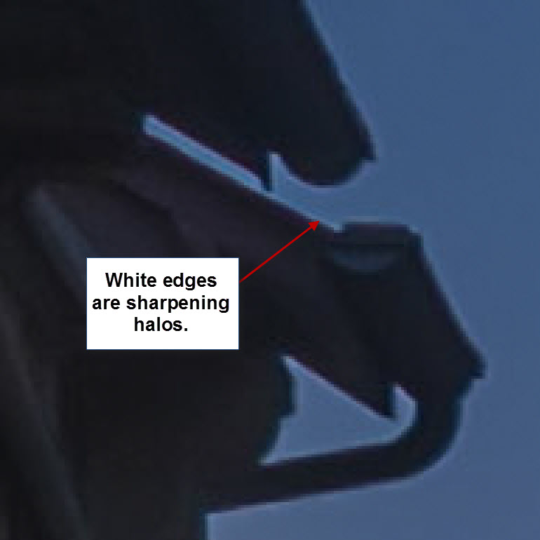
Removing sharpening halos can be done, but is a big hastle. It’s better to avoid them.
I sharpened the Light house and the vegetation on the right hand side dune.
Step 4 – Brighten
Sometimes I also brighten my photos slightly. A monitor has light, and you can see it in the dark. A print doesn’t light up, it has to have the brightness built into the image.
If you are unsure, see if you can get a small print proof before you print for real. This can save some frustration. When you have done it a few times, you get to know your printing company, and what happens.
In the case of this photo, I did not brighten additionally. But I would say I do it in 50% of the cases.
Before and after
Below here, you can see the difference between the textured and the print ready image. Not exactly the same, but in many ways, the same feeling is present.
[twentytwenty]

[/twentytwenty]
The Weekend Post by Jacob Surland
If you find my articles interesting and consider getting AuroraHDR, please use the link on my webpage and support me that way. I only recommend software and tools that I use.
I am not ‘bought’ to say nice things with sugar on top. I say what I think and feel about products. I get nothing for writing these articles, but I do get a kickback if you use my link to buy AuroraHDR, as well as if you use my 15% discount coupon code “caughtinpixels” for buying Buy Photomatix Pro. Thanks.
If you like my work, why not follow me on Twitter, Facebook, and Google+. I post photos daily.
–Jacob Surland
]]>
The Wizard can feel the warmth as he enters his Tower of Wizardry, thanks to his is ever burning fireplace. Even though he has been on the road for a few days, the ever burning fireplace, keeps his tower nice and warm.
He has been out collecting components for his spells, and he is physically tired and cold to his very bones. He looks around, but everything is where he left it, nobody would be stupid enough to try to steal from a wizard.
He can’t wait to study his harvest. He closes the front door and goes straight to his laboratory. There are many strange smells and odors, but he likes it that way, some sweet and some more acid.
His workbench is an old table made of oak wood and full of magic silver rune inscriptions. The magic orb sits on its stand. He uses the orb to figure out, where he can find his components; it’s magical. He can look for specific components, but he can also search geographic areas, and the orb will show him, what he can find there. This way, he finds new components he which existence didn’t even know.
As he bends to puts down his Bag of Holding, containing the harvest from his trip, he notices mud on his robe, but he doesn’t care. The Wizard can’t wait to play with his new components, and see what magic he can produce. He found a few rare components, and he has been pondering on what to use them for all the way back to his tower of Wizardry.
He opens his bag and takes out the components, one by one, and he scrutinizes them and smells to them, before placing them on his work bench. When done, he studies them, roots out a few, that doesn’t have the quality he needs to work his magic. And then he picks up his Wacom wand and starts working.
I truly believe that post-processing is a kind of magic. The post-processing puts magic into a photo, and photos wouldn’t be the same if you didn’t do it. I have been thinking a lot about this for the last couple of years.
To begin with, it was the post-processing that triggered my interest for photography. Once I read someone who said ‘if you diguise a turd, it’s still a turd’ referring to that you can’t save a bad photo in post-processing.
Of course, to some degree, that is true, but I still like to disagree, because I believe, that you can do magic in the post-processing. And as a digital wizard, I have to feel that way. I am obligated to do that!
I started out three and a half years ago, and it started the very day, that I figured out the importance of post-processing. Going into details on what I have done and learned, would probably result in a spellbook.

In broad terms I have been exploring and working digital magic in Lightroom, Photoshop, Photomatix, various tools, and last but not least the new AuroraHDR.
I have found tons of tips and ways to do things, and I keep exploring, because I believe in being curious, and I love the digital magic. A famous Danish author once said: ‘I do not want to die curious’, and that’s my tagline.
I believe one of the most powerful tools a digital wizard has, is dodging and burning. Traditionally dodging and burning is the art of changing the exposure of your photo locally. It’s a term that stems from the old film days and dodging, and burning was a technique you used in the dark room; in the post-processing.
When the negative was exposed through the enlarger to the photographic paper, you blocked the light, shortly in various places. This way you gave some parts less exposure by moving a lollypop looking cardboard stick around. The photo would be lighter in these areas, and this is ‘Dodging.’
‘Burning’ is the opposite process. After having given a normal exposure, you give extra exposure to some parts of your image. By using a piece of cardboard shaped to fit your needs, you would more let light pass and darken these areas.
Remember that the photographic paper was sensitive to light and therefore less light, was lighter (dodging) and more light darker (burning). Ansel Adams was a pioneer in burning and dodging.

Modern digital dodging and burning is much more powerful. If classic dodge and burn was a wand of light, modern dodge and burn is a wand of fireballs. And as with all magic, use it with care.
Adobe Lightroom is the leading digital darkroom, and it has very powerful dodging and burning capabilities. Aperture for Mac is also a digital darkroom. However, it has been discontinued. Other options exist too, but Lightroom is by far the best digital darkroom on the planet.
Digital dodging and burning is a much wider thing, than the old film days dodging and burning. Not only can you change the exposure, you can change the white balance, sharpening, saturation, clarity etc., this is powerful stuff.
In Photoshop, there are classic dodging and burning tools. I have used these tools to lighten up dark leaves backlit on a bright sky, but they are destructive tools in their nature. But there are other and better ways of dodging and burning in Photoshop.
However, I do a lot my dodge and burn in Lightroom. Lightroom is a cool and strong tool, and in many ways much easier to use, it does a fantastic job and more important it is nondestructive work.
Let’s do some magic!
Let’s add and remove light magically

My goal with this photo from Mont Saint Michel in France was to create a rich warm, inviting and magic night shot of a medieval street and make you wish to be there. But to get there, I had to work some magic.
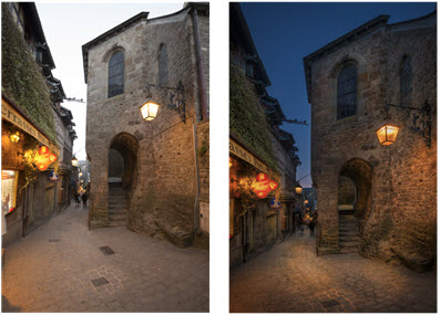
0-exposure Final photo
First I did my usual post-processing (my classic HDR Workflow Photomatix and blending layers). When I was done with that, I still felt, that I did not have quite the feeling of warmth that I wanted.
I had chosen to make the sky a bit darker than it actually was. It did some of what I wanted to achieve, but the houses and street lacked the warm feeling, that I wanted.
How to do magic dodge and burn in Lightroom
Let’s walk through the final steps I took, to complete my magic. First I reimported a 16-bit TIFF file into Lightroom. In Lightroom, I used the Adjustment Brush for dodging and burning. When using the adjustment brush you have these options:
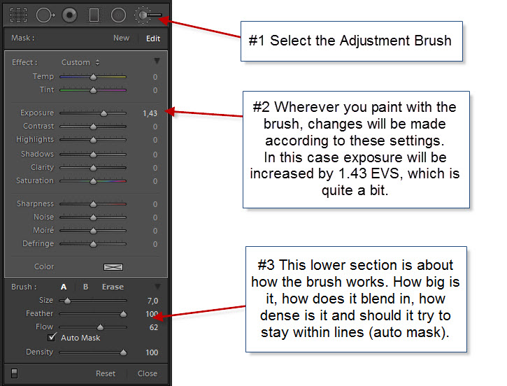
As you can see, there are many options. More than just changing the exposure as Ansel Adams could do in his darkroom.
Let’s see how I did some artificial lights in the old medieval village of Mont Saint Michel just off the shore of Normandy:
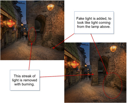
As you can see, I removed a streak of light on the wall in the middle of the image. It’s a streak of light coming from a spotlight just outside the image on the left. It doesn’t do anything good to the image.
I also added some artificial light below the lamp on the right-hand side. The eye believes the light to come from a light source, and it adds tothe mood of the image. Just what I wanted, but not everything I wanted.
To make the magic work, I have to simulate the already existing light sources. Brighter light in a different color typically characterizes a light source. Both light intensity and the color of the light have to match pretty good, to make the magic work.
In this case, the light is quite warm, and I increased the temperature by +71 and the tint by +57. I also increased the saturation by +36 and then I set the exposure to +0.67 (2/3 of a stop).
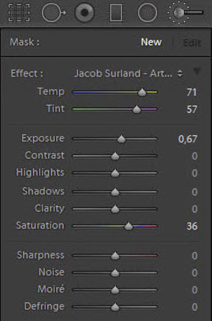
The exact values I have to try out for each image, because different color of light exists in almost any photo. The light in this particular image is rather warm, and by adding even more warm light, gives me more of what I wanted to achieve in my goal.
I added an artificial light source by painting (dodging) where I wanted it in order to make it warmer and lighter, giving exactly the same result as if real light source shun on the area. You could say that I painted with light. It is important that the light sources you add, fall in naturally. You don’t necessarily have to see the light source making it, but it has to be likely that a lamp could be making the light.
I removed the light streak on the wall, by doing just the opposite. I burned it (made it darker), but I also changed the temperature. By decreasing the exposure and adding Blue and Green instead of Yellow and Magenta I could paint on top of the streak, and it vanished. That’s burning.
Burning can be used for many different things. One of the things I like to use it for is to burn shadows to make them even darker and more prominent. This can have dramatic effect on images.
Adding more light sources the easy way
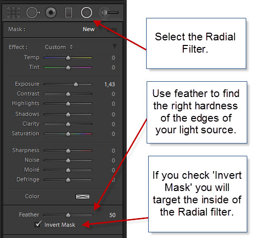
Adobe Lightroom 5 introduced Radial Filters and by using them you can quite easily simulate light sources. The light of a lamp is reflected as a round or elliptic shape on a surface. The Radial Filter is round or elliptical too, which makes it very easy to use for this purpose. The Radial Filter you can apply the same values to, as you can to the Adjustment Brush.
By default, the Radial Filter will target everything outside the radial area. This is great for making advanced vignettes, but luckily you can use ‘Invert Mask’ to target the inside of the Radial Filter, and that is exactly what we want:
I used the Radial Filter in several places in this photo:
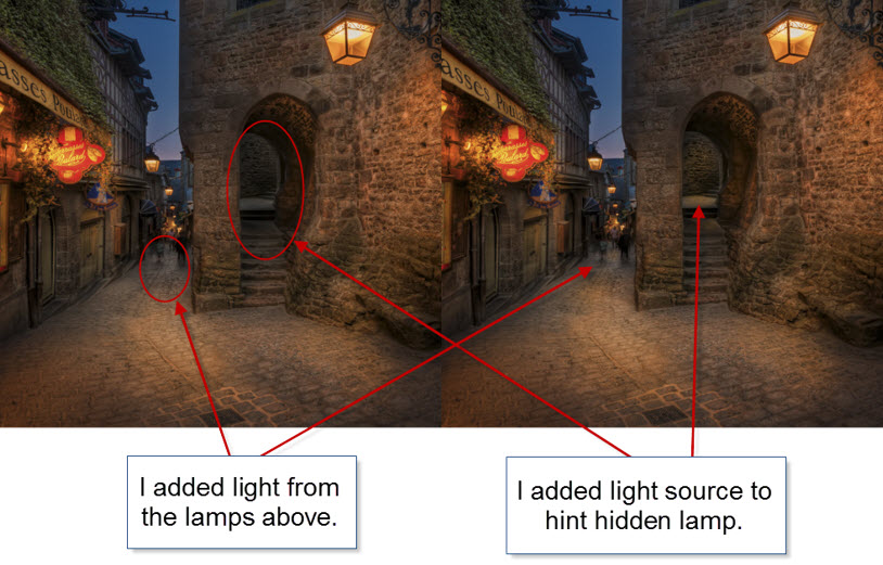
Notice how I have lit up the passage up the stairs and the platform at the far end of the passage, in order to make the viewer curious, and think ‘what’s up there?’
I also added some lights to the street, supposedly to come from the street lamps hanging above the street. Each Radial filter has its own size and slightly different values. I placed radial filters here:
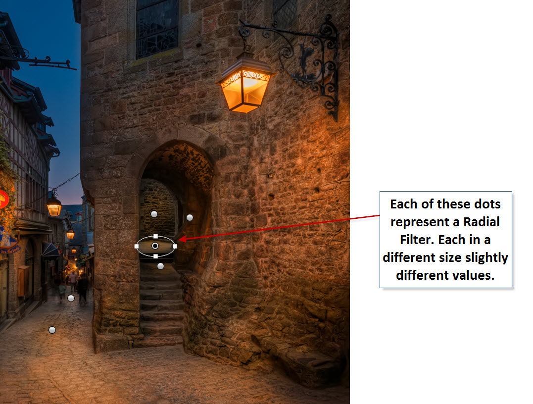
I started by adding one Radial Filter, with similar settings as I used for my Adjustment Brush. Then I duplicated and resized it to fit new areas.
You can duplicate a Radial Filter by pressing CTRL + ALT (and CMD + Option key on Mac) and then drag it to a new location. That will make a copy of the same size and with same settings.
Resize the new Radial Filter to fit the new location. You might also want to change the exact exposure adjustment and white balance settings because the light is different in the new spot.
By dodging and burning in this way, I achieved my goal of making a warm, inviting and magical image of a street the in the medieval village of Mont Saint Michel.
And when I am done doing an image like this, I feel like a Wizard.
The Weekend Post by Jacob Surland
If you find my articles interesting and consider getting AuroraHDR, please use the link on my webpage and support me that way. I only recommend software and tools that I use.
I am not ‘bought’ to say nice things with sugar on top. I say what I think and feel about products. I get nothing for writing these articles, but I do get a kickback if you use my link to buy AuroraHDR, as well as if you use my 15% discount coupon code “caughtinpixels” for buying Buy Photomatix Pro. Thanks.
If you like my work, why not follow me on Twitter, Facebook, and Google+. I post photos daily.
–Jacob Surland
]]>
The ‘Skerpi’ is a house made of sticks, and put on wheels. The gourmet restaurant ‘Koks’ from the Faroe Islands has this as a pop-restaurant in Copenhagen these days.
For the past week, I have been playing around with AuroraHDR by Trey Ratcliff and Macphun. It’s one of the latest products for creating HDR photos, and I have been pretty excited about getting to know it.
This article covers my first initial impression of AuroraHDR. My overall impression is positive. There are lot’s of good stuff, but there are also a couple of bad bits.
Let’s start with one of the bad bits. It’s Mac… Only… However, Macphun is working on a Windows version, but there is no official date for this yet. Maybe they will brand it under ‘Winphun’? Probably not!
Anyway, I am or was a Windows user, but I do have a MacBook Air 13″ from mid-2011, equipped with an i7 1.8 GHz and 4Gb ram. It was the most powerful MacBook air back then. And this Mac has been my test drive computer.
I think that has been a good exercise and I can give a couple of additional input because I used this older computer.
First run of AuroraHDR
I picked a series of bracketed photos from my latest photoshoot. I exported seven exposures from Lightroom as DNG (Adobe’s device independent RAW format) files, as I always do, and dragged them into AuroraHDR.
And I waited for the preview screen getting ready to show the images.
It was 7 36.3 megapixel photos from my Nikon D800, and it took a while, so I waited a bit more. Fair enough, it is big image files.
And then I waited a longer bit more.
After 30 minutes of waiting and nothing had happened, I shut off the computer. I was VERY disappointed.
I tried once more, and picked only 3 of the 7 exposures, and after a couple of minutes the previews did show up, and I could start up AuroraHDR.
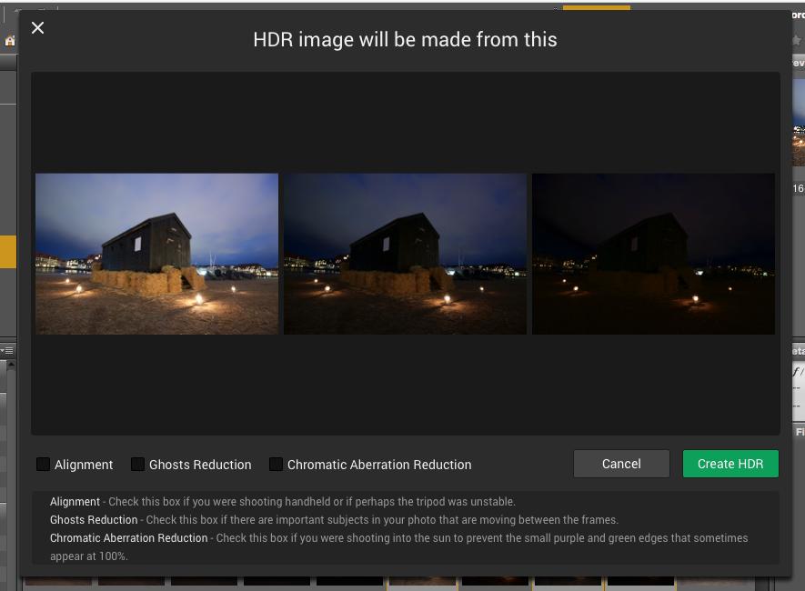
I wondered because I had heard that AuroraHDR should be fast. I looked up the minimum requirements, but my oldish Mac was above the minimum requirements. What could be the problem? Had Macphun really made a piece of software that couldn’t run on an older Mac?
No, of course, they had not. It took a little experimenting to figure out, what the problem was. It was the file format DNG. For some reason, the DNG files are insanely slow loading in AuroraHDR.
As soon as I used JPEG or native RAW files, it’s pretty snappy. 36 megapixel files are slower to work with, than 12 megapixel, which is no big surprise. But it works.
I did a test using three 3 images of 36 megapixels. The native Nikon RAW files took 1 minute and 55 seconds until it was ready to process. The DNG files took 11 minutes and 11 seconds. The first is comparable to other tools, but DNG is just too slow.
AuroraHDR tip #1: Do not use DNG files. Use native RAW files or JPEG files.
Now that I had found a solution to my initial major disappointment, I began exploring the tool itself. After looking for a little while, I realized, that AuroraHDR is a stand-alone image processing tool.
You can (almost) use ONLY AuroraHDR; it’s like a studio.
AuroraHDR high-level feature overview
The software loads and merges the images into the 32-bit HDR image, as is expected from HDR software. And then what? What is available?
As I said before, AuroraHDR is a Studio, and what do I mean by that? You don’t need much else. You can do almost everything inside AuroraHDR.
It offers layers with masks, as you know it from Photoshop and GIMP. It has a ton of tools to adjust including: White Balance, Clarity, Contrast, Color balance, toning, Gradient adjustment, split toning, and these are just some of the tools available.
The initial HDR image will be the first layer. On top of that, you can add other layers, and each layer has the same set of adjustment tools available.
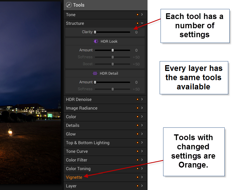
In Photoshop, you can add a curves adjustment layer and a Hue and Saturation layer etc., and they appear as individual layers. In AuroraHDR if you add a layer, that layer has everything, all adjustment tools are available.
The first mistake I made, was to forget about the layers and try to do everything in one layer – the Original HDR image layer. And of course, I can’t do that. I can try, but the result is not very good.
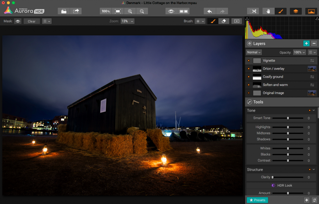
After having played around with a couple of images, I decided to do this little cottage standing in the harbor in Copenhagen. I ended up with 5 layers.
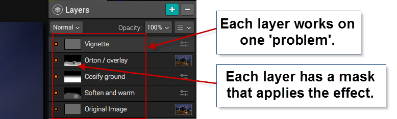
In a way, this is similar to what I would do in Photoshop. I start out with an original image, and I begin to apply effects, to solve ‘problems’.
Those of you who follow my blog will know, that I the way I post-process my images, is by identifying problems and solving them.
The problems I worked with on this image, were like this ‘The ground is too gritty’, ‘It’s not cozy enough’, ‘It’s not warm enough’. All problems leading to the creation of an inviting warm image.
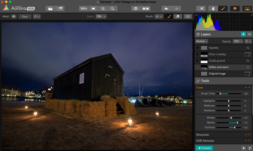
The second layer enhances the warm light coming from the small lamps.
As it turned out, I adjusted no more than 3 tools in one layer, and I think that was the right strategy. If you try to do too many things in one layer, you end up with unwanted effects in some areas.
AuroraHDR Tip #2: Limit the number of tools you use in each layer. This way you can make changes locally, rather than globally.
I am pretty happy with the final result of this image. I could have reached a similar result, using Photomatix and Photoshop, as I usually do, but in this case, I was able to create everything inside AuroraHDR.
What’s missing in AuroraHDR?
AuroraHDR is almost a complete Studio; only a few pieces are missing. In my workflow, it’s the ‘finalizing’ that I can’t do in AuroraHDR.
The Crop and Rotate tool work nicely, but it does not have perspective correcting options. If you need to do perspective corrections, you will need another program. It’s not a big issue, AuroraHDR comes with export to Photoshop, but the feature is not inside AuroraHDR.
There is no healing brush or clone stamp, which again force you out of AuroraHDR, again not a big issue, but if… That would have been nice.
There might be a couple of other things I discover when I get around in AuroraHDR. But I haven’t found them yet.
What’s not so good in AuroraHDR?
One of the big issues with creating HDR photos is the noise. Digital cameras produce noise in images, especially at higher ISO levels, and HDR increases that noise.
Photomatix Pro, which I am very fond of, has a bad reputation for creating a lot of noise. But Photomatix can create noiseless HDR photos if you set the settings right. The question is if you like that output.
AuroraHDR comes with a built-in adjustable noise reduction. A very nice touch I must say. However, if your photos have areas, that are underexposed, AuroraHDR handles those areas badly, at least if you try to lift the shadows.
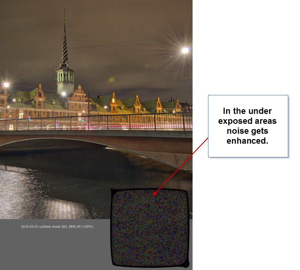
In my first test drive of AuroraHDR, I didn’t find a good solution for handling underexposed areas. Not the built-in HDR Denoise tool. By the time the noise is gone, so is the details. So the solution I found best, was to leave the dark, in the dark.
You could argue, that this wouldn’t have been a problem, had I shot some brighter exposures. In reality I had shot too few shots, to cover all of the dynamic range, so, in a way, it’s a self-inflicted problem.
AuroraHDR tip #3: If you have noise levels beyond control in AuroraHDR, you can make a version of the image in Lightroom, treating these dark areas as you would like them treated. Then export that version and blend it in, in Photoshop or GIMP.
Conclusion after the test drive of AuroraHDR
Will I use this tool again? Definitely. Will it be the only tool I use? I think not, but it will play a major role I think.
It will not replace my beloved Photomatix, but it will be a strong alternative. And thinking about it, I will be able to use AuroraHDR in the same way, as I use Photomatix, just as well as I can use the ‘Studio’ to make a final photo.
The initial HDR image created by AuroraHDR, you can process using the various tools included. But even before you do anything, you get a pretty good start:
The Standard is an old ferry terminal in Copenhagen. This is the initial HDR, and it is really good looking already.
AuroraHDR does a lot of things in a cool way. I think the biggest danger of using AuroraHDR, is that you get lazy and get stuck on presets.
For some people AuroraHDR might just be the tool they need to create better quality HDR photos, with less effort. I am not on that road. I am not searching for less effort, but for new interesting paths to walk. AuroraHDR offers that.
Because there are so many tools built into AuroraHDR, you can get tempted to stop right there, on ‘just one layer’. And if you get real lazy, that layer is just a preset.
The problem of getting stuck using just one layer is that you don’t reach the full potential of your image. You apply all changes globally with a few exceptions like the gradient tool.
What pushes a photo from 80% to a 100% is the local optimizations. AuroraHDR raises the bar, from the ‘out-of-the-box’ HDR photo, but it is still not a 100%, and what fun would that be, if it was? I love post-processing.
What is new, is that you can move from 80% to a 100% without leaving the software. AuroraHDR offers new ways of working, and it will be refreshing to try it out.
I have been planning a switch to Mac for a longer period. As it happens, my old Windows computer has numbered days and is waiting for retirement or burial.
AuroraHDR is what tipped the decision, and I have now ordered a MacBook Pro. When I get that, I can dive further into AuroraHDR. And that I am looking very much forward to!
The Weekend Post by Jacob Surland
If you find my articles interesting and consider getting AuroraHDR, please use the link on my webpage and support me that way. I only recommend software and tools that I use.
I am not ‘bought’ to say nice things with sugar on top. I say what I think and feel about products. I get nothing for writing these articles, but I do get a kickback if you use my link to buy AuroraHDR, as well as if you use my 15% discount coupon code “caughtinpixels” for buying Buy Photomatix Pro. Thanks.
If you like my work, why not follow me on Twitter, Facebook, and Google+. I post photos daily.
–Jacob Surland
]]>
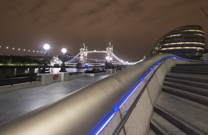
This photo ‘Trailing Again’ is shot in London.
This post is The Weekend Post – sign up on the website, and get it on email. Last week’s post was my hThree most important tips for photographers. If you missed it, you can read it here.
This Weekend post is a ‘The Making of…’ post. Something that I will regularly be doing in my Weekend Posts. I show how I made the image ‘Trailing again’, on a request from Steve Evans, who wanted to know how I made it.
This photo (and the title indicates it) is actually version 2 of a photo.
Normally, I don’t go back and make changes to an already published photo, but sometimes I do, and the reason usually is, that there is something nagging me, about the image.
In this case, there was, but I didn’t find the solution until I got some feedback from my mentor Robin Griggs Woods, and she was spot on my pain. She showed me an easy way to solve the problem, using the Select Color Range and Colorize. I will get back to that later.
While I was at it and had the patient cut open, I enhanced the futuristic look of this photo further.

The originally posted ‘Trailing’.
This particular evening in London gave very smog orange looking photos, and I did not like that. This is the original shot:
The photo is 5 shot HDR series ranging from -2 to +2, which I processed as I typically would treat an HDR.
I put the five original photos into Photomatix Pro, and create first one tone mapped image, and then a second tone mapped image (see this article How to make double tone mapped images the details).
I know that Photomatix has a lot of bad publicity among photographers, but I believe that it is one of the strongest High Dynamic Range tools on the market, but it is a bit like a Ferrari, you have to learn how to drive it. How do you get the good stuff? And how you avoid the bad stuff? If you learn to control Photomatix, you can get awesome results using it.
I blend the layers to a coherent image, with a mood, look and feel that I like.
What I like about Photomatix, is that it is very flexible, and I can often create the mood that I like. I don’t always use Photomatix, but I almost always give it a try.
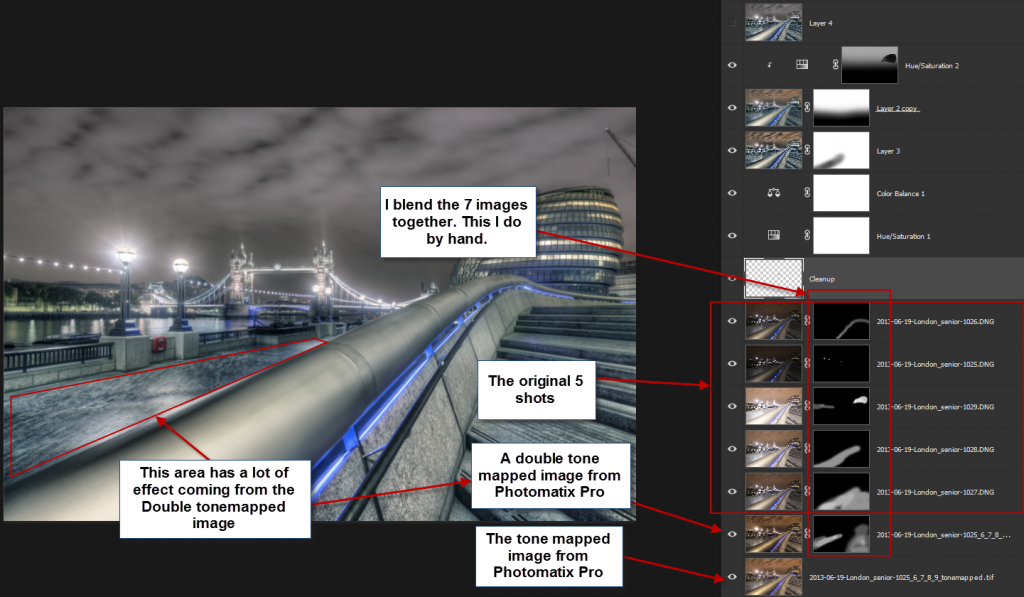
The double tone mapped image has a very strong effect, and applying it globally on the picture, would look terrible, but using it locally on the stairs and the tiled pathway works well. This choice turns out to be an important factor in creating this futuristic style.
I don’t know what a photo should look like before I start, at least not when it’s an extreme one like this one. I feel little bit like Alice tumbling down the Rabbit hole when I make a photo. I see what I get from Photomatix, get an idea and move from there to the next idea. Other tools will give me more ideas along the way, and this way, a photo develops.
Problems that arise, I solve as they show themselves.
Typically I try various effects and presets to get ideas, but what is important in my workflow, is that ‘I never use a full press-a-button-effect‘. I always apply effects locally, and often only in much less than a 100%. This takes a little longer, but it is worth the while.
Sometimes I end up with using less than 10-20% of the tone mapped image from Photomatix. Typically I use probably somewhere between 40-60% of the tone mapped image.
You could ask, why I include it in the first place if I don’t use more than that? My answer would be that it is an important part of the magic, and you can tell, if it is not there. It does make a difference.
The first step was to blend the seven photos to get an overall working photo (two from Photomatix and five original shots). The second phase was to optimize the sky and the railing.
The railing I made more gray, but the sky proved to be a real problem. I tried to find a proper color balance for, that would match the rest of the image.
After trying for a long time, I ended up with this version, and I was not 100% happy with the sky. It nagged me.
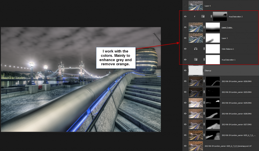
This is how I ended up, with the first version of the image. The sky had an magenta sort of hue to it.
The problem with this image is that the sky doesn’t play too well with the colors in the rest of the picture. I tried many things, including making it go completely gray, but that didn’t work either.
How to change color in the sky using Select Color Range
Later I learned, during a critique that was given to me by my mentor Robin Griggs Woods, what the solution to the sky was. There’s a lot bluish and cyan colors in vast areas of the image. If the sky contained some blue or cyan instead of magenta, it would play along in a much better way. And she showed an easier way to change the colors of the sky than I had been using earlier.
I took the first version into a new Photoshop file and worked from there.
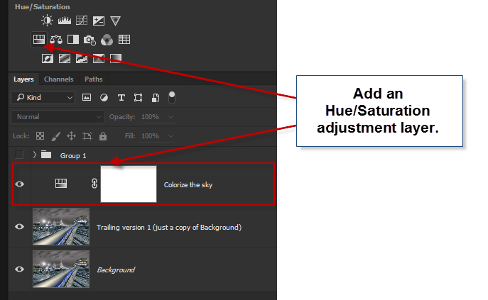
Step 1 – Create a Hue/Saturation Adjustment layer
The first step is to create the layer, which will modify the colors in the sky. I use a Hue/Saturation adjustment layer for that.
Step 2 – Use the Select Color Range tool
I only want to apply the color changes to the sky, and there are many ways to select the sky, but one of the faster and easier ways for this case is to use Select Color Range tool in Photoshop. This tool will let allow you to select areas having a particular color range, applied with some fuzzy algorithm. It does a fantastic job of it.
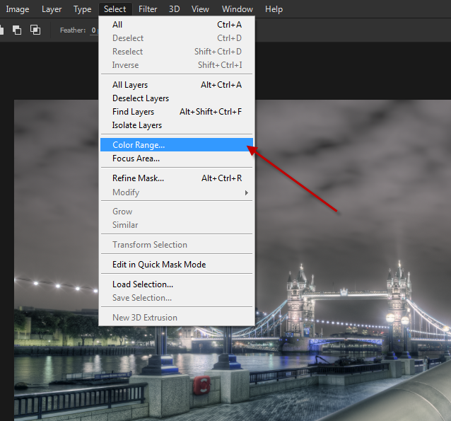
The tool itself shows a mask, and when I click in the sky, I can see that some of the masks will turn white. What is white, is what my Hue/Saturation adjustment layer, will target.
The task is to use this tool, to select to all of the sky, and by pressing SHIFT and keep pressing SHIFT, I can click more places and the selection increases. I collect samples this way.
The two sliders ‘Fuzziness’ and ‘Range’ I can slide from left to right, and if I do that, Photoshop changes how it calculates what to select, based on the samples I have made.

There is no precise way of doing this, and it’s a triangle of the sampled areas, fuzziness, and range. Try moving them around, and find the best selection you can. In the case of this sky, it was fairly simple. When you are happy, click OK, and the mask will be put on the Adjustment Layer.
Step 3 – Changing the color of the sky
The next step is to change the color of the sky.
The mistake I had made when I made the first version was that I tried to change the individual colors in the Hue/Saturation panel, and it quickly got complicated to get something that looked nice.
Double click the small “Hue/Saturation” icon on the layer and I open the panel.
I then click the checkbox “Colorize”, which will make the layer monochrome, but with with a color overlay. And because we made the mask for the sky, only that area will be affected.
Just by clicking it, the default color is switched on, and I get a purple sky.
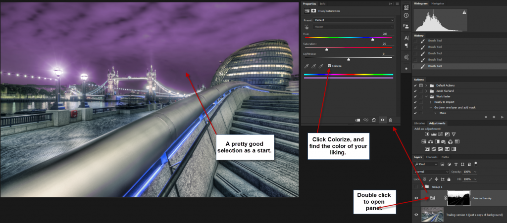
There are three sliders:
Hue: Changes the hue and by dragging it back and forth you can see the colors change. I want to search for something in the bluish section.
Saturation: This changes the saturation. I don’t wish to have a highly saturated sky so that I will look at the lower end of the scale.
Lightness: This controls the how bright or dark the layer should be. Again, it is late at night, and I will be searching in the dark area.
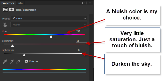
After searching for a short while, I found the right balance of blue, saturation and lightness. I made smaller changes to the mask along edges, primarily around the lambs, to make the new color work seamlessly with the photo. I used the brush for that.
At this point, I now had a photo, similar to my version 1, but with a sky that worked together with the rest of the image, but I still wanted to try one more thing.
Step 4 – Adding the Orton Effect
The Orton Effect can add a dreamy blurry and yet still sharp effect to the photo (you might want to read my tutorial on the Orton Effect). The Orton Effect can sometimes add a magic touch, and in this case, it did in the same areas as I used the double tone mapped image (the tiled pathway and the stairs). You can see the change here:

To create the Orton Effect I need two extra duplicated layers.
The first layer must be a merged version of all the layers. I don’t want to delete the layers, and there is a secret key combination for doing this. I haven’t found it in the menus, but it is one of the features I use the most in Photoshop.
I make sure that I am on the top layer, and then I use the secret key combination SHIFT + CTRL + ALT + E (on Mac SHIFT + CMD + ALT + E).
I get a merged layer, but without deleting the original layers.
The second copy I get just by pressing CTRL + J (on Mac CMD + J).
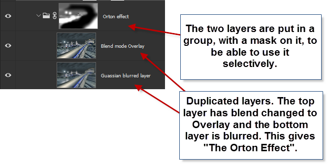
I then change the Blend mode to Overlay on the new top layer, and I use Gaussian Blur to blur the layer just below the top layer. The amount of blur I choose changes what the Orton Effect looks like, and I search for something that looks good.
I then place the two layers in a group, and add a black layer (CTRL + I / CMD + I will invert a white mask to a black mask) mask to that group, and then I paint in the Orton Effect where I want it, to the extent I want it.
If you look at the layer called “Orton Effect” you can see, the black areas and they will get no Orton Effect. That is the rail that doesn’t get any while the tiles and stairs get almost a full dose of Orton.
And that is the story of how I tumbled down the rabbit hole to the final result.
I needed some feedback to get the final idea.
It is always good to find someone you can ask for feedback. That could be a community or someone you know. I often ask my wife or my son for feedback, and they often give valuable feedback, that I can use.
–Jacob Surland
]]>