Warning: Undefined array key "multiauthor" in /var/www/caughtinpixels.com/public_html/wp-content/plugins/post-layout/plugin.php on line 114
Warning: Undefined array key "mobile" in /var/www/caughtinpixels.com/public_html/wp-content/plugins/post-layout/plugin.php on line 352

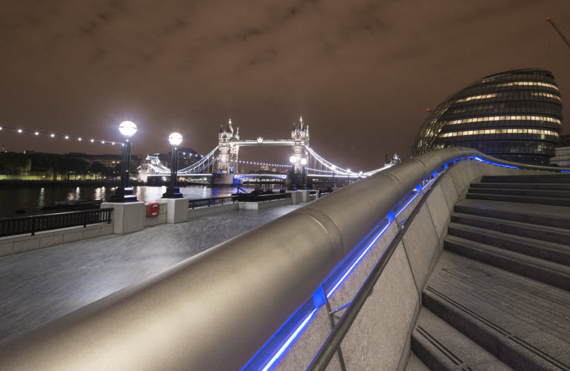
This photo ‘Trailing Again’ is shot in London.
This post is The Weekend Post – sign up on the website, and get it on email. Last week’s post was my hThree most important tips for photographers. If you missed it, you can read it here.
This Weekend post is a ‘The Making of…’ post. Something that I will regularly be doing in my Weekend Posts. I show how I made the image ‘Trailing again’, on a request from Steve Evans, who wanted to know how I made it.
This photo (and the title indicates it) is actually version 2 of a photo.
Normally, I don’t go back and make changes to an already published photo, but sometimes I do, and the reason usually is, that there is something nagging me, about the image.
In this case, there was, but I didn’t find the solution until I got some feedback from my mentor Robin Griggs Woods, and she was spot on my pain. She showed me an easy way to solve the problem, using the Select Color Range and Colorize. I will get back to that later.
While I was at it and had the patient cut open, I enhanced the futuristic look of this photo further.

The originally posted ‘Trailing’.
This particular evening in London gave very smog orange looking photos, and I did not like that. This is the original shot:
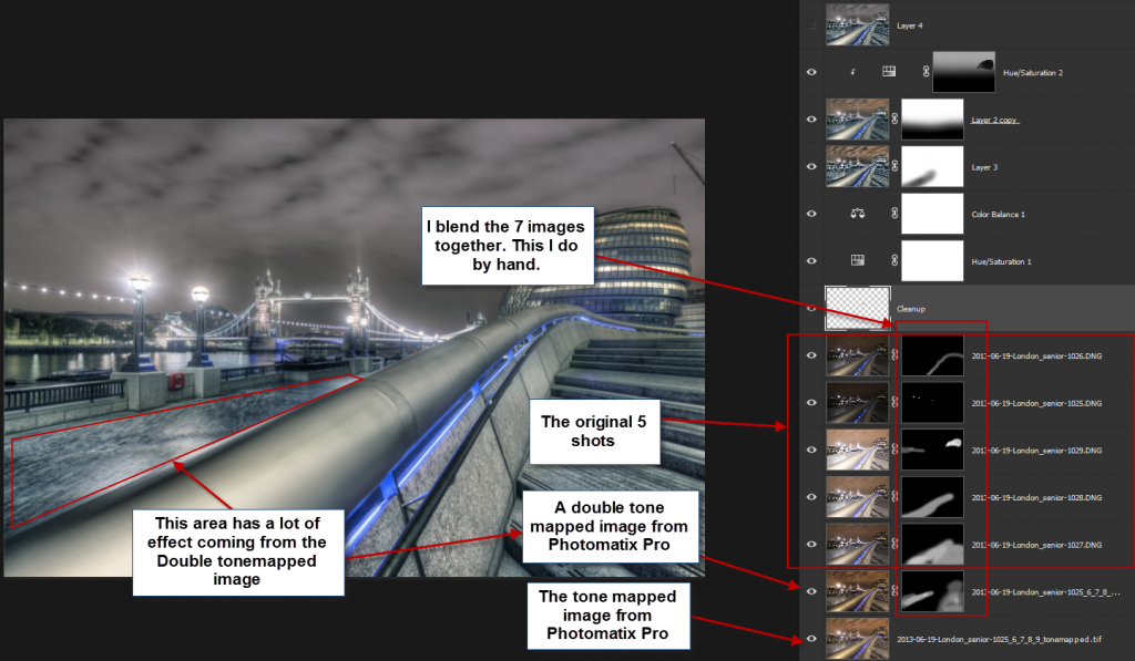
The photo is 5 shot HDR series ranging from -2 to +2, which I processed as I typically would treat an HDR.
I put the five original photos into Photomatix Pro, and create first one tone mapped image, and then a second tone mapped image (see this article How to make double tone mapped images the details).
I know that Photomatix has a lot of bad publicity among photographers, but I believe that it is one of the strongest High Dynamic Range tools on the market, but it is a bit like a Ferrari, you have to learn how to drive it. How do you get the good stuff? And how you avoid the bad stuff? If you learn to control Photomatix, you can get awesome results using it.
I blend the layers to a coherent image, with a mood, look and feel that I like.
What I like about Photomatix, is that it is very flexible, and I can often create the mood that I like. I don’t always use Photomatix, but I almost always give it a try.
The double tone mapped image has a very strong effect, and applying it globally on the picture, would look terrible, but using it locally on the stairs and the tiled pathway works well. This choice turns out to be an important factor in creating this futuristic style.
I don’t know what a photo should look like before I start, at least not when it’s an extreme one like this one. I feel little bit like Alice tumbling down the Rabbit hole when I make a photo. I see what I get from Photomatix, get an idea and move from there to the next idea. Other tools will give me more ideas along the way, and this way, a photo develops.
Problems that arise, I solve as they show themselves.
Typically I try various effects and presets to get ideas, but what is important in my workflow, is that ‘I never use a full press-a-button-effect‘. I always apply effects locally, and often only in much less than a 100%. This takes a little longer, but it is worth the while.
Sometimes I end up with using less than 10-20% of the tone mapped image from Photomatix. Typically I use probably somewhere between 40-60% of the tone mapped image.
You could ask, why I include it in the first place if I don’t use more than that? My answer would be that it is an important part of the magic, and you can tell, if it is not there. It does make a difference.
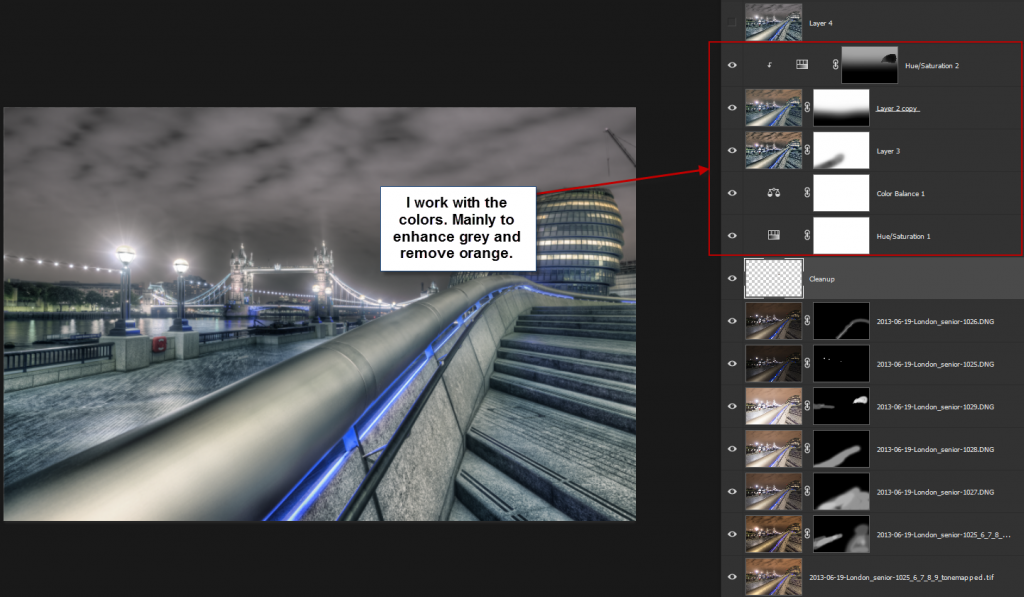
The first step was to blend the seven photos to get an overall working photo (two from Photomatix and five original shots). The second phase was to optimize the sky and the railing.
The railing I made more gray, but the sky proved to be a real problem. I tried to find a proper color balance for, that would match the rest of the image.
After trying for a long time, I ended up with this version, and I was not 100% happy with the sky. It nagged me.
This is how I ended up, with the first version of the image. The sky had an magenta sort of hue to it.
The problem with this image is that the sky doesn’t play too well with the colors in the rest of the picture. I tried many things, including making it go completely gray, but that didn’t work either.
How to change color in the sky using Select Color Range
Later I learned, during a critique that was given to me by my mentor Robin Griggs Woods, what the solution to the sky was. There’s a lot bluish and cyan colors in vast areas of the image. If the sky contained some blue or cyan instead of magenta, it would play along in a much better way. And she showed an easier way to change the colors of the sky than I had been using earlier.
I took the first version into a new Photoshop file and worked from there.
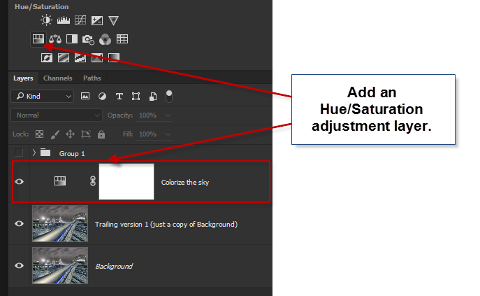
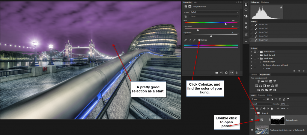
Step 1 – Create a Hue/Saturation Adjustment layer
The first step is to create the layer, which will modify the colors in the sky. I use a Hue/Saturation adjustment layer for that.
Step 2 – Use the Select Color Range tool
I only want to apply the color changes to the sky, and there are many ways to select the sky, but one of the faster and easier ways for this case is to use Select Color Range tool in Photoshop. This tool will let allow you to select areas having a particular color range, applied with some fuzzy algorithm. It does a fantastic job of it.
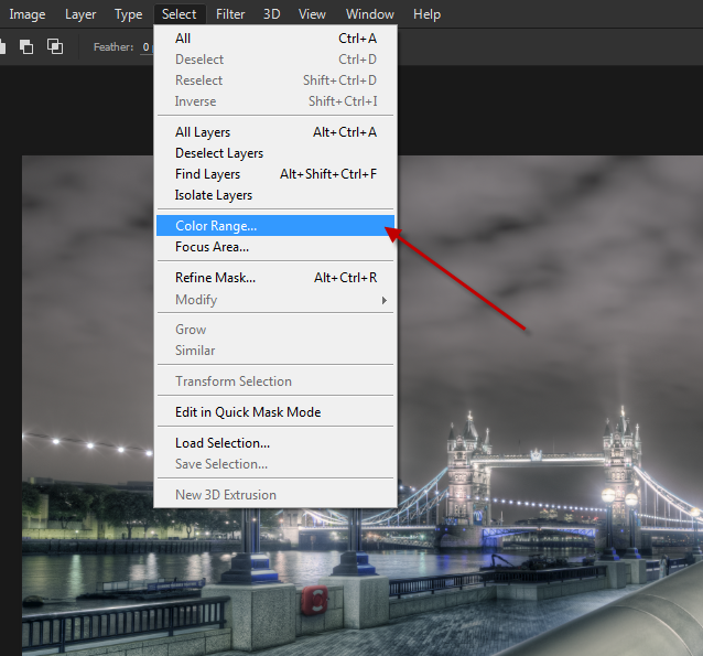
The tool itself shows a mask, and when I click in the sky, I can see that some of the masks will turn white. What is white, is what my Hue/Saturation adjustment layer, will target.
The task is to use this tool, to select to all of the sky, and by pressing SHIFT and keep pressing SHIFT, I can click more places and the selection increases. I collect samples this way.
The two sliders ‘Fuzziness’ and ‘Range’ I can slide from left to right, and if I do that, Photoshop changes how it calculates what to select, based on the samples I have made.

There is no precise way of doing this, and it’s a triangle of the sampled areas, fuzziness, and range. Try moving them around, and find the best selection you can. In the case of this sky, it was fairly simple. When you are happy, click OK, and the mask will be put on the Adjustment Layer.
Step 3 – Changing the color of the sky
The next step is to change the color of the sky.
The mistake I had made when I made the first version was that I tried to change the individual colors in the Hue/Saturation panel, and it quickly got complicated to get something that looked nice.
Double click the small “Hue/Saturation” icon on the layer and I open the panel.
I then click the checkbox “Colorize”, which will make the layer monochrome, but with with a color overlay. And because we made the mask for the sky, only that area will be affected.
Just by clicking it, the default color is switched on, and I get a purple sky.
There are three sliders:
Hue: Changes the hue and by dragging it back and forth you can see the colors change. I want to search for something in the bluish section.
Saturation: This changes the saturation. I don’t wish to have a highly saturated sky so that I will look at the lower end of the scale.
Lightness: This controls the how bright or dark the layer should be. Again, it is late at night, and I will be searching in the dark area.
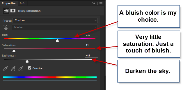
After searching for a short while, I found the right balance of blue, saturation and lightness. I made smaller changes to the mask along edges, primarily around the lambs, to make the new color work seamlessly with the photo. I used the brush for that.
At this point, I now had a photo, similar to my version 1, but with a sky that worked together with the rest of the image, but I still wanted to try one more thing.
Step 4 – Adding the Orton Effect
The Orton Effect can add a dreamy blurry and yet still sharp effect to the photo (you might want to read my tutorial on the Orton Effect). The Orton Effect can sometimes add a magic touch, and in this case, it did in the same areas as I used the double tone mapped image (the tiled pathway and the stairs). You can see the change here:

To create the Orton Effect I need two extra duplicated layers.
The first layer must be a merged version of all the layers. I don’t want to delete the layers, and there is a secret key combination for doing this. I haven’t found it in the menus, but it is one of the features I use the most in Photoshop.
I make sure that I am on the top layer, and then I use the secret key combination SHIFT + CTRL + ALT + E (on Mac SHIFT + CMD + ALT + E).
I get a merged layer, but without deleting the original layers.
The second copy I get just by pressing CTRL + J (on Mac CMD + J).
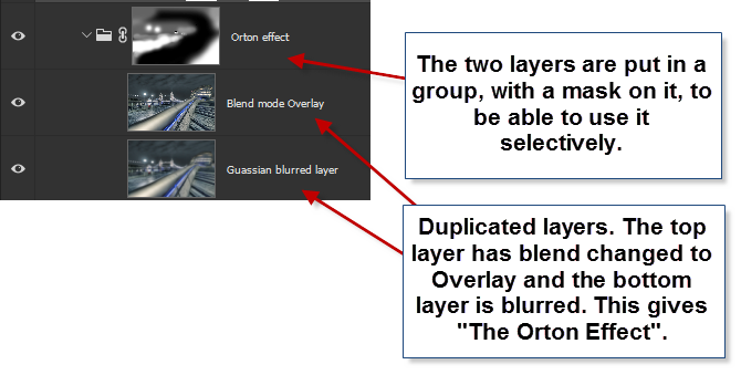
I then change the Blend mode to Overlay on the new top layer, and I use Gaussian Blur to blur the layer just below the top layer. The amount of blur I choose changes what the Orton Effect looks like, and I search for something that looks good.
I then place the two layers in a group, and add a black layer (CTRL + I / CMD + I will invert a white mask to a black mask) mask to that group, and then I paint in the Orton Effect where I want it, to the extent I want it.
If you look at the layer called “Orton Effect” you can see, the black areas and they will get no Orton Effect. That is the rail that doesn’t get any while the tiles and stairs get almost a full dose of Orton.
And that is the story of how I tumbled down the rabbit hole to the final result.
I needed some feedback to get the final idea.
It is always good to find someone you can ask for feedback. That could be a community or someone you know. I often ask my wife or my son for feedback, and they often give valuable feedback, that I can use.
–Jacob Surland