
The Bean in Chicago is an insanly fascinating piece of art.
During the day, The Bean in Chicago is crowded with people, enjoying the wild reflections. It is insanely fascinating, such a large curved mirror, and I shot a ton of photos during both day and night of The Bean.
About the making of this photo
This photo is made from 5 exposure bracketed shots. They are shot from -2 to +2 with 1 step between each photo.
First I processed the shots to get the color balance I wanted. One of the problems with city night shots, is that colors tend to get all orange.
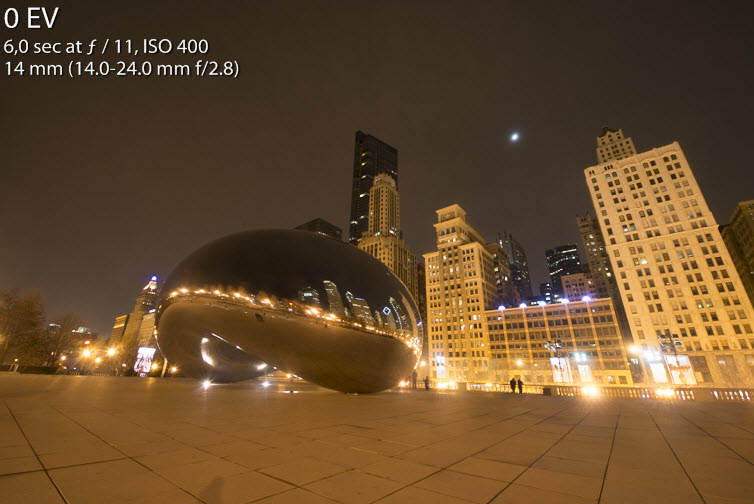
This is the 0-exposure. It’s very orange and dull in the colors and something had to be done to bring it to life.
In this case I started by fixing the colors in Lightroom. I did that by adjusting the white balance, and afterwards adjusting the Split toning panel. The temperature I adjusted to match the temperature of the light in Chicago, and this is done by moving the temperature slider to lower temperatures.
In this case things began to look normal around 2.100 decrees celsius. If you are unlucky, there is no simple selection, because many different light sources, with different kinds of light bulps are in the frame. Then I would suggest to make virtual copies in Lightroom, and match the temperature for each, and then load all needed versions into Photoshop as Layers, and then blend them together.

Bringing the temperature down normalize the colors.
The result from the changed White Balance is a bit on the cool side. While I like some of the blue colors, I have lost the warm city light, which I would like to have some of. To bring it back, I use the Split toning panel. The split toning can add some color to both high lights and shadows.

Splitning is used to bring back some warmth into the image.
I add some orangy / brownish color to the highlights. I use my gut feeling or taste to find the right amount. But the general idea is that the highlights should be warmer with a tint of orange.
To the shadows I add some purple. Again the purple is a blue, with some warmth in it, so to speak. And this way I add some warmth both to the highlights, and the shadows. You might ask, why I don’t I just change the white balance? Because the split toning allows me to target the highlights and shadows with different colors, and the result is different and more interesting.
I then synchronized the settings to all five shots in Lightroom, before I used my regular HDR workflow.
I exported the five originals into into Photomatix and did my tone mapping, saved the output file. This I opened along with the 5 original shots, in Photoshop as Layers.
Once in Photoshop I corrected the perspective and mixed the tone mapped image and the 5 originals to my liking. When I was done, I flattened the layers and saved it as a 16-bit TIFF file and reimported that into Lightroom. In Lightroom I did some final fine tuning of the colors. The sky had gotten more purple than blue, while during the tone mapping.
]]>
Nikon D800, Nikkor 14-24, ISO 400, 14mm, f/4.5, 1/25 sec
By pure random coincidence I arrived in Chicago on Sct Patricks day. I went for a walk and saw one of the landmarks: Chicago Theater. I would have loved to go inside, but on a short business trip, you’re not always allowed that luxury.
This photo is processed in Lightroom. The main things I have done to this photo is correct perspective and then change the White balance, and then do a little dodge and burn.
Some photos work absolutely best when the colors are as close to natural as possible, while others are quite different. In particular shots around sunrise and sunset really can change mood quite a lot, if you change the white balance.
Have a look at the before photo:
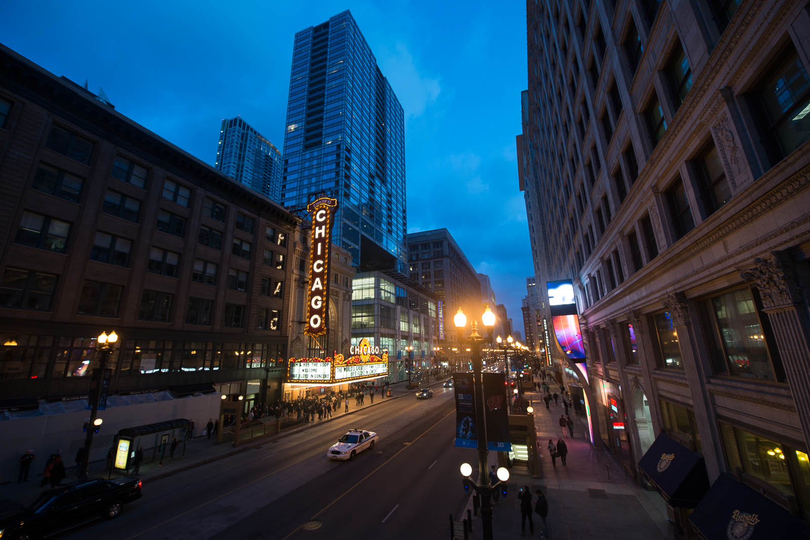 As you can see a much colder and less interesting photo. Reality is probably somewhere in between my final photo and this one. The camera is trying to deal with both natural light in the sky and electric light and chooses something in the middle, not really working.
I changed the color temperature from 3200 to 5800 in Lightroom. That added the nice and warm colors. Chicago in March, however, is a cold experience and I learned that Chicago is not named the Windy City for nothing. It was freezing cold and my colleague had to buy a winter coat! The warmth of the photo does not reflect the actual temperature, but then again, I’m not in business of portraying reality exactly, but rather in the business of making photos that I like.
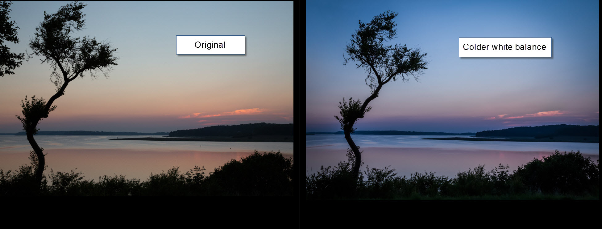
When you have these golden hour or blue hour photos, always try to make the photo a little warmer and see if you get something nice. This is another example from just after sunset, in this case I made it colder and that also changed the photo dramatically.
]]>

By chance I arrived in Chicago on the eve of Sct Patricks day and everybody wore green hats or hair and the city was partying. I of course have heard of this legendary day and I was also looking forward to see if they actually did color the river green. On my way up to the river I walked under the elevated railway and came by Millers pub and took a few photos. Later I got to the river and they sure had colored it green or rather super green.
About the processing of this photo
This one came out as a surprise to me and though it is a bit extreme, I like it. It’s much more like a painting Sometimes Photomatix does wonders for you. I processed this photo quite different than I usually do. I experiment with the things I learn and mix them together. This one is a cross-over of making HDR-like photos in Lightroom and then doing a real tone mapped HDR in Photomatix.
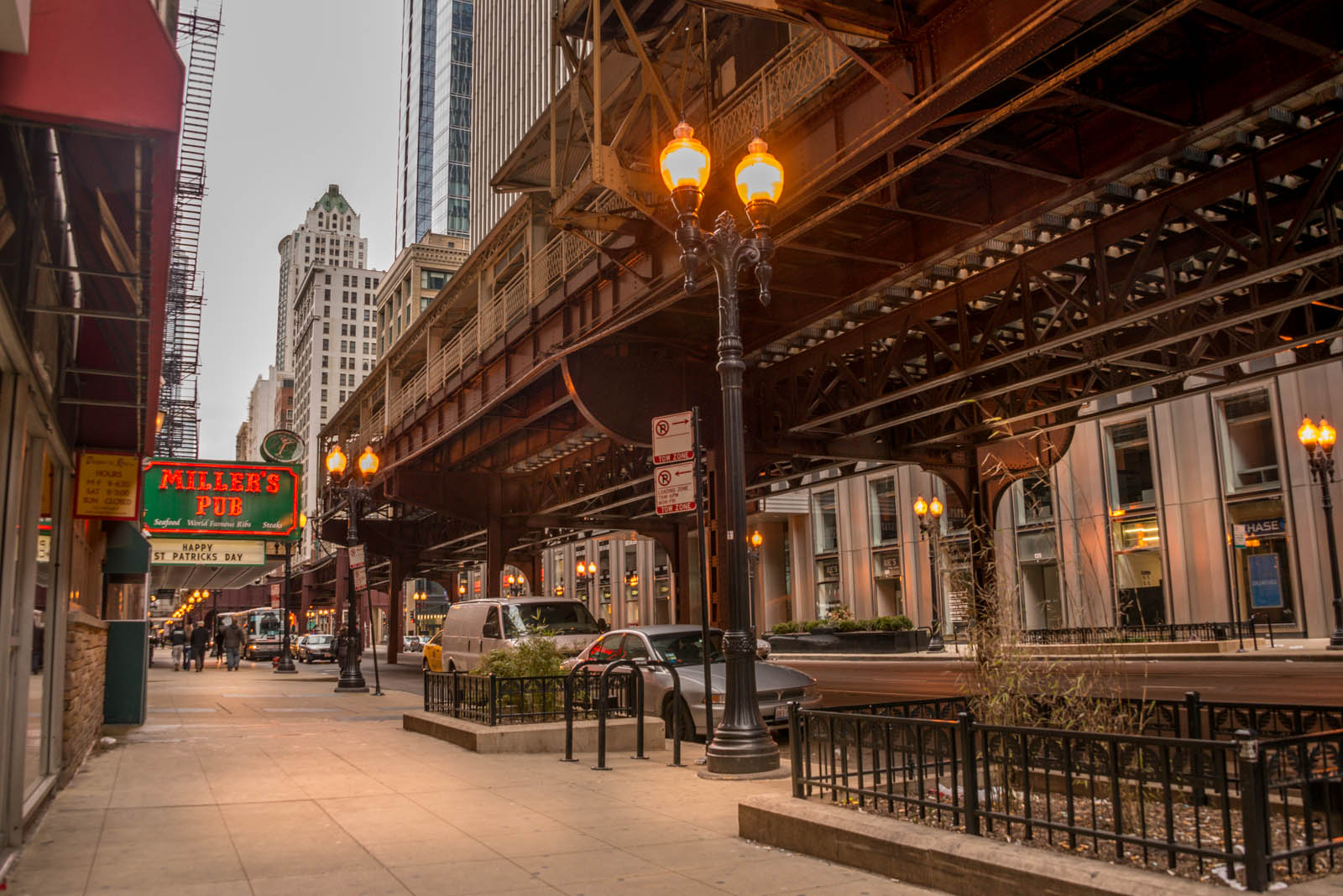
Initially I had 7 shots from -3 to +3. This is the -1 unprocessed:
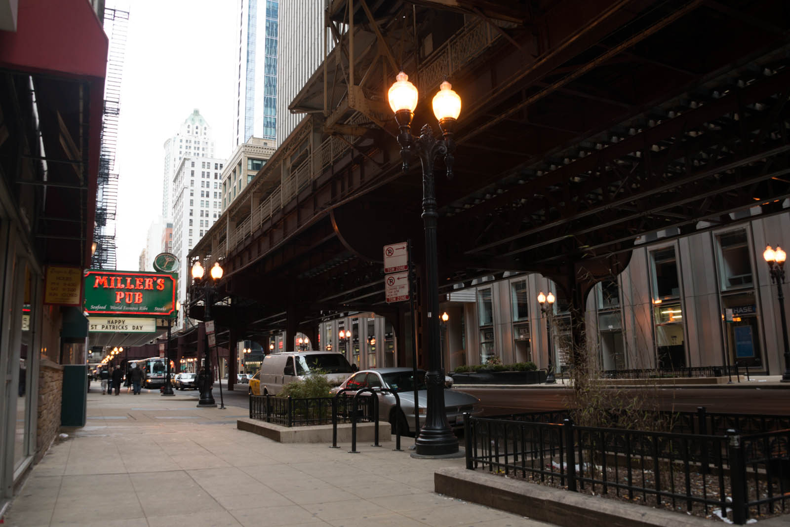
As you can see it is quite flat and the mood is far from the mood in the final photo. I had to shoot 7 shots, because it’s really dark underneath that elevated train and the sky is extremely bright in comparison, even though there were heavy clouds over Chicago that day.
I started by trying to do an HDR-like photo in Lightroom (you can read about how you do that in this article), but because of the huge dynamic range (very dark and very bright), I couldn’t to that. Either there was too little information in shadows or the sky blew out. So after having worked with it for a while and not really getting anything that I liked I decided make a true tone mapped HDR. At this time, this was what I had in Lightroom:
I had added a little artificial light on the sidewalk and on the buildings. This makes the photo a little more interesting for the eyes to wander around in (you might want to read about how I add artificial light in this article).
What I usually would do is to press reset and then export the 7 photos into Photomatix and do my usual process. But what I did in this case, was to synchronize my settings from the one photo to the six other photos too. Lightroom has a simple and very fast way of doing that:
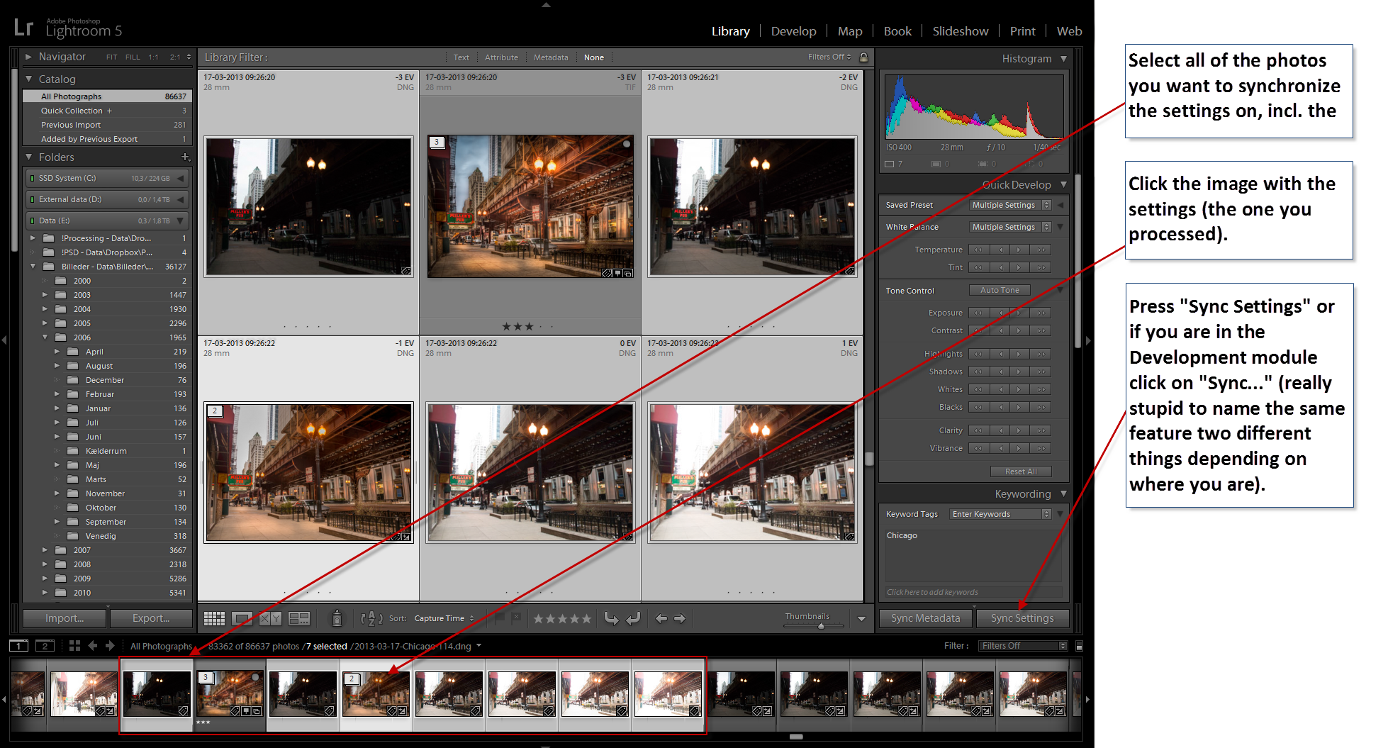
What you have to do is to select all of the photos you want to synchronize the settings to and include the one you have the settings on – seven photos all together in this case. Then click on the one that you have processed (the one with the settings) and then click on “Sync Settings” (or if you are in the Development module click “Sync…” – it’s the same feature, just named two different things, depending on if you are in the Library module or in the Development module – really a stupid thing to name the same feature two different things). This gives you this dialog:
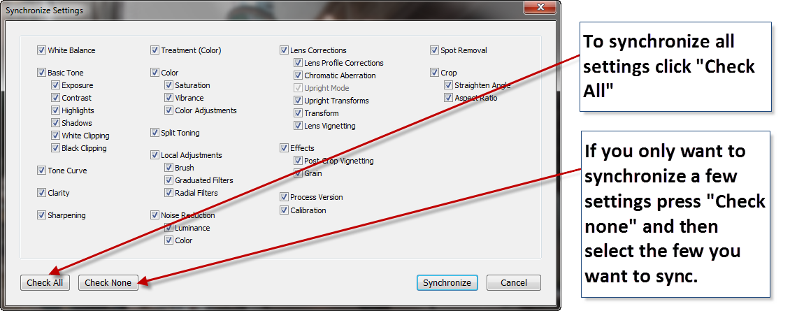
To synchronize everything click on “Check all” and press Synchronize. If I just want to synchronize some of my settings, like some color balancing or maybe a crop or some other settings I have made, I always press “Check none” first and then select the settings I want to synchronize. This way I don’t happen to miss deselecting some setting I don’t want synchronized.
So now I had 7 exposures all post-processed in Lightroom using the HDR-Like post-process flow, and with some dodge and burn and a few other adjustments. I exported them into Photomatix and this is the tone mapped image I got from Photomatix:
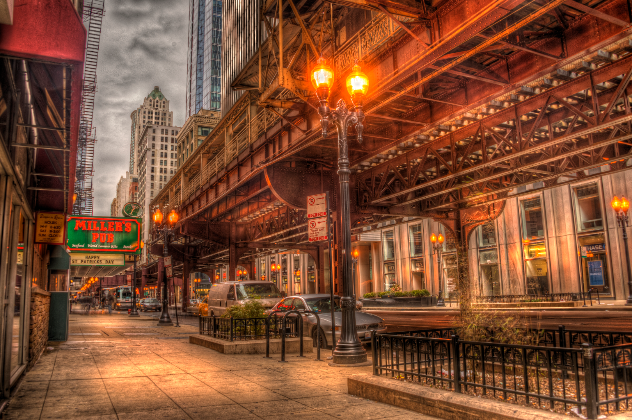
Now, that was funky – I instantly recognized this as a Double Tone mapped image, even though it is only a single tone mapped image (if you want to know more about double tone mapped images, you might want to read this article). This got me thinking. The HDR-like processing I did in Lightroom evens out the differences between highlights and shadows (that is the purpose of HDR photography). So in a way this shouldn’t have been a surprise, I just made the first HDR image in Lightroom and the second in Photomatix. Normally I do both HDR’s in Photomatix Pro.
Another interesting thing about the tone mapping is that even the fairly subtle dodge an burns I did in Lightroom got accentuated in the tone mapping process. It’s part of what the double tone mapping does. Even small differences in lights and shadows gets emphasized and this can in some photos look fantastic, but you have to control it, because it easily gets out of hand in the double tone mapped image.
The raw output from Photomatix Pro is a bit too extreme, so I have to dial it backwards a bit. A problem with the double tone mapped images is that strong light sources often gets over the top: 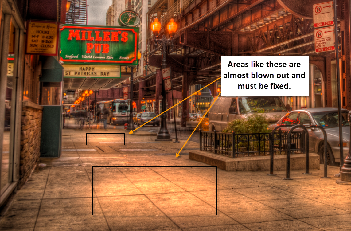
Have a look at the side walk. The light souces are almost blown out and it does not look good. This have to be fixed.
What I do to fix this, is to mix in one of the original 7 shots. I paint on a layered mask, to blend the tone mapped image with one of the original shots like this:
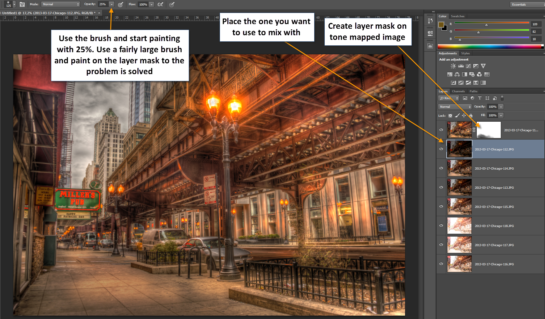
And by painting over the problematic areas I slowly fix the problem. Each time I click I add another 25% opacity of my brush to the area. By doing it gradually, instead of painting with 75% or 100% opacity, it makes it easier to control and to hide the strokes that I make. You don’t want to be able to see strokes. You might want to read my articles on blending layers in Photoshop or blending layers in GIMP.
The rest of the photo I dial slowly backwards in local areas. I wanted to keep the mood, but I also wanted to get rid some of the extreme HDR look. I did that by keep blending the various images into the tone mapped image. Finally I did some sharpening. For some reason HDR often looks a little to unsharp to my taste, even though they are sharp. I there fore apply some sharpness using the Unsharp mask.
So that was the making of this HDR. Remember that if you want to make similar photos, you need Photomatix and you can get 15% off Photomatix Pro if you use my discount code “caughtinpixels”. You can buy Photomatix right here.
]]>
The Bean in Chicago is an awesome pieace of art. Though I only had very little time in Chicago I managed to get by it three times, the last time was at night time. The bean is a huge mirror built in steel, and then shaped like a bean. Everything reflects in the bean but in strange ways, because of the curves. It’s very fascinating.
The photo is a 5 shot HDR shot with my Nikon D800 and the Nikon 14-24mm lens, which I love to death. When I processed this photo I made both a tone mapped version and a double tone mapped image in Photomatix Pro and then I have blended them in Photoshop. The double tone mapped image I have primarily used for the ground, because it emphasize the texture and details.
Double tone mapped HDR images are often very easy to recognize. They push the image beyond a natural looking image, into a much more painterly world. They start to look like paintings rather than photos. Some like this, others don’t. I do like it. But exactly what effect you get when you double tone map an image, depend very much on how the light was when you shot your photo. A city night shot like this of the been, is excellent for double tone mapping. Here are some other examples of double tone mapped images:


As you can see they have a look and feel in common. That is the because of the double tone mapped image made in Photomatix Pro.
What a double tone mapped image does, is to exaggerate the texture and details enormously, which can look very cool if applied to all of an image, but you can also use it much more subtle, like in the two images below. In both I have applied a double tone mapped image to both on the rocks in the foreground and to the house in back ground, but the rest of the images are mostly other normal tone mapped or maybe just even one of the original shots.


As you can see, they are very rich in detail on the rocks as well as on the houses. This is because of the double tone mapped.
How to make a double tone mapped image
The idea of the double tone mapping is that, you first do one HDR photo and tone map it in Photomatix using the option “Tone map” and “details enhancer”:
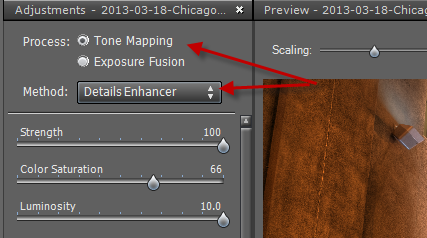
and the image that you get from that process, you tone map too.
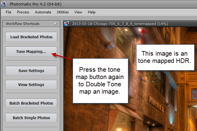
This is simply done by pressing the “Tone mapping” button once more. A side effect of the double tone mapping is, that you get a lot more noise (grain) into the image and a wildly saturated image. The noise you have to clean up with a tool, but not necessarily all of it. The noise adds some of the grittyness to the image, which is part of the effect.
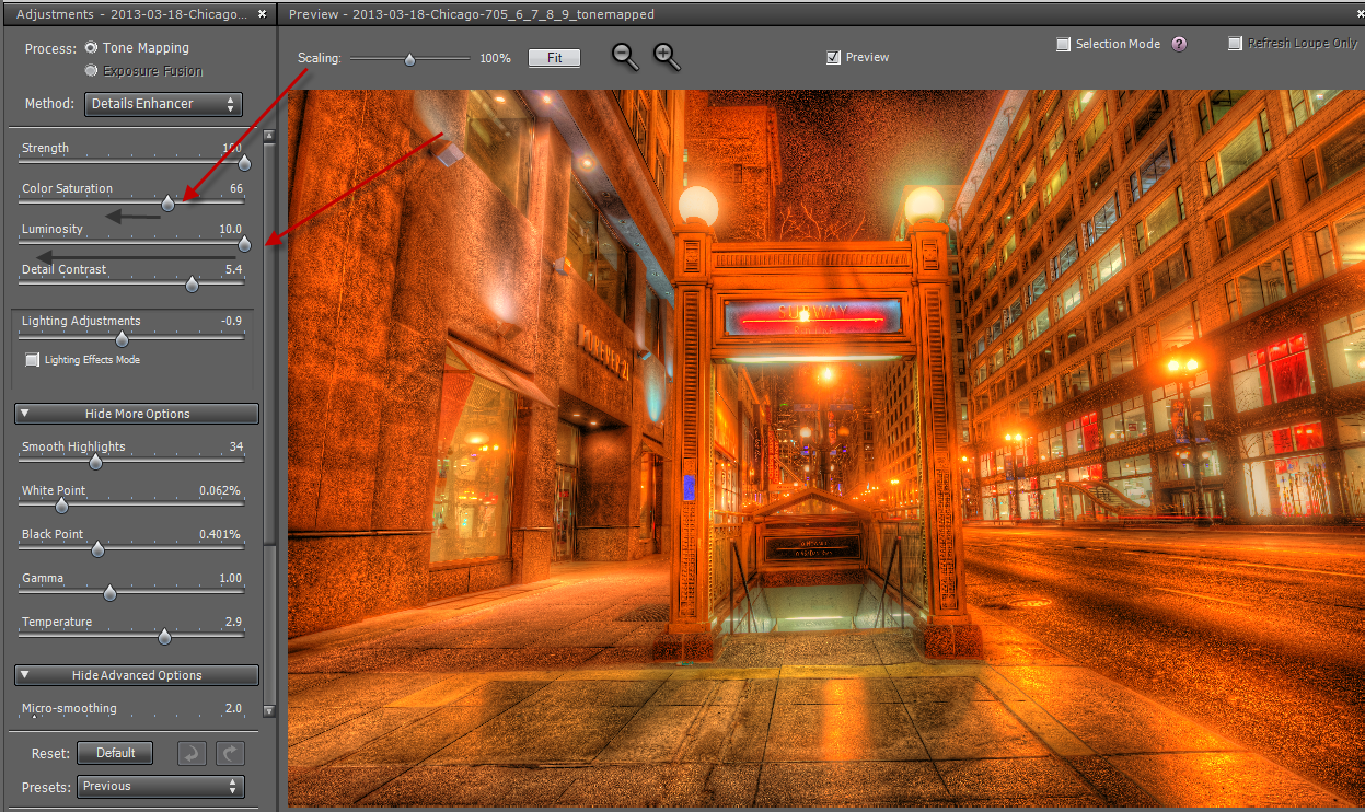
As you can see this is wildly saturated, so I slide the saturation slider to the left. I also do that to the luminosity slider. The Luminosity slider is very potent now, and I select something that I like, which is usually on the far left. And this is the result I get:

When you try to do this, try some of the other sliders too, and see how they affect your photo. When you are done, you have your double tone mapped image.
The way I process my photos, I will only use a portion of the photo. I never use what I get from Photomatix 100%, I always mix a bunch of images into the final image. I have a pool of candidates, the double tone mapped image is just one candidate.
If the double tone mapped effect is too strong, I will only mix it in with perhaps 50 or 75% opacity (see my tutorial on blending and mixing layers in GIMP or Photoshop).
This is the basics of double tone mapped image. You do need to have Photomatix Pro to do that. If you use this coupon code “caughtinpixels” you get 15% discount, and you can Photomatix Pro here.
]]>
On the first floor of a sky scraper on the magnificent mile in Chicago we had a great big american steak, that doesn’t get any better, at Michael Jordan Steak house. It was superb. While sitting there, I was looking at this fantastic hand painted ceiling of a kind of African style. I took a picture of that (to be published later). While taking that shot, I looked down the hall way to the area with elevators, which looked interesting too. I walked down there, and saw something more fantastic. I saw this Egyptian stair case on the first floor in a skyscraper – wow, how did that ever get there?
About the processing
This shot is a very typical double tone mapped HDR photograph. You can see it from the strong enhancement of the details. When you do a double tone mapped HDR, the details are enhanced quite a bit, and you have to be careful not to over do it and you have to be aware that you are moving into a surreal zone. Many photographers don’t like this area, because it doesn’t portrait reality as it looked. No, true enough, but neither does black and white photos. A double tone mapped image is like a painting. I put no less work into making a double tone mapped image, than I do into making any other image. It doesn’t make it less good, than any other photos that it is a double tone mapped image and I like it, and many people really do. But some there are people who don’t like it.
This is the 0-exposure original image:

#1 Notice how the details are enhanced, compared to this original photo. While this is an ok’ish photo, I like the double tone mapped much better. The rug on the floor also has got a lot more detail and texture. I like that in the final photo. A double tone mapped image is an HDR image that you created with Photomatix Pro, and that you tone map once more. This is easily done, by clicking “Tone mapping” once more in Photomatix. The photo goes complete crazy, and you have to turn down the saturation and the luminosity to achieve the desired effect.
#2 I have straighten the photo up. As you can see the lines are tilting, and that is because I was using a really wide angled lens at 14mm. And because I tilted the lens slightly upwards, the lines start to get really tilted. This is an effect, but also a nuisance, that you have to learn to handle. I straighten this one in Photoshop, by using Perspective crop tool, but I could also have done it in Lightroom, by using “Lens corrections -> Manual -> Vertical and horizontal” sliders.
The photo is a 5 shot HDR, that I merged in Photomatix Pro. I have tried making double tone mapped images in Nik HDR Pro 2, but haven’t had a lot of succes with the results.
]]>