
Hallstatt in Austria. Edited in Aurora HDR 2018. 0% Photoshop used and 1% Lightroom used.
Initially, when Aurora HDR came out two years ago I was very intrigued by the software. No doubt the makers of Aurora MacPhun have put themselves in a good position, by allying themselves with one of the HDR giants Trey Ratcliff. But, after the first initial rush of interest, I was deeply disappointed.
I did go into the software with a very open mind. I am a software addict and I love to use new software. However, I instantly ran into trouble. It was Mac only, I had Windows. I did have a 4-year-old MacBook Air. The biggest 2011 model, 4 Gb ram and i7 CPU. Powerful enough to run Photoshop, Photomatix, and Lightroom. Not the fastest car on the highway, but certainly working.
But, starting the first version of Aurora HDR with a 36-megapixel image was impossible. I then downscaled the images to about 12 megapixels and I was able to start the application, but I ended up waiting until I got a MacBook Pro.
On my fully loaded, top of the line, all maxed out MacBook Pro I still found Aurora HDR was extremely slow. Whenever I did anything it took seconds and some operations took up to a minute. I timed it and filmed it.
I did make a couple of OK-ish images and I did a review while still biased by the hype. But, as soon as the smoke did clear I was not overly happy to work with the tool. It was far too slow and the results were not always satisfying.
Aurora 2017 arrived
What? Do I have to buy a new version? Not just an update? All of my other tools for Photoshop come with free updates. That didn’t feel right. Particularly, because the first version was more of a Beta than an actual working tool. And looking at all of the praise on the internet and feeling the hype, I thought “This is the Emperors New Clothes”. They were selling a turd as if it was the greatest pumpkin pie ever made.
Anyway, I bought 2017 reluctantly. The speed issues were mostly gone, which was good. A new luminosity feature had arrived, not very fast though, but most things were snappy enough.
I tested the quality of the tool, but I was deeply disappointed by the tool itself. It generated halos no matter what I did and I could not really get rid of them. The brush left strong edges between the layers, making it even harder to work with.
Once in a while, I have tried to process a photo in Aurora 2017 just to be sure, but I never liked what came out of it and I simply stopped using it.
The hype was still going on. To me, Aurora HDR 2017 seemed just as much The Emporers New Clothes as the first version.
Aurora 2018 – I have to pay – again?
I almost didn’t buy it.
Come on, make a subscription out of it! It is ridiculous to buy a new version every year!
Being so disappointed with the two initial versions I had almost given up on it. But being the software addict that I am, I bought it and in short, I was deeply impressed.
Let’s begin with a screenshot:

This is a 5 exposure bracketed image series and I have merged the 5 images and nothing else. I have touched no sliders. This is the clean HDR merge that Aurora HDR does. Notice the very strong dark halos on the left, which is the 2017 version. It is that type of halos that torments almost any image in Aurora 2017, almost no matter what you do.
I have tried to make counteractions to get rid of the halos or try to hide them, but it shouldn’t be that way. Almost all tools can generate halos if you go over the top, but not out of the box. This is what Aurora HDR is put in the world to do. Merge exposure bracketed photos to something decent.
Almost all tools can generate halos if you go over the top, but not out of the box. This is what Aurora HDR is put in the world to do. Merge exposure bracketed photos to something decent.
On the right there is you can see the new Aurora HDR 2018 merge and not only, does it not have the nasty halos, it also does a very clean and nice merge. That has changed my mind entirely on Aurora HDR. At least the software now does, what it is supposed to do.
Edit: To be very strict the merge in Aurora HDR 2018 is not 100% perfect. Halos are just so soft and big, that you have to look for them and it is very easy to work with. I don’t believe in “press a button processing”. I believe what comes out of any HDR tool has to be blended with the original photos to achieve a perfect HDR photo. There is no silver bullet.
A few other very nice new details that I like:
- The speed has improved even more. I would go so far as to call it very snappy and responsive in most respects, even on my 42-megapixel images. They have certainly worked on optimizing the speed. It does get slower as you add more layers, but then again so does Photoshop. I have triggered something that requires heavy calculating, but mostly it is snappy.
- There are the necessary tools to finalize a photo in Aurora HDR 2018. You have:
- Transform features to correct perspectives. However, this feature is only available at certain times which makes it very confusing to figure out. A good beginning, but there is room for improvement.
- Crop tool.
- The Heal tool is an external tool that requires an additional license, but it is accessible from Aurora. You can also just remove the spots when you bring the photo back to Lightroom.
Other improvements that I like
- The brush is soft enough to make nice blends between layers. In 2017 clear edges appeared around the brush, which was another reason not to use Aurora 2017.
- Original images are not apart of the new file format, which I guess is fine if you don’t need them. You can load them if you need them. Edit: This has been fixed in a later update.
What I don’t like
- The merge is very clean and the halos are super soft, if there at all. The images do tend to be a bit flat. That is normal behavior for HDR software and you will have to process the image more, to add depth back into the image. The best way to achieve this is by blending in the original images.
- Minor things that I find annoying, like:
- There is no “Save as…” feature – but why not?
- Some features are located in strange places, like for instance the Transform.
- No preview from Finder or Bridge. A small thing, but it just would make it easier to handle Aurora HDR files in a workflow.
- Call it a software subscription instead of a new paid version every year. I don’t mind paying for a subscription, at least I know it’s a subscription.
Who is Aurora HDR 2018 the right tool for?
When you begin to use a tool, that does a lot automatically, like Aurora HDR 2018 does, you also have to accept that it has a distinct and recognizable style.
Aurora HDR has a distinct style and you have to do some work, to get rid of it, just like you would with any other tool. That doesn’t make it a bad tool if you like what you get out of it.
Aurora HDR is capable of producing high-quality HDR photos, without the nasty halos the first two versions created. It is packed with a lot various effect tools, like Radiance, Glow, HSL panel, Split toning panel, various HDR structure sliders, vignette tool as well as old plain contrast, highlights shadows and white and black sliders. You also have the Luminosity masks available. In short, it is a pretty full package.
So, who is this tool for? Anyone how likes to shoot HDR photos and who might feel that dancing with Photoshop is too difficult, but Lightroom is not enough.
Aurora HDR 2018 is finally ready for real use and it is a full package, that can produce final images, maybe with the exception of removing dust spots.
Will this be my tool of choice? For some things, absolutely, but not solely. Why? Because I love to work in Photoshop and some of the highly advanced things I like to do in Photoshop, are not available in Aurora HDR. I love to post-process the images. I don’t necessarily want the fastest route through the forest. That is just how I am. You may feel different.
–Jacob
]]>

I found this Colorful Shop in Rome.
While we were in Rome we passed this little mini restaurant, street kitchen, kiosk, souvenir shop many times, and at night, it was full of lights.
Just behind this little street shop, there are stairs leading down the Tiber, which is the river winding its way slowly through Rome.
We went down there during the day, to shoot the Castel Sant’Angelo from below. We had the feeling, that it was probably not the safest place in Rome after dark. And yet, we had seen many night shots from down there.
We decided to take the Blue Hour up around the Vatican, and then work our way down here to Castel Sant’Angelo, and take the late blue hour or the first of the night. And then we would make a judgment of the situation. Would it be safe to go down to the Tiber or not.
By the time we got down to this kitchen on wheels, at was a bit darker than we had planned. A few people hung around in the area, and I started the descent of the stairs, looking carefully around.
I didn’t get more than 10 steps down, and the stairs were splashed in what looked exactly like fresh blood, and I turned around. Even if I wanted a photo from down there, I didn’t want it that bad.
Instead, I have been playing around with one of the daytime photos I shot. I don’t like daytime photos that much, and I don’t a lot of them. But what I have come to like, is to put textures on them.

Castel Sant’Angelo in Rome is fascinating. I wouldn’t go as far as claiming that the building is beautiful, but spectacular it is.
The textures take the daylight away, in particular in this one, where I have gone berserk. I have begun to use AuroraHDR. Another neat feature in AuroraHDR is, that it support Textures too. However, my poor old MacBook Air from 2011, didn’t like 5 layers of textures on top of a 36 megapixel HDR.
Fair enough, it adds up in the memory, and my Mac only has 4 Gb, which is far too little to be doing heavy image processing. 8 Gb would have been much better.
When you make textured images, it is important to use several layers of different textures. A single layer will be too dominant and too easy to see ‘what is’.
Textures are typically images of a wall, ground, iron, paper, anything flat, and by using several textures, you get a complex mix, not only of structure but also of colors. And if you can find something, that works nicely together
The trick is to find some textures, that work nicely together, both in colors, and structure. And depending on the image you use, the blending changes, and you find that you have to apply textures that work well with your photo.And if you can find something, that works nicely together
I never apply a texture evenly on an image. I always add a mask and paint in and out the bits I like and don’t like. My primary objects, like the Castel Sant’Angelo in this image, I give a less texture, to enhance it.
If you find my articles interesting and consider getting AuroraHDR, please use the link on my web page and support me that way. I only recommend software and tools that I use.
I am not ‘bought’ to say nice things with sugar on top. I say what I think and feel about products. I get nothing for writing these articles, but I do get a kickback if you use my link to buy AuroraHDR, as well as if you use my 15% discount coupon code “caughtinpixels” for buying Buy Photomatix Pro. Thanks.
If you like my work, why not follow me on Twitter, Facebook, and Google+. I post photos daily.
–Jacob Surland
]]>
The ‘Skerpi’ is a house made of sticks, and put on wheels. The gourmet restaurant ‘Koks’ from the Faroe Islands has this as a pop-restaurant in Copenhagen these days.
For the past week, I have been playing around with AuroraHDR by Trey Ratcliff and Macphun. It’s one of the latest products for creating HDR photos, and I have been pretty excited about getting to know it.
This article covers my first initial impression of AuroraHDR. My overall impression is positive. There are lot’s of good stuff, but there are also a couple of bad bits.
Let’s start with one of the bad bits. It’s Mac… Only… However, Macphun is working on a Windows version, but there is no official date for this yet. Maybe they will brand it under ‘Winphun’? Probably not!
Anyway, I am or was a Windows user, but I do have a MacBook Air 13″ from mid-2011, equipped with an i7 1.8 GHz and 4Gb ram. It was the most powerful MacBook air back then. And this Mac has been my test drive computer.
I think that has been a good exercise and I can give a couple of additional input because I used this older computer.
First run of AuroraHDR
I picked a series of bracketed photos from my latest photoshoot. I exported seven exposures from Lightroom as DNG (Adobe’s device independent RAW format) files, as I always do, and dragged them into AuroraHDR.
And I waited for the preview screen getting ready to show the images.
It was 7 36.3 megapixel photos from my Nikon D800, and it took a while, so I waited a bit more. Fair enough, it is big image files.
And then I waited a longer bit more.
After 30 minutes of waiting and nothing had happened, I shut off the computer. I was VERY disappointed.
I tried once more, and picked only 3 of the 7 exposures, and after a couple of minutes the previews did show up, and I could start up AuroraHDR.
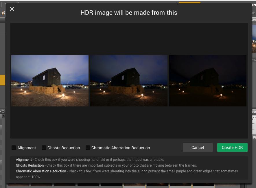
I wondered because I had heard that AuroraHDR should be fast. I looked up the minimum requirements, but my oldish Mac was above the minimum requirements. What could be the problem? Had Macphun really made a piece of software that couldn’t run on an older Mac?
No, of course, they had not. It took a little experimenting to figure out, what the problem was. It was the file format DNG. For some reason, the DNG files are insanely slow loading in AuroraHDR.
As soon as I used JPEG or native RAW files, it’s pretty snappy. 36 megapixel files are slower to work with, than 12 megapixel, which is no big surprise. But it works.
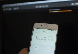
I did a test using three 3 images of 36 megapixels. The native Nikon RAW files took 1 minute and 55 seconds until it was ready to process. The DNG files took 11 minutes and 11 seconds. The first is comparable to other tools, but DNG is just too slow.
AuroraHDR tip #1: Do not use DNG files. Use native RAW files or JPEG files.
Now that I had found a solution to my initial major disappointment, I began exploring the tool itself. After looking for a little while, I realized, that AuroraHDR is a stand-alone image processing tool.
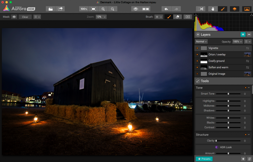
You can (almost) use ONLY AuroraHDR; it’s like a studio.
AuroraHDR high-level feature overview
The software loads and merges the images into the 32-bit HDR image, as is expected from HDR software. And then what? What is available?
As I said before, AuroraHDR is a Studio, and what do I mean by that? You don’t need much else. You can do almost everything inside AuroraHDR.
It offers layers with masks, as you know it from Photoshop and GIMP. It has a ton of tools to adjust including: White Balance, Clarity, Contrast, Color balance, toning, Gradient adjustment, split toning, and these are just some of the tools available.
The initial HDR image will be the first layer. On top of that, you can add other layers, and each layer has the same set of adjustment tools available.
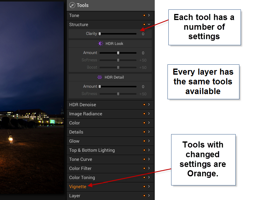
In Photoshop, you can add a curves adjustment layer and a Hue and Saturation layer etc., and they appear as individual layers. In AuroraHDR if you add a layer, that layer has everything, all adjustment tools are available.
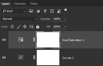
The first mistake I made, was to forget about the layers and try to do everything in one layer – the Original HDR image layer. And of course, I can’t do that. I can try, but the result is not very good.
After having played around with a couple of images, I decided to do this little cottage standing in the harbor in Copenhagen. I ended up with 5 layers.
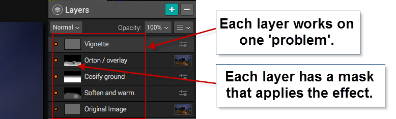
In a way, this is similar to what I would do in Photoshop. I start out with an original image, and I begin to apply effects, to solve ‘problems’.
Those of you who follow my blog will know, that I the way I post-process my images, is by identifying problems and solving them.
The problems I worked with on this image, were like this ‘The ground is too gritty’, ‘It’s not cozy enough’, ‘It’s not warm enough’. All problems leading to the creation of an inviting warm image.
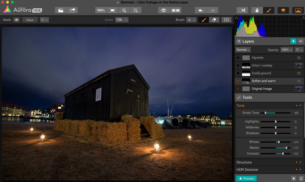
The second layer enhances the warm light coming from the small lamps.
As it turned out, I adjusted no more than 3 tools in one layer, and I think that was the right strategy. If you try to do too many things in one layer, you end up with unwanted effects in some areas.
AuroraHDR Tip #2: Limit the number of tools you use in each layer. This way you can make changes locally, rather than globally.
I am pretty happy with the final result of this image. I could have reached a similar result, using Photomatix and Photoshop, as I usually do, but in this case, I was able to create everything inside AuroraHDR.
What’s missing in AuroraHDR?
AuroraHDR is almost a complete Studio; only a few pieces are missing. In my workflow, it’s the ‘finalizing’ that I can’t do in AuroraHDR.
The Crop and Rotate tool work nicely, but it does not have perspective correcting options. If you need to do perspective corrections, you will need another program. It’s not a big issue, AuroraHDR comes with export to Photoshop, but the feature is not inside AuroraHDR.
There is no healing brush or clone stamp, which again force you out of AuroraHDR, again not a big issue, but if… That would have been nice.
There might be a couple of other things I discover when I get around in AuroraHDR. But I haven’t found them yet.
What’s not so good in AuroraHDR?
One of the big issues with creating HDR photos is the noise. Digital cameras produce noise in images, especially at higher ISO levels, and HDR increases that noise.
Photomatix Pro, which I am very fond of, has a bad reputation for creating a lot of noise. But Photomatix can create noiseless HDR photos if you set the settings right. The question is if you like that output.
AuroraHDR comes with a built-in adjustable noise reduction. A very nice touch I must say. However, if your photos have areas, that are underexposed, AuroraHDR handles those areas badly, at least if you try to lift the shadows.
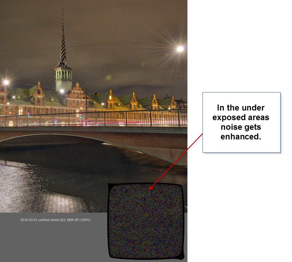
In my first test drive of AuroraHDR, I didn’t find a good solution for handling underexposed areas. Not the built-in HDR Denoise tool. By the time the noise is gone, so is the details. So the solution I found best, was to leave the dark, in the dark.
You could argue, that this wouldn’t have been a problem, had I shot some brighter exposures. In reality I had shot too few shots, to cover all of the dynamic range, so, in a way, it’s a self-inflicted problem.
AuroraHDR tip #3: If you have noise levels beyond control in AuroraHDR, you can make a version of the image in Lightroom, treating these dark areas as you would like them treated. Then export that version and blend it in, in Photoshop or GIMP.
Conclusion after the test drive of AuroraHDR
Will I use this tool again? Definitely. Will it be the only tool I use? I think not, but it will play a major role I think.
It will not replace my beloved Photomatix, but it will be a strong alternative. And thinking about it, I will be able to use AuroraHDR in the same way, as I use Photomatix, just as well as I can use the ‘Studio’ to make a final photo.
The initial HDR image created by AuroraHDR, you can process using the various tools included. But even before you do anything, you get a pretty good start:
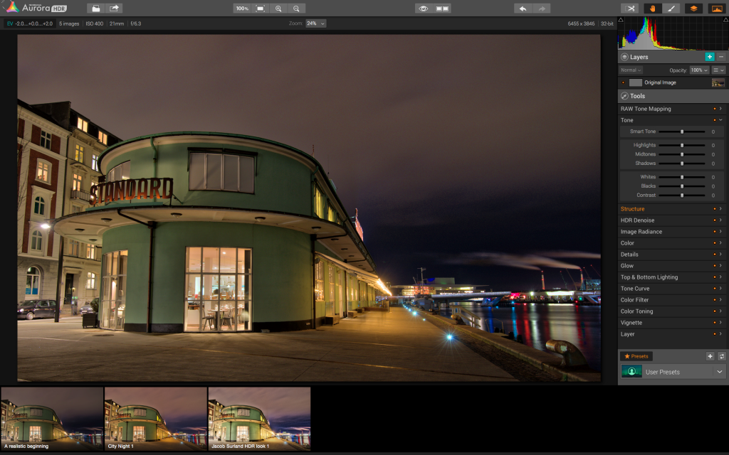
The Standard is an old ferry terminal in Copenhagen. This is the initial HDR, and it is really good looking already.
AuroraHDR does a lot of things in a cool way. I think the biggest danger of using AuroraHDR, is that you get lazy and get stuck on presets.
For some people AuroraHDR might just be the tool they need to create better quality HDR photos, with less effort. I am not on that road. I am not searching for less effort, but for new interesting paths to walk. AuroraHDR offers that.
Because there are so many tools built into AuroraHDR, you can get tempted to stop right there, on ‘just one layer’. And if you get real lazy, that layer is just a preset.
The problem of getting stuck using just one layer is that you don’t reach the full potential of your image. You apply all changes globally with a few exceptions like the gradient tool.
What pushes a photo from 80% to a 100% is the local optimizations. AuroraHDR raises the bar, from the ‘out-of-the-box’ HDR photo, but it is still not a 100%, and what fun would that be, if it was? I love post-processing.
What is new, is that you can move from 80% to a 100% without leaving the software. AuroraHDR offers new ways of working, and it will be refreshing to try it out.
I have been planning a switch to Mac for a longer period. As it happens, my old Windows computer has numbered days and is waiting for retirement or burial.
AuroraHDR is what tipped the decision, and I have now ordered a MacBook Pro. When I get that, I can dive further into AuroraHDR. And that I am looking very much forward to!
The Weekend Post by Jacob Surland
If you find my articles interesting and consider getting AuroraHDR, please use the link on my webpage and support me that way. I only recommend software and tools that I use.
I am not ‘bought’ to say nice things with sugar on top. I say what I think and feel about products. I get nothing for writing these articles, but I do get a kickback if you use my link to buy AuroraHDR, as well as if you use my 15% discount coupon code “caughtinpixels” for buying Buy Photomatix Pro. Thanks.
If you like my work, why not follow me on Twitter, Facebook, and Google+. I post photos daily.
–Jacob Surland
]]>
In the previous articles we have covered the theory behind HDR, and why it is necessary to take more than one shot. How to improve the image quality, by pushing the histogram to the right and various approaches to post-process HDR photos. This is fundamental knowledge to HDR photography.
If you did not read them, you might want to. You find them here:
- Part I: Understanding Exposure Value Stops or EVS.
- Part II: The Dynamic Range.
- Part III: The Histograms.
- Part IV: HDR and tone mapping.
The purpose and result of HDR software
Because you shoot several shots of the same scene, you have to use a tool to put them together. You can either do it manually, and blend the images, by stacking the photos in Photoshop or GIMP and then blend them into a final HDR photo using layer masks. Or you can use a tool that will do this automatically.
The automatic HDR software is probably the more common approach.
The problem of doing something, automatically is, that you are less in control, and the engine might not do want you want it do, or it will do more than you want it to do. Like in all other aspects of of life ‘there is no silver bullet’. There is no secret recipe, that will give you fantastic HDR photos, by pressing a button.
But making a fantastic HDR photo, does not have to be difficult, if you just know what to do, and have done a little practicing. I will help you understanding, what it is that you (need to) do.
As covered in part IV, the purpose of the HDR software is a two step process, first to merge the photos together to a 32-bit image file (the real HDR photo), and second to transform it into a 16-bit image, because you can’t see the 32-bit image properly. The 16-bit, is not really an HDR photo, but is usually referred to as the HDR, and this I also do, just bear in mind that the 32-bit image is technically the HDR photo.
A tone mapping algorithm will map the tones from 32-bit to 16-bit and a fusion algorithm will blend the photos.
The fusion algorithm does not have the same flexibility and artistic options as does the tone mapper, and for that reason I personally prefer to use a tone mapper, rather than use a less flexible fusion algorithm. But it is a matter of personal taste.
Tone mappers also come in many flavors, and to me, artistic flexibility is the most important thing.
Single exposure tone mapping
The tone mapper maps tones from one image to another, by passing the image through an algorithm. The merging of three images into the 32-bit HDR, does not have anything to do with the tone mapper itself.
You can take a single (well exposed) image, and put that through the tone mapper, and you will get a similar result, as had you used a 32-bit HDR photo. The viewer will see the photo, and recognize it, as what is commonly referred to as ‘an HDR photo’ (keeping in mind, that the only HDR really is the 32-bit image, that we can’t see properly).
Not all single exposure images gives great results in the tone mapping algorithm. It depends very much on how well exposed the image is.
A couple of examples of single exposures I have tone mapped:


To commoners these photos will look like HDR photos, because what is commonly referred to as HDR photos, really are tone mapped images. And the commoners, will not know the difference. I hope I have made it clear enough to you.
Side effects when tone mapping
Tone mapping is not without flaws, in particular if you push the gas pedal towards the floor. To me the tone mapper is a flexible tool, that you can bend, not necessarily to your will, but can bend into many interesting and artistic results, but if you are not careful, you can also get the worst image ever. This opens up for creativity and I do use this to great extend, and with great care.
Let’s walk through some of the common side effects from tone mapping.
Halos
Halos are bright edges that appears around darker areas, typically along the horizon. You will see a bright halo in the sky, like if the horizon was shining. You then have few options, either lift your foot from the gas pedal, and do a less strong tone mapping, or see if one of the sliders, helps you, without ruining what you have. The last option is to fix it later. You often end up in this situation, because the rest is looking nice, and that IS no problem to fix later.

And if you look at the thumbnail, it is often even easier to spot the halo:
Some halos are easy to spot. You can see them a million miles away, but others you don’t notice at first. A thing I have begun doing, to increase my ‘halo termination quote’, is to zoom out and get a very small image. This way, you can see large halos very easily. These can ruin a photo too, but be difficult to see, if you work close to a 100% zoom level.
Noise
Digital noise is a killer in tone mapping. Some tone mappers are worse than others in producing noise. But where does the noise come from? The noise already exists in the photos, it’s just not very visible, but when you apply the tone mapper the noise is enhanced, because one of the things that the tone mapper does, is to increase micro contrast. If you have even a little noise, the tone mapper will enhance that noise. This is particular bad in large even surfaces and areas, like ground or sky.
There are several ways to keep the noise levels under control:
- Keep your ISO to as low as possible, when you shoot your photos.
- Use noise reduction software before merging the shots to the 32-bit HDR photo. Adobe Lightroom Noise reduction is great for this, but also the built in noise reduction in Photomatix Pro also works great.
- Use the “Exposure To The Right” technique, I mentioned in part III, The Histograms.
- Try the sliders, to see if they help you.
In some cases it can be difficult control the noise levels, and you just have to solve the problem later. If you have to solve it later, you can:
- Use noise reduction software on the final image. If the noise is nasty, you might not be able to carry it all the way to a clean photo. But, there is a road in the middle, that is acceptable. Some noise is acceptable, while other types of noise the eyes are not as forgiving with.
- The original photos will have less visible noise, try and blend this with the tone mapped image. This obviously replaces the tone mapping effect, and that might be a compromise to you. You can try a 50% blend, and see if that takes away most of the noise, but leaves you with some tone mapping effect. It’s a flexible thing, and you probably want to do it locally.
Let’s look at the example of this photo:
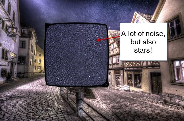
This really is nasty noise and it is problematic to get rid of, from the tone mapped image. However, what the tone mapping also does, is to enhance my stars. The stars are almost invisible in the original photos, and I have found no other way to extract them, as efficiently, as tone mapping does. But it comes with a price, the noise. The task now is to make a compromise, between the noise level, and keeping the stars.
You are caught between a rock and a hard place. The problem is, that the noise reduction software, will also remove some of the stars. I chose this level of noise and stars:
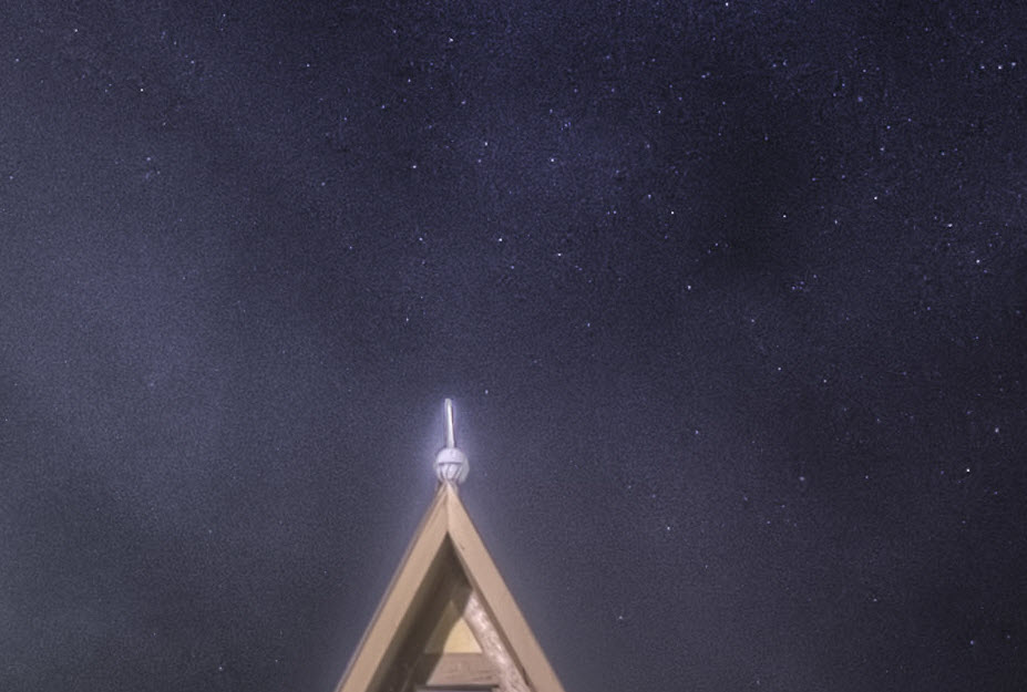
It is a compromise. This noise will not be particularly noticeable, even in a large print. To much noise reduction will take out details and soften the image, too little will ruin the image with too much noise. It is a balance.
Some people switch their HDR Software/tone mapper because of the noise. Photomatix is known for it’s bad noise levels, but if you know what to do, you can keep it under control and it is no big problem. I personally prefer the visual flexibility that Photomatix offers, and then handle the noise. It is the final result that counts.
Stormy Clouds
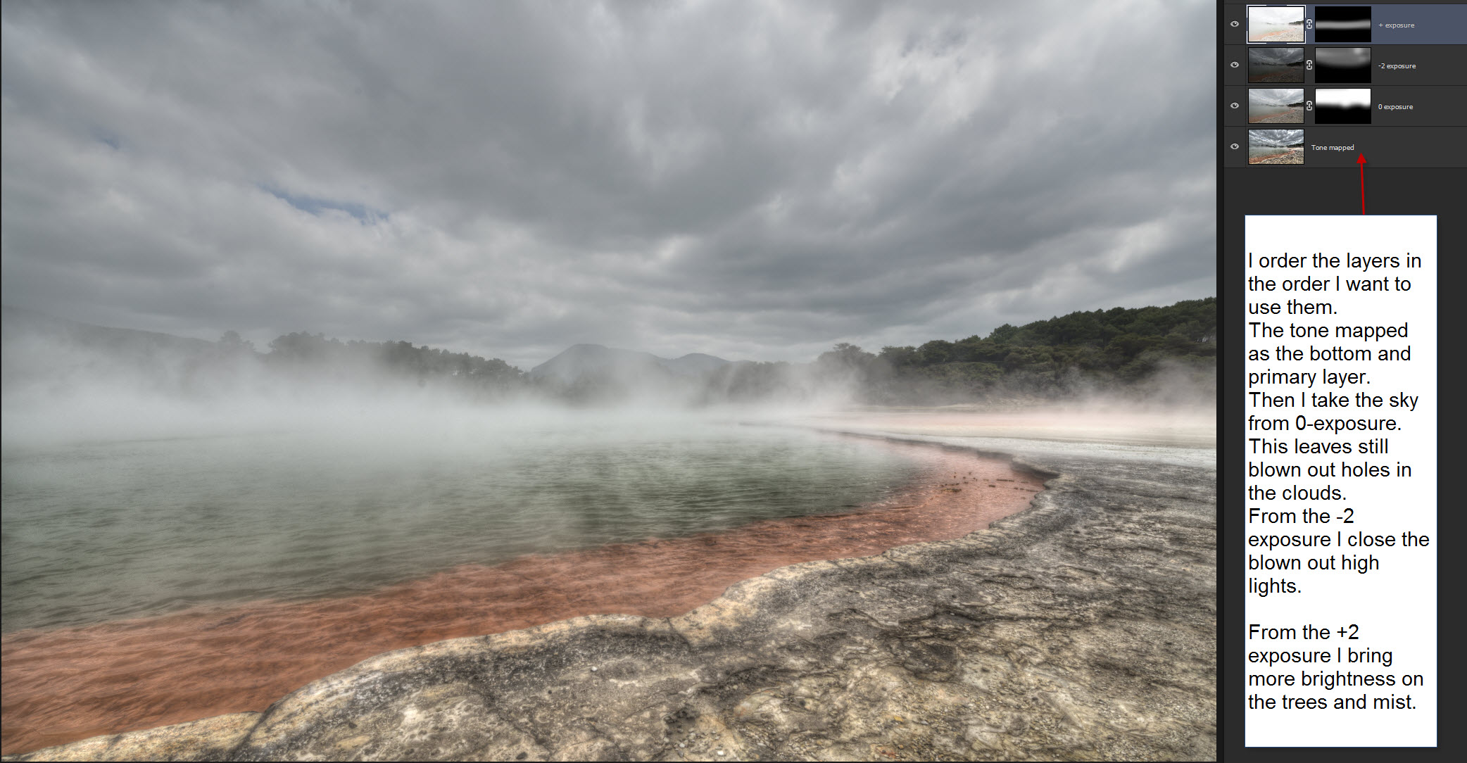
Dark stormy clouds are one of the easiest ways to spot (badly) processed HDR photos. While a beginner might think “Wauv”, because you suddenly get a very dramatic sky, you do not want to have a too stormy sky, if you want to have a great result. It must blend in nicely with the rest of the scene.
These clouds are too much:
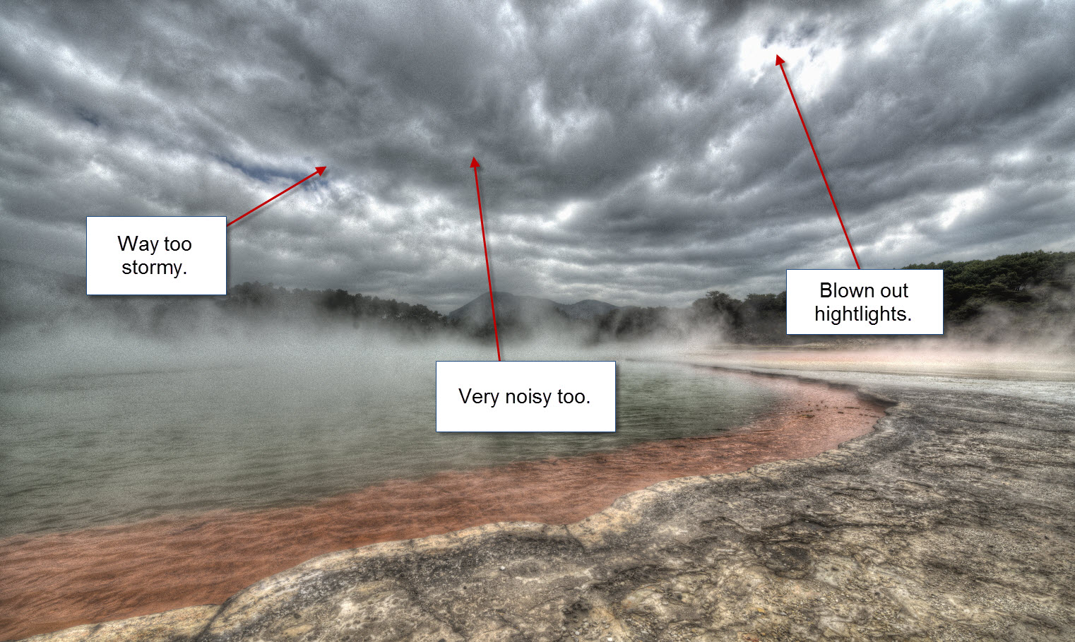
In a photo like this, I would use the sky from one of the originals, like this:
Blown outs
You also have to look out for blown out highlights. Try to move around the sliders, to avoid this situation. If the result, really is, what you want, then you must fix it later in the process.
Some times only one of the colors blow out. I often have yellow splashes in my photos, telling me, that the red is blown out. This I usually fix later in the process, by mixing one of the originals back in those areas. Typically this happens around street lamps and other light sources. The principle is the same as fixing the sky in the example above.
The tone mapper can also be used “on itself”. When you tone map the 32-bit HDR photo, you get a 16-bit image as a result, this image, you can put into the tone mapper once more, and you get a “double tone mapped” image. While the double tone mapped images can get really funky, all of the nasty side effects explode too, and if you are not careful, it will blow out your highlights too.
Double tone maps, can only be used gently in a mixture with the original exposures and the single tone mapped image.
Over saturation
The tone mapper can increase saturation quite a bit. My photos are very saturated – just to the brink of ‘too saturated’. That’s because I like it that way, and I know I have gone over the top a few times. An over saturated image is not good, you do not want to go there. Be careful on the saturation slider.
The ‘grey’ look
This is a very common side effect from making HDRs and many people don’t know realize it and don’t know how to fix it. In this example (which is a single exposure, that I tone mapped), the sky has lost all of it’s blue color in the left one:
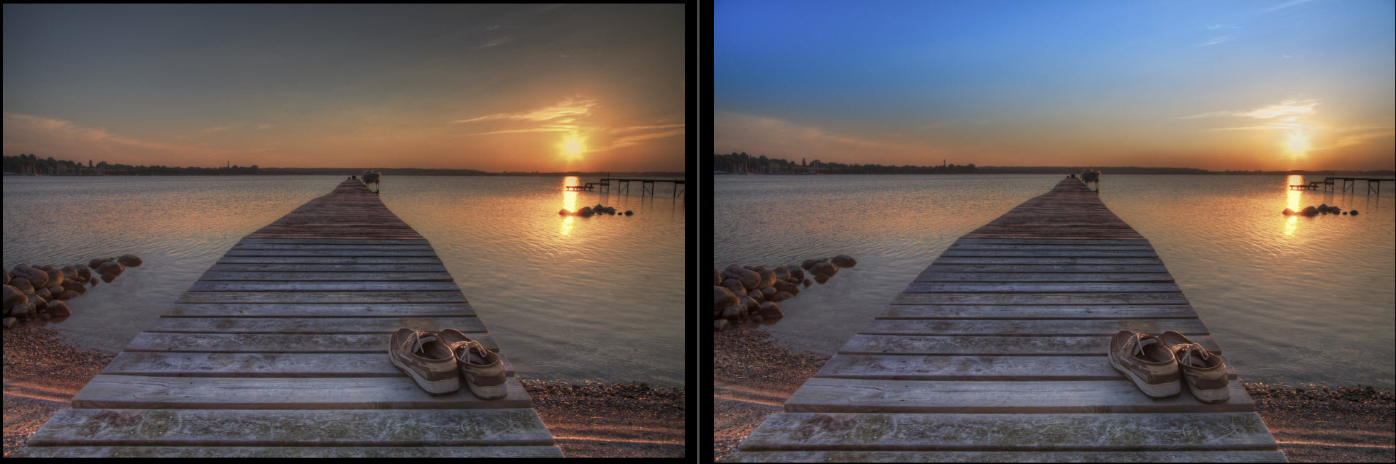
To fix this issue I used the original RAW file, and made virtual copy in Lightroom, and played around with the sliders until I had the sky I wanted, and then I blended that sky into the ‘grey’ version.
Another example:
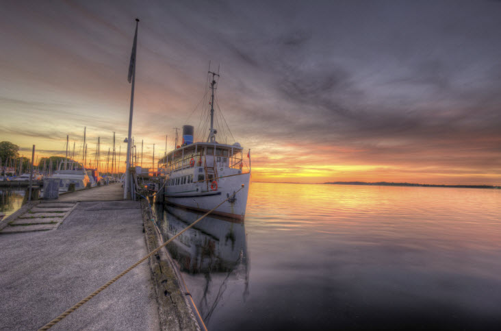 And this is the final image including process flow in Photoshop:
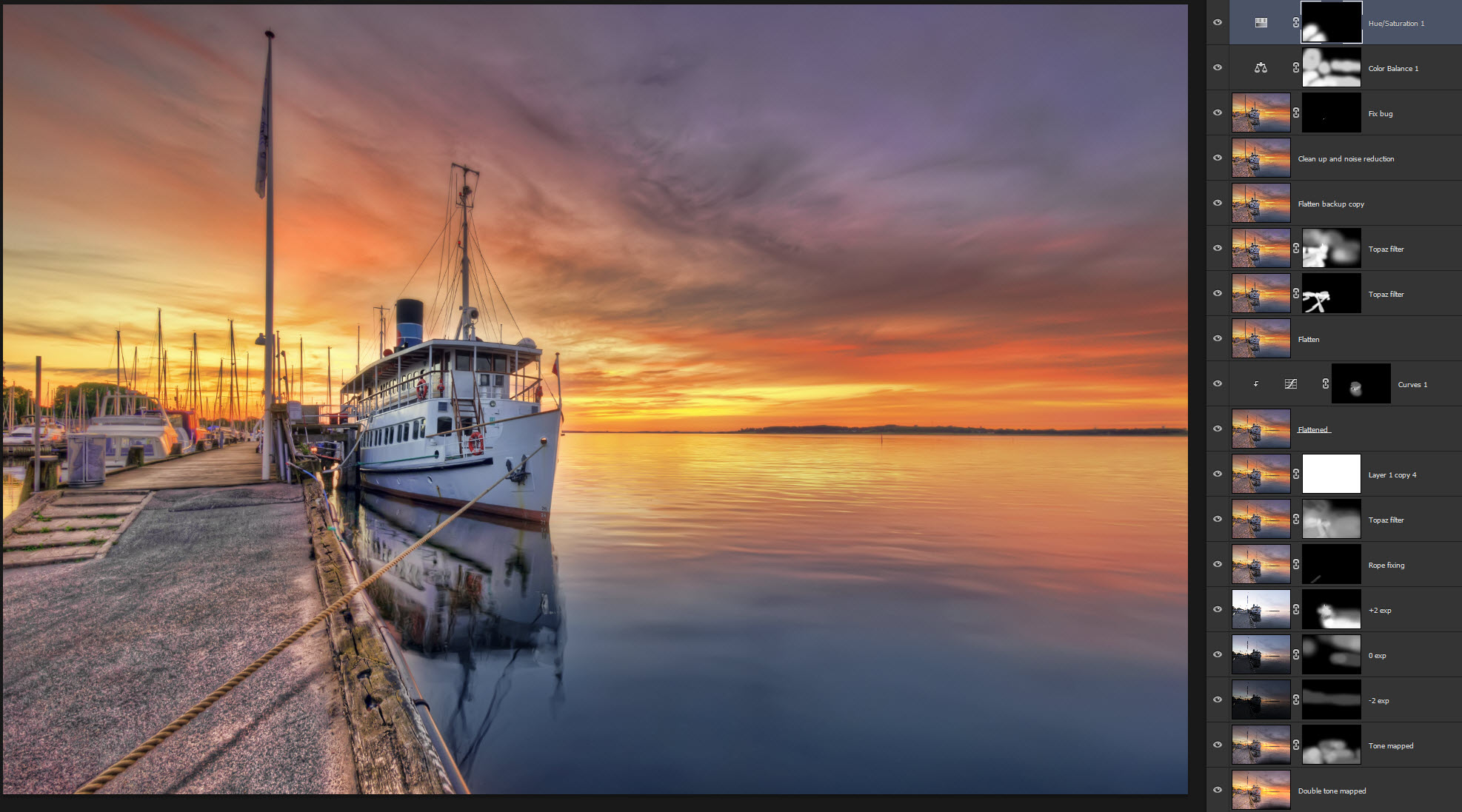
Notice how the colors start popping, and that the grey look disappears.
And final touches in Lightroom to bring back the blue sky:
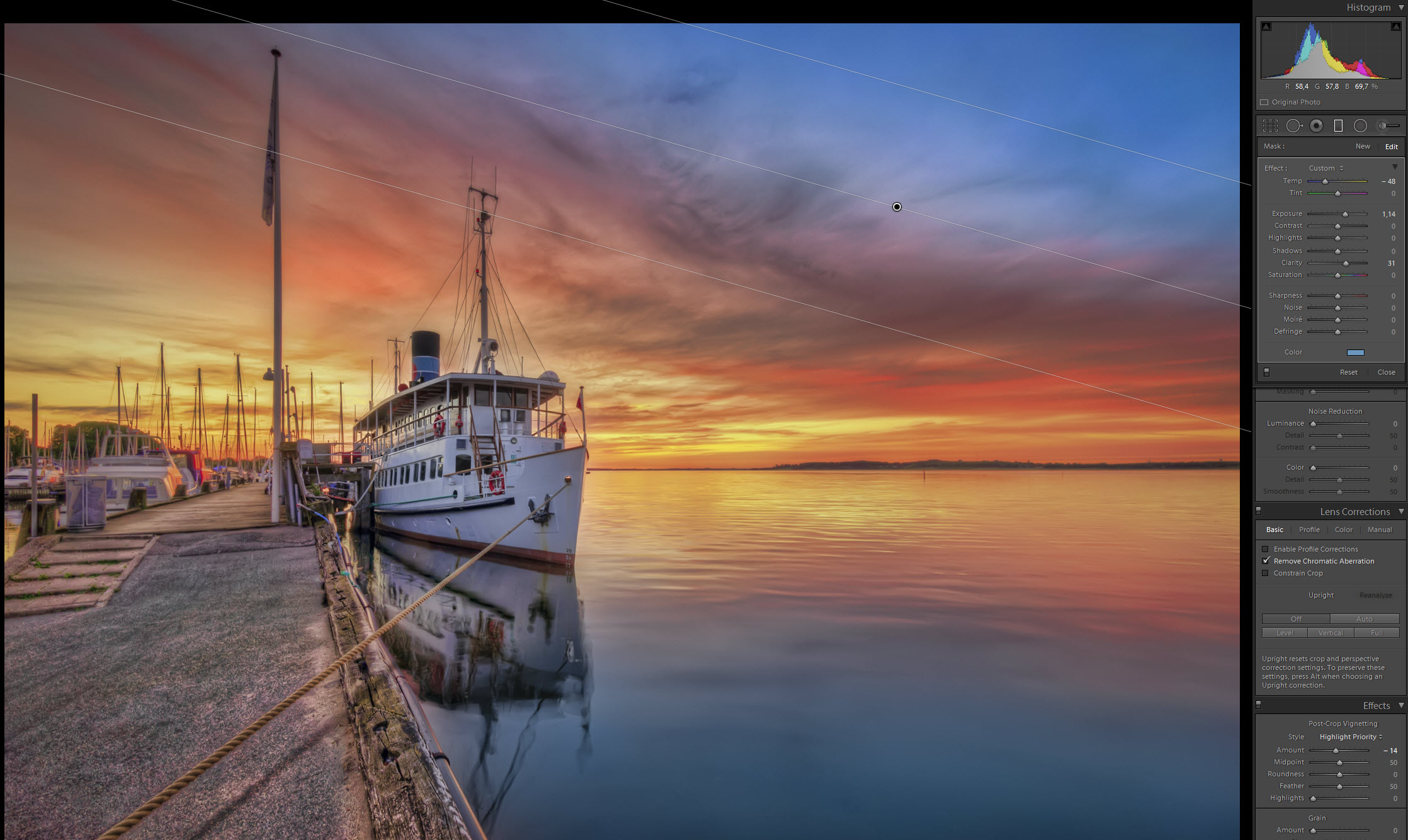
Removing the grey look, truly transforms the image. These two are very colorful examples, but they had not necessarily needed to be that colorful.
The softness
Another side effect is softness. This is fairly easy to fix, you just need to use some sharpness and contrast. In Adobe Lightroom this can be done by adding Sharpness, Clarity and/or Contrast, in Photoshop you can also add contrast this way:
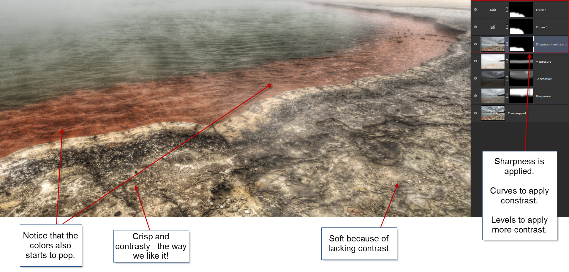
No black in HDR photos?
This is in the same category as softness. Tone mapping can give both too much and too little contrast even in the same image. The stormy clouds from before had too much contrast, while the ground in the same image had too little contrast. And this really is the core of the reason why, you can not apply I tone mapping, and then expect to get a final image. You need the image processed different, in different areas.
When you apply contrast, even if only locally, you start adding black back into the photo, and this is a very important step. A photo without black, will look flat. You do not want that.
What you get from tone mapping must be processed further, to get a better result. And working with contrast, both removing and adding, is a very central part of this process.
What HDR software to use?
I have tried various HDR software both for Mac and PC, but for me, what it comes down to, is how many artistic options do I have? How well does it integrate into my workflow? What is the performance?
In the end, what is important to me, is what I can get out of the software, in the final image. I have an overall processing workflow that looks like this:
- Prepare images in Lightroom (white balance, noise reduction, lens correction and maybe more).
- Process the images in HDR software.
- Load HDR result image and the original photos into Photoshop as layers.
- Blend the layers to get a “clean” image, rid of HDR artifacts, halos, noise etc.
- Apply more effects using tools like Topaz, Nik Collection or OnOne.
- Reimport the image into Lightroom and do finishing touches there.
When I evaluate the HDR software that I use, I evaluate in this context. It’s just one step out of several, and it’s certainly not the last.
From the various pieces of HDR Software, I have tried, there really only are only two that I keep around, and I use the one for 98% of my HDR images. I use Photomatix Pro 5 for 98% of the images, and I use HDR Efex Pro 2 (a part of Nik Collection, from Google), for the last 2%. The last 2% are mostly for giving the alternative a second (third and fourth) chance or if for some reason Photomatix fails to produce something that I like.
HDR Efex Pro 2
There is no doubt, that the user interface of HDR Efex Pro 2 is very nice and has many sliders. There is a lot of control on many parts of the processing, but the creative sliders are not worth a lot – they are close to useless:
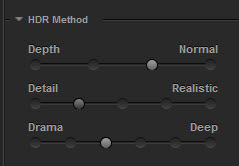 Having sliders with 4 to 6 stops is not a lot of options, why not make them slide softly from one to the other? To me, these are the options for the creativity and they just doesn’t cut it. More than half of the positions bring your photo into the realm where you do not want to bring your photo. This is the far extreme:
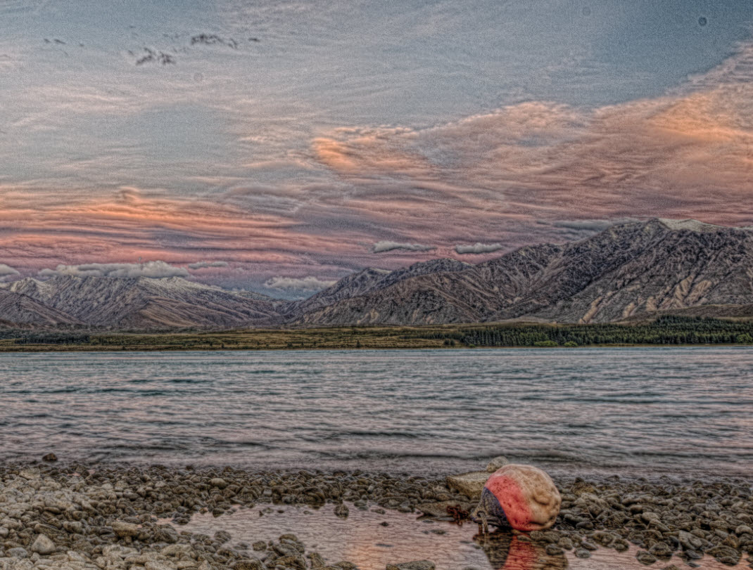
This effect you see in this example is what I do not like about HDR Efex Pro 2, it keeps sneaking in. As soon as I try to go a little more creative, this is the effect that starts appearing, and I do not like it.
In this photos, it is the same effect sneaking in, and all I want to do, is enhance the texture on the building:
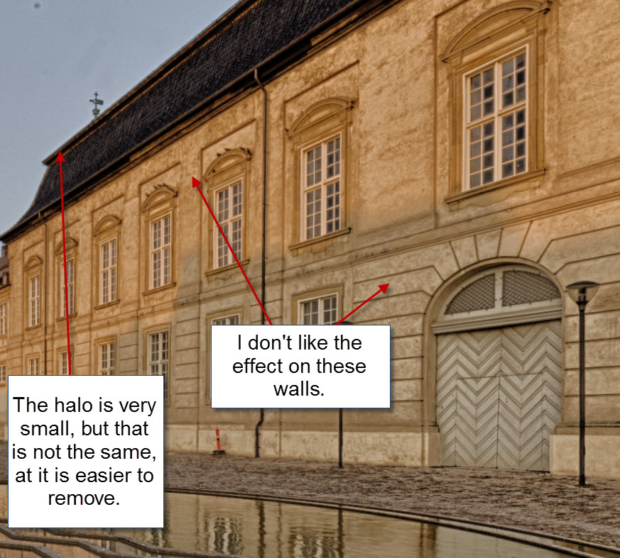
This I would never use in final photo, it looks cheasy and like a bad HDR photo.
That said, you do have a very good control of the contrast, highlights and shadows in various ways. And for a photo in a fairly realistic world HDR Efex Pro 2 does a very nice job. I love the workings and user interface of the program, but I do find it a bit on the slow side.
The tool has got some “finishing touches”, which indicate, that you can produce final results in this tool, but DO NOT let yourself be fooled! You only get the 80% in the tool, you still need to get the last 20% in Photoshop or Gimp.
The noise levels are kept under control. The noise reduction is probably a part of the merge procedure. If you use Noise reduction in Photomatix, you also have noise levels under control.
Halos appear different in HDR Efex Pro 2, than they do in Photomatix. You don’t get the huge nasty halos, but you get small lines along the horizon. But don’t be fooled, these might prove be at even harder to to remove than larger halos.
What I like
- Produces really nice results, within a natural realm.
- Nice user interface.
- Low noise levels – not non-existent, just low.
- Good control of contrast, shadows, highlights
- Good integrations into: Lightroom, Photoshop and Bridge.
- It is not prone to make the same artifacts as Photomatix, such as Softness and The Grey Look.
What I don’t like
- Not good on the artistic side
- Keeps sneaking a special kind of style of texture into the photos, that gives a cheap HDR look, that is hard to get rid of.
- Makes small halos that are difficult fix.
- A bit on the slow side.
Photomatix Pro 5
Photomatix Pro is one of the pioneering HDR software engines on the market. It’s both famous and infamous. It’s a very flexible tool, that can produce many different results, both good and bad.
The user interface is not as nice as HDR Efex Pro 2. It looks a bit old and out-dated.
There are a number of HDR engines built in, both fusion and tone mapping.
Compared to HDR Efex Pro 2 there are fewer sliders in Photomatix Pro, but you still have many ways of controlling the contrast, which is the important thing. Some of the sliders a bit magic and mysterious, but that is what creates the magic I guess.
There are a number of processing engines built into Photomatix, the one that gives most flexibility for creativity is the “Tone mapping->Details Enhancer”.
Let’s have a look at the same image, as processed in HDR Efex Pro 2, just processed in Photomatix Pro. First the single tone mapped image (btw: To me it seems that HDR Efex Pro 2, does not give the additional effect by double tone mapping):
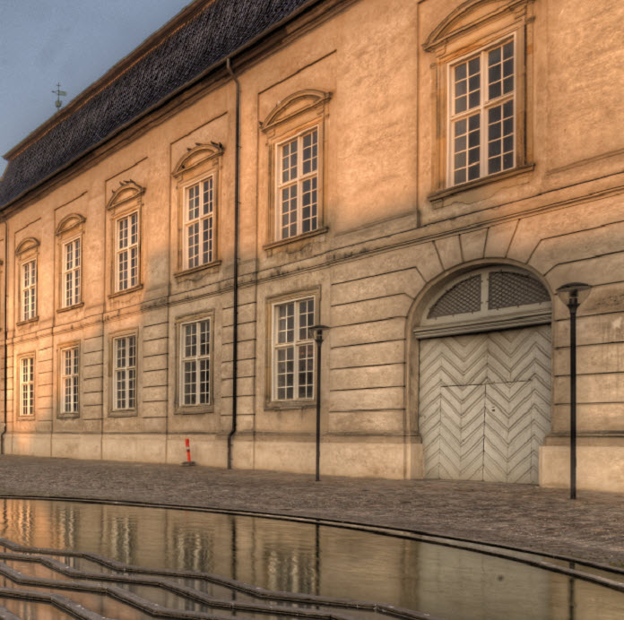
I do like this texture. It does not have the same cheap HDR effect, as the one HDR Efex Pro 2 produced. And then the double tone mapped:
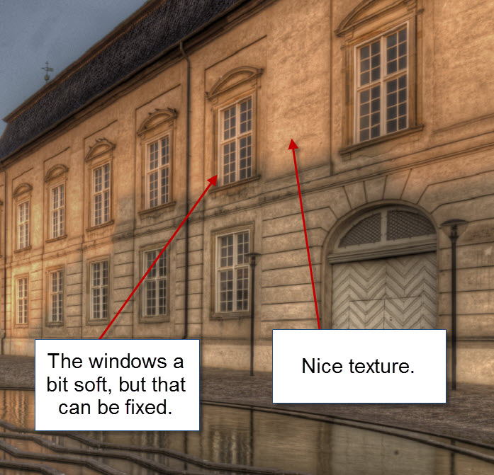
This is the magic, that Photomatix does. It creates nice texture. You only use this double tone mapped image lightly, because of all the nasty artifacts, but this effect, can put magic into your photos. Just use it with care.
Photomatix produces some artifacts, and that is what it is infamous for. The noise can get out of control, but if you use either the built in noise reduction or use Lightroom’s noise reduction before exporting to Photomatix Pro, you will be alright.
Halos come are common, but there are some tricks to get rid of the too. The “Smooth Hightlighs” can be useful, not always, but often:
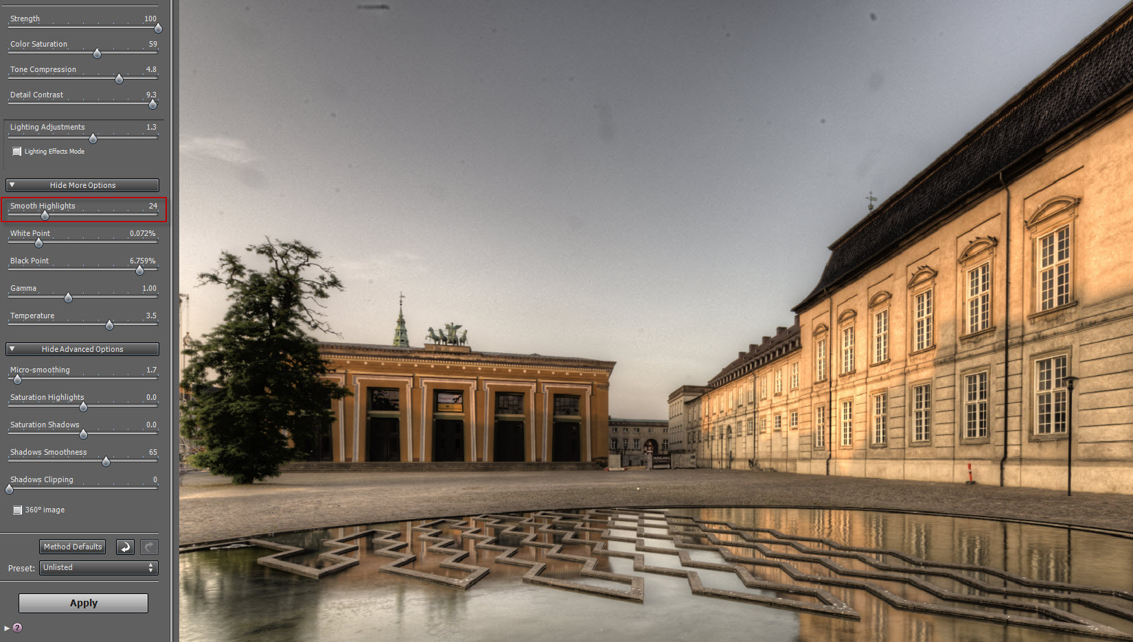
And then if I increase the “Smooth Highlights” to 80, it helps a lot, it also takes some of the “greyness” out of the photo. What’s bad though, is it also takes out a lot of the texture effect, which I really liked.
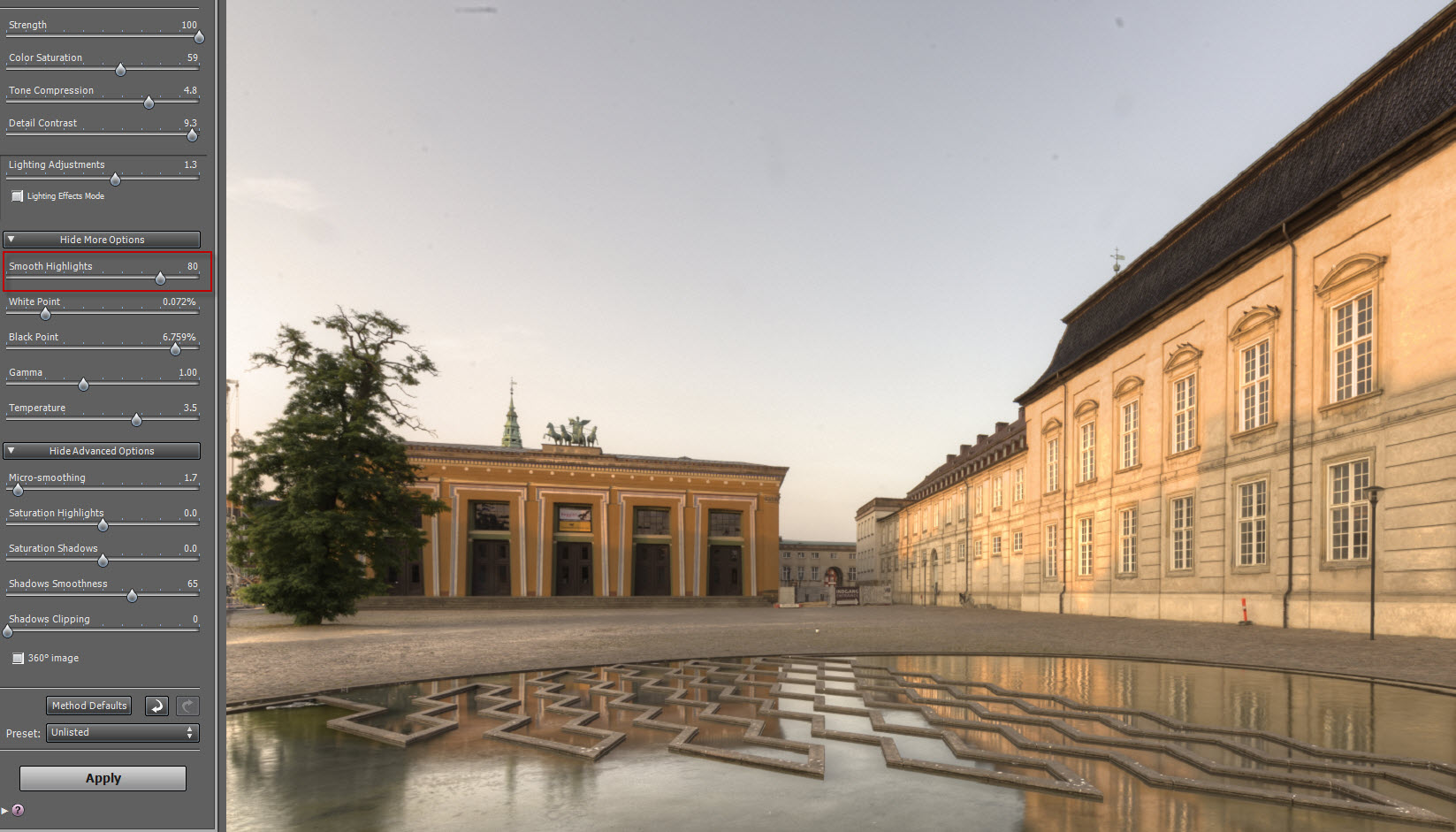
In a case like this, I would make one of each, and mix them to the final photo, along with the original 3 shots I have.
What I like
- Good artistic flexibility
- Produces really nice results, both within the natural realm and the more creative realm.
- Good built in noise reduction – just remember to use it.
- Good control of contrast, shadows, highlights.
- Good integrations into: Lightroom, but it supports drag’n’drop.
What I don’t like
- The user interface is out-dated.
- Makes large halos.
- Creates a grey look
- Creates a softness.
Conclusion
There is a reason, that I stick to Photomatix Pro, despite the rather severe artifacts it generates. It has got a flexibility and magic, that the others don’t have. The final results are much better, from an artistic point of view. But! There certainly is room for improvement. The tool itself looks outdated, and it must be possible to adjust the algorithm, to make fewer of these artifacts.
I will never get a workflow, skipping what I do in Photoshop. It’s hand crafted HDR photos I do, not press a button HDR’s. And for that reason, all artifacts, can be overcome and fixed.
A seriously better HDR program, will of course cut a little bit of the post-processing time, but not really a lot. When you have tried to remove halos, bringing back the colors (aka removing the grey look), removing the softness, you realize, that this really is very simple and easy. You learn what to do, and it is quite easy and fast.
What I will never give up on, is the artistic flexibility.
Wrapping up this series of blog posts
So this wraps up my five articles on understanding HDR photography better. I hope that you learned something. If you have any questions, please leave them in the comments.
Thanks for reading the articles!
Further reading
If you want something more to read, these are good points to continue:
- Get 15% discount on Photomatix Pro. Use promo code: caughtinpixels
- How to make double tone mapped images.
- How to blend layers in Photoshop (or Gimp – it’s basically the same).
- You might also want to read my free detailed HDR tutorial here.

London Tower Bridge – a 5 shot HDR photo processed with Photomatix Pro 5 beta 4 and then mixed with a long exposure image for the fountain and the clouds. The Long exposure I made using my 10 stop ND filter from B+W. I did use a final filter High Key from Topaz Adjust to get the more pseuchedelic look.
Some of you might have noticed that a new version of Photomatix Pro 5 is on its way. The official beta 4 is now available and I have had a quick glance at it. After having played around with for a awhile I am a bit disappointed, but there are a few goodies too.
The wording – that is the usability – has changed in general to the better. By using the right words you can do a lot for the ease of use of a software program. For instance instead of calling a feature ‘Align source image – by correcting vertical and horizontal shifts’ it gets a lot easier to understand from the new wording: ‘Align source images – Taken on tripod’. I’m a great fan of usability and this is great usability in it’s essence. Straight talk for normal human beings to understand, not engineer talk that only a small group of people can understand.
There are a couple of others of these wordings that has changed for the better. The Button “Process” has been changed to “Apply and Finish”.
The algorithm for aligning images should be improved, but that is fairly hard to test. I have never really had any problem with the one from Photomatix 4 – but improvements of course is good.
The deghosting as been changed too and is better. However I never use the deghosting tool. I might give it a try or two, but basically I think you get a better result using by blending one of the source image in using layered masks in Photoshop or GIMP.
A couple of new processing methods has been added. Tone mapping has got a ‘Contrast optimizer’ method in addition to the Details Enhancer and the Tone Compressor:
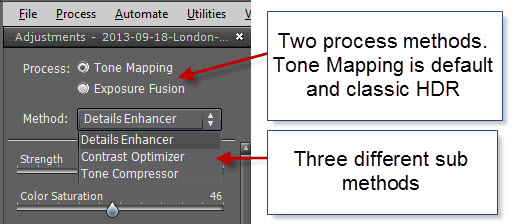
The ‘Contrast Optimizer’ is great for natural looking images, but is not worth much for more creative processing. I will probably not use it for much. The fusion also got an ‘Fusion/Real estate’ optimized for images to show both interior and the outside for real estate photographers. That’s not really me either. So I’m stuck with the Fusion/Natural and Tone Mapping/Details Enhancer.
The details enhancer has got a single change. Luminosity has changed to Tone Compression, but it does exactly the same. In fact the Details enhancer does exactly the same as before. I had hoped for more fun and creative options, but got disappointed on that. I have tried to process images with both Photomatix Pro 4 and Photomatix Pro 5 beta 4, with the exact same settings and the images are identical. That really disappointed me. The noise levels are the same. One of the weaker points in Photomatix Pro is the noise it produces. Of course there are other ways of handling the noise, would just have been nice if the algorithm had been better at handling noise.
I had also hoped for the loop feature to do a perfect processing, so that you would see the real deal, but that is still very poor.
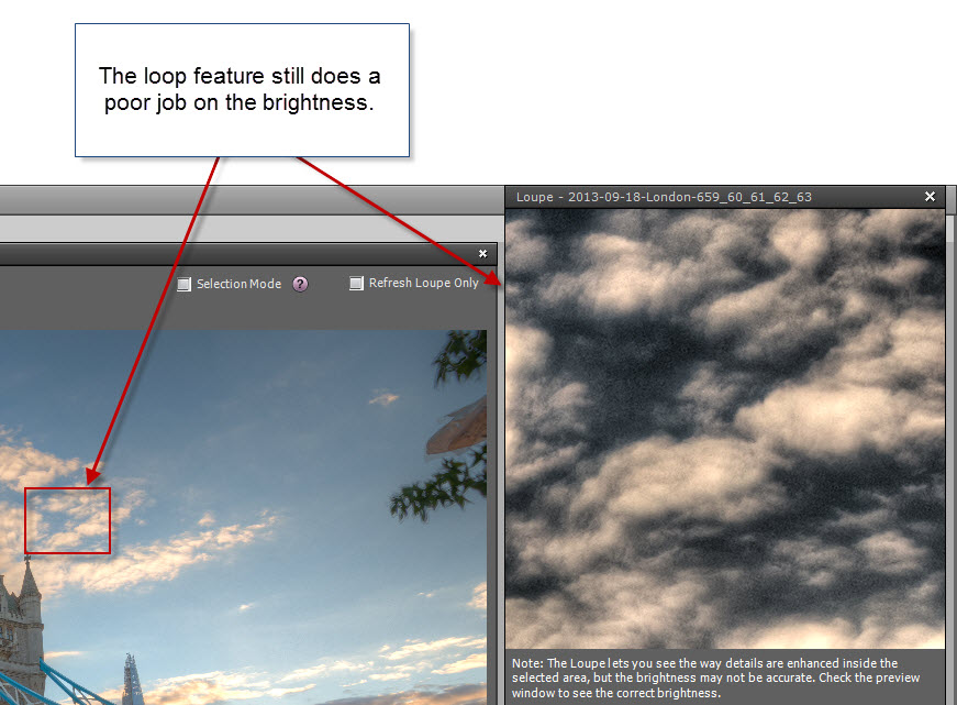
Conclusion of a preliminary review of Photomatix Pro 5 beta 4
There are number of usability improvements in the software, which really makes it easier to use, and some improvements in some of the more automatic parts of the software, like deghosting and auto aligning.
There are also a couple of new processing algorithms, but they are targeted to a different group than the more creative HDR photographers.
But for the more creative side this version is a more or less 1:1 with the old Photomatix 4.
Good thing that if you bought Photomatix 4.2 or later, you get the Photomatix pro 5 for free.
So I’m a bit disappointed.
Try out the beta of Photomatix Pro 5 here – it will still water mark the images if you haven’t purchased it.
Remember that I have a detailed Free HDR photo tutorial and by by using the coupon code “caughtinpixels” you can get 15% off when you buy Photomatix Pro.
]]>

There are many tools and ways to make High Dynamic Range photos. Some are more advanced than others and some give better results than others. I have tried to line out a place to start and what software to get, to make HDR photos. You can start out for free and use the free versions of the software, to see if you like it. And if you do like it, the essential software is not that expensive, and I can give you a 15% discount, if you use my coupon code.
I have made a list of the essential software you need, and why you need it that you can find here.
About this photo above. It is from Amsterdam Maritime History Museum located on the water front of Amsterdam. If you ever get to Amsterdam it is highly recommended to visit, alone to see the building. Make sure to visit the toilets in the cellar…
This is a 7 shot HDR processed first in Photomatix Pro and then afterwards optimized using Photoshop CS6.
]]>
There are many ways of making HDR photos and this is yet another way. I have used Merge to 32-bit HDR, a plugin for Lightroom, made by HDR Soft who also makes the state of the art HDR software Photomatix Pro. Merge to 32-bit HDR just does the first step of what Photomatix does. It merges your photos into one 32-bit TIFF photo and reimports it back into Lightroom. It does not do any tone mapping of the photo and the result is quite neutral when it get’s into Lightroom. But the photo is loaded with information from all of your bracketed photos and you can start playing around with the development module in Lightroom and get the most impressive things out of your photo.
One of the huge advantages doing an HDR in this way, is that you don’t get the noise that tone mapping sometimes gives. And it really is very easy in many ways, especially if you start to build or gather a collection of Lightroom presets. Over the last few months I have been creating presets in Lightroom, which really makes sense, because I save a lot of time when I post process my photos. Not only do presets work as … well presets … a lot of preset post-processing configurations, but it has another advantage, they inspire me. Presets give me ideas and inspiration as I try out some of the presets. I might not use a preset as the single click post-processing, but it does give me a good (and fast) start.
I quite fond of my presets and I’m working on making my Lightroom presets available from this website in the near future. I will make them available along with a guide to explain the concepts and ideas to what I do and how the presets work and can be used, with some examples.
I already showed, that you make HDR photos, even though you are using Lightroom post-processing. I showed how to use Lightroom and GIMP to make an HDR (you can find the tutorial here). And now I will show how to do it with Merge to 32-bit HDR and Lightroom to make an HDR photo.
Merge to 32-bit HDR from HDR Soft
You need both Lightroom and Merge 32 from HDR Soft. If you use the Discount code “caughtinpixels” on HDR soft you will get a 15% discount when you buy anything from HDR Soft. You can also buy it bundled with Photomatix Pro
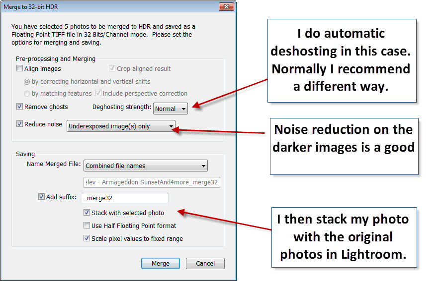
‘Merge to 32-bit HDR’ plugs it self into Lightroom. First you select your bracketed photos, like I just selected my 5 bracketed photos below. Then you start the export into Merge to 32-bit HDR this way:
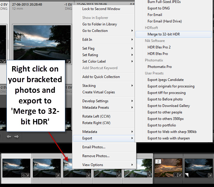
You then get some options. Normally I really do recommend a different process to remove ghosting in your photos, but on the other hand, if the automatic deghosting does a good job, you are done quickly and if it doesn’t give a good result, you can always turn to my recommend procedure. My recommended process is to mask one of the photos into the HDR photo, where the photo is ghosted. You can do that using either GIMP or Photoshop. With this particular photo, I think deghosting did a good job.
When the photo is reimported into Lightroom it’s a neutral flat and a bit dark photo, which is completely unprocessed:

I then applied one of my presets called Armageddon Sunset Revisited. It adds an orange hue to a sunset photo giving it this very sunset feeling. I did do one more thing. I want the boat in front to pop a little more. By using the brush feature in Lightroom, I painted on the boats and the small path, and increased the exposure and contrast a bit.

When I merge my 5 exposure bracketed photos into one 32-bit tiff file I have got a lot more information, than I just had in 1 RAW file. TIFF files comes in 8-bit, 16-bit (the normal) and 32-bit – the more bits, the more information. When you do HDR’s and tone mapped images, the 32-bit image is an intermediate product, that you normally don’t use or see, but this tool just exports it. The more information there is in one image, the more details I can extract from the shadows and the highlights, and a 32-bit file can contain A LOT more information than any RAW file can contain. But it also takes up a lot of hard drive. My Nikon D800 produces 400+ Mb 32-bit TIFF files, when made from 5 HDR shots. So the 32-bit TIFF files, are not keepers in my world- they are intermediate products I delete, when I have made my final image. I then export my final image as a 16-bit TIFF file and reimport and delete the 32-bit TIFF file to save disk space.
If you have Lightroom and want to try out this way of making HDR photos, you can buy Merge to 32-bit HDR from HDR Soft with a 15% discount by using my discount code “caughtinpixels”.
And soon you will be able to get my Lightroom presets from this website.
]]>
My post-processing skills have improved enormously and I amaze even myself what it is possible to do with an image. Recently I decided, it would be fun to see, what I could recover or restore from before I got great cameras.
I have found that I can restore some of my old photos. The main overall problem is that I have shot most in JPEG (do not shoot in JPEG!! Shoot in RAW) and therefore have too little information in my images. But the problems I can in general summarize to this:
- Too little information because I shot in JPEG.
- Too much digital noise in the photos. This has to be removed, without removing too many details. This requires some decent Noise Reduction software. I mainly use Noiseware.
- The mood has to be improved in the photo to create that ‘this is a great photo’ feeling.
The Basilica Cistern of Istanbul
The Basilica Cistern of Istanbul is an amazing place. More than 1500 years ago, while Istanbul was a part of the Roman Empire, a giant cistern was build. A cistern to contain water for drinking. The construction is enormous 138m by 64m and the ceiling is carried by pillars, some reused from even older buildings.

Canon 400D, Sigma 30m f/1.4 at ISO 200, 30mm, f/2.5 and 1 sec.
I didn’t have a tripod so I had to use the rail on the pathways running in and out of the between the pillars. This is the only one I managed to get fairly sharp, but if you look at the original in a 100% crop, you can see that it is far from tack sharp. Taking sharp photos in light conditions in poor light conditions is difficult, because the camera can focus.
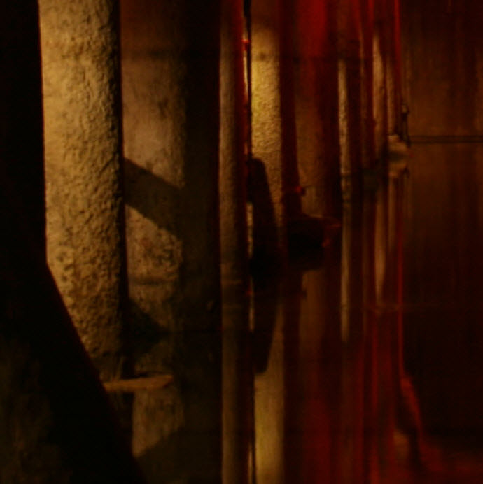
100% crop of original JPEG shot.
And this is a 100% crop of the final image.
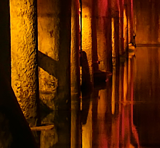
While the photo will never be comparable to one shot with a really expensive high end camera, it has improved impressively and has become a great photo worth publishing. This is original JPEG photo:

So what did I do to this image? I have done several things.
- First I created the overall mood and feeling. I did that in Adobe Lightroom. This is a JPEG and I only shot the one shot. There is no way I can make an HDR out of this image. This means that, what ever is shadows will remain shadows. There is virtually no information in the shadows.
- I cropped the image to Portrait format instead of Landscape format. This works better as a composition, but also leaves me with a much smaller photo of 5.1 megapixels.
- I did noise reduction, first a little in Lightroom, but when the noise is complicated and fairly strong I have to use another tool. Otherwise I can’t get rid of the noise without losing too many details. I have various dedicated noise reduction software, but I mostly use Noiseware from Imagenomic, which does a great job of reducing noise without losing too many details. And what I especially like about it, is that there is a built-in sharpener too, that works quite efficiently. That I used on this image too, because it lacked the sharpness.
These are my settings in Lightroom to create the overall look and feel:
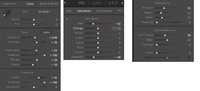
Let’s do a walk through of the settings:
Exposure +0.48: The original shot is a bit too dark. I increased the exposure 0.48 exposure step. That makes noise evident in everywhere in the photo.
Contrast +26: Almost every photo I make I increase the photo. It makes them pop a bit more.
Highlights +24: Usually I let the highlights go in minus, but in this case I wanted more power in the light areas and this explains the stronger light on the pilars on the left side.
Shadows +100: Make the dark areas more bright. Remember this is a JPEG and there is very very little information in the dark areas. So noise reduction is mandatory afterwards.
Whites +29: This increases the point of how bright the image is by stretching the brightness. If you press ALT while you move the slider to the right, you can see when you start to get blown out white areas.
Blacks -10: It is good to have some black in your photo to make it work. If everything is gray’ish, the photo will be dull and flat. This also goes for HDR photos – there has to black to create depth in the photo. I have increased the dark areas, compensating for having set the ‘Shadows’ to +100.
Clarity +45: Clarity is potent slider. What it exactly does I can’t explain, but it adds some kind of contrast and it does at it says, it makes things more clear. In this case the photo is a bit unsharp and soft and by using the Clarity slider quite a bit I can ‘un-soften’ the photo, which is needed. Careful with the Clarity, it can very easily be overdone.
Vibrance +100: Wow – I think that is the only time I have ever used +100. Vibrance works a bit like Saturation, except that it only works on some colors. Skin colors (red and pinks colors) are less affected. This photo almost only has red colors and therefore Vibrance only has a little effect in the orange on the pillars.
Saturation 0: The photo has plenty of colors, no need to add them.
HSL (Hue, Saturation and Luminosity)
It is a complete section of it’s own. The more I use Lightroom the more I use these sliders to finetune the colors of an image. In this case I found the the Red was too intense, and I lowered the saturation of the red.
Red -42: I reduced the reds quite a bit.
Magenta -38: It has got absolutely no effect on this image. There is no magenta in it, I just dropped it somewhere. I always check magenta, because chromatic aberrations often come in magenta colors. This is one way to remove purple chromatic aberrations.
Sharpening
The photo is a bit unsharp and does require sharpness. I add some sharpness here, but I also add some in Noiseware later.
Noise reduction
I add some noise reduction. If you are not sure, what noise is, it’s grain in your photo that is generated digitally by you sensor in you camera. The more expensive your camera is, the better it handles noise. This is shot with an entry level DSLR – an old one too, which makes it very prone to adding noise to the images. This is the noise in my image (click it up to see the full size):

Crop the Image
Some go against cropping and argue, that it is better to get the photo right in the camera. I disagree. If a photo gets better by cropping, do so. The only problem I see in cropping is that you get a smaller image, and if you want to print it, that might be a problem. This photo is shot as a 10 mega pixels, but I’m left with only 5.1 mega pixels. This is better than an unusable photo, right?
Reducing the noise in a photo in a third party tool
When you shoot photos in poor light conditions your camera will most probably generate digital noise. There are many tools that you can use to remove digital noise. I have used several. There are Noise reduction in Lightroom, but it is not the most optimized tool that I know. It takes away too many details, but I find that Noiseware from Imagenomi really does a great job of reducing noise and keeping the details. But it also does a quite efficient sharpening. A side-effect in reducing the noise, is that you get a softer photo and therefore need to add sharpening – and having it built into one application I find very convenient.
]]>One thing I really love about Lightroom is, that everything I do to a photo in Lightroom is applied on top of my RAW file. If I make multiple virtual copies, to which I can make other adjustments, so that I have got several different photos, based on the same RAW file, but most important I still only have one photo on my hard drive. A great bonus from this feature is, that I can always dial back and press Reset.
But there are some features missing in Lightroom, which really pushes me into Photoshop. I use a wide angled lens a lot. 80% of my photos are shot at a wide angle lens, and quite often I have to shift the camera upwards or downwards, and when I do that, perspective gets distorted. That is a side effect from using a wide angled lens and some times it can be used as a feature, at other times it ruins the photo, if not straighten up. In Photoshop I use the “Perspective crop” tool to solve these problems. It does a decent job, but sometimes it squashes the the photo too much, like making the Empire State Building look like a small fat 20 story skyscraper.
In Lightroom 5 there is going to be a new Upright feature, aimed specifically at this task. This I’m really looking forward to. It can both save me from having a TIFF file around, and maybe even doing a better job than Perspective crop in Photoshop?
Another thing that pushes me into Photoshop, is when I want to do content aware removal of things. I can only remove round things in Lightroom 4, with the clone stamp, which is fine for removing sensor dust spots, but not satisfactory, when I clean up my photos by removing lamp posts and other stuff from my photos, to make a more clean photo. But in Lightroom 5, there will be an advanced Healing Brush.
Then there are some new features:
- The Radial ND filter, can be a cool thing too. The Gradual Neutral Density filter I already use a a lot to make adjustments to a sky, by lowering the exposure on a very bright sky, increasing the contrast etc. to get the details and texture more clear. This gives a more balanced photo. The new Radial ND filter I guess can be used for some fun stuff on round objects, like the sun, faces etc. You can probably achieve similar things with the existing brush tool.
- Smart reviews. I don’t think this feature will be usable for me, with my current workflow. The idea is if you are using your laptop is your primary machine to handle your photos, then you got a problem, when you are on the road. You can’t bring all of your photos along, because they take up way too many gigabytes to fit on your small laptop hard drive. What this new feature allows you to do, is to work “off-line” of your primary storage (like a NAS), on low resolution versions of your photos. You can do meta tagging and adjustments. I figure adjustments are post-processing. Though this is quite cool for some, I do have a much more powerful desktop computer, to do my primary post-processing on. For some this might be cool.
- Photo book creation – I think not. I stick to www.pixum.com to make my family albums. They offer excellent quality and excellent flexibility. But of cause I will look at it, when Lightroom 5 is a available.
Adobe Lightroom 5 will also include a number of minor features and enhancements. More information is available here.
To create todays photo I have used the clone healing brush and the perspective crop in Photoshop. It is a 7 shot HDR photo, and I used Photomatix pro, to create both a single tone mapped image and a double tone mapped image, which I mixed with the original ones.

The original photo is not a bad one, but neither perfect.

#1: I removed the branches. When I straighten the church, some disappeared, but I ended up removing them completely. When I took the shot, made sure, that they were included and did not cover the church. I used the brush healing tool in Photoshop.
#2 The sky I worked with, to emphasize the light in the mist. That is an important part of the mood. I increased the contrast and saturation a bit.
#3 The church I straighten to a certain level. I can’t straighten it completely, because it makes a small fat church, which is not the reality. The compromise is somewhere in between completely straightened and this. Ideally I would have gone further away, but that was not possible.
#4 The acid color of the light from these lamp posts I didn’t like, so I worked with the colors, and mixed that into my final photo. I did that, by making a new layer in Photoshop, opened the Hue/Saturation dialog (CTRL+U) and dialed back some of the yellow and green. I then mixed the lamps into my image.
#5 These lamps are blown out, but because I shot it in HDR I can achieve the moody great look from the lamps, in stead of just a white blob. There is not a lot of dynamic light in this photo otherwise, but the lamps I save.
#6 I then used more healing brush to remove the snow. I used a clone stamp after wards to get a better result on the cobble stones.
#7 The cobble stones is the double tone mapped image. What I get from the double tone mapped image, is the lovely reflections from the lamps and the many details and textures in the cobble stones.
This is one of the photos, where you might ask “Why HDR it?” – well I got more details within the windows of the church and on the lamps. I also got more shots, so that I could remove people and the car coming around the corner. And then it added some of the magic, mysterious Jack the Ripper mood.
]]>