
X-Wing Squadron in Sweden.
I had a lot of fun making this photo of three X-Wings from Starwars patrolling a Swedish night. I got the idea to make this image because I am working on a book on composition and I use a spaceship as a metaphor. I thought it would be cool to have a photo of a spaceship on those pages, but how do you get a photo of a spaceship? They don’t sit on every second corner.
My first thought was to use one my sons Lego spaceships (he has a ton of them). But before I acted I remembered this kind of cool shot of the ‘Space Mountain’ in Disneyland Paris and decided that would have to make do.

But I then shuffled a bit around in the photos from that area, and I noticed a photo of the X-Wing and an idea came to me. An X-Wing is a proper spaceship, just what I needed. I would put that on a shot of the Milky Way that has no foreground object or main subject, other than a bit of wood and the Milky Way itself.
I had two shots of the X-Wings from the same angle, just shot on two different days, using two different cameras. Had I known what I would need photos of the X-Wing at a later time, I would have shot a series from different angles, but I didn’t.

The original photo of the Milky Way looked like this:

This is the first shot I shot of the Milky Way. It requires an area low on light polution. This is place in Sweden is not too bad. You can see a bit of light polution just above the trees. However, the photo is not interesting in itself. There is a lack of interesting foreground.
The process of creating a believable composite
I wanted to make the illusion of three X-Wing fighters patrolling Sweden and to make that work and I could see some problems that I needed to be solved.
Problem #1: One photo is shot in the daylight, the second at night
I had to make the X-Wing fighters fall in, and I had two ideas, either a painterly cartoon-like approach or I could take a path on a more realistic look. I decided to try the painterly cartoon style first.
The photo is only a jpg, but I created two virtual copies in Lightroom and made an artificial -2 and +2 for an HDR processing workflow.
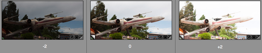
These three I put into my HDR software and got out a tone mapped HDR version. If the image, like this one, is shot in a low dynamic range situation like here, you can get fine results, when you tone map an image like this. It is only a pseudo HDR, but you still get the look from a real HDR.
At this time, I did not notice; but have a look at the darker image. That fits just perfectly into a night image. I figured that out later, but I only noticed this, because I had made this darker -2 version of the image. And that is the one in the final image.
Problem #2: Masking out the background from the X-Wing
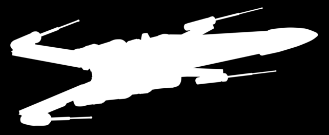
The X-Wing is a pretty regular shape, and it is not too hard to cut out using the Pen tool. The Pen tool can create a Path, which can be converted to a very sharp mask, but it takes a little practice to use.
But for an object like this X-Wing, it was the only real option. I tried some of the magic tools in Photoshop at first, but it just didn’t work well enough in this situation.
The Pen tool you will find here:
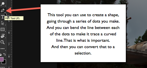
The Pen Tool allows you to set a series of dots. Photoshop will play “connect the dots”, and if you end up closing the line, you will have a shape. That shape you can convert to a Selection.
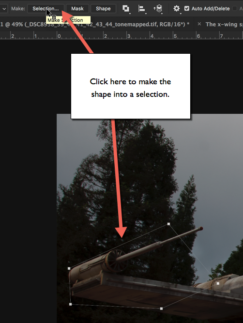
You get some options before you get your selection.
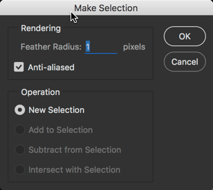
Starting from the bottom, you want to create a ‘New Selection’, and you also want to have it on ‘Anti-aliased’, because it makes a smoother transition between the neighboring pixels on the edge.
And the first option is ‘Feather Radius’. If you set this to zero, you will get a very hard edge, and it will not blend very well with a background. Typically I use values between 0.5 and 2, depending a bit on the size of the object, the resolution and what it is. For the X-Wing I used 1-pixel feather radius, and that looks great.
How to use the Pen Tool in Photoshop?
This takes a little practice before you get the hang of it. Start by setting the first dot at a location good for closing the path to a shape. A corner is always a good place.
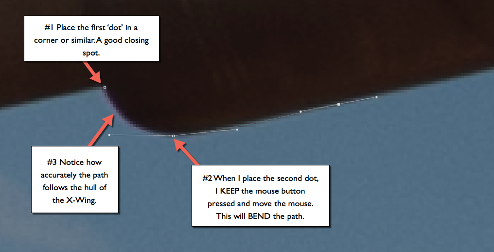
When you place the second dot DO NOT let go of the mouse button. Keep it pressed and move the mouse, notice how the path begins to bend, depending on how you move your mouse. Use this to make the path follow the shape, you want to have a mask for.

You also get two additional lines (handles). The handles tell Photoshop how to bend the path. Each dot has two handles, one for bending the path before the dot, and one for bending the path after the dot.
The path between two dots is controlled by two handles, one from each dot.
Moving handles: A handle can be moved if you carefully position the mouse exactly over the handle and press ALT. Then you can drag it around and change the path. It is necessary to use this in corners and whenever there is a need for a sudden change in the direction of the path.
And when you miss the handle, just press Undo. You will miss it 100 times because it is small.
Moving a dot: You can move a dot if you press CMD on a Mac or CTRL on PC. Again, be careful to place the mouse exactly on top of the dot, and as with the handles use Undo, whenever you miss. And you will miss.
It takes a little practice, but as soon as you get going, you can make a perfect mask for the X-Wing in less than 30 minutes.
Problem #3 making a seamless composite
As mentioned in Problem #1 I ended up using the darker exposure, and when I added the mask (just press the ‘add mask’ when your selection from the path is active), the X-Wing appeared on top of my Milky Way. As you can see in this 270% crop, the transition between the X-Wing and the background is seamless. This is because of the ‘Feather Radius’ of 1 pixel, as mentioned in Problem #2.

I made three duplicates of the X-Wing layer, and resized and rotated them a bit, to make them look like three individual X-Wings. I also distored the shape slightly, but not too much. Too much would be obvious, because the perspective would be distorted.
The second part is to make the light match both in intensity and colors. The original X-Wing is shot in daytime, and the colors match a daytime.
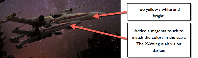
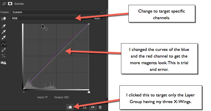
To make it fit better I change the colors, using a curves layer. I have organized my three X-Wings in a Layout Group. I can target any adjustment layer to only the the layer just below, and if that is a Group of layers, they will all be targettet. But my background will not be targetted.
I also have a curves adjustment layer to make the ships slightly darker.
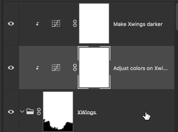
The X-Wings now have a good and transparent blend with the background.
Problem #4 placement of the X-Wings
I decided to go with the idea of three visible X-Wings on a patrol. It should look like they are flying at a low altitude, and just flying over the woods as I shot the photo.
The third X-Wing would have to be half hidden by the trees to make this work. To make this work I needed a mask for the trees only, to hide the part of the X-Wing that should look covered by trees.
In the latest version of Photoshop CC 15.5 there is a new Masking tool, and using that, I pretty quickly got a usable mask for the trees.
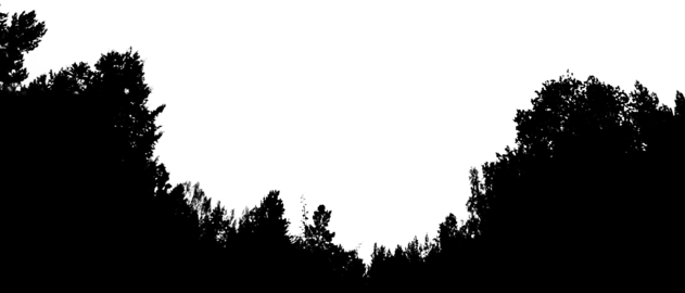
The new masking tool is accessed by using:

And putting this mask on top of the X-Wing Group allows me to half hide the third X-Wing behind the trees and the illusion is complete.
Thanks for reading
If you enjoyed reading this article, you might also enjoy my latest book “10 Essential Tips for Fine Art Photographers“. What you get from the book, that you don’t get from the blog is the mindset and organized rock solid tips on how to become a Fine Art Photographer producing professional images.
–Jacob
]]>

This photo really came to life, when I used the color space Lab Color as a tool.
Teaser: Last in this post, you can see the before version of this image of the Eiffel Tower.
Recently I have been working a lot on understanding colors and color spaces. It has been coming to me, from two different angles. It’s funny how things sometimes converge from different places and situations into the same realization, at the same time.
I have been working on understanding why some of my prints went haywire color wise, even at a professional printing house. It turned out, it had to do with color spaces or more correctly the gamut of a color space. A gamut is the range of colors a color space can produce. Gamut is a strange word, but I will try to exemplify in a simple way. I will discuss this in more detail in a later post.
At the same time, as I was working on getting my prints looking right, on another track in my life, in my eternal search for new cool processing ways, I came across the Lab color space as a processing technique. It was introduced to me, by Robin Griggs Woods, and I was completely blown by it.
What is a color space anyway?
Before getting deeper into the Lab Color color space, let’s talk a bit about the color spaces in general. Color spaces are quite complicated, and I will try to make an easier-to-digest description.
The most common color space is sRGB, it’s sort of the industry standard, and it is, as the name indicate, based on Red, Green and Blue colors. And by combining Red, Green and Blue you can generate ‘any’ color, well not exactly ‘any’, but a lot of colors. sRGB has a certain color range, a certain gamut, meaning that it has a specific amount of colors, it can produce, and each color in sRGB is defined as a mix of Red, Green, and Blue. However, sRGB does not have the biggest gamut of them all.
AdobeRGB 1998 has a larger gamut, and even if it is also based on Red, Green, and Blue. A super simple explanation of gamut could be done with simple geometric figures like these:
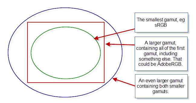
Examples of different sizes of gamuts, shown in simple geometry.
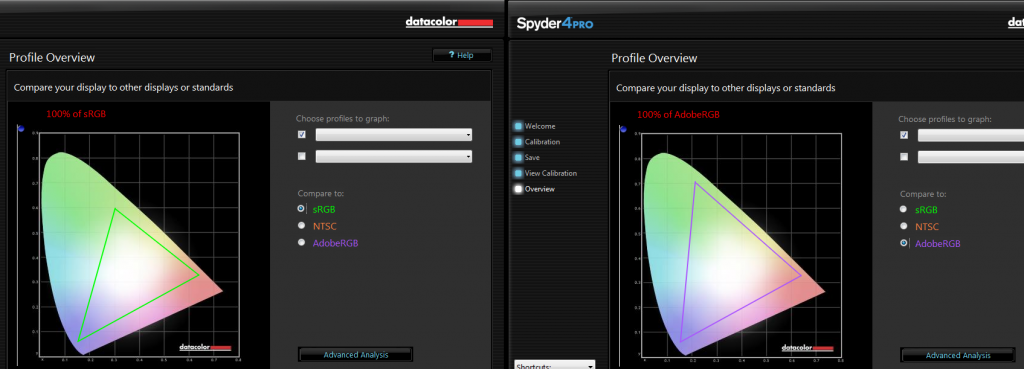
Below is shown the gamut, from the Spyder4Pro software, I use to calibrate my screen. The odd colored shape is the gamut of my monitor.
The triangles represent the gamut of sRGB on the left and the gamut of AdobeRGB on the right. As you can see my monitor can show both gamuts completely, but that might not be the case of any monitor. I have a high-end monitor a low-end monitor will probably come short on AdobeRGB.
The implications of different sizes of gamuts quickly get complex. How do you map from one color space to another? It easy to map from a small gamut to a larger, as long as the smaller is completely within the larger, but what should be done the other way, if you have colors outside the gamut? What should happen to these colors?
All of this is very complicated, and I will wait to a later post, to explain it in more detail. For now, let’s just accept that, there are different color spaces, that have different gamuts, and some are larger than others.
One color space is to rule them all
Lab Color is a color space too, and it works quite differently than RGB based color spaces, and you get some advantages from that.
The Lab colors are defined in another way than the classic RGB based color spaces. The L stands for Lightness, and a and b are the color channels; a covering green to magenta, and b covering blue to yellow.
The lightness channel only changes the lightness, and the color channels only change the colors. This is different from the RGB color spaces. It allows you to work on the colors, without changing any contrast in the photo, and you can work with the contrast, without changing any colors.
Let’s have a look at this photo, and do something wild to it first, and afterward, do something nice. This is straight out of the camera, except for a crop.
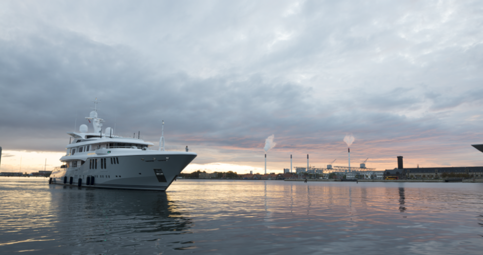
This photo is shot in RAW and when I export it to Photoshop I export in AdobeRGB, and I have set up my Photoshop to also work in AdobeRGB.
NB! A RAW file has its own native color space.
First I add a Curves Adjustment Layer to my image.
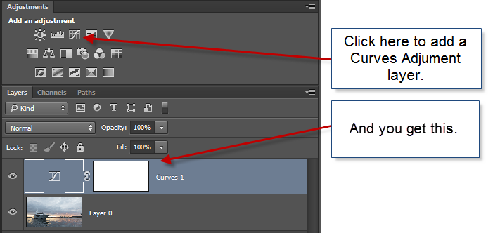
And then I do something crazy with the curve like shown below.
What happens to the image, is that the contrast change. Notice the lower part of the ship goes brighter, and the upper part goes darker. But what also happens, is that the colors go completely wonky. The from part of the sky goes orange, and greenish colors appear too. The top of the ship goes orange.
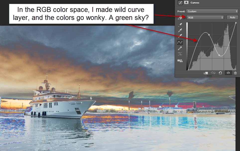
A wild curves layer added to the image in RGB Color space. The colors change.
Now I add the same Curves Adjustment layer to the image while having it in the color space Lab Color. Notice how the Curves layer now offers Lightness instead of RGB.
I change the curve to a wild one too, and now the colors actual remain the same, but the contrast change. The ship still go bright in the lower part, and the upper part still goes darker, but the upper part now remains in the gray tones it should be. The same goes for the sky and water. It remains in gray, bluish, orange/brown and purple in the right places.
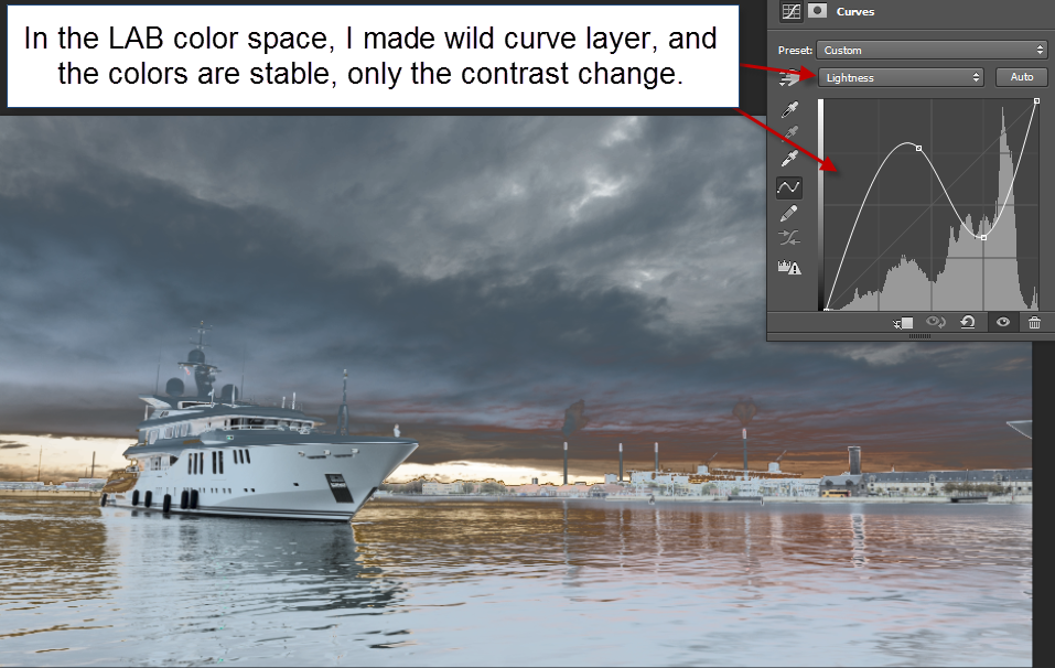
A wild curves layer added to the image in LAB Color color space. The colors stay the same, only the contrast change.
While using a wild curves adjustment layer did not change the color, only the contrast, the result is not really any prettier. But let’s do something pretty out of this photo, using Lab Color.
How to create magic photos using Lab Color
Step 1 – open the image file in Photoshop
My workflow always starts in Lightroom. Often I will do something to the image, before exporting it to Photoshop. But in this case, I will just go straight to Photoshop with the RAW file, using the standard export to Photoshop from Lightroom.
In Photoshop, I can confirm, that I am working in the RGB color space, by going to the submenu Image->Mode.

If you look closely, you can see ‘Lab Color’ in this submenu too. But I don’t want to switch to Lab Color yet.
I want to make adjustment layers to my image, but I also want to end up having my image back in the AdobeRGB color space. So what I really want, is to work in two Photoshop files, one in RGB color space and one in Lab Color.
Step 2 – make two Photoshop files
Photoshop has a feature to do this.

This gives a dialog:

I press OK and get a new copy of my image.
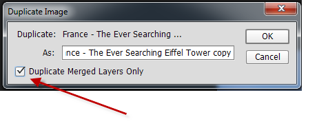
Advanced tip: If I already had made some preliminary adjustment layers in my RGB file, I would need to click the tick ‘Duplicate Merged Layers Only’ checkbox.
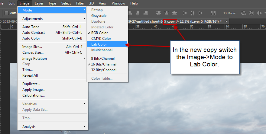
Step 3 – switch new copy to Lab Color
In the new copy, I go to the submenu Image->Mode and switch this image to Lab Color. I am now ready to process this image in Lab Color, and I will start by adding a Curves Adjustment Layer.
Step 4 – make adjustment layer
I add the Curves Adjustment layer:
And I adjust the curves. I start by adjusting the contrast a bit, using the Lightness channel.
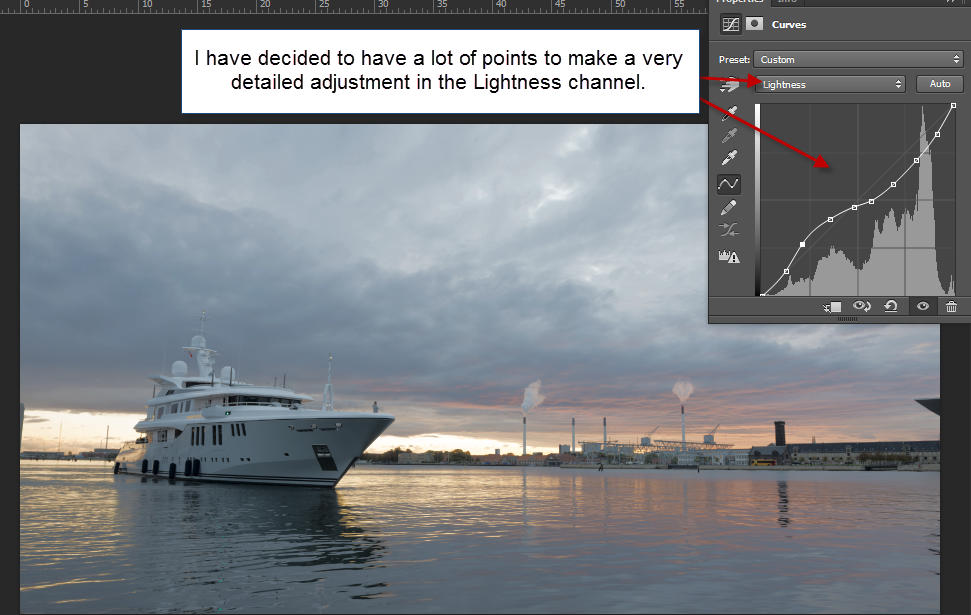
This gives a little change, not a lot, but it’s a beginning. Now the fun begins!
Step 5 – adjust color channels
Let’s take the blue and yellow channel first, that’s channel b. It’s mostly a blue and yellow photo, so I think that’s a good place to begin.
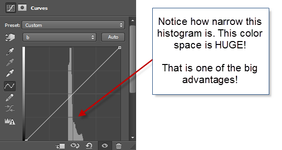
Notice I have switched to channel b. And what the heck is going on? The histogram is so narrow! This tells us, that the Lab Color’s gamut is ridiculously large, much bigger than e.g. the AdobeRGB gamut. This gives a lot of elbow room to work with the colors, without getting a lot of nasty artifacts, and this is one of the advantages.
Remember, that when I work with the color channels a and b I do not change the contrast, only the colors. Let’s pop some colors!
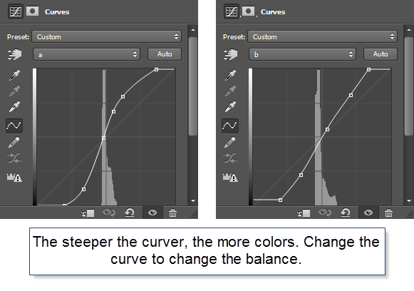
I played around with channels a and b for a little while and ended up with the curves above. The image I got out of it looks like this:
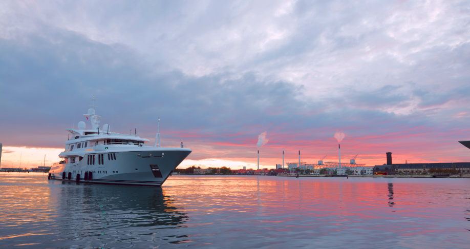
This is a much more punchy photo. Notice how the colors really has been brought to life. I haven’t added any colors, just boosted what is already there. And this is what I find so fantastic when I use the Lab Color. Not all photos really benefit from them, but some do.
Let’s bring it back to the RGB image.
Step 6 – merge the images
To bring the processed Lab Color image back to the original RGB image, I need to flatten the image. There are many ways for doing that, but I use ‘Flatten Image’.

And then copy and paste the layer back to the original psd file like this:

Now I have the image back, as a layer in my original psd file, containing the RAW file. From here I can do more processing if I want to. I have already brought this photo much more to life, but I want to do more to it. To me, the Lab Color is just a step on the way.
Real life use of Lab Color in an RGB World
How do I use this Lab Color technique, in the real life, when I process my photos? I use it as an effect. In the clinical example above I started out from scratch, slamming the RAW file straight into the Lab Color mode, but in the case below it was something I did midway because I kept not getting the colorful punch that I wanted.
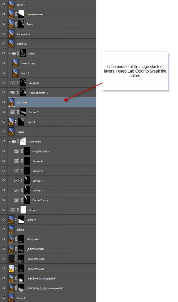
It is rare that I have this many layers for creating an image.
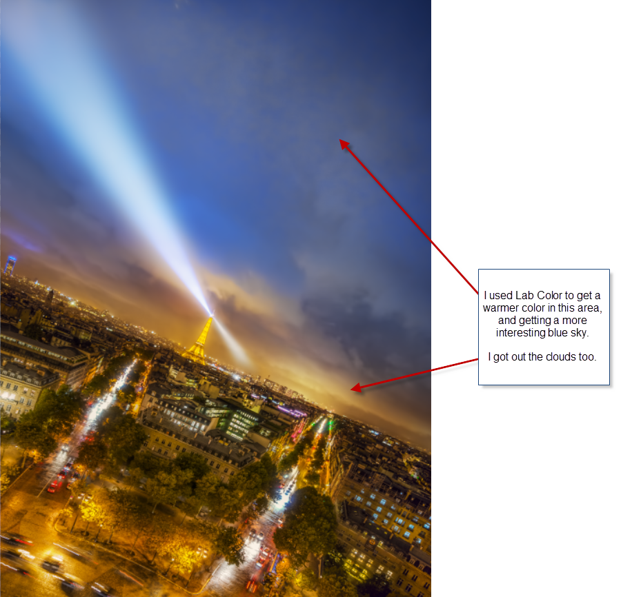
My problem when I worked on the image was that I could not really get the colors to work my way. Something kept missing, and I couldn’t really put my finger on it. So what I did was to take it into Lab Color, and I found exactly the effect that I wanted.
Because it was something I did at a late stage, I had to use the ‘Advanced tip’ from Step 2. Check the box in the Duplicate dialog
In Lab Color mode I managed to put some life into the distant yellow clouds. They had been a bit too gray. The warmer color goes great with the blue sky. But I also discovered some very subtle skies in the otherwise dead space in the upper right corner.
Lab Color did not make this photo, but it added just that magic I had been searching for, without knowing exactly what it was.
As promised in the beginning of this post, you get to see the before version of the primary image in this post.
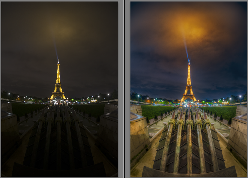
Left side unprocessed RAW file and right side final photo.
In this case, it was the balance of blue and orange that Lab Color helped me to get. Everything was too orange, but the Lab Color helped me to intensify the orange in the clouds, and getting a bluish shade in the sky.
This is the stack of layers for this image:
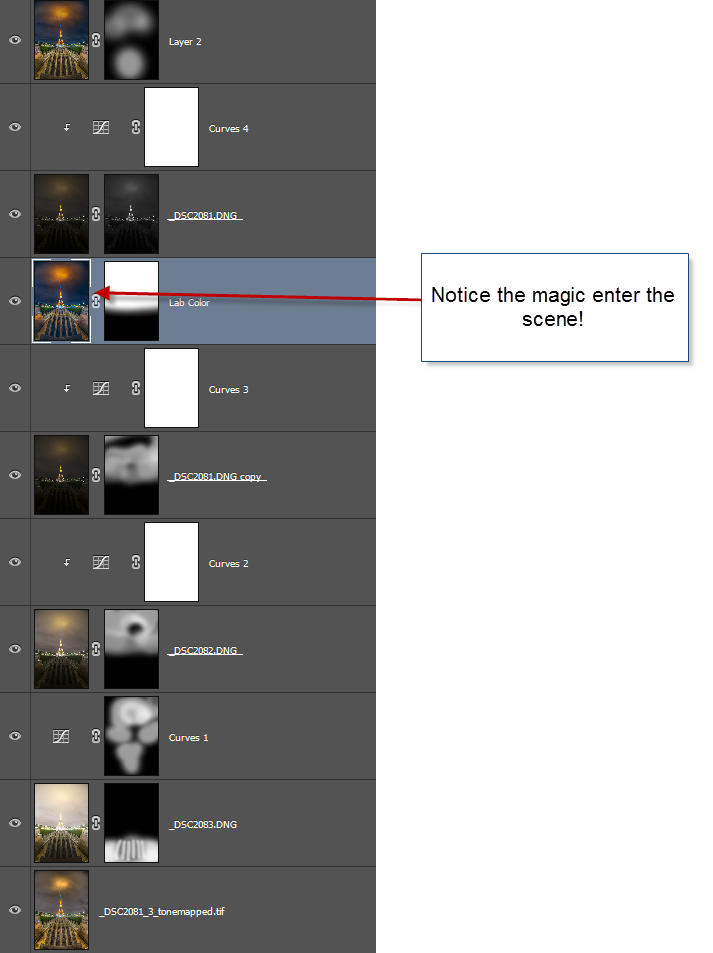
And to show the exact impact. The photo on the left is the one I put into Lab Color, and the one on the right is the one I got out. That’s magic!

Thank you, if you have read so far. This became one of the bigger tutorials.
–Jacob Surland
]]>

The famous Bell Tower in Bruges.
I only stayed in Bruges for one night, on the way to France. I did, however, make sure I got that way, even if it was bit longer. Bruges is incredibly beautiful, and there are a lot of chocolate stores, pretty close to Paradise if you ask me!
This photo I shot on the main square Grote Markt as a 5 shot HDR. It was on an extremely hot summers eve, in a light drizzle. I made a point of making a more dramatic image, than the original. This is the original photo:
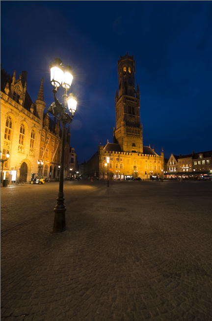
I created the drama, by adding some strong vignetting, and on top of that, I brightened the sky around the tower itself, and increased contrast to enhance the structures. A bit like a storm building up. This way I got a more interesting photo.
]]>
The colors of the roof and walls keep changing colors, to simulate day, night and the weather.
I knew that the ‘Muséum national d’Histoire Naturelle’ would be something special, but I was still blown completely away with the beauty of this enormous old room.
I arrived in the midst of a tropical thunderstorm. The roof changes colors, along with the one wall, to simulate the weather. It can show lightning, day and night, and a rainbow … at least that was what I saw, during my 1,5 hours I had there until it closed. I didn’t even get much time to look at the exhibition, but that looked really awesome too. This place I would require a day, to do it full justice I think.
I could just squeeze in visiting the Museum between I hung up my artwork at Carousel du Louvre, and the VIP grand opening later in the evening.
About the processing of this photo
This photo is shot with a Sony A7R using my metabones Nikon adapter attached with my 16mm Nikon Fisheye lens. The fisheye is obvious. I used a fisheye in this location, to got something out of the ordinary classic shot from this museum, and I think I managed to get that. At least, I have never seen anything like this before.
It is an HDR shot bracketed -2, 0 and +2. The Sony A7R is somewhat limited regarding shooting bracketed HDR photos. I need at least 1 stop between each shot, and prefer 2 stops. When choosing this option, the A7R can only shoot 3 bracketed photos. If I shoot less than 1 stop between each stop, it can shoot 5 shot, a ridiculous limitation.
I shot it at an f/stop somewhere in the middle. One of the drawbacks from using the Metabones adapter for Nikon is, that no EXIF information is transferred from the lens. But I know I had the f-stop somewhere in the middle, my guess is f/8-f/11. And then I had the camera at ISO 100 and the longest shutter speed was 5 seconds. This allows me to blur most of the people fairly much away.
I used my standard processing workflow for this image. I processed it in Photomatix (you might want to see my tutorial here), and afterwards i took the three originals along with the output from Photomatix into Photoshop and blended it to this final result. These are my three original unprocessed photos:

One of the important things, when you shoot a photo symmetric like this one, is that symmetry is as exact as possible. I could spend a long time while shooting, to get it exactly right in the camera, by shooting, checking and re-shooting. I work in a different way. I need to be ‘close enough’ to the final framing, but I do not mind, doing a final more exact crop at home on the computer. This way I get more time, to do more shots, instead of working one composition into death. This might be a different way, than others work, but I like it that way. Of course I sometimes get stuck, if I can’t get a “good enough” result quickly. I hate getting home with something, that I cannot use.
I am far from puritan about ‘getting it right in the camera house’. I see no point in doing that, it would only require more time, at each location, giving me less to time, to do more compositions.
In Photoshop I first got an “overall” good blend of the tonemapped output from Photomatix, and the three original images. Then I added some effect, by using Topaz Adjust. Afterwards i used two of the original shots ones more to fix or improve very specific areas.

How do I determine what ‘needs to be fixed’ in an image? What I get out of Photomatix is next to NEVER a final image. This I know, and I just have to look for the ‘problems’ with the image from Photomatix. There is always something, that doesn’t look too good. Something that is too extreme, a nasty halo or a to hard contrast. How do I spot that? I look closely at the image, both in a smaller thumbnail seized image, and in a closer to 1:1 version. But in the end it comes down to a mix of taste and experience/practice. The more images you have processed, the better you get at doing this. In the beginning, this was pretty much a lot of guessing work and less qualified work. Most of this early work, I have withdrawn from my public stream. The more images you process, the better you get at it, and some of the ‘problems’ gets so obvious to fix, that you hardly think about it.
In this particular image, I first got the ‘basic’ image, by blending the Photomatix version, with the three originals. Then I made some effect using, Topaz Adjust, and afterwards I fine tuned the image, by picking some very specific areas from the original images, to fix some problems.
–Jacob Surland
]]>
I got a kick out of making this photo. The photos I like the most, is the ones I get a kick out of.
As unreal as it might seem, this is a photo from an underground station in Vienna. And to be honest, I have forgotten which. I usually can reconstruct the details in my mind, of where a photo was shot, but this one, I have simply forgotten this exact location.
About this the making of this photo
This photo I processed in a different way, compared to most of the photos I make. Actually you only see a quarter of the photo, because I mirror it, twice! Let’s have a look at the original:
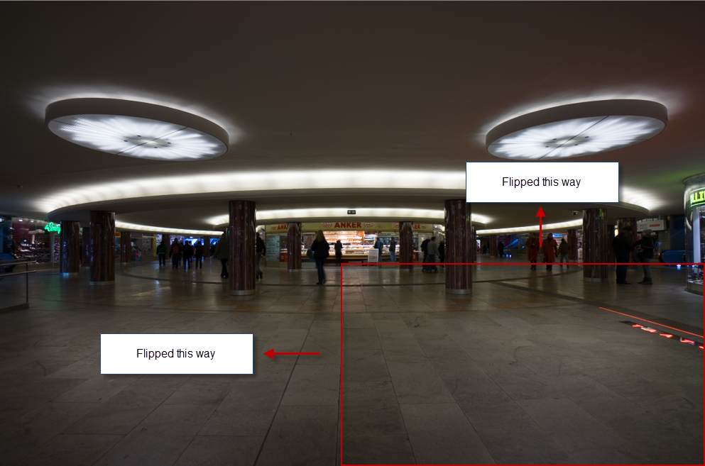
You can probably easy recognize the lower right hand corner. What’s interesting about this corner is both the light in the floor, and the fact, that almost no people are there.
Why does this work as powerful as it does? There are some lines in the flor, and one of the lines of tiles is even slightly brighter than the others, forming an X when mirrored, first vertically and the horizontally.
The scene is not quite interesting enough, even if the lamps and the circular form of this underground station in Vienna are interesting subjects. I shot this hand held, using my Sony A7R, while I was on the move. I managed to get the perspective right, but it would have required more time and a tripod, to get a really good shot out of this. I tried to proces this in my usual ways, but couldn’t get something really interesting out of it.
Instead I did what I do best. I switched on my problemsolving brain. When put into problemsolving mode, my brain works in mysterious creative ways, with lots of ressources, and this idea of mirroring popped up into my mind. And from there, things went fairly easy.
]]>
Palazzo Ducale or Doge’s Palace in Venice is a huge and incredibly beautiful building.
I really love Venice, even if there are heaps of tourists. The city is something out of the ordinary, and its magic just captures me. We got up early enough, to be able to see Piazza San Marco (almost) without any people (and of course to capture it in the right light). I think we got lucky with the weather.
About this photo
This is a 7 shot HDR, ranging from -4 to +2. I shot it using my Nikon D800 and my Nikkor 16-35mm f/4.

Why did I shoot from -4? They are almost completely black. One of the hard parts in shooting night shots, or blue hour photos like this one, is that street lamps are incredibly bright, compared to the rest of the photo. And often you end up, having completely blown out lamps. Sometimes, blown up lamps, can look great, at other times, lamps with full details can look great.
By shooting, and making sure, that I have all information, I have the artistic freedom, to choose if I want one or the other. A blown out lamp or a lamp with details. In the case of this photo, I went in the middle.

You could argue, that from -2 to +2 would have been enough, but if I had wanted to do something different when I got home, I couldn’t have changed my mind. So I made sure, when I shot the shot.
]]>

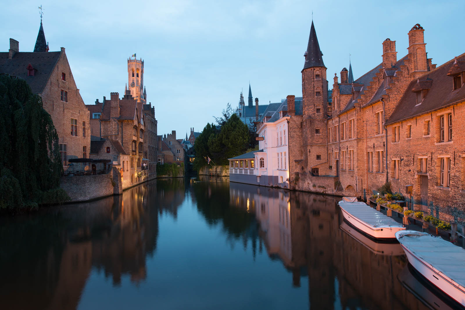
The White hotel on the right is the one from the move “In Bruges”.
Bruges in Belgium is an amazing town with a center that dates back to the middle ages.Some call it ‘Venice of the North’, but I learned that cities and towns with many canals, like to call themselves Venice of this” and “Venice of that”.
I think both Bruges and Amsterdam both in all fairness can be called a “Venice of the North”. They are both absolutely fantastic. Bruges has a lot of canals, and they wind their way through the medieval center of the city. It is a very beautiful place that I can highly recommend coming visit it for an extended weekend.
I got inspired to go to Bruges from the movie “In Bruges” starring Colin Farrell. In the movie, a couple of hired killers go on vacation to Bruges, and the one character really hates it, while the other one loves it. Personally, I found the movie hilarious, but I know other’s hate it. Some movies divide the World, just like cats and dogs do.
Anyway, the great footage from the old center that made me want to see Bruges, and I made a point out of making a one night stop in Bruges on my way to France.
What I didn’t know about Bruges is that it’s called the Chocolate Capital. I just love chocolate, and we did buy some, which, unfortunately, had to eat at once, due to the extremely hot weather.
This photo is from a particular famous corner, next to “Cafe Little Venice”. I have seen many shots from this corner, and this is my version.
The making of this photo
I shot this photo using my Nikon D800 and Nikkor 14-24mm. I shot it as a 5 shot HDR from -2, -1, 0, +1 and +2. This is the 0-exposure (the normal exposure):
Nikon D800, Nikkor 14-24mm, ISO 200, 22mm, f/11, 2.5 sec.
I should have used a lens not quite as wide, but there was a light drizzle and I did not want to change the lens, instead I cropped the image. That’s one of the wonderful things about having many megapixels. You can crop quite a bit away, and still end up with a 12-megapixel image, like this one.
I know that some people find that cropping images to be a sin and that you should get it right in the camera in the first place. I believe that if a photo get’s better from cropping it, then by all means crop it! And one more thing, I would rather come home with 10-20% too much of a scene, than 10-20% too little.
In this case, I didn’t like the white canal tour boats in the corner. I composed the photo, and included the boats and decided to crop the photo later if I didn’t like the boats.
HDR Processing workflow
My overall workflow, when I process HDR photos is, that I generate a pool of images, based on the original bracketed photos. And these I blend to together into a final image. I usually create a one or two images in some HDR software, usually Photomatix Pro. And these I add to the pool of the original RAW files, these files I load into Photoshop as layers and blend them together.
Photomatix supports presets and I have a few I use for inspiration. Often I use one, and tweak it a little bit until I am happy. I did that in this case.
I processed two versions of this photo in Photomatix Pro. First I made one, a single tone mapped. Saved that, and then I took the output, and put back into Photomatix, and did a double tone mapped image.

Use Double Tone Map to push the effects, but use it with care, because the effects easily get’s really out of control.

Single Tone mapped image.
The double tone mapped image usually goes completely wild, and you have to control it a bit, to make some of useful. The trick is to turn down saturation to around mid 40’s, and push Tone Compression to the left and Detail contrast to the right. They are highly potent, and you will have to find the right balance. Sometimes I find that the balance isn’t really there, and just skip making a double tone mapped image.
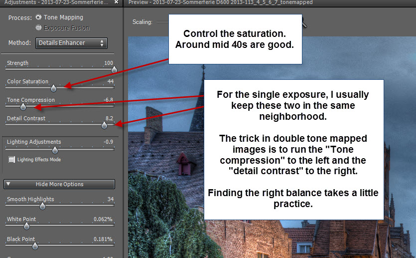
How to get the best result when making double tone mapped images in Photomatix Pro.
When I start to blend my images in Photoshop (you might find my tutorial on layer blending useful) I order them, so that the one I like the most, is my primary image, and it’s usually my single tone mapped image, but not always.

Double Tone mapped image.
In general, my goal with my post-processing technique is to improve my primary image, and by improve I mean:
- Remove ugly bits.
- Add cool effects
- Make it work as a complete and balanced image.
Now that I have my (primary) tone mapped image, I look at the issues I face:
#1 The lamps are way too bright. I dial them back a bit by blending in a darker version of the lamp, from one of the other images.
#2 The wall for some reason has gone almost white (blown highlights). This I also change by using a darker version and masked it in 25-50%.
#3 I really wanted the tower to be brighter, so I found a brighter version in one over the over-exposed image and blended that in.
#4 The water is bad – really bad. It has got a nasty halo. You can see that the water is almost black in the lower middle while it’s very bright along the edge of the reflections. This is called a halo and must be removed. I do that by mixing in the water from the 0 exposure.
A side effect from using the double tone mapped image is that light sources and other bright areas tend to get very bright or even blow out. A part of making the double tone mapped images is to find the balance between getting enough effect, without getting too much trouble repairing the blown out highlights and the halos.
To fix all of the above-mentioned problems, I use Photoshop. I load all my original five shots plus my two tone mapped images into layers (you might want to read this blog post for a full demonstration).
By using this technique I can remove and fix blown out highlights, by blending either the single tone mapped or one of the originals into the areas that are ruined or just look bad.
The result is, that the buildings and reflections come from the double tone mapped image, primarily, while the sky and the water comes from the original exposures.

Final touches
When done in Photoshop I then save the file as a flattened TIFF file and import that into Lightroom.
In Lightroom, I use the brush tool to increase contrast and the clarity in the sky. By doing this, I enhance some details in an otherwise flat sky. The texture is there, it’s just not very easy to see, but I can be enhance it this way. A side effect of doing this, is that the colors get too saturated, I have to turn down the saturation a bit.

The pink areas are the areas that I painted using the brush. On the right you can see what settings that is applied to the pink areas.
Further reading
If you find this kind of processing interesting and want to try it out for yourself, you might want to get a hand on a copy of Photomatix Pro. There is a free trial, but if you use the discount code “caughtinpixels” you will get a 15% discount.
You might also want to read my basic understanding of making HDR photos. There’s a lot of things to understand, and a lot of pitfalls. I get around all of these things here.
I also have these tutorials:
Detailed tutorial on using Photomatix Pro.
Learn how to make double tone mapped images in Photomatix Pro.
Learn how to blend layers using layer masks in Photoshop.
Learn how to blend layers using layers masks using GIMP, the free alternative to Photoshop.
]]>