Warning: Undefined array key "multiauthor" in /var/www/caughtinpixels.com/public_html/wp-content/plugins/post-layout/plugin.php on line 114
Warning: Undefined array key "mobile" in /var/www/caughtinpixels.com/public_html/wp-content/plugins/post-layout/plugin.php on line 352

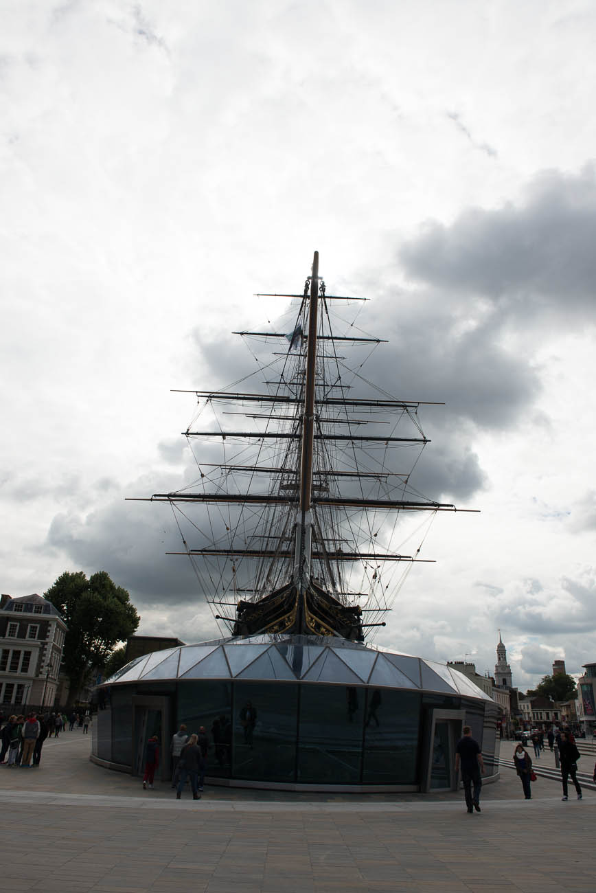
The old Sail Ship Cutty Sark, is placed in a dock in Greenwich Village, London. The old ship sailed with tea and was build in 1869. A few years a ago a fire destroyed some of it, but not more, than it could be repeared. I happened to pass the ship at 12 o’clock and the Sun stood just at the top of the masts.
The making of this photo
I shot 7 hand held shots (-4 to +2), at ISO 200. It is very bright, and the shutter speeds range from 1/8000 to 1/160. This is the 0-exposure:
 As you no doubt can see, it is quite different, from my final photo. What I did was to make a split toned image in Adobe Lightroom. I have some presets that I have made, some of which uses split toning of the colors. This can sometimes be a great way, to punch some interesting coloring into a mid-day photo.
I often use my Lightroom presets, to get an idea, in particular with a shot like this. The problem with this shot, is that it’s taken in the middle of the day, and the light really isn’t great. I got a composition that I liked, with the sun right on top of the mast. Clearly Cutty Sark is placed North South, otherwise the symmetry wouldn’t have worked.
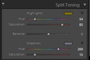
Anyway, one of my presets give this yellow coloring to the highlights and some purple to darker tones.
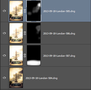
 This gives the overall look and feel of the photo. And this makes an otherwise a little bit boring daylight photo, more interesting. I then synchronized the processing to 3 of the other exposures photos:
 I did a little individual processing on the lower part of the photo. I wanted to mix these four photos in Photo, into a final photo.
I then used the Lightroom feature to open the four photos as layers Photoshop:

And then I blended the layers to my liking.
I used the four images to get the right mixture on the sky. The brighter one for the people on the ground. When I was happy with the result, I re-imported the 16-bit TIFF file into Lightroom and did the last things there.
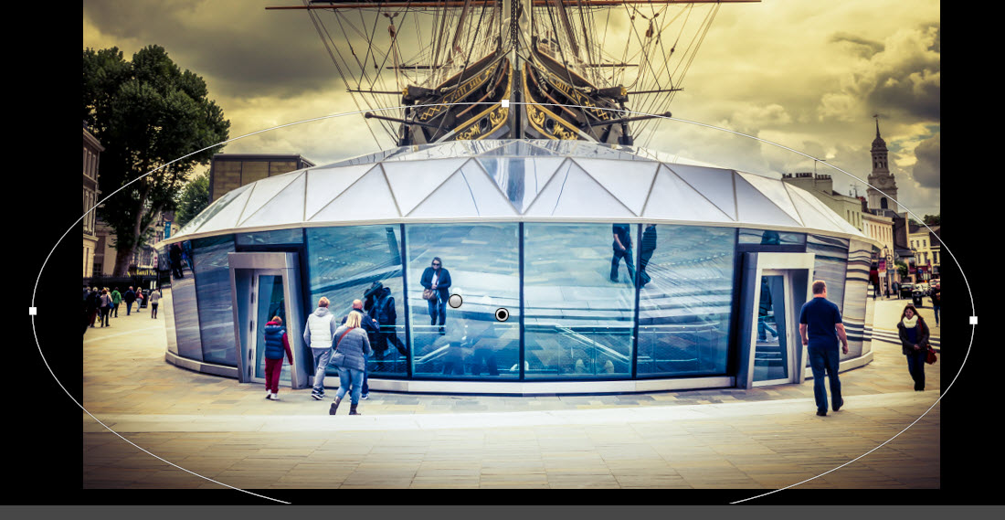
The glass building in front of Cutty Sark I wanted to pop a bit more. Blue and yellow goes really well together, so I wanted to pop the blue color. To do that, I added an elliptic gradient (remember to inverse it!). I increased the exposure, to make it bright, and started playing with the color toning of that.
And the values I used:

I did several things. I lowered the temperature to -35. This moves the area away from Yellow towards blue. Then I increased the exposure slightly, but also the shadows. But I also added some color, a blue/purple color. What I do when I use this color map, is to drag the pointer slowly around, and use a “better worse” strategy.
For sharpness I used both the Clarity and the Sharpness.
The photo was now roughly done. I thought it was maybe a tiny bit too orange, and made a little adjustment in the Hue section in Lightroom. I pushed the Yellow a bit towards Green, and that took the top of the orange.

And now I only needed to do the final touches:
- Reduce noise
- Remove sensor spots and paper on the ground.
And that was it.
I have a lot of other photos, that I have described “The making of…”. You can find them here.
Warning: Undefined variable $pstl_comments_number in /var/www/caughtinpixels.com/public_html/wp-content/plugins/post-layout/plugin.php on line 43
Warning: Undefined array key "cid" in /var/www/caughtinpixels.com/public_html/wp-content/plugins/post-layout/plugin.php on line 46
Seriously this is awesome. I really love to see the difference between the start and end result.
Warning: Undefined variable $pstl_comments_number in /var/www/caughtinpixels.com/public_html/wp-content/plugins/post-layout/plugin.php on line 43
Warning: Undefined array key "cid" in /var/www/caughtinpixels.com/public_html/wp-content/plugins/post-layout/plugin.php on line 46
Thanks a lot Alin – have a great day!
–Jacob
Warning: Undefined variable $pstl_comments_number in /var/www/caughtinpixels.com/public_html/wp-content/plugins/post-layout/plugin.php on line 43
Warning: Undefined array key "cid" in /var/www/caughtinpixels.com/public_html/wp-content/plugins/post-layout/plugin.php on line 46
Really great final image! Love the composition and the contrasting colors as well as combining the old and new. Very impressed that your mind’s eye saw a final version from the original shots which where ‘meh’. Thanks for taking the time to go into detail (with screenshots no less) of your processes and settings. It’s a tremendous way to learn.
Warning: Undefined variable $pstl_comments_number in /var/www/caughtinpixels.com/public_html/wp-content/plugins/post-layout/plugin.php on line 43
Warning: Undefined array key "cid" in /var/www/caughtinpixels.com/public_html/wp-content/plugins/post-layout/plugin.php on line 46
Hi Randy,
Thanks a lot – and you’re most welcome. I do use presets to trigger my imagination and inspiration – and you’re absolutely right about the original. Hadn’t the sun been at the top of the mast, I probably never would have taken the shot.
Thanks for the comment and have a nice day!
–Jacob