Warning: Undefined array key "multiauthor" in
/var/www/caughtinpixels.com/public_html/wp-content/plugins/post-layout/plugin.php on line
114
Warning: Undefined array key "mobile" in
/var/www/caughtinpixels.com/public_html/wp-content/plugins/post-layout/plugin.php on line
352

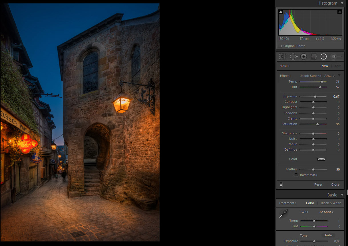
Not so hidden passage
When I shot this photo I was worried about the bum walking in the far end of the passage, but because I used a wide angled lens, he got pushed so far away, that he grew so small that it didn’t matter. But when I shot this shot, I didn’t really understand what was going on and because I have spend quite some time thinking about it, I will share my thoughts on the topic.
When I bought my first DSLR back in 2007, a Canon 400D, I was told that I had to multiply my mm on the lens by 1.6. And because I had a 300 mm lens, that was equivalent of 480mm. I found this odd, but that was cool because I had a 70-300mm, which was really a 112-480mm. The crop factor made it an even more extreme tele zoom lens. That was cool. I learned too that there are different crop factors, e.g. Nikon has a crop factor of only 1.5, so I thought Canon was just a notch better than Nikon at this crop factor thing. Later I found out, that this was one big misunderstanding.
To fully understand this I have to explain several things, I will:
- Explain the difference between a camera with an APS-C sensor and a camera with a full frame sensor.
- Then I will explain how conversions between the APS-C sensor and full frame sensor work.
- I will also explain how wide angle and tele lenses work and what lens compression is.
- And last I will explain a bit about what effect this while crop factor thing has on bokeh (out of focus back ground).
It’s actually less than a year ago I figured out how it really works and that it is a big mistake, to think of it as ‘equivalent’. It was after I bought my Canon 5D Mark III and a bunch of lenses, that I learned how it really works (you might also like to read my Review of Canon 5D Mark III vs Nikon D800 and Nikon D600).
A cropped sensor (APS-C sensor) vs a full frame sensor
Inside a digital camera, there is a sensor that captures the light that comes through the lens and translates that into an image. Sensors in DSLRs most commonly comes roughly in two different sizes, the APS-C sensor and the full frame sensor. The smaller APS-C sensor is approx 23mm x 15mm, while the larger full frame sensor is about 36mm x 24mm. The exact size varies from brand to brand. The full frame sensor corresponds to the old 35mm films.

When you attach a lens to a camera, a lens does not change how it works, whether it is attached to a full frame camera or an APS-C camera. A 15mm lens is defined from the way the glass is constructed and placed in the lens. By moving it to from one camera type to the other, does not change the lens or the glass.
The difference lies in what is captured by the sensor and because the APS-C sensor is smaller, it also captures a smaller portion of the scene that comes through the lens, while a full frame sensor captures a larger portion of what comes through the lens. And this is very important to understand! If you didn’t quite understand it, I encourage you to try to read it again.
If I shoot a scene with a 15mm lens on a full frame camera body and I then move the lens to an APS-C camera body and shoot the scene again, I will get a smaller portion of the scenery with the APS-C sensor. If I cropped the image I shot with the full frame camera in Lightroom or Photoshop in the post-process, I would get exactly the same image from the two cameras (probably in different mega pixels, but otherwise the same image).
If I want to capture the same scene on the APS-C camera, I would have to compensate, for what the sensor crops away. There are two ways of compensating, one is to move further away and the other is use a wider lens, which captures more of the scenery. Let’s stick with the wider lens.
Now the crop factor comes into play. It is calculated like this using the width of the sensor 36mm / 23mm = approx 1.5. And remember the exact numbers vary from brand to brand.
So if I used a 10mm lens on an APS-C sensor, that would compensate from what the sensor crops away, because 10mm x 1.5 = 15mm. The is the reason for the confusion of the lenses being ‘equivalent’. But let’s not forget, that it is not longer the same glass in the lenses. On my full frame camera I have a 15mm lens and I have a 10mm lens on my APS-C camera and they do produce different images, as you will be able to see further down in this article.
And these two lenses behave different because of lens compression, which brings me to the other part.
Understanding lens compression (Wide angle and tele lenses)
The human eye sees the world much in the same way as a 50mm lens does. That’s probably one of the reasons, why 50mm lenses are popular among photographers. Almost every camera brand has got a fairly cheap and excellent 50mm prime lens.
Wide angle lenses are shorter than 50mm, while tele lenses are longer than 50mm. Both wide angle and tele lenses comes with a zoom (e.g. 16-35mm and 70-200mm), and there are lenses that works in both areas, like the very popular 24-70mm zoom lens. Every brand seems to have a superb 24-70mm, as well as they have a 50mm lens.
But what happens when you get a longer lens? Or shorter lens? In terms of millimeters that is.
Let’s start with the tele lenses. You most probably have realized, that they enlarge things, but something else happens too. Things get compressed. Even though things you have within your frame, are far apart, can suddenly look close to each other. This is called lens compression.
And what happens with a wide angle lens is, the exact opposite, things get pushed further away, than they really are. And when you get to the extreme wide angel things in the corners gets distorted too. So a wide angle lens decompress or expands a scenery.
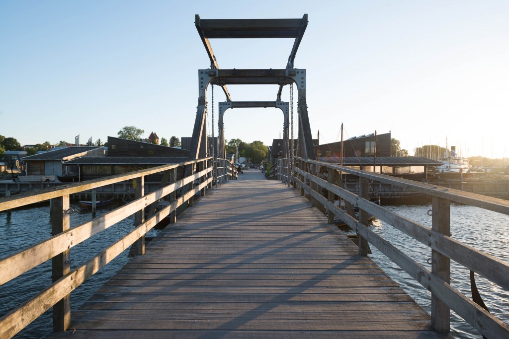
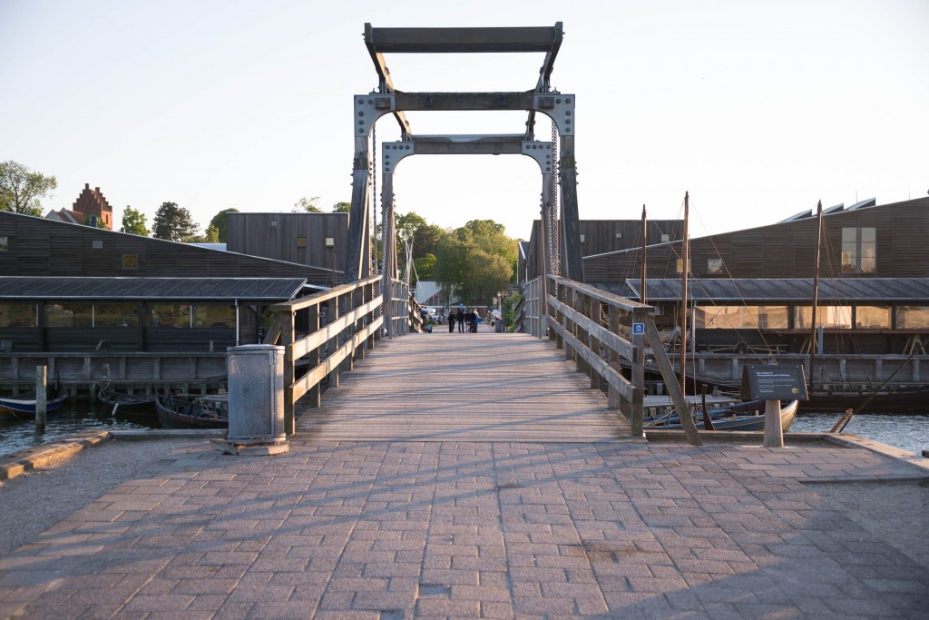
This calls for some examples to get the grip of it. I found a bridge here in my hometown, and then I shot this bridge as the primary object in my photo, and kept it approximately the same size, and different focal lengths. This is something, that you can’t do with your own eyes, but your brain knows how to translate it.
I have tried keep the frame of the bridge in the same size, and started at 14mm, in which case I had to actually stand on the bridge, and then I moved backwards and took shots at 24mm, 50mm, 70mm,100mm, 200mm and 300mm. And that gives this sequence of photos:
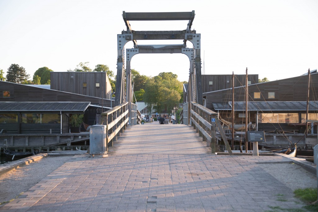
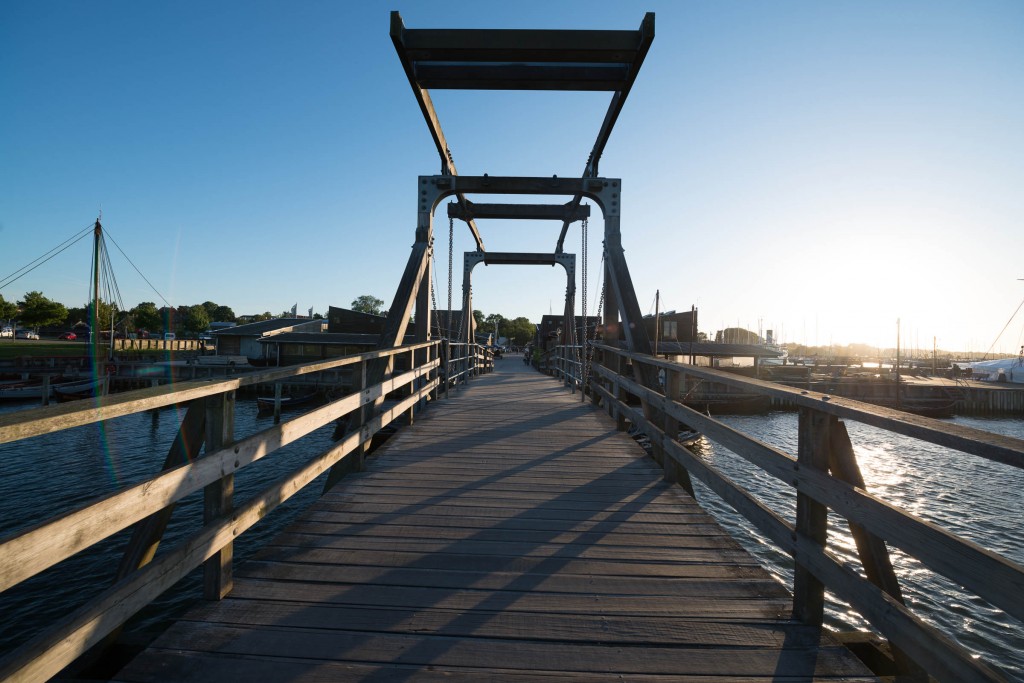 14mm. Can you spot the tree in the center?
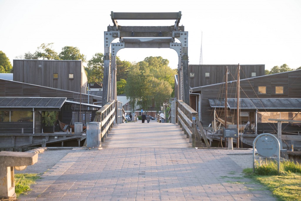
 24mm. You can see a small tree in the center now.
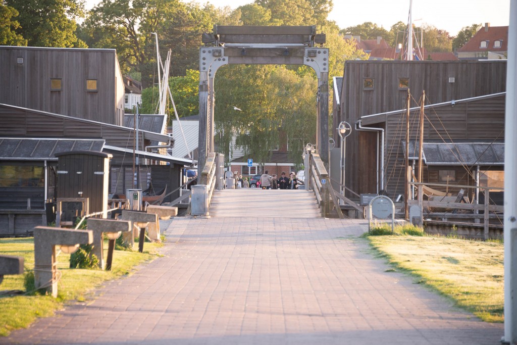
 50mm. Now the tree is clear, but still small. This is the way the human eye sees it.
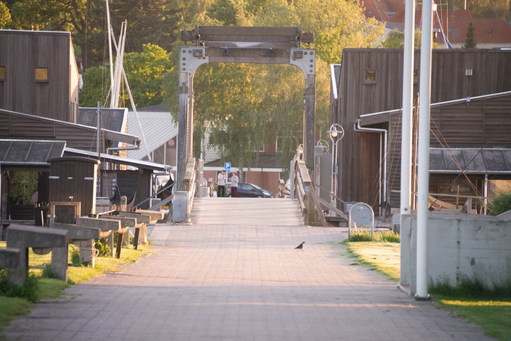
 70mm. The tree grows.
 100mm. The tree now fills the inner frame of the bridge.
 200mm. The tree has grown out of the inner frame of the bridge.
 300mm. Now you can’t even see the horizon.
And this final image is back to the 14mm, taken from where I took the 300mm shot.
As you can see things change quite dramatically. As you get longer focal lenths, things that are further away suddenly seems closer. The tree in the back ground, suddenly grows big.
This you can use as a feature, when you compose your photo, either by pushing something further away or pulling something close. If you use a tele lens to shoot mountains, you can make them look bigger, than they really are.
Lens compression on cropped and full frame cameras
Let’s return to the cropped camera vs full frame camera issue and the crop factor. As you might be able to realize now, a crop factor of 1.5, does not make a 10mm lens on an APS-C camera equivalent to a 15mm lens on a full frame camera.
Depth of field on cropped vs full frame cameras
Another thing, that comes from the optics, is that wide angle lenses have a huge depth of field, meaning that you can have almost everything in focus, while tele lenses are good to make blurry back grounds on portraits. If you are shooting landscape photos using extreme wide angle lenses, you will be able to get even more in focus on a 10mm lens compared with a 15mm lens. This can be an advantage. So a cropped camera will in general have a larger depth of field, than a full frame camere, if you use the crop factor to recalculate the focal length. But this also has got one more implication, which involves the bokeh.
Bokeh on cropped vs full frame cameras
Because the depth of field is larger on a cropped camera, if you use the crop factor calculation on the focal length (like 30mm on a cropped camera equals 45mm on a full frame camera), the bokeh also changes. The bokeh is the “out of focus” blurry back ground that looks to great on portraits. Let’s have a look at a 100% crop of both images at the same resolution.
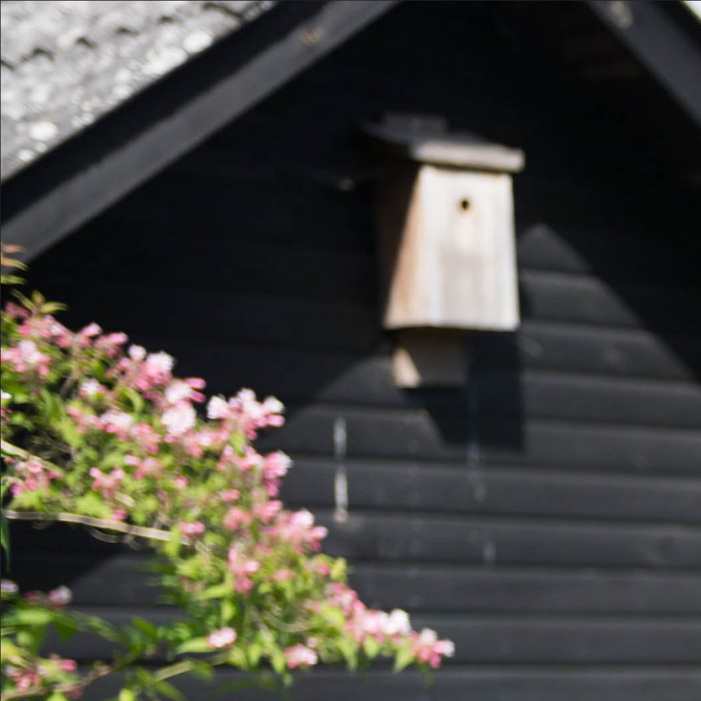 100% crop of a 30mm, f/2.8 on a cropped camera. Notice the bokeh on the flowers.

100% crop of 45mm, f/2.8 on a full frame camera. Notice much softer and stronger bokeh.
As you can see you get a much softer and nicer bokeh on the full frame camera, which is an advantage if you are shooting photos, where you need the bokeh.


")