The Millenium Bridge and Sct Pauls

Millenium Bridge and Sct Pauls

The Millenium Bridge and Sct. Pauls Cathedral in London.

The first time I tried to get to the Millenium Bridge, while I was in London, and get a shot of Sct. Pauls Cathedral, I completely underestimated how long time it would take to walk there, from London Tower Bridge. I had to give up, because it was getting very late, and I was tired, and my feet hurt. I had to get a Taxi back to the Hotel because the Underground had stopped for the night.

A few months later, I got back to London, and this time, my starting point was once more London Tower Bridge. However, I did not hang around too long in this neighbourhood, but started moving down the Thames, and when I felt it was time, I got the Underground and quickly got here.

The bridge is actually quite wobbly, and I had to wait until no people walked the bridge, and shot my 9 shots. The dynamic range of this scene is incredibly high, from the darkest areas down around the Thames, and to the highly lit Sct. Pauls Cathedral. But 9 shots did it.

–Jacob Surland

Stairs lead to Sct Pauls Cathedral

I always wanted to see Sct Pauls Cathedral up close, and even though I lived in London for a year. It was one of the things, that I just didn't get around to do. This time I didn't get any closer than this, but I figure it was closed at this time of day anyway. Photo by: Jacob Surland, www.caughtinpixels.com

Sct Pauls Cathedral as close as I have seen it so far. Next time I will go closer!

I always wanted to see Sct Pauls Cathedral up close, and even though I lived in London for a year, it was one of the things, that I just never did get around to do. This time the purpose was to photograph it. As I moved closer and closer, I realized, that it is so huge, that if I got up close, I might not be able to get a proper shot of the cathedral. It was getting late, and I was tired, so I decided that this was as close I got this time. I had begun shooting right after dinner, and I had walked a long way and for a very long time, and I was getting tired. So this time too, I didn’t much closer than this. It’s something I still have on my bucket list…

About the making of this photo

This photo is a seven shot HDR shot ranging from -5 to +1. Why did I use seven shots? Well, one of the hard parts shooting under conditions like this is, that is pretty dark in a street like this, even if there are a few lamps. Sct. Pauls Cathedral itself is white and lit up by a lot of lights, and it is an incredible contrast to the dark street.

The street lamps are bright too. Because I like to have my ‘city by night’ shots well balanced, it requires to capture virtually all light, from the darkest corner to the brightest light bulb. And in this case, I needed shot 7 shots, to cover approximately all light.

When I processed this photo, I suddenly realized that there were stars in the sky. When in a big city like London, the light pollution usually is so bad, that stars are close to impossible to see. I liked having them, and I began to enhance them. Photomatix really can do an excellent job of this, but, unfortunately, digital noise is also increased. In the end, it is a balance of stars and noise levels, and this is my choice. Had I been standing in a field 70 miles from the closest city, it would have been an altogether different story.


Artistic freedom

Don't worry, River Thames was just as muddy as ever. One of the reasons I love post-processing so much is because I can do whatever I like. I am not married to reality, like a documentarist. I am an artist. I process my photos until I get something I like. I don't particularly like a muddy river, and the blue one looks much better. Photo by: Jacob Surland, www.caughtinpixels.com

A long exposure photo of the London Tower Bridge just around sunset.

Don’t worry, River Thames was just as muddy as ever. One of the reasons I love post-processing so much is because I can do whatever I like. I am not married to reality, like a documentarist. I am an artist. I process my photos until I get something I like. I don’t particularly like a muddy river, and the blue one looks much better.

But how did I make the water blue?

I made a virtual copy of the image in Lightroom. I now had two identical photos. On one, I started to play with the HSL panel to make the water blue. This made the rest of the image look terrible, but that’s OK, that is why I made a virtual copy.

When I was happy with the water, I selected both images, and exported them to Photoshop as Layers, and then I blended the water into the normal photo, and the result is this image.

Poor conditions push creativity

In the midst of London, you can experience new and old blend together in a futuristic vision. Photo by: Jacob Surland, www.caughtinpixels.com

London Tower Bridge and London City Hall shot on a rainy night. See the original image further down.

For some reason, I always find myself much more creative, when I come home with photos shot under difficult conditions. A particular evening like this in London had a light drizzle. Not a lot of rain, but enough to get the ground wet, and the lights reflect a bit. That can turn out pretty awesome.

Continue reading

Buying guide for Neutral Density filters or ND filters

A longexposure of a sunset shot from London Tower Bridge, on a late summerday. Photo by: Jacob Surland, www.caughtinpixels.com

“Thames Sunset” shot with a 10 stop ND filter allowing to exposure for 40 seconds with the Sun within the frame.

Using Neutral Density filters can make a dramatic change to your photos. The photo above is a 40-second exposure, which only is possible with something to stop down the light. The Sun is within the frame and had I shot without the filter, the shutter speed would have been 1/25 seconds. I shot this at ISO 100 and f/8. I could have gone to ISO 50 and to F/22, and changed the shutter speed to maybe around a 1/4 or 1/2 seconds, but not 40 seconds.

ND filters are pretty expensive stuff, and I have ended up spending a fortune on them, not only because I have a fairly complete set, but also because I have made some mistakes. Expensive mistakes, that is. In this buying guide, I will try guide you not to make the same mistakes.

Continue reading

Thoughts on finding your own style

The Japanese Tower in the Tivoli Gardens is the home of a Sushi restaurant. As a lover of Sushi, I frequent this place, whenever budget and time allows it. It has a very special place in my heart, as it has been used for several celebrations. Photo by: Jacob Surland, www.caughtinpixels.com

As an Apprentice of The Arcanum we get presented all sorts of tasks and exercises, on our journey to become better artists. At my current level, I have to focus more on what is “me” and “my” art in what I do.

Even before I got the assignment from my Master Robin Griggs Woods, I had started down the road of ‘who am I’? It’s not as easy as you might think, realizing who you are, and what you do, which is uniquely you.

Truth is, that I find myself most creative, when I am sitting in front of Lightroom and Photoshop, not when I am out shooting photos. I get ideas on processing techniques, combining techniques in new ways, trying out all sorts of things. Some photos are fairly straightforward, while others are much more time-consuming, and require that I used my creativity.

Some of my photos, I spend weeks, months, even years before I get the final idea. The images may pop in my head, and then I think of ways to process them for a while. Forget about them, and then come to think about them again. Try some stuff, it might not work, and I shelve the photo again for a while. And then suddenly one day, I have the idea. This photo stars above London is a great example of this process. It took me months and many failed attempts before I finally made something I was happy with.

London City Hall with the London Tower Bridge just after midnight. Only a few people hovers around the area. The stars are peaking out from the skies. Photo by: Jacob Surland, www.caughtinpixels.com

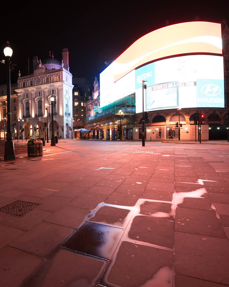
What I have come to realize is, that I see a difference in ‘just’ processing a photo, into something nice. The other day I processed two nice photos from London, but I didn’t get the kick out of, that I wanted. I thought about it. Why was it, that two perfectly great photos, full of city lights didn’t turn me on? It should be my favorite sort of photos. After thinking about it for a while, I came to the conclusion, that making the photos, only required Craft and Skills, not creativity.

The way I had shot the photos, and the light I had shot them in, didn’t leave much room for processing creatively. And because it was a standard processing technique, I could do in my sleep, it didn’t turn me on.

This fact has changed the way I see myself as a Fine Art photographer. I need room for creativity, in what I do. I get bored by doing the same routine stuff every day.

I have known for quite some time, that I do like to play with the viewers mind. I add elements, enhance elements beyond what is realistic. I may over enhance shadows, add light sources or change colors. This way I can play tricks on the viewers mind. His sub consciousness will detect, that something is not right and some even see what it is. What happens, when I do that, is the image will get an artificial look to it, maybe like a painting or at least border lining to surrealism.

In the photo in the top, of the Japanese Twoer in Tivoli Gardens in Copenhagen, Denmark, I have enhanced the shadows cast by the group of people. The shadows are far stronger than the original photo showed. Another thing I have done is to remove almost all color, in the lower part of the image. There is quite a lot of colored light, and it shows on the ground.

I find these elements very much me, other people may do it too or do similar things, but it is something that I like to do, and that I have found out on my own and integrates into many of my images.

On the London image, I added light beams on top of the London Tower Bridge, even though there are no light beams.

While these small techniques do not dictate a style, they are a part of me and my art. I use them in many different kinds of photos, but they are a part of my images, in general. I have some other techniques, which I also use, to make my own style of photos. It does not necessarily mean that my photos, end up looking the same, because they don’t, but you will find elements in each, that come from the same core.

What I am beginning to realize, is the elements in what I do, that make my photos into ‘my art’, as an expression of me. I like to tease and be surreal, I always loved surreal artists and texts, and, therefore it is a part of the photos that I make.

Clean up the ground – it does make a difference!

I never thought that I should see Piccadilly Circus abandoned for people, but at 5:43 in the morning it is possible. A single early bus passed while I shot the photo. Photo by: Jacob Surland, www.caughtinpixels.com
I have a few shots from Piccadilly Circus, and for some reason, all of the chewing gum in the world is spat out here. Have a look at the before photo, and see how much chewing gum there is on the ground. I have spent hours and hours cleaning up the ground using healing and cloning tools in Photoshop.

It’s a drag to clean up that much chewing gum, but it is worth the hard work. The result looks so much better, and it does make the difference.

This is the before photo, or rather one of the 9 photos – actually 18, because I shot two series of 9. The first series were completely empty and the second included the bus.

Chewing gum on Piccadilly Circus

Understanding HDR part III – The Histograms

Piccadilly is always crowded - well almost always. And shooting photos there is difficult because of all of the people. But when you patiently are waiting, with your camera on tripod, people also get curious and come talking to you. This particular image is assembled from 9 various photos, with different people and light settings. Photo by: Jacob Surland, www.caughtinpixels.com

May the Histograms be with you!

Use the Histograms, Luke!

In this article I will cover histograms. I will use the knowledge from part I and part II of this series of articles on Understand HDR. If you missed the first two, you might want to read them too.

Some of the questions I will try to answer in this article, are ‘What is a histogram?’, ‘Why are histograms important in HDR photography?’ While answering there will be other findings; findings like: ‘Why is it important to push the histogram to the right?’

When I started on digital photography I noticed the histograms on my camera, when I played back my photos on the LCD screen. I did not really realize what, it was. I guessed it was some kind of graphical representation of the photo, which is true, but the real understanding I did not realize until much later.

Last year I attended a photo workshop, and the coach managed in a few hours, to explain to everybody, even the wives of the photo geeks, what a histogram is, how important it is and how to use it in a field. I was quite impressed by this deed.

Histograms are one of the most important tools for a digital photographer. It is always important, also if you are shooting HDR photos, some think it might not be, but it is. I still sometimes forget to check my histograms and I regret it when I get home.

What is a histogram and what does it show?

A histogram is a visual representation of how the tonal range is in a photo. The height of the bars in histogram, tells us how many pixels in the image have the specific tones.

The far left of the histogram is black and the far right is white. If there is a lot of high bars in the left hand side of the histogram, the image will have a lot of dark tones, while if there is a lot of high bars to the right, the image will have a lot of bright tones.

This photo is a well exposed photo:

Histogram - bell curve

A photo like this, is a well a exposed photo because the bars does not touch either side of the histogram. But it tells us more than that. From the distribution of the height of the bars, we can see that there is a peak in bright tones end of the histogram, which tells us a lot of brightness exists. And of course that is the bright clouds.

Continue reading

Processed live in a course

The blue hour is a beautiful time. Here you can see the London Tower Bridge in the distance. You see it from alley

I post-processed this 7 shot HDR photo at one of my HDR courses. It’s always interesting to see, what you get from a photo. When I process a photo at a course, I try to find something, that will end up great and has some of the magic HDR look to it. But at the same time involves some problems, like moving people.

The blue hour is a beautiful time. Here you can see the London Tower Bridge in the distance. You see it from alley “More London Place” connecting “The Shard” with the London Tower Bridge.

What is the Dynamic Range of Sony A7R?

Liberty House is a beautiful shopping mall in London. An old one selling a lot of different things, but famous for luxury goods. You can almost see it on the building. Photo by: Jacob Surland, www.caughtinpixels.com

What is the hype about the Sony A7R? For the last few months I have seriously been considering buying the Sony A7R camera. Why? Because I love the size of the camera. I find the D800 rather bulky, and sometimes I bring my Finepix X100 instead. The Finepix X100 is a great camera, but it is terrible slow, not wide enough and it is not great for HDR photography.

But having read many many reviews of the camera, to be sure it really is the right choice. To my amusement, I have come across many Canon users doing flip flops over the Dynamic Range of the camera.

Having had owned both Canon 5D Mark III and Nikon D800, I have learned that there are major differences in the two brands, and in particular when it comes to the Dynamic Range. The Nikons are so much better at Dynamic Range, than the Canons cameras. Apparently this is something that many Canon photographers is not really aware of. Canon 5D Mark III (according to www.dxomark.com) has a dynamic range of 11.7 EVS, while the Nikon D800 has got 14.4 EVS. That is 23% more dynamic range coverage. That is a lot! I

have covered this in detail in my comparison review of Canon 5D Mark III, Nikon D600 and Nikon D800.

The switch from Canon to Nikon really is tough. Not only because it is really expensive to switch, because you have bought a lot of lenses. But Canon and Nikon also are rivals and it’s a religious thing, to be either a Canon or a Nikon guy. You do not go to the enemy!

But Sony has hit a sweet spot. They have crammed a similar sensor to that of the Nikon D800E into a very small body, and the camera delivers the quality. And attaching an adapter to the camera, you can use both Nikon and Canon lenses. Nikon only manual focus though.

Of course both Canon and Nikon photographers loves this little camera. But, the Canon photographers really goes “Wooohooohaahaaaay!” and gets a good surprise, when they realize what 14.4 EVS in Dynamic range truly means. The Nikon guys, they are used to this.

Dynamic range explained

What is the Dynamic Range? Well, it is how much light the sensor inside the camera can capture. What is too bright to capture for the sensor, will just be white. And what is too dark will just be black.

The better a sensor is, the more light it can capture. You measure the dynamic range in “exposure value steps”. One step is equivalent of doubling the shutter speed or cutting it in half.