How to handle strong noise

Milford Sound is surely one of the most beautiful places on Earth. This is Mitre Peak at the gates of Milford Sound just before sunrise. Photo by: Jacob Surland, www.caughtinpixels.com

As I have been writing about I have been searching for something I can use as a new style. I have had a feeling of what I was looking for. I have had a few shots at it, without striking a clean note.

But as I was rumbling through older photos I came across this one, which I never processed before and applied one of the Lightroom filters I made last week – and there it was! A clean note. Or at least the beginning of it. I did a little extra post-processing here and there, but not a lot, and I was happy … for about 10 seconds. I zoomed in, and saw that the image was ruined by noise. I had shot it at ISO 10159 (why why WHY!!!). Because I had had the camera on Auto ISO the day before, while driving through a tunnel to get to this wonderful place. And this photo is shot almost in darkness.

It is processed in Lightroom only, except for the Noise reduction. To handle the noise reduction, I started by reducing the size of the image to about half resolution, not half megapixels. I shot this at 36 megapixels, cropped it down to 29.5 megapixels, and what I did was to reduce the resolution from 7360×4004 to 3676×2000 and thus reducing it to 7 megapixels). After I had done that I applied noise reduction to the final result. And this is it.

I used Noiseware for the noise reduction, and I used the Default settings. There are a number of various settings, but I quickly started loosing details, so I stuck with the default filter.

The photo is still noisy, but it actually works quite nice with the colors and style I think. If I had used stronger noise reduction I would have lost so many details, that the photo would have been ruined.

In my Arcanum cohorte one of my fellow apprentices asked about when to do noise reduction. I first tried to do the noise reduction before the resolution reduction, but that gave a terrible result. Then I reduced the size first and then did the noise reduction, and that was a much better result. This is still noisy, but at least it is regular noise.

Gotta get my Mojo working!

The city of Luxemburg is placed in and above a canyon. Along the edge of the canyon a balcony runs giving you a fantastic view of the beautiful old city below. It's nick named the most beautiful balcony in Europe. Luxemburg is both modern and an old city, with a grand history of war, money and politics. And there are many great restaurants for food lovers like me. Absolutely worth a visit. Photo by: Jacob Surland, www.caughtinpixels.com


I am a realist by Nature. Sometimes that is a curse and at other times it’s a blessing.

Currently I am trying to push new styles out of my photos, but it doesn’t really work for me, yet. Life has taught me, that everything is hard the first time you try. Experience comes in … well levels. You get stuck from time to time, but suddenly you can do whatever you were trying to do. A new skill has been acquired (tada.wav). Sometimes you don’t even realize, what was difficult is in fact no longer difficult.

Then for a while you get comfortable with what you are doing – your mojo is working just great. But then you start trying to reach new areas. Things get hard, and you have to get mojo working again.

Currently I find myself in such a place. I don’t full fill my own expectations to myself to the level I want to be on. I don’t get exactly the results that I want. I am searching for the answer, searching for the key that will unlock the door I want to go through. I am confident that I will find the key, not sure when, though. But eventually I will succeed. This life has taught me.

One of the things I have been dealing with is colors. The danger over over saturating photos, while not leaving them flat and colorless. I am addicted to the colors, and the more I use them, the more I want them, and suddenly, I am over the edge. This photo I have processed over the last couple of days, with the specific goal to keep saturation well under control.

This is a an in between version:

Luxemburg before

#1: The original had this boomerang cloud, slightly darker than the rest of the clouds. I enhanced it to get an “object” in the sky, to work with the ground. But I wasn’t really happy with it, until I noticed that there were some natural edges or cuts in the clouds.

#2 I used this natural cuts, to brighten up the sides of the boomerang cloud and ended up with a cloud like an object in the sky. This worked much better with the composition, I think.

About the photo

The city of Luxembourg is placed in and above a canyon. Along the edge of the canyon runs a balcony giving you a fantastic view of the beautiful old city below. It’s nick named the most beautiful balcony in Europe. Luxembourg is both modern and an old city, with a grand history of war, money and politics. And there are many great restaurants for food lovers like me. Absolutely worth a visit.

Understanding HDR part V – Understanding and handling tone mapping

Rothenburg ob der Tauber is one the most idyllic German medieval towns I have visited. Fot that reason I have been there three times. This split road is particularly lovely I think. Photo by: Jacob Surland, www.caughtinpixels.com

In the previous articles we have covered the theory behind HDR, and why it is necessary to take more than one shot. How to improve the image quality, by pushing the histogram to the right and various approaches to post-process HDR photos. This is fundamental knowledge to HDR photography.

If you did not read them, you might want to. You find them here:

The purpose and result of HDR software

Because you shoot several shots of the same scene, you have to use a tool to put them together. You can either do it manually, and blend the images, by stacking the photos in Photoshop or GIMP and then blend them into a final HDR photo using layer masks. Or you can use a tool that will do this automatically.

The automatic HDR software is probably the more common approach.

The problem of doing something, automatically is, that you are less in control, and the engine might not do want you want it do, or it will do more than you want it to do. Like in all other aspects of of life ‘there is no silver bullet’. There is no secret recipe, that will give you fantastic HDR photos, by pressing a button.

But making a fantastic HDR photo, does not have to be difficult, if you just know what to do, and have done a little practicing. I will help you understanding, what it is that you (need to) do.

As covered in part IV, the purpose of the HDR software is a two step process, first to merge the photos together to a 32-bit image file (the real HDR photo), and second to transform it into a 16-bit image, because you can’t see the 32-bit image properly. The 16-bit, is not really an HDR photo, but is usually referred to as the HDR, and this I also do, just bear in mind that the 32-bit image is technically the HDR photo.

A tone mapping algorithm will map the tones from 32-bit to 16-bit and a fusion algorithm will blend the photos.

The fusion algorithm does not have the same flexibility and artistic options as does the tone mapper, and for that reason I personally prefer to use a tone mapper, rather than use a less flexible fusion algorithm. But it is a matter of personal taste.

Tone mappers also come in many flavors, and to me, artistic flexibility is the most important thing.

Single exposure tone mapping

The tone mapper maps tones from one image to another, by passing the image through an algorithm. The merging of three images into the 32-bit HDR, does not have anything to do with the tone mapper itself.

You can take a single (well exposed) image, and put that through the tone mapper, and you will get a similar result, as had you used a 32-bit HDR photo. The viewer will see the photo, and recognize it, as what is commonly referred to as ‘an HDR photo’ (keeping in mind, that the only HDR really is the 32-bit image, that we can’t see properly).

Not all single exposure images gives great results in the tone mapping algorithm. It depends very much on how well exposed the image is.

A couple of examples of single exposures I have tone mapped:

University of Copenhagen

Lighthouse on the edge

To commoners these photos will look like HDR photos, because what is commonly referred to as HDR photos, really are tone mapped images. And the commoners, will not know the difference. I hope I have made it clear enough to you.

Side effects when tone mapping

Tone mapping is not without flaws, in particular if you push the gas pedal towards the floor. To me the tone mapper is a flexible tool, that you can bend, not necessarily to your will, but can bend into many interesting and artistic results, but if you are not careful, you can also get the worst image ever. This opens up for creativity and I do use this to great extend, and with great care.

Let’s walk through some of the common side effects from tone mapping.

Continue reading

Understanding HDR part IV – HDR and Tone mapping

Amsterdam Maritime History Museum looks beautiful in the early morning. The building reflects in almost perfectly smooth water. Behind me, the city is beginning to come alive. Photo by: Jacob Surland, www.caughtinpixels.com

This is the fourth article in my series of articles on getting a better and deeper understanding of HDR photography.

If you haven’t read the previous articles, you might find them interesting too before reading this one.

High Dynamic Range and Tone Mapping

Is HDR the same as tone mapping and vice versa? No, it is not. However, it is two terms that people often confuse with each other, and it is quite important to get a grasp on which is which, if you ask me.

In Part II about the Dynamic Range I said that a High Dynamic Range photo, is a photo that is merged from several different exposures into one final photo. This way you extend the cameras natural dynamic range and get more detail.

People with some knowledge of photography, will often recognize an HDR photo, as being an HDR photo. But what they recognize is really something different, than the fact it is an HDR photo, if by HDR, we stick to, that it is several photos merged into one.

Continue reading

5 easy steps to improve your HDR photography

Monaco is a beautiful little country. At the center you find the old Casino Monte Carlo. Rich people come and park their cool cars and people gather to envy the cars and take pictures of them. Photo by: Jacob Surland, www.caughtinpixels.com

I often hear someone saying about my photos “Usually I do not like HDR photos, but I this one I like. You have not overdone it.” This kind of comment of course makes me happy; who doesn’t like to get appraisal of ones work? But I also think to myself “You should know how much I have treated this photo – this is HDR extreme!“.

I have heard it so many times, that I have started thinking about, what it is that people “who don’t like HDR’s” don’t like. Because, clearly, it is not the HDR they don’t like. It must be something else.

I believe that one of the things they don’t like, is when the HDR photos are badly processed. If you want to make great HDR’s, there are some rules, you have to oboy, no-matter if you are doing extreme HDR’s or more natural looking HDR’s.

Save 15% on Photomatix Pro. Remember that by using the coupon code “caughtinpixels” you will get 15% discount on Photomatix Pro here. Photomatix is the HDR tool in the world.

Tip #1 Do not have halos in your HDR’s

Halos tells that you are not very good at processing your photos – or at least sloppy about it. Halos can in some cases be really really difficult to fix. But in most cases I find it easy, to moderate easy. The problem usually comes, when you start boosting your effects.

Monaco halos
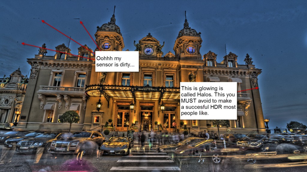
Learn to control your boosting of effects. Do not apply the strongest effect you possible can. Do go either one step at a time or do it more moderately. It is not a competition of going most extreme. It is all about making an awesome photo. This is NOT awesome.

You can do almost anything with your HDR, go lightly, extreme etc. Just do not have halos!

Check out my HDR tutorial to see how to remove halos. And here you will also see how to use effects selectively. One of the most important rules, is that you don’t have to use an effect globally in your photo. If the effect only improves 10%, of the photo, by all means, only use it in 10% of the photo and throw away the rest.

Tip #2 Be there at the right time

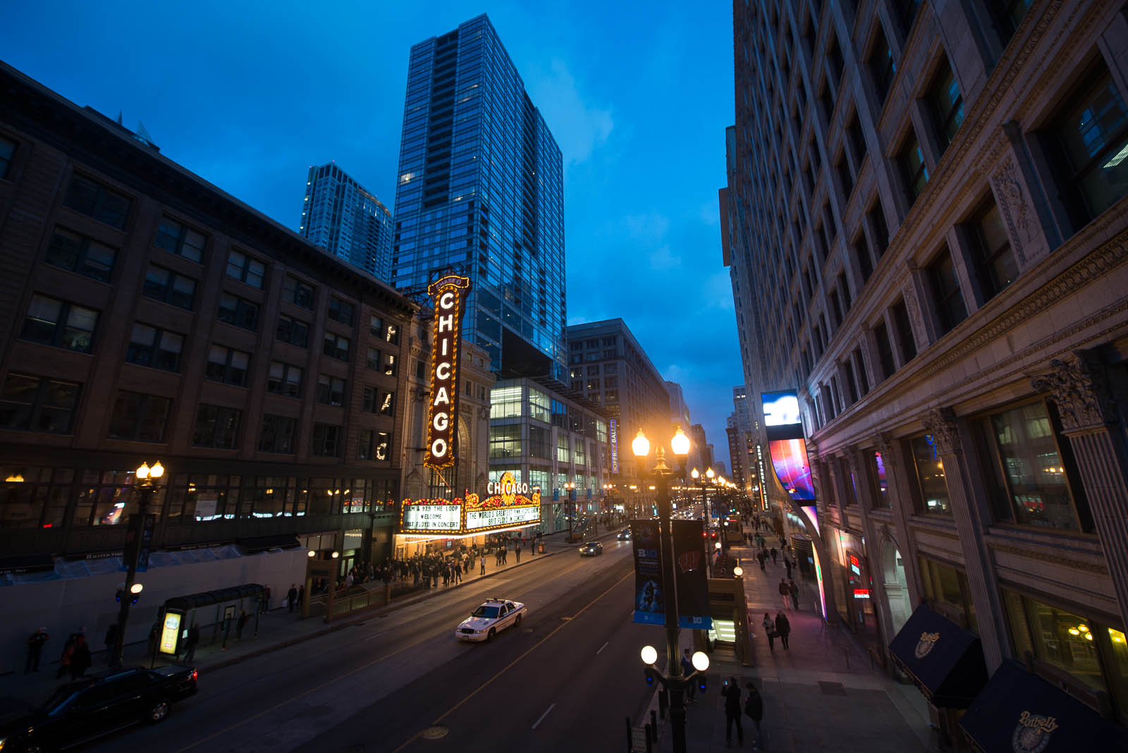
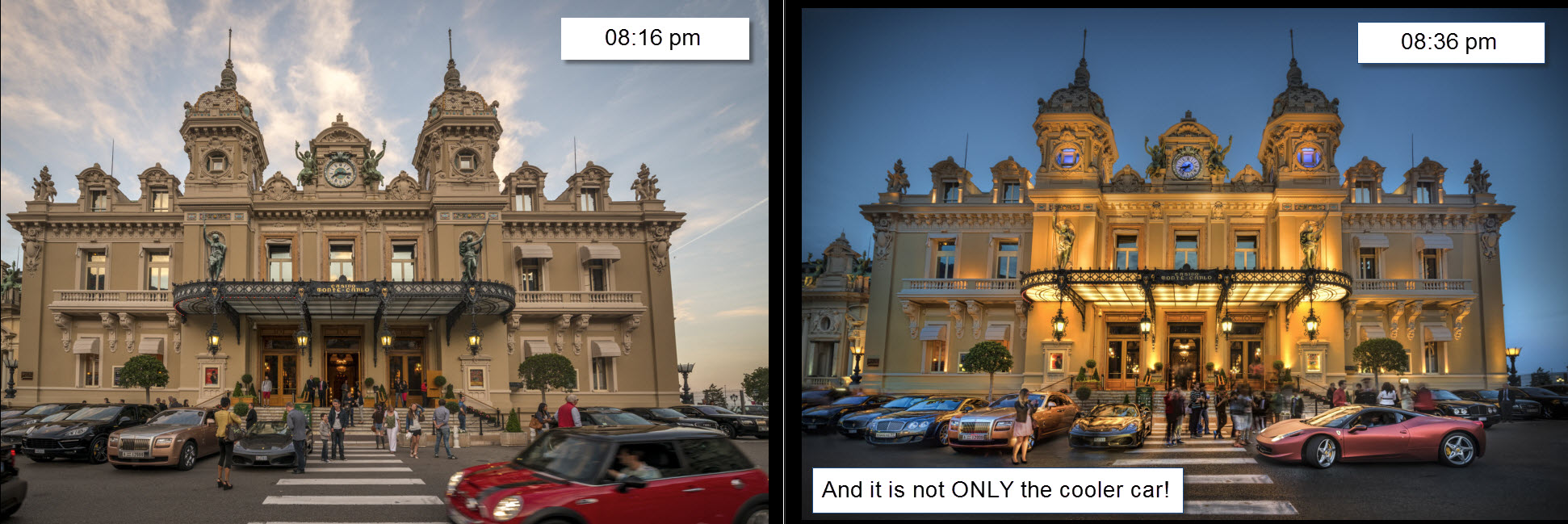
I am not a great fan of daylight HDR’s. Yes, often you do have a very high dynamic range in the middle of the day, and you can only cover it using HDR technology, but you usually do not get the coolest photos. Yes, you can usually hand held the camera, because there is much more light, and therefore the shutter speeds will be much faster, but it shows in the final result.

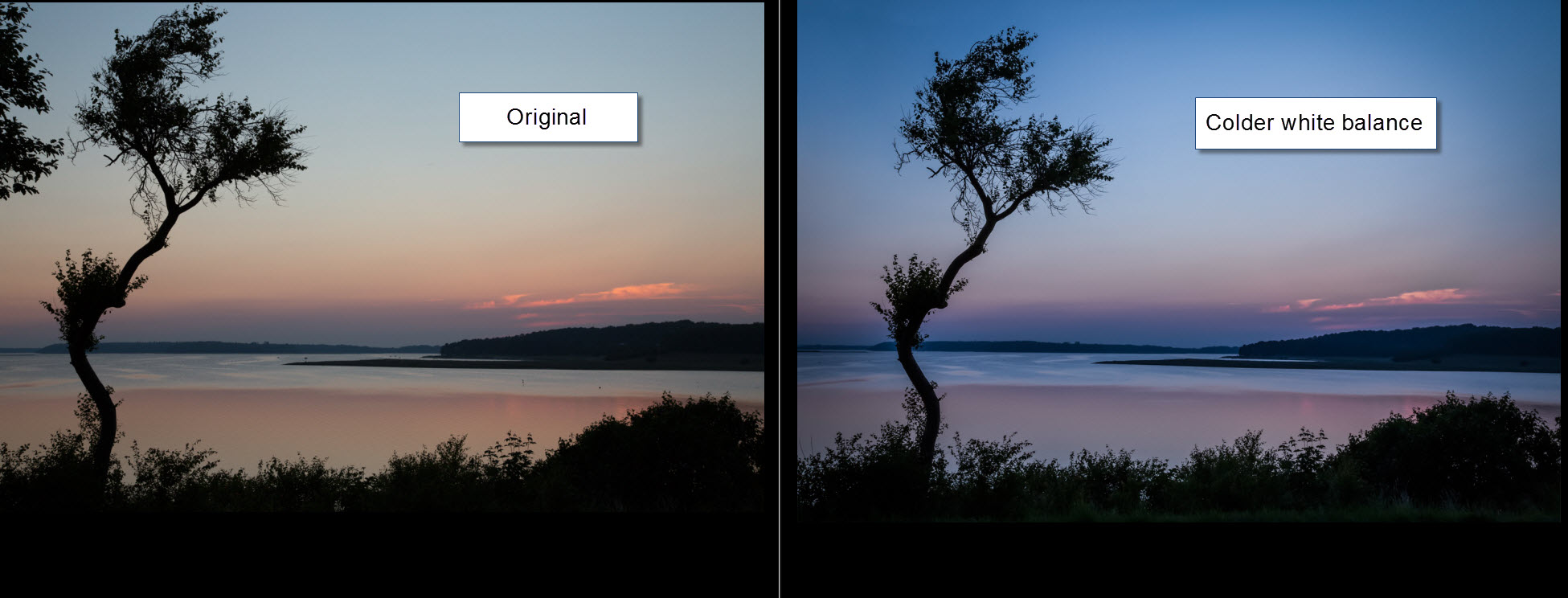
This is 20 minutes difference. Do you agree, it was worth waiting for those 20 minutes? And it is not only the much cooler car, that does the trick. It is the light.

Monaco - timing

The timing goes for all photography really, but HDRs kick in the turbo, when it get’s low light.

Tip #3 Use a tripod

If you already have learned to accept tip #2, then do not be tempted to shoot with out a tripod. If you do not use a tripod, you will have to compensate in other ways. First you will open your lens to the lowest f number and will end up at f/2.8 or f/3.5 or whatever your lens supports. Second, you will get longer exposure times, and when they get so slow, you can’t keep the camera still, you will increase the ISO.

A nasty side effect of making HDR’s, is the noise. It kind of comes with the concept, because details are enhanced. Some HDR products are better at handling the noise than others. And you can do a lot with noise reduction, but still… You loose quality and details.

The only way around it, is to use a tripod and have those longer exposure times, too keep the ISO as low as possible.

It took some convincing for me to use the tripod … always! And I felt stupid the first times I used the tripod among people, but I have learned, that you gain respect. And whenever you put up the tripod, people stop up, and take the “same” photo using their cell phones.

Tip #4 Setup the camera right

Setting the ISO

Fix your ISO to as low a setting as possible – do not use auto ISO! You will get far too much noise in the bright exposures.

It is a compromise, when it get’s darker, you will have to increase the ISO, to stay within the 30 second exposure, for the longest exposure. If you need to have a longer exposure than 30 seconds, you can either increase the ISO or the aperture (a lower aperture number). This is a compromise.

Use aperture mode

Always use fixed aperture mode (A or Av depending on the brand) when you shoot your bracketed shots. You can also do this in manual mode, but I only use manual mode in extreme cases. If you using aperture mode, you will be just fine in 99.9% of all cases.

But why not use Shutter speed (S or Tv) mode? Because what the camera will do, is to change the aperture for each photo. And changing the aperture changes the depth of field. And if the depth of field changes, you will end up with photos, that are not identical.

A scenario you could end up with, is that the dark -2 exposure might be tack sharp, because it has the lowest aperture (highest number), and largest depth of field.

The normal 0 exposure will have slightly blurred background and the bright +2 exposure will have both blurred foreground and even more blurred background, because the brightest will have the lowest depth of field.

Three photos with changing Aperture you can not blend. They are not identical and the result will not be good.

Use a timer or remote control

Use a remote control, cable release or a timer to set off the bracketed series of photos. If you touch the camera, the photos might be shaken.

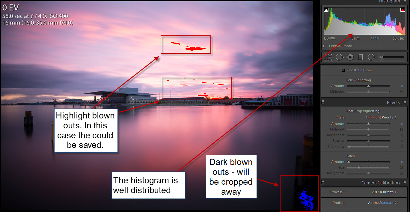
Tip #5 remember to check out your histogram.

If possible at all, make sure, that you have all light covered. The reason why you are shooting more exposures in the first place, is to cover all light, from the darkest shadow to the brightest light source. And if you miss out, when you are doing the bracketed serie, you are not much better off, than you were in the first place with only one photo.

Check your histogram on the cameras playback function and check that you have all light covered.

Monaco - histograms
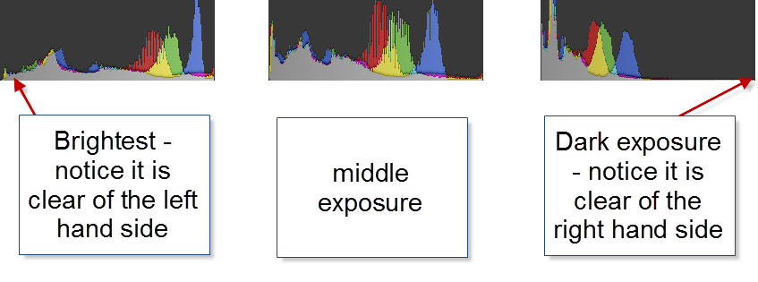
Some situations are harder to cover than others, and might require more shots than others.

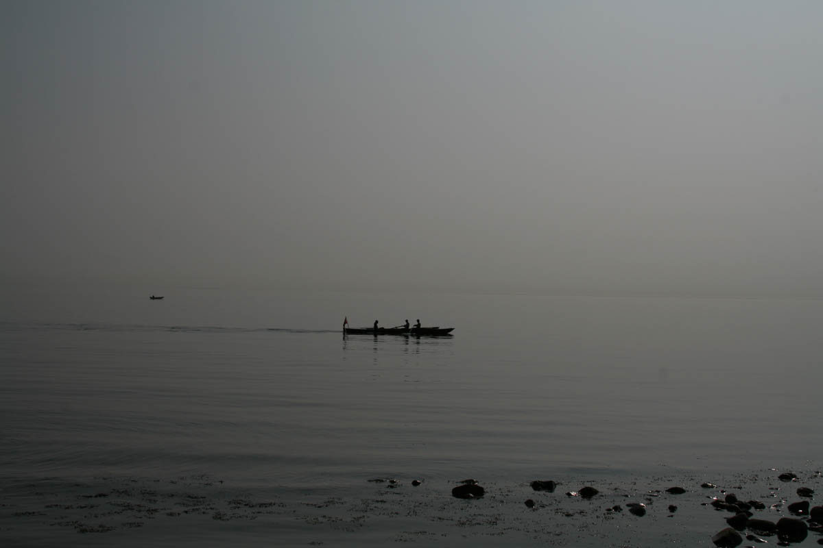
Some of the more difficult ones, are city night shots or shots having the Sun in the frame. Many of my city night shots, I often cover from -4 to +4 to get all information from the darkest shadows to the brightest light bulbs in the street lamps.
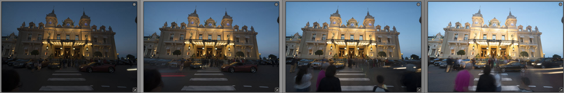
About the photo

I shot this photo in front of Monte Carlo Casino in a wild crowd of people with cameras. I only got four of my 5 planned shots, because a guard noticed my tripod. He was a senior member of the tripod police, and certainly did not like no tripods. I did not enter a discussion about, this being a public square, because I knew I had covered the light well enough, and got my cool car. I packed up my tripod and left the location happy.

Making the photo was really much more about mixing the four photos I had shot. The cool car is only present in the two of the four photos.

What I did, when I shot the serie, was a bit unusual, because of all of the crowd and the many cars passing by. I very carefully broke with my tip #4, and pressed shutter release manually for each exposure. Looking carefully at the scene for each photo. This way, I got my cool car, and made sure that I had photos with no people in more or less all parts.

Monaco before
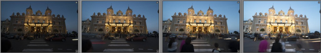
As you can see, it was quite a challange because of all the people and cars.

Another problem was, that I had positioned the camera for the pedestrians crossing instead of the Casino. This was a bigger mistake than first anticipated. I ended up spending quite some time correcting the perspective. It wasn’t easy.

Removing the people required a very delicate mixing of the layers in Photoshop, and then some cloning too. But I ended up with a fairly clean photo.

When my photo was clean, I started to apply my effects on the lower half of the photo. The casino itself is HDR, but the rest is a handful of effects from various tools.


Finding you own style – Realism Digital Art

The Liberty in London is a fascinating beautiful shopping mall. It's not as famous as Harrods, but from the outside, it's much more charming, if you ask me. Photo by: Jacob Surland, www.caughtinpixels.com

Finding your own style is something that takes a little time. Most of my photos are HDR photos, but making HDR photos is like making an oil painting. It is only a technique. Even what is considered an HDR is only vaguely defined.

Some think it is a must, to have shot more than one shot, to cover the Dynamic range, while others don’t and I belong the to the latter group. I believe that what people recognizes as HDR photos, are tone mapped photos. The tone mapping gives the “HDR effect”. But still, tone mapping can give any range of photos.

A large portion of my photos belongs to a special art style, which I call Realism Digital Art inspired by the traditional Realism Art. It would not be precise enough, just to say that I do HDR photos. It would be like saying that I do oil paintings.

It has taken some time to realize what my style is. I love doing a lot of different styles of photography, but the Realism Digital Art, is what I keep going back to.

Realism Digital Art definition

Realism Digital Art is an art form, based in photography, but with images looking almost like very detailed Realism paintings. The amount of details photography offers, invite the viewer’s eye to wander around, and discover small details and get astonished about the fine details. Even though the work was developed from a photograph yet, captivates the viewers and make them wonder, because it has elements of a painting.

In Realism Digital Art the light and colors play an important role and often they shape the image. Colors and light are essential parts in the composition of the image.

In contrast to photo journalism and naturalism, Realism Digital Art is not trying to portrait reality, but instead strives to present the scene in the most beautiful way, given the circumstances under which the photo was taken.

If removing objects, like lamp posts, signs, rubbish etc. improves the beauty of the image, that is acceptable, even encouraged. Introducing elements, like stars or a sky from another photo, is acceptable too, however not encouraged. In general, Realism Digital Art is not striving to composite photos, but if an element from another photo can fill an empty space in the image, that is acceptable.

Realism Digital Art a photographic way to strive to get to similar results, as the Realism Art does.

The photo above of the Liberty in London, is a fine example fitting this definition, but it is also an HDR. It seams that very often, HDR is a good platform or technique for making Realism Digital Art.


How to make a classic WWI plane enter a war scene

Sir Peter Jackson (Director of Lord of the RIngs) 
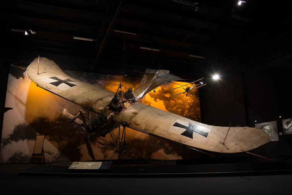
has his private collectoin of World War 1 aeroplanes stored at the Omaka Aviation Heritage Centre Blenheim. This is one of the first aeroplanes used in war, but you can also find the red baron among a lot of other great planes. What really is impressive, is the way each scene is built up. It's really amazingly detailed and very natural looking. If in the neighbourhood of Blenheim in New Zealand, don't miss out on the Aviation Centre. Photo by: Jacob Surland, www.caughtinpixels.com

This beautiful aeroplane  ‘Etrich Taube’ is one of the few left in the world. It’s the German’s first mass produced war plane and it dates back to before the Great Word (World War I). I saw this in Blenheim on the South Island of New Zealand.

Sir Peter Jackson (Director of Lord of the RIngs) has his private collectoin of World War I aero planes stored at the Omaka Aviation Heritage Centre Blenheim. This is one of the first aeroplanes used in war, but you can also find the red baron among a lot of other great planes. What really is impressive, is the way each scene is built up. It’s really amazingly detailed and very natural looking. If in the neighbourhood of Blenheim in New Zealand, don’t miss out on the Aviation Centre.

About the making of this photo

This photo is an 5 shot HDR. The plane hangs inside a hangar, and while some of the background is cool, the rest is looking like a hangar. As always, when making my photos, I run into trouble with something and have to find a solution to it. Let’s look at the original:

Before photo of Etrich Taube

As you can see, the scenery is quite nice, with two extra planes, and a war scene behind, however, the background isn’t large enough to cover the entire hangar.

I used a few tricks to make the plane look like in a real war scene. The first thing I did was to tone map my HDR photos, to get the look and feel of the aeroplane. This photo I then put into Photoshop and did a motion blur, in the direction of the plane seems to fly. And this I merged in all around the plane.

Etrich Taube explained


Having added the motion blur, around the plane, certainly helped removing most of the hangar, but the structure is still visible.

Etrich Taube explained blurred

The trick now is to make the rest of the hangar go away. And to do this, I start clone stamping some of the ground, at perhaps 25% opacity. The goal is to get all square lines out of the image or at least not noticeable. This proved difficult with only the ground available for clone stamping.

The original background contained some clouds and I decided to try to to a cloud texture on the photo, and then mix that in, in exactly the same way as I did with the blur. And now I had the material to start removing the hangar.

The important steps, was to remove what gave away, the fact, that the plane hangs inside a building.


Split toning doing the magic … again

On an early spring day in the mist, I encountered a boat full of rowers, moving almost silently through the water. Only small splashes of water as the oars go in and out of the water. Photo by: Jacob Surland, www.caughtinpixels.com

Canon 400D, Sigma 30mm f/1.4, ISO 100, 30mm, f/10, 1/1600 sec

Once more I have been digging around in my old photos, and found this one from Røsnæs in Denmark. A rowning boat coming by in the mist, and a motorboat slightly further out. Once again it’s the split toning in Lightroom that does the magic.

From this original JPEG photo (still hadn’t switched to RAW):

Denmark - Rowing in the midst

I could get to this result:

Denmark - Rowing in the mist settings

I added (using split toning) a lot of yellow to the highlights and then a little bit of purple to the shadows. I tuned the colors a little bit more, later in Photoshop. But this was my starting point and I could see, that I was on to something.

I also added a radial filter, to punch the yellow even more, in the center and I also brightened the center up, like the sun was out there. In fact the Sun was a little to the right of the scene, and not within the frame. But hey – who’s counting?

Denmark - Rowing in the mist radial


This is not the final photo, but it’s 80% of the photo. I took it into Photoshop and did some noise reduction and removed some JPEG artifacts (grainy spots).

Finally I cropped the stones out. I do like the stones, but I liked it better without the stones in the foreground. They are slightly too dominating and breaks the peace.


Long exposure HDR

The Opera House of Copenhagen caught just before sunrise. It's a long exposure. Photo by: Jacob Surland, www.caughtinpixels.com

This photo is taken 35 minutes later than the last ones I published from Nyhavn, Copenhagen. This is the Opera House of Copenhagen, Denmark, and I have been down there a few mornings to try to get a good shot, but the sunrise has always turned into … a grey one. But this time I was rewarded with a grand ‘almost’ sunrise. I never actually saw the sun, it went behind the clouds before it got up. I saw the sunshine on the buildings behind me, but I never saw the sun. But I did get a wonderful display of colors!

I do like Long Exposure photography. It really fascinates me, what the long exposure does to both water and clouds. And on a morning like this, when the water wasn’t particular smooth, and the Opera house didn’t make a good reflection in the water, a long exposure is a perfect solution. I took out my 10 stop B+W screw on filter and placed that on my 16-35mm lens. A lens I have purchased for this sole purpose, to be able to attach filters on it.

What I did was to first shoot the 7 HDR shots, and then I screwed the filter on the lens, and did a 58 seconds exposure (using a cable release). My plan was to use the water, and maybe the clouds from the long exposure, and mix it with the HDR shot. As it turned out, I must have moved the camera ever so slightly when I put on the filter, because the images doesn’t fit on top of each other. That is a risk.

Then I thought of something I learned from another photographer ‘Photography is always a compromise‘! I looked at the long exposure. It really was an almost perfectly exposed photo. Only a few blown outs in the darks and lights, and some of it even in the corner, which I knew I would crop away anyway:

Opera house copenhagen histogram

Continue reading

Chicago Theater on Sct Patricks Day – And the white balance

By pure random coincidence I arrived in Chicago on Sct Patricks day. I went for a walk and saw one of the landmarks ; Chicago Theater. Photo by: Jacob Surland, www.caughtinpixels.com

 Nikon D800, Nikkor 14-24, ISO 400, 14mm, f/4.5, 1/25 sec

By pure random coincidence I arrived in Chicago on Sct Patricks day. I went for a walk and saw one of the landmarks: Chicago Theater. I would have loved to go inside, but on a short business trip, you’re not always allowed that luxury.

This photo is processed in Lightroom. The main things I have done to this photo is correct perspective and then change the White balance, and then do a little dodge and burn.

Some photos work absolutely best when the colors are as close to natural as possible, while others are quite different. In particular shots around sunrise and sunset really can change mood quite a lot, if you change the white balance.

Have a look at the before photo:

2013-03-17-Chicago-037As you can see a much colder and less interesting photo. Reality is probably somewhere in between my final photo and this one. The camera is trying to deal with both natural light in the sky and electric light and chooses something in the middle, not really working.

I changed the color temperature from 3200 to 5800 in Lightroom. That added the nice and warm colors. Chicago in March, however, is a cold experience and I learned that Chicago is not named the Windy City for nothing. It was freezing cold and my colleague had to buy a winter coat! The warmth of the photo does not reflect the actual temperature, but then again, I’m not in business of portraying reality exactly, but rather in the business of making photos that I like.

When you have these golden hour or blue hour photos, always try to make the photo a little warmer and see if you get something nice.  This is another example from just after sunset, in this case I made it colder and that also changed the photo dramatically.

White balance games