How to make something out of nothing

Birds flee from the Church of Hallgrim. In Danish Hallgrim means 'half ugly', hopefully, that's not why the bird flees. The Church is named after a poet from the 17th century, and perhaps he should be happy, that he wasn't completely ugly, but only half ugly. Photo by: Jacob Surland, www.caughtinpixels.com

 Birds flee from the Church of Hallgrim. In Danish Hallgrim means ‘half ugly’, hopefully, that’s not why the bird flees. The Church is named after a poet from the 17th century, and perhaps he should be happy, that he wasn’t completely ugly, but only half ugly.

I have a bunch of photos in my library, from great locations around the world, but because the light wasn’t right, I have to add something, to make it into something. This image is an example from Hallgrims Church in Reykjavik in Iceland. A fantastic and beautiful modern church. I shot the photo on a gray and rainy day. The sky was gray as it gets as you can see in the original unprocessed image:

Hallgrims church

Continue reading

How to remove grafitty from a wall

The Old Observatory at Brorfelde in Denmark sitting in the sunset on an early spring evening. Looks like it's going to be a night, worth watching the stars. Photo by: Jacob Surland, www.caughtinpixels.com

I shot this the other day, while waiting for my son while he is at music training. I have 40 minutes, and this time of year, it fits with the Sunset.

Brorfelde is an old observatory, that I have wanted to see for a while. When I got there, all of the trees had just been cut down, and the ground was all tractor wheels and ruble. Not exactly a great ground for photography. But I tried to clone out the worst of the tracks, and then I darkened the ground quite a bit.

My goal with this one, was to make a fairly classic sunset photo, with the two observatory buildings leading to the sun. I captured a couple of people riding the horizon. These I left in the image, though they would be easy to clone out, because they add value to the image.

Interesting trick used

The wall on the nearest observatory building is full of grafitty. To get rid of it, I duplicated the layer, blurred the top one, just enough to make the writings disappear. Then I took a texture of a wall, used overlay blend mode and painted that gently on top of the wall, and then the wall still has it’s color from rust and the light, but also new texture.

This is the grafitty – to particularly pretty. Notice the rust on the wall.

Brorfelde grafitty

First thing I did was to duplicate the layer, and then blur using Gaussian Blur in Photoshop. I blurred just enough to make the grafitty unreadable. I then added a black layer mask to the blurred layer and painted the blurred layer on in, wherever the grafitty was.


Brorfelde grafitty gone

I then found a texture of a wall and by using the feature ‘Blend mode’ in Photoshop. I can add back some texture to the wall while I still keep the colors of the original wall. Notice the rust is still there.

Brorfelde grafitty new texture


I did it by changing the blend mode on the layer with the texture. I added a layer mask to that layer too and painted in the texture where ever I had painted in the blurred layer. The blurred wall, now receives texture but keeping its colors. There are a number of different Blend modes, i just tried all of them, and picked the one, I found best for the purpose. In this case, it was Pin Light.

Brorfelde grafitty new texture how

How to make textures to save a gray photo

Strasbourg city of administration and city of beauty. Known for it's EU administration. But Strasbourg is much more than administration, the old center of Strasbourg has a long and very interesting history. One of the pearls is the Pont Saint-Martin. There's lock between the lower and the higher canals. You can sail the canals, and walk the narrow old streets. Photo by: Jacob Surland, www.caughtinpixels.com Once in a while, you just don’t have either the time of day or the weather with you, when you shoot photos. Take this example from Strasbourg. I had researched Strasbourg from home, and had a pretty good idea, what I wanted to shoot. But two things turned out to be a problem. 1) I could not stay in the city until sunset, due to time schedules, but I could stay until an hour before sunset, which could have been good enough. 2) It was grey, and there was drizzle. I shot my shots using an umbrella, and left Strasbourg not quite satisfied with the result. It’s a long exposure, to at least try to make the water interesting enough. I love this place Pont Saint-Martin in Strasbourg. I think it is also probably the most photographed place in Strasbourg, nevertheless I love the place, and I did not want to let my photo go. I looked into alternative processing methods. I did not have any success on the light, so I had to add something else, make it stand out. And as it turned out, it was in using textures I found the answer. This is the before photo: Pont Saint Martin before And this is what I did: Continue reading

How to cross process photos in Lightroom

I always find that churches are interesting and I love to photograph them. Each country has it's own style, and yet you can almost always recognize a church. This particular church is from Hishult in Sweden. A typical Swedish village church. Photo by: Jacob Surland, www.caughtinpixels.com

Location location and location. Three of the most important things for photographers, at least for cityscape and landscape photographers like myself. The three next important things are light light and light. But what if you only have one them, the Location? Will you then have nothing?

Usually my mantra is ‘Light is everything’, but as recent events has turned out for me, I have ended up with a whole bunch of daytime photos. And instead of discarding them, I have started working on them, to see if I can get something interesting from them. Something more artistic.

This is the original of the photo above:
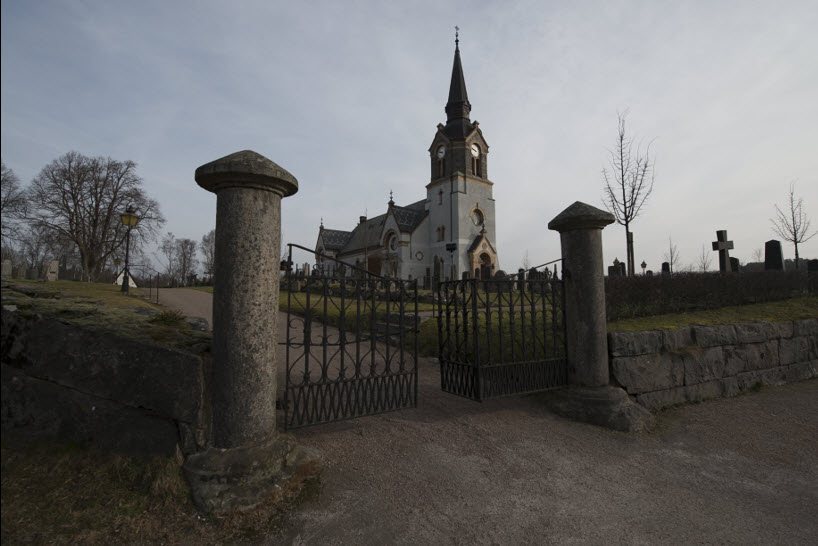
A swedish church - before photo

As you can see quite different, and not really interesting. There is one good thing, to say about the light; it’s slightly defused, due to the slight overcast. And this does give me more flexibility. Lucky me!

This photo needs a kick. A kick to send it somewhere more interesting. The first thing you have to realize, and accept, is that you have to leave reality behind you, and enter the world of art.

The making of this is photo

Since I ended up with all of these daytime photos, I have been playing with toning and cross-processing photos Lightroom. There are number of ways of doing this, to get something really interesting out of it. Cross processing was invented in the film days, and you did it by developing in the wrong chemicals. This of course was a very unpredictable process. Today you can do it digitally, and you have full control.

These are some tricks, that I use when I cross process my photos in Lightroom.

Split toning: There is a panel in Lightroom called split toning. This I use more often than not, on my photos, daytime or not. Sometimes only to nudge a photo ever so gentle in a direction. This photo is split toned like this:
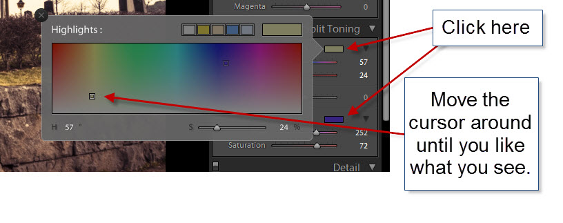
Swedish church split toning 2

I often end up with some kind of yellow in the highlights and some kind of blue in the shadows, this case is no different. But when you try it, do try to move the cursor around, slowly to digest the changing colors and see what you can get, that you like. Remember that not two photos are alike.

Hue / Saturation / Luminance (HSL): This panel in Lightroom is really powerful, when it comes to Cross Processing the colors.
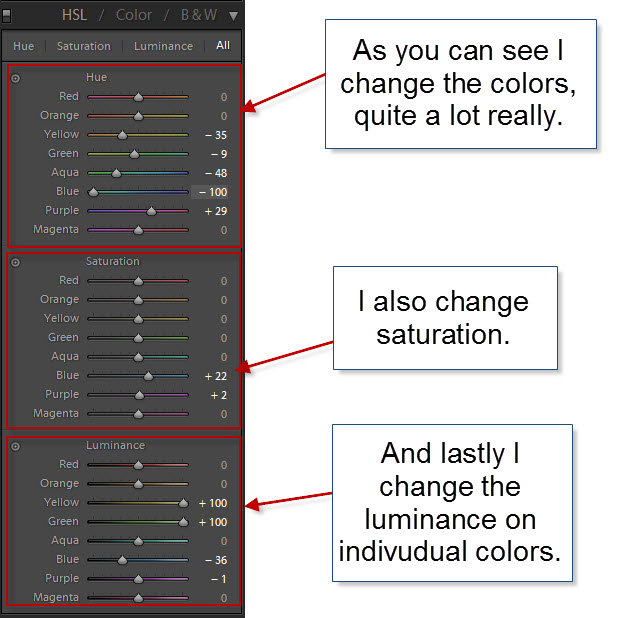
Swedish church HSL panel

But how do I end up with these values? Exactly these values? I do it, by using this button for each of the panels. This example is for the Luminance, but you can do the same for the Hue and the Saturation panel.
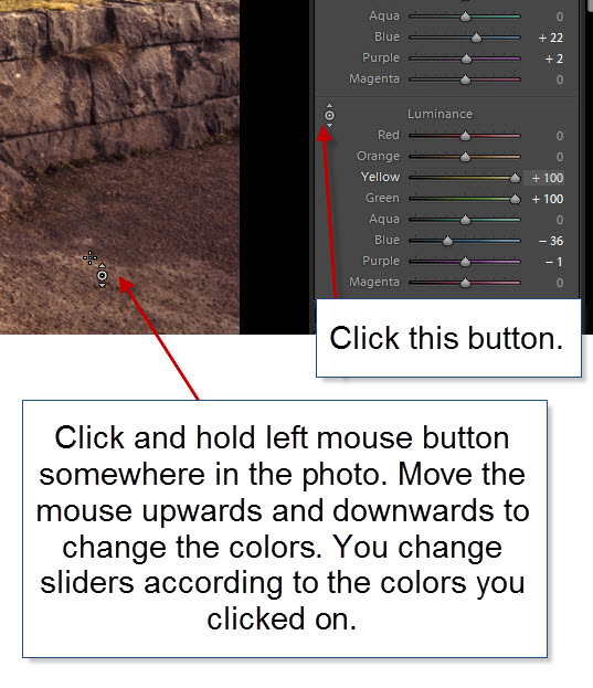
Swedish church HSL panel 2

This way, you typically adjust two or three sliders, at the same time, but not at the same rate, because the pixel you clicked on will not have all colors represented to the same extend.

Colored Gradients: The last thing I used to tone this image, is toned gradients, like this:
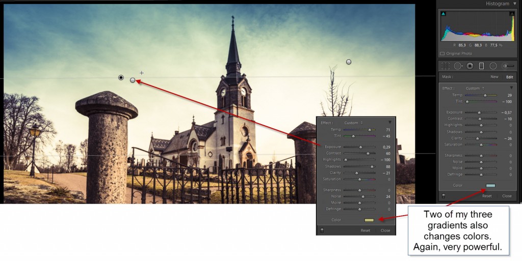
Swedish church Gradients

As you can see this image has three gradients. Each touches the image in an individual way. Two has got toning, a blue color and a yellow color. The last one, makes sure that the upper right corner has a similar brightness as the left hand corner has. The before photo has a bright and less bright corner, but I like a more symmetric look in the sky, and therefore darken the right hand corner a little bit.

Final steps in Photoshop

After having “toned” and “cross processed” my photo in Lightroom I brought it into Photoshop. What I still didn’t like, was too much contrast and I wanted the gate to be a little more prominent.

First I added some Orton Effect (you might want to learn about that here – it’s digital magic). I used the “Overlay” blend mode, this way, I could stick to my normal exposure. The Orton Effect I added using A mask. I rarely use global changes in Photoshop. The reason why I bring things into Photoshop is to tune specific parts of an image, and by applying global changes, I shortcut my purpose.
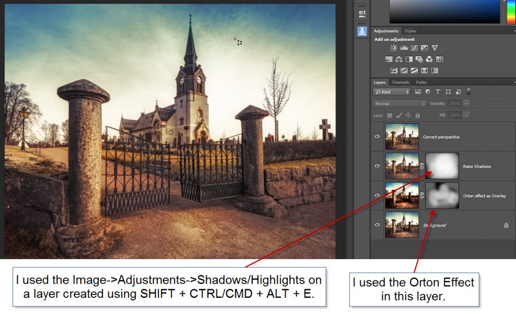
Swedish church Photoshop in changes

After having applied the Orton Effect to the extend that I liked, I merged all layers into a new layer (not flattening!), by pressing SHIFT + CTRL + ALT + E (or on Mac SHIFT + CMD + ALT + E). This is probably the feature that I use the most in Photoshop.

This new layer I changed the Shadows and Highlights in, using this feature:
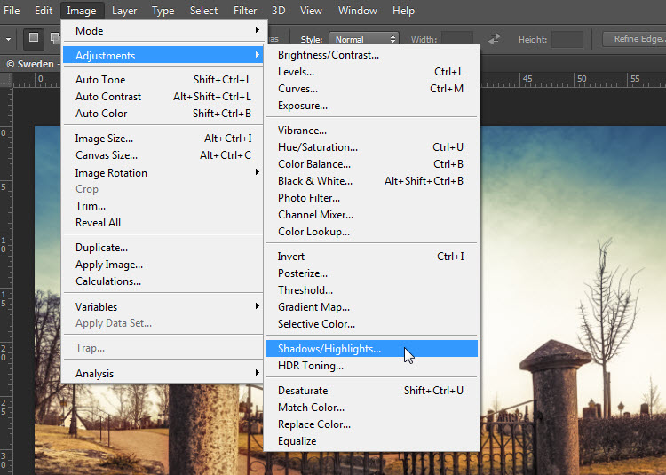
Swedish church Photoshop Shadows and HighlightsThis tool I used to increase the shadows, making the photo less contrasty, which I think improved the photo in general. However, I still took what I needed, using a layer mask.

The final step was to change the perspective. I know, that there is a Perspective Crop in Photoshop, but I really prefer to use a different tool, that is much more visual. But to use that, I once more merge all layers into a new layer (still not flattening) using my favorite feature in Photoshop SHIFT + CTRL + ALT + E (or on Mac SHIFT + CMD + ALT + E).

Correcting perspective

The feature I use for correcting perspective, is transform->Distort. The advantage of this feature, is that it is visual, you can actually see what you are correcting. The disadvantage is that it only targets one layer, and for that reason I created the new merged layer.

If I used the perspective crop, I would correct perspective in ALL layers. However, if I do that, I would not be able to bring in a new version of the photo or a different exposure from Lightroom to blend in. Because I shoot normally HDR, I often go back into Lightroom to export another version/exposure of my image, to use along with the ones I have in Photoshop already. But if I corrected perspective using crop, this path would be closed to me.

By using the Transform->Distort, all I have to do is to remove that layer, and then import the extra photo into Photoshop. Do what ever I want to do, and then do a new Transform->Distort on a new merged layer.

Let’s see how this is done:
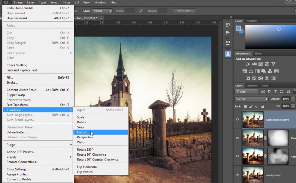
Swedish church Photoshop Correct perspective


And then you get a frame, that you can move around, and you see the result instantly. This I like, because I can really fine tune what I want.
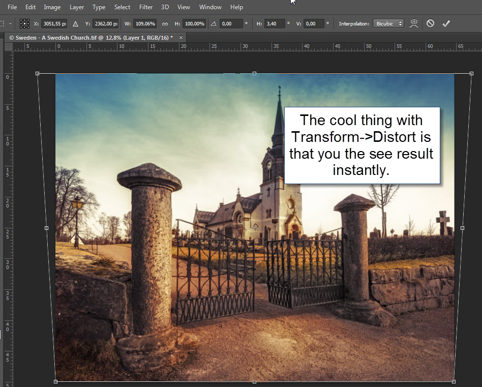
Swedish church Photoshop Correct perspective step 2

And this is basically what I did to bring this ordinary daytime photo, into an artistic photo.

Follow my blog

If you found this tutorial helpful or interesting, you might want to receive my other posts. In the right hand corner you find a “Follow” button – click on that, fill in your email address and you will receive my posts on email.

How to make a classic WWI plane enter a war scene

Sir Peter Jackson (Director of Lord of the RIngs) has his private collectoin of World War 1 aeroplanes stored at the Omaka Aviation Heritage Centre Blenheim. This is one of the first aeroplanes used in war, but you can also find the red baron among a lot of other great planes. What really is impressive, is the way each scene is built up. It's really amazingly detailed and very natural looking. If in the neighbourhood of Blenheim in New Zealand, don't miss out on the Aviation Centre. Photo by: Jacob Surland, www.caughtinpixels.com

This beautiful aeroplane  ‘Etrich Taube’ is one of the few left in the world. It’s the German’s first mass produced war plane and it dates back to before the Great Word (World War I). I saw this in Blenheim on the South Island of New Zealand.

Sir Peter Jackson (Director of Lord of the RIngs) has his private collectoin of World War I aero planes stored at the Omaka Aviation Heritage Centre Blenheim. This is one of the first aeroplanes used in war, but you can also find the red baron among a lot of other great planes. What really is impressive, is the way each scene is built up. It’s really amazingly detailed and very natural looking. If in the neighbourhood of Blenheim in New Zealand, don’t miss out on the Aviation Centre.

About the making of this photo

This photo is an 5 shot HDR. The plane hangs inside a hangar, and while some of the background is cool, the rest is looking like a hangar. As always, when making my photos, I run into trouble with something and have to find a solution to it. Let’s look at the original:

Before photo of Etrich Taube

As you can see, the scenery is quite nice, with two extra planes, and a war scene behind, however, the background isn’t large enough to cover the entire hangar.

I used a few tricks to make the plane look like in a real war scene. The first thing I did was to tone map my HDR photos, to get the look and feel of the aeroplane. This photo I then put into Photoshop and did a motion blur, in the direction of the plane seems to fly. And this I merged in all around the plane.

Etrich Taube explained


Having added the motion blur, around the plane, certainly helped removing most of the hangar, but the structure is still visible.

Etrich Taube explained blurred

The trick now is to make the rest of the hangar go away. And to do this, I start clone stamping some of the ground, at perhaps 25% opacity. The goal is to get all square lines out of the image or at least not noticeable. This proved difficult with only the ground available for clone stamping.

The original background contained some clouds and I decided to try to to a cloud texture on the photo, and then mix that in, in exactly the same way as I did with the blur. And now I had the material to start removing the hangar.

The important steps, was to remove what gave away, the fact, that the plane hangs inside a building.


Preparation for Art Monaco 2014

Saint Mont Michel in France is one of the biggest tourist attractions in France with more than 1.2 million visitors a year. Disneyland Paris has got 14,5 million. And Disneyland is probably 5-10 times larger than Mont Saint Michel. That kind of put's it into perspective how many people come to visit Mont Saint Michel. However, if you venture of the mainstreet after you have had your traditional ommelet for dinner, you can find empty streets and alleys like this one. Photo by: Jacob Surland, www.caughtinpixels.com

I am going to Art Monaco 2014 to exhibit two of my photos. Art Monaco receives about 10.000 visitors from all over the world, in just 4 days. That’s an incredible lot of people in a very short time. This is going to be very exciting.

Art Monaca 2014

It is the International Fine Art Realist Painter  and gallerist Mona Youssef, who has invited me, and I am very proud and I am looking very much forward to work with her. Mona does realistic landscape paintings, while I do a lot photos that looks like paintings. Have a look at some of paintings, they are absolutely beautiful. You can find them on her web-site www.mona-gallery.com.

Booking my hotel in Monaco, proved to be more difficult, than first anticipated. The first couple I wanted to look at, had no vacancy at all, but I managed to find one, a bit further away, than I had hoped – but at least within walking distance! The prices in Monaco, really can really go over the top!

While I do like the prints I have made so far, I would like to go a notch higher in quality, if possible at all. I have been searching and searching, and asking people where to get the best quality. It really is the framing, I am only 98% satisfied with. In a couple of weeks I am going to a showroom, to see various print types.

About this photo

I shot this photo in Saint Mont Michel in France. Saint Mont Michel is one of the biggest tourist attractions in France with more than 1.2 million visitors a year. Disneyland Paris has got 14,5 million. And Disneyland is probably 5-10 times larger than Mont Saint Michel. That put’s it into perspective, how many people come to visit Mont Saint Michel.

However, if you venture of the main street after you have had your traditional omelet (in the old days travelers had an omelet, when they arrived to Mont Saint Michel) for dinner, you can find empty streets and alleys like this one.

The making of this photo

This photo is one the photos I have pushed furthest away from the original photo. This is the original:

France - Deserted Alley in Mont Saint MichelAs you can see, quite a different image. What I did, was to add a lot of artificial light sources. Things that are not present in the photo at all, and then I added some warmth to the photo as well. I also made it darker, to simulate night time.

France - Deserted Alley in Mont Saint Michel-2

But what really pushed the image home, towards the final look, is putting it through Photomatix Pro.  Photomatix does wonderful stuff to artificial light sources, this I have shown in detail in this post. It’s the same method I have applied here. The result has to be fixed, because it goes over the top, but that is the same you have to do with everything you put through Photomatix Pro – it is only 2/3 of the final photo.

If you too want to experiment with Photomatix, either for doing HDR photos or more painterly like photos, you can try it for free, but you can also buy it with a 15% discount, by using “caughtinpixels” coupon code. You find Photomatix Pro here.

Split toning doing the magic … again

On an early spring day in the mist, I encountered a boat full of rowers, moving almost silently through the water. Only small splashes of water as the oars go in and out of the water. Photo by: Jacob Surland, www.caughtinpixels.com

Canon 400D, Sigma 30mm f/1.4, ISO 100, 30mm, f/10, 1/1600 sec

Once more I have been digging around in my old photos, and found this one from Røsnæs in Denmark. A rowning boat coming by in the mist, and a motorboat slightly further out. Once again it’s the split toning in Lightroom that does the magic.

From this original JPEG photo (still hadn’t switched to RAW):

Denmark - Rowing in the midst

I could get to this result:

Denmark - Rowing in the mist settings

I added (using split toning) a lot of yellow to the highlights and then a little bit of purple to the shadows. I tuned the colors a little bit more, later in Photoshop. But this was my starting point and I could see, that I was on to something.

I also added a radial filter, to punch the yellow even more, in the center and I also brightened the center up, like the sun was out there. In fact the Sun was a little to the right of the scene, and not within the frame. But hey – who’s counting?

Denmark - Rowing in the mist radial


This is not the final photo, but it’s 80% of the photo. I took it into Photoshop and did some noise reduction and removed some JPEG artifacts (grainy spots).

Finally I cropped the stones out. I do like the stones, but I liked it better without the stones in the foreground. They are slightly too dominating and breaks the peace.


Zenith at Cutty Sark – The making of…

The old Sail Ship Cutty Sark, is placed in a dock in Greenwich Village, London. The old ship sailed with tea and was build in 1869. A few years a ago a fire destroyed some of it, but not more, than it could be repeared. I happened to pass the ship at 12 o'clock and the Sun stood just at the top of the masts. Photo by: Jacob Surland, www.caughtinpixels.com

The old Sail Ship Cutty Sark, is placed in a dock in Greenwich Village, London. The old ship sailed with tea and was build in 1869. A few years a ago a fire destroyed some of it, but not more, than it could be repeared. I happened to pass the ship at 12 o’clock and the Sun stood just at the top of the masts.

The making of this photo

I shot 7 hand held shots (-4 to +2), at ISO 200. It is very bright, and the shutter speeds range from 1/8000 to 1/160. This is the 0-exposure:

Zenith Cutty Sark - beforeAs you no doubt can see, it is quite different, from my final photo. What I did was to make a split toned image in Adobe Lightroom. I have some presets that I have made, some of which uses split toning of the colors. This can sometimes be a great way, to punch some interesting coloring into a mid-day photo.

I often use my Lightroom presets, to get an idea, in particular with a shot like this. The problem with this shot, is that it’s taken in the middle of the day, and the light really isn’t great. I got a composition that I liked, with the sun right on top of the mast. Clearly Cutty Sark is placed North South, otherwise the symmetry wouldn’t have worked.

Anyway, one of my presets give this yellow coloring to the highlights and some purple to darker tones.

Zenith Cutty Sark Split ToningThis gives the overall look and feel of the photo. And this makes an otherwise a little bit boring daylight photo, more interesting. I then synchronized the processing to 3 of the other exposures photos:

Zenith Cutty Sark exposuresI did a little individual processing on the lower part of the photo. I wanted to mix these four photos in Photo, into a final photo.

I then used the Lightroom feature to open the four photos as layers Photoshop:

Cutty Sark blue open in photoshop


And then I blended the layers to my liking.

Cutty Sark blue layers in photoshop

I used the four images to get the right mixture on the sky. The brighter one for the people on the ground. When I was happy with the result, I re-imported the 16-bit TIFF file into Lightroom and did the last things there.

The glass building in front of Cutty Sark I wanted to pop a bit more. Blue and yellow goes really well together, so I wanted to pop the blue color. To do that, I added an elliptic gradient (remember to inverse it!). I increased the exposure, to make it bright, and started playing with the color toning of that.

Cutty Sark blue mapping 2

And the values I used:

Cutty Sark blue mapping

I did several things. I lowered the temperature to -35. This moves the area away from Yellow towards blue. Then I increased the exposure slightly, but also the shadows. But I also added some color, a blue/purple color. What I do when I use this color map, is to drag the pointer slowly around, and use a “better worse” strategy.

For sharpness I used both the Clarity and the Sharpness.

The photo was now roughly done. I thought it was maybe a tiny bit too orange, and made a little adjustment in the Hue section in Lightroom. I pushed the Yellow a bit towards Green, and that took the top of the orange.

Cutty Sark Hue changing


And now I only needed to do the final touches:

  • Reduce noise
  • Remove sensor spots and paper on the ground.

And that was it.

I have a lot of other photos, that I have described “The making of…”. You can find them here.


Long exposure HDR

The Opera House of Copenhagen caught just before sunrise. It's a long exposure. Photo by: Jacob Surland, www.caughtinpixels.com

This photo is taken 35 minutes later than the last ones I published from Nyhavn, Copenhagen. This is the Opera House of Copenhagen, Denmark, and I have been down there a few mornings to try to get a good shot, but the sunrise has always turned into … a grey one. But this time I was rewarded with a grand ‘almost’ sunrise. I never actually saw the sun, it went behind the clouds before it got up. I saw the sunshine on the buildings behind me, but I never saw the sun. But I did get a wonderful display of colors!

I do like Long Exposure photography. It really fascinates me, what the long exposure does to both water and clouds. And on a morning like this, when the water wasn’t particular smooth, and the Opera house didn’t make a good reflection in the water, a long exposure is a perfect solution. I took out my 10 stop B+W screw on filter and placed that on my 16-35mm lens. A lens I have purchased for this sole purpose, to be able to attach filters on it.

What I did was to first shoot the 7 HDR shots, and then I screwed the filter on the lens, and did a 58 seconds exposure (using a cable release). My plan was to use the water, and maybe the clouds from the long exposure, and mix it with the HDR shot. As it turned out, I must have moved the camera ever so slightly when I put on the filter, because the images doesn’t fit on top of each other. That is a risk.

Then I thought of something I learned from another photographer ‘Photography is always a compromise‘! I looked at the long exposure. It really was an almost perfectly exposed photo. Only a few blown outs in the darks and lights, and some of it even in the corner, which I knew I would crop away anyway:

Opera house copenhagen histogram

Continue reading

Stars above the London Tower Bridge

London City Hall with the London Tower Bridge just after midnight. Only a few people hovers around the area. The stars are peaking out from the skies. Photo by: Jacob Surland, www.caughtinpixels.com

I used to live in London back in 1991-92. London has changed a lot since then. Many new modern buildings have replaced old ones and I must admit, that they are doing a really good job of doing this. Magnificent architecture and daring shapes takes London into the new millennium, as the true world metro-pol city it is.

The London City Hall looks like a … space helmet or a twisted egg, and there’s this amphi theater right in front of it. And it is built just next to the old London Tower Bridge and it stands beautiful in the night. And behind my is the alley that leads to another of Londons new buildings, the Shard.

The making of this photo

The photo is a 7 shot HDR ranging from -4 to +2. I often shoot with an exposure compensation of -1 or -2 in night conditions like this, with really really bright parts (lamps) and really dark shadows. I only use -2 if I shoot 9 shots. Why do I do that? Because the lamps really are bright in the night and the camera really is struggling trying to capture all light, so my -4 shots are aimed at the light sources only.

The 7 shots I tone mapped in Photomatix Pro. I have worked a long time with this photo afterwards both in Lightroom and in Photoshop, without really finding what I wanted. This is the original untouched photo (the 0 exposure):2013-06-19-London_senior-950

While this is in many ways is a nice photo I wanted more of it, and there are things I don’t like about it. As it turned out, it proved to be quite a problem to hit the right node, and the major problem really was the sky. It was far too orange to my taste, mind you it was kind of orange when I was there, but it just didn’t really work.

I tried a lot of different things. The HDR process only made the orange sky even worse. I tried working with the white balance and the helped a bit. In the end I ended up using very cold colors on is photo, to take out the orange colors,

While working the image I realized, that the light beams on the Tower Bridge shone up in the air, while not very easy to see I decided to exaggerate them and that helped quite a bit. I did that using dodge and burn tools, by raising the exposure in an area like a beam going up from the sky.

UK - City hall and london tower bridge

To emphasize the light beams even more, I increased the contrast on the clouds. What happened then, was that the upper left corner went black.

It was dark, but the increased contrast made it black and it looked like a hole in the clouds existed, and that gave me the idea of putting stars there.

I have this great photo of the Milky way I shot in Sweden some time ago, that lacks a good scene, but the stars really are nice.

2012-10-06-Karlskrona-285

I decided to merge the stars into the left hand corner like this and I made the light beams even more visible using a curved layer. Now things started work for me!

UK - City hall and london tower bridge step 2Here you can see that I add layers with a channel mixer. I do that to work with the colors and take out the orange. Things go a bit too blue and in Lightroom I ended up de-saturating a lot of the clouds and adding some yellow to the bridge, to make it work nicely.

I also removed the orange two flags. This required some detailed work with the clone stamp tool in Photoshop. My son said – wow it’s just like “Tron” – and his Daddy was happy! Even though it is “only” London.